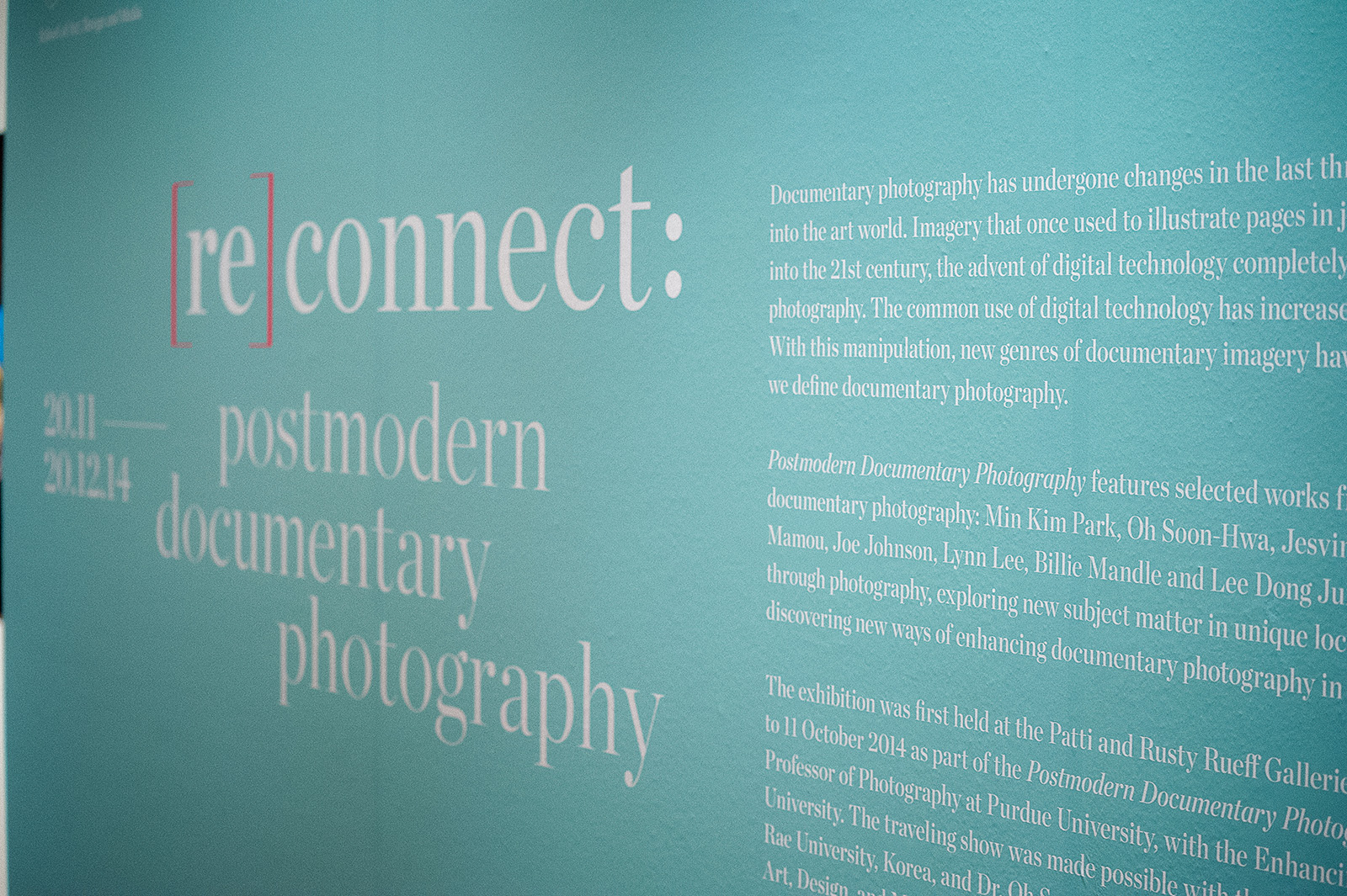
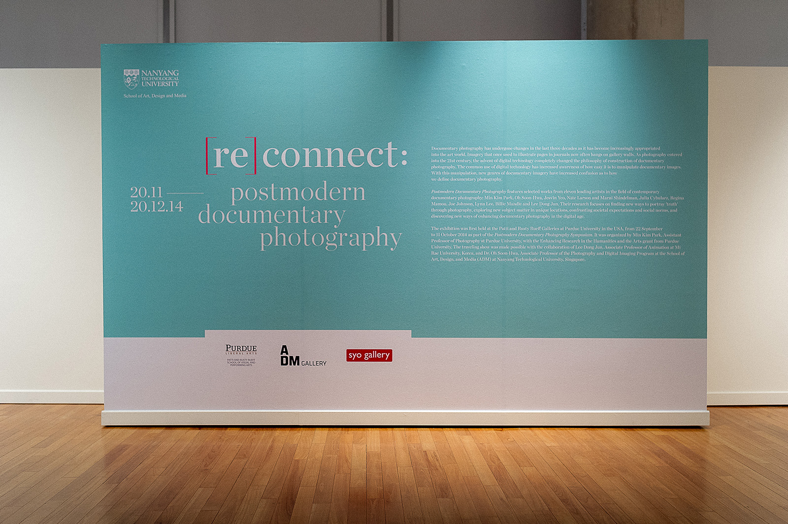
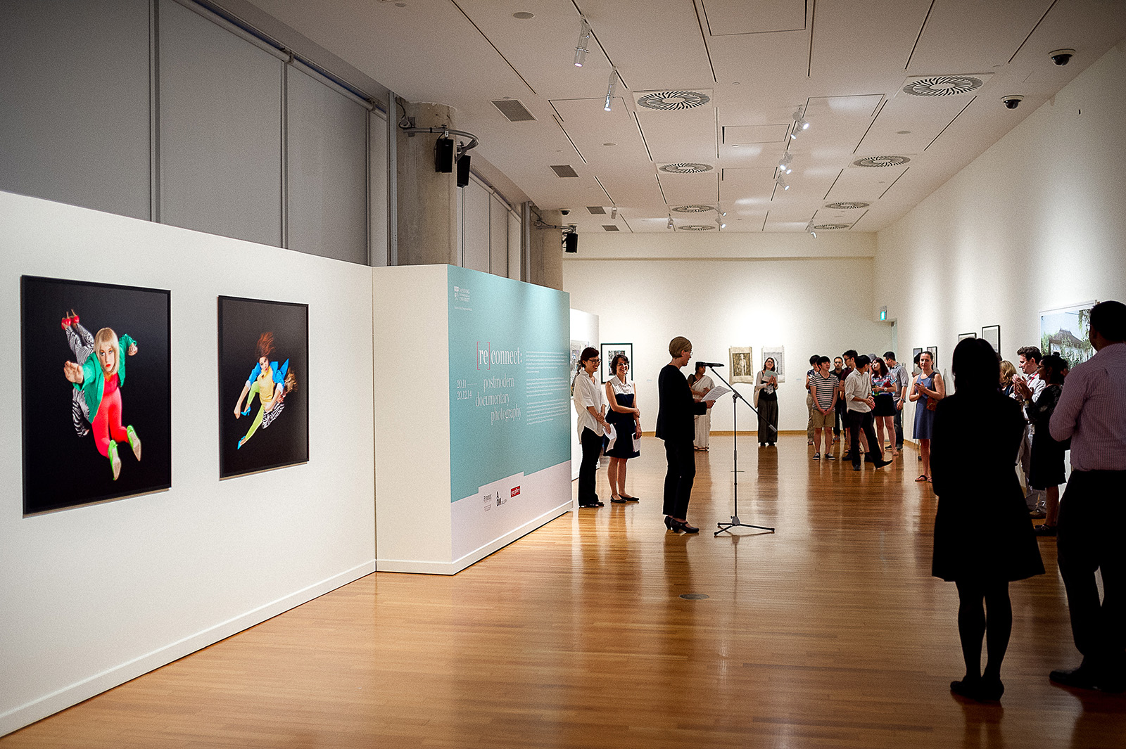
Sea State

2016

SEA STATE is an exhibition by artist Charles Lim Yi Yong, commissioned for the Singapore Pavilion for the 56th Venice Biennale and presented at the NTU Centre for Contemporary Art Singapore. For over a decade, Lim’s ongoing project SEA STATE examines the biophysical, political and psychic contours of Singapore through the visible and invisible lenses of the sea. SEA STATE is an in-depth inquiry that scrutinises both man-made systems, opening new perspectives on our everyday surroundings, from unseen landscapes and disappearing islands to the imaginary boundaries of a future landmass.

We took inspiration from this to design the exhibition branding, which is applied across all environmental graphics and print collaterals.


CCA Quarterly

2016

Located in Gillman Barracks, the NTU Centre for Contemporary Art Singapore (NTU CCA Singapore) is a national research centre of Nanyang Technological University and is supported by a grant from the Economic Development Board, Singapore. The Centre is unique in its threefold constellation of exhibitions, residencies, research and academic education. The NTU CCA Singapore positions itself as a space for critical discourse and encourages new ways of thinking about Spaces of the Curatorial in Southeast Asia and beyond. As a research centre, it aims to provide visiting researchers and curators a comprehensive study on the contemporary art ecosystem in Singapore and the region. The Centre’s dynamic public programmes serve to engage with various audiences through lectures, workshops, open studios, film screenings and Exhibition (de)Tours.

We were tasked to design the quarterly(s) for 2016, a set of brochures launched every three months to highlight the ongoing events and activities going on in the centre. Set in an accordion fold, its grid system allows the viewer to easily locate activities and programmes they are interested in based on dates and venues. We also specially designed a taller than usual insert for the public programmes to draw people’s attention to it.


Edition Ltd

2015

Edition Limited is a multi-faceted, multi-disciplinary, platform that constantly evolves and re-invents, coupled with a strong belief that through innovation, every Edition will be a new version and improvement from before.

The Edition brand mark is the culmination of stability and innovation. It is centred around a bold square which suggests rigour and discipline while encapsulating a constant development based off a strong platform. To further reflect the company’s innovative and multi-faceted nature, the lines of the square grows and evolves to resemble an abstract diamond shape, opening it up to various interpretations; it resembles values such as Quality, Imagination & Fulfilment.

The concept is further leveraged by combining the brand mark with a bold typographic stack which allows for future add ons of subsidiary brands, emphasising the brand’s potential from constant innovation and evolvement.


The Singapore Story

2015

Seeing Singapore’s past through art

The Singapore Story is exactly that: about Singapore’s past through art depicting the lives of its people and conditions from the time of the island’s founding by Stamford Raffles in 1819 to its present state as a global city. Visitors will be brought back in time through these paintings and video presentations of lost images, the various stages of life in Singapore – the slumps, the simple life, hawkers peddling food on the streets, going to the markets in Chinatown, bump boats lining the Singapore River and the filth and unpaved roads all over the island. Sanitation was lacklustre and as such, diseases such as malaria, measles and other infectious diseases were very prevalent. Health care was very basic. Infant mortality rates were high and life expectancy rates were capped in the 60s.
 
These visual memories and videos of decades long ago will open a window for the younger generation to reflect on where we’ve come from and inspiration for what lies ahead in the future.


With over 200 artworks displayed, the environmental graphics was focused on conveying a coherent narrative throughout the exhibition. We adopted a bold venture to use two contrasting typefaces for the exhibition title in the words ‘The Story‘ and ‘Singapore‘. This was inspired by how every single artwork was a recollection, a scene, a remembrance, or an image depicting a particular period of Singapore’s history. The typeface and colour choices was extended throughout the various section titles and descriptive texts to ensure a comfortable consistency and balance in the message.


ADM Show 2015

2015

What do we see when a ball is travelling through the air or rolling across a surface? Some may marvel at the effortless grace with which a simple object moves through space and time, but for most of us, a ball in motion is an ordinary occurrence bound by the laws of physics.
 
But it is more than that. The ball achieves momentum, gains speed, passes by and through the pressures that could slow it down or bring it to a halt. It becomes greater than a simple shape – it’s a circle, a wheel, a cell, an atom, an organism. It takes flight, it clashes and connects with others, and through that friction gains strength, intensity and direction. It is projected into the world; its reach and potential amplified.
 
This arc parallels the journey that students undertake at the School of Art, Design and Media (ADM). The pathway of the ball is a symbol of their growth and the amplification of their potential, which is showcased during the annual ADM show.

admgradshow.com

 
AWARD(S)

DFA Design For Asia Awards 2016 (DFA 亚洲最具影响力设计奖) – Bronze


This year, the show’s identity uses a bold, deconstructed hybrid logotype, complemented with the image of a ball that projects the title of the exhibition. While the ball symbolises the possibilities of student potential, the letters in the typographic stack evoke dynamism and vibrancy. Between the division of lines and planes, the message behind the logo is simple: to project creative talent into the world – as our graduates will when they complete the final stage of their journey through ADM.


A customised typeface was designed to convey the spirit of ‘Amplification’ the key theme in this year’s show identity and it is used throughout all print, digital & environmental materials to strengthen the visitors’ experience.


Full Set of Collaterals


The invitation this year was based off the idea of a Thaumatrope, an interesting way for us to portray the idea of Amplification for the show identity to be represented within a 2D printed material.


Exhibition Catalogue


An app designed for the show on both iOS & Android platforms that contains nifty features such as being able to browse through all the graduating students’ portfolios on the fly, contacting the students directly through the app (either though e-mail, calls or messaging) and also finding out about the latest events.
 
Download links: iOS / ANDROID


Wayfinding

Post

2015

Urbanisation has reached new speeds. The physical and virtual world has met for a match at the tennis court. The call for nationalistic stance on matters is pushing international relation efforts – how does one negotiate their stand on reality then and what does it mean to call it home (again)? Modernity in modernity- we are face with nostalgia, paranoia and chaos of the past, such damaged romanticism finds itself ever-promising a new dawn… Are we ingesting ourselves to what wasn’t left behind or is this merely a trip back to Eden?
 
We were commissioned by Jane Koh, an independent curator to design a set of branding collaterals for the exhibition titled Post, as well as an artist publication which documented two of her photographic series.


ADM Prospectus 15/16

2015

In conjunction with the 10 year anniversary of the School of Art Design & Media at Nanyang Technological University, we were tasked to design a special edition of the annual prospectus publication. This publication serves as a promotional material which allows prospective students to understand and find out more about the undergraduate programmes the university has to offer.
 
The publication is presented in an interesting two-booklet folded format: Part I explaining the admission criteria and general information about the school, whilst Part II details the Bachelors of Fine Arts programme offered at the institution.
 
The front cover is embossed in a striking fashion which runs all the way to the back, separated by an interesting pop up spine which presents the title of this publication.


[re]connect: Postmodern Documentary Photography

2015

Documentary photography has undergone changes in the last three decades as it has become increasingly appropriated into the art world. Imagery that once used to illustrate pages in journals now often hangs on gallery walls. As photography entered into the 21st century, the advent of digital technology completely changed the philosophy of construction of documentary photography. The common use of digital technology has increased awareness of how easy it is to manipulate documentary images. With this manipulation, new genres of documentary imagery have increased confusion as to how we define documentary photography.
 
[re]connect: Postmodern Documentary Photography features selected works from 11 leading artists in the field of contemporary documentary photography: Min Kim Park, Oh Soon-Hwa, Jesvin Yeo, Nate Larson and Marni Shindelman, Julia Cybularz, Regina Mamou, Joe Johnson, Lynn Lee, Billie Mandle and Lee Dong Jun. Their research focuses on finding new ways to portray ‘truth’ through photography, exploring new subject matter in unique locations, confronting societal expectations and social norms, and discovering new ways of enhancing documentary photography in the digital age.


We designed the print and environmental aspects of the exhibition, building upon previous themes used in overseas versions of the exhibition, incorporating a graphic language that embraces the contemporary and elegant aesthetics of the pieces exhibited.


Sense & Sensuality

2015

Today, smart textiles and wearable technology is an emerging interdisciplinary field that brings together artists, designers, scholars, scientists, and engineers to explore fashion in various perspectives. The leading edge is coming from academic, art, and research institutions worldwide, as well as innovative local arts groups and startup companies, and primarily in the field of wearable and ubiquitous computing. This exhibition, Sense and Sensuality: The Art & Aesthetics of Wearable Technology is a dynamic intersection between fashion and the future. Curated by Assistant Professor Galina Mihaleva, the exhibition features her works as well as works produced by ADM students and alumni, and leading experts from Singapore, United States, The Netherlands and Canada.
 
Our branding work for this exhibition spreads across print and environmental design. The brand mark we created is built upon the emotive qualities of theatre and drapery to reflect the nature of this exhibition. We took a futuristic and new age approach in regards to the environmental and poster design, drawing influence from the technological influence and overall experience of the show.


Gnome & Bow

2015

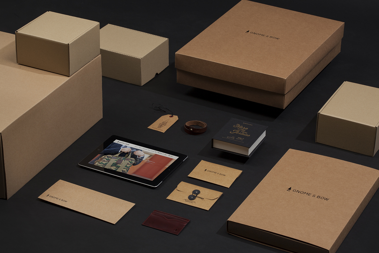
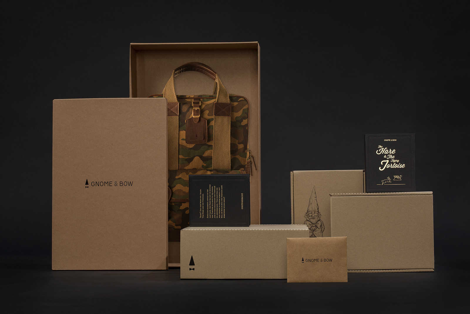
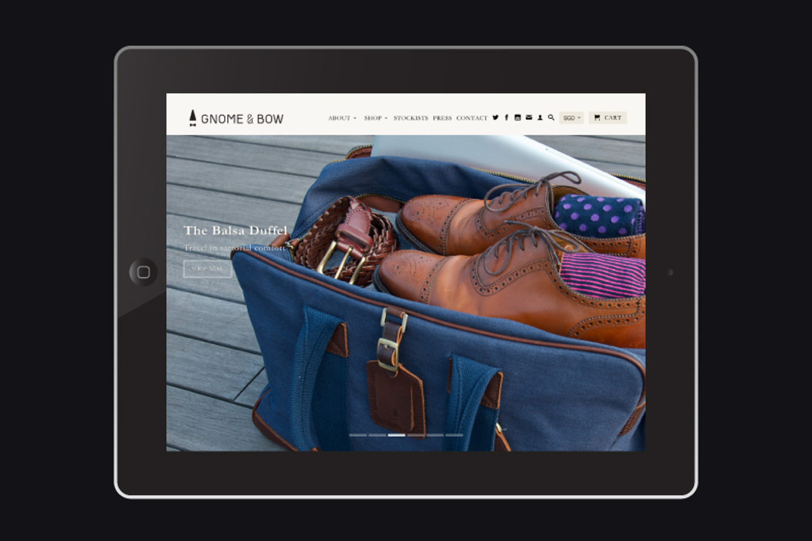
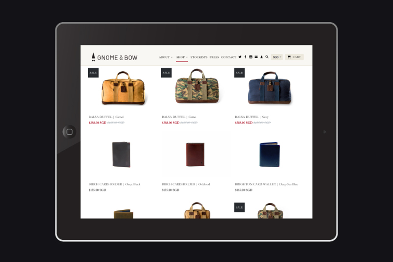
Gnome & Bow is a Singapore based fashion start-up, offering bags that do more than just provide function, 
but also crafted as an extension of ones imagination and individuality.
 
We were approached by its founder to create the Gnome & Bow brand identity, as well as to craft a crowd funding campaign with the aim to raise SGD$30,000 in a space of two months in order to fund production and launch his first line of products.
 
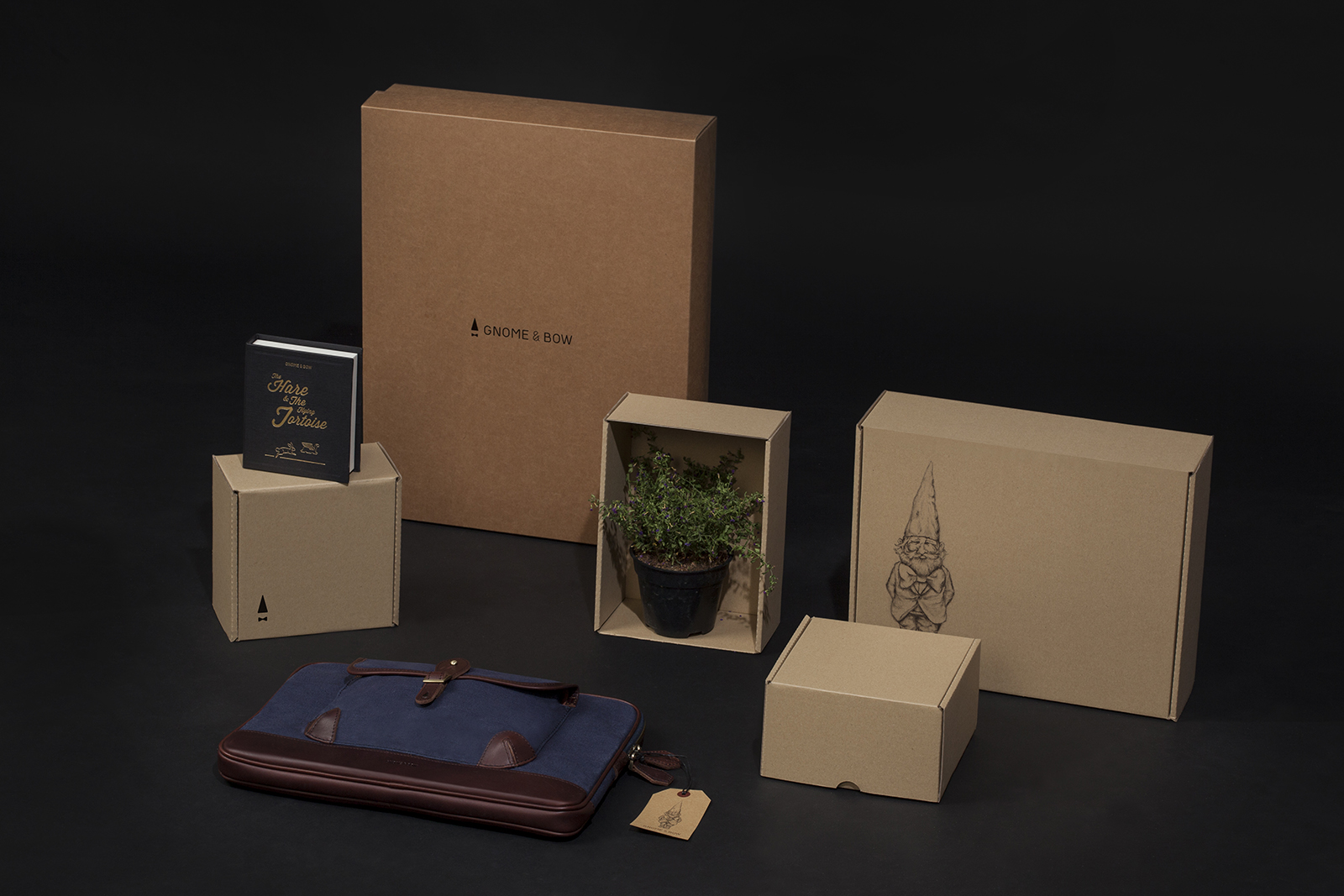
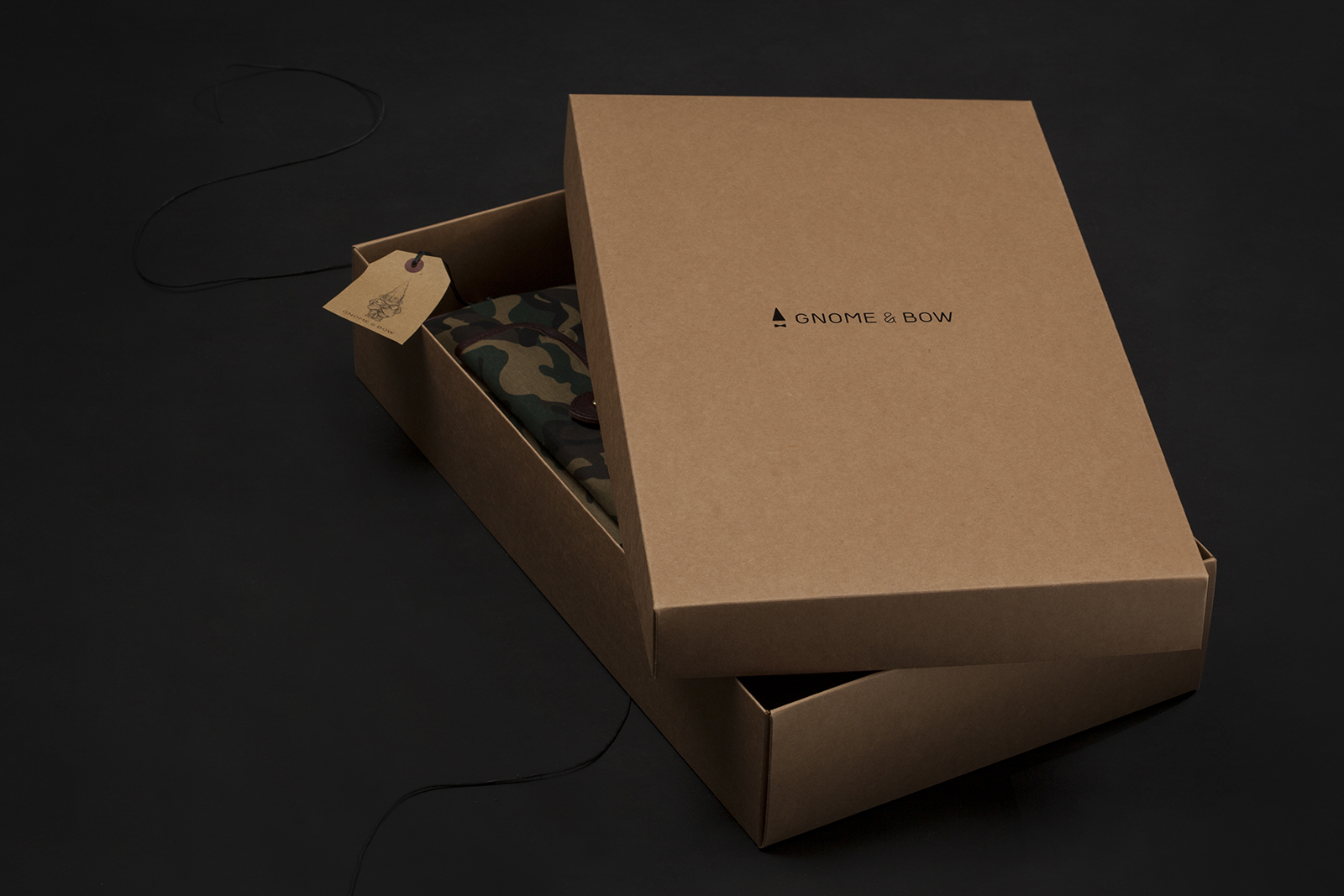
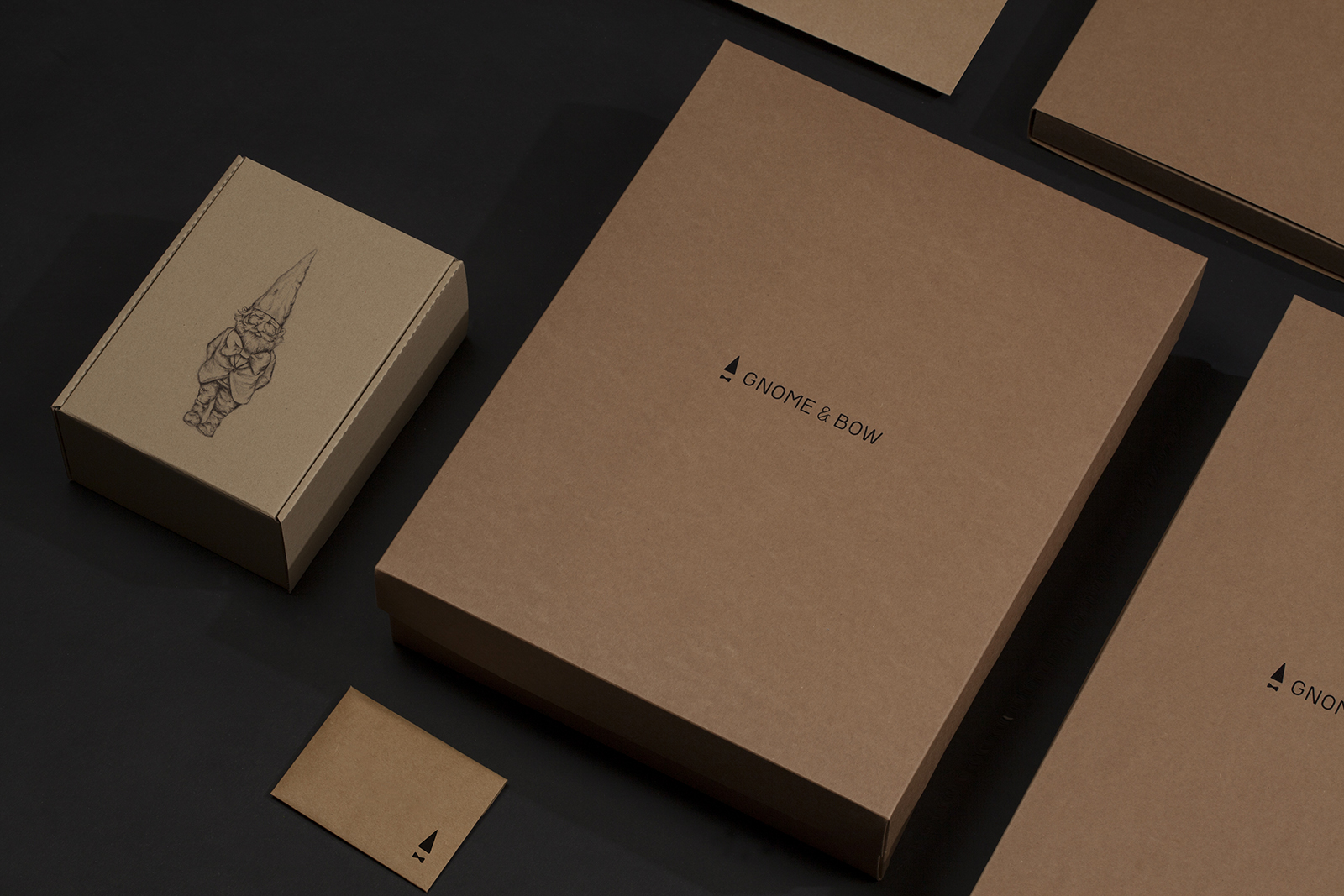
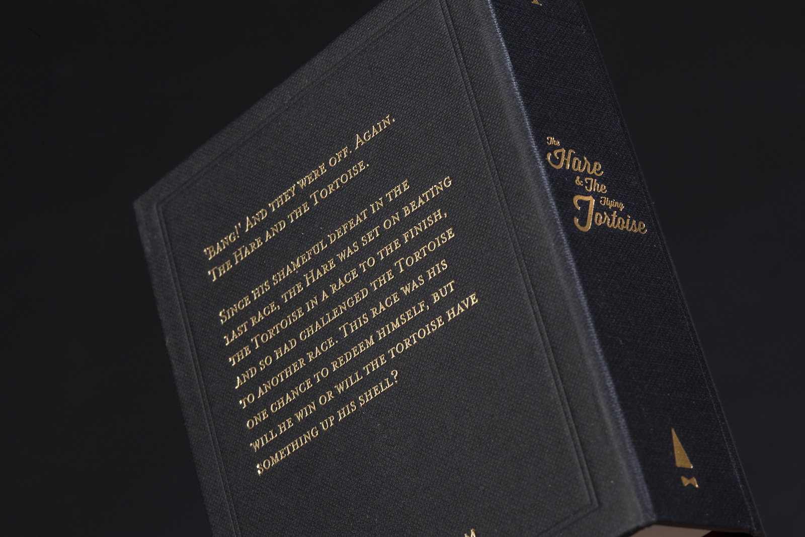
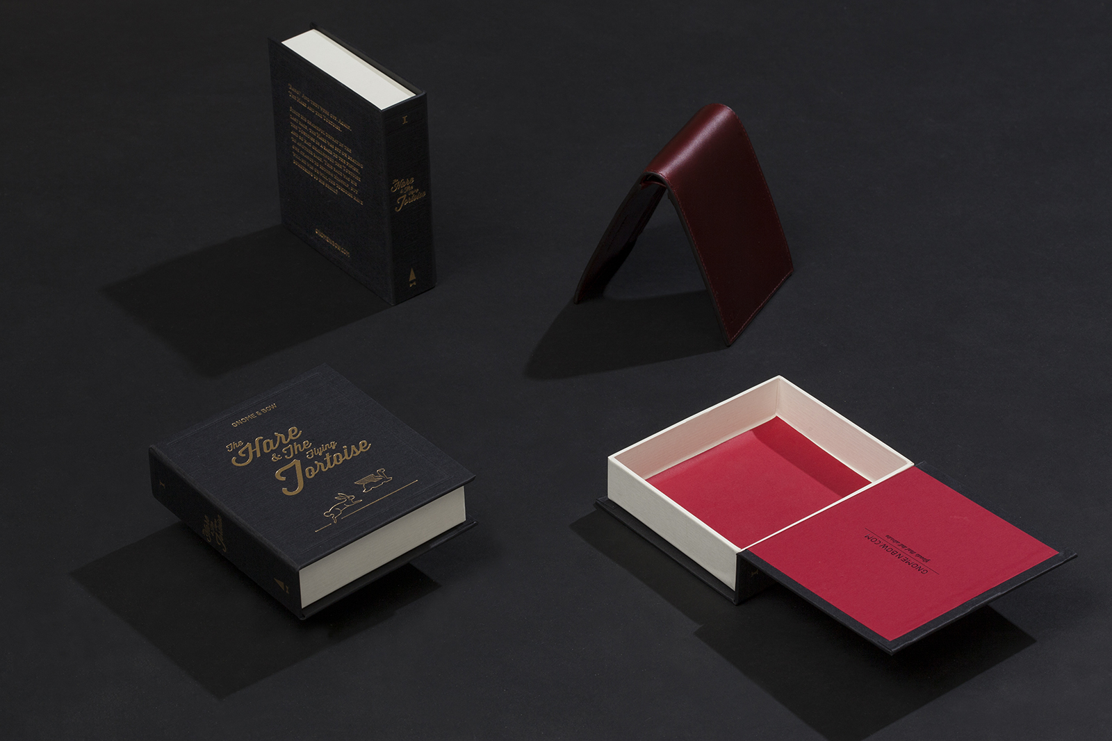
We designed Gnome & Bow’s brandmark as a modern symbol resembling the brand’s mascot, the Master talessmith. The combination of the tall Gnome hat and classic gentleman bow tie speaks about the essence of the brand – the culmination of fantasy with the mark of class. The Gnome & Bow brand was then further crafted based on extensive market research to help distinguish itself from the competition. The visual language we developed allowed the fantasy element of the brand to come forth, appealing to its target audience and potential contributors.

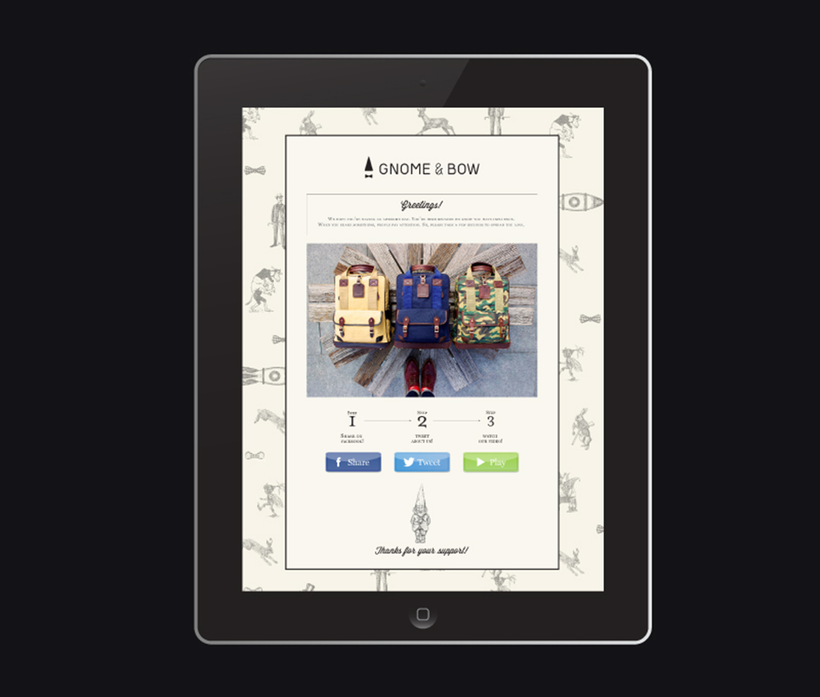
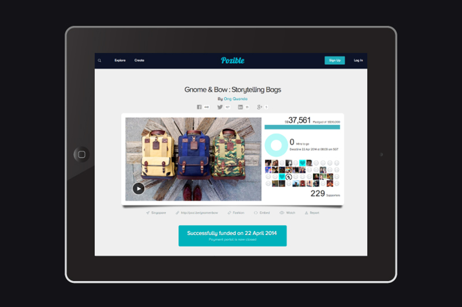
Leveraging on a strategic social media strategy, the crowd funding campaign was a tremendous success. $37,561 was raised in 38 days, 25% more than initial target. It became the largest successfully crowd funded campaign of its nature in Asia Pacific, with over 10,500 Facebook page views garnered and featured in over 20 online and print media outlets such as Esquire, Style Men & Cosmopolitan etc. Following that, we designed the Gnome & Bow online store from which the brand was launched.
 
View Pozible Crowdfunding Campaign / Visit Gnome & Bow Online Store


Packaging


Special zips depicting the story of The Hare & The Flying Tortoise


Wallet & coin pouch packaging shaped like a storybook


Call to action landing page