Go Local!

2015

We were tasked to art direct, design and build the set for a local MTV starring Singaporean singer 谢慧娴 Hui Xian, to be aired on the Starhub cable channel as part of their channel ident. A series of ‘Truly Singaporean’ props and backdrops were created for the various 2D & live action sets.

A collaboration with Semicolon.


Spindle (Behind the scenes)


Malay Wedding (Behind the scenes)


Marina Bay Scene (Behind the scenes)


MRT (Behind the scenes)


Hawker Centre (Behind the scenes)


HDB (Behind the scenes)


Making of video:

Superfat Designs

2015

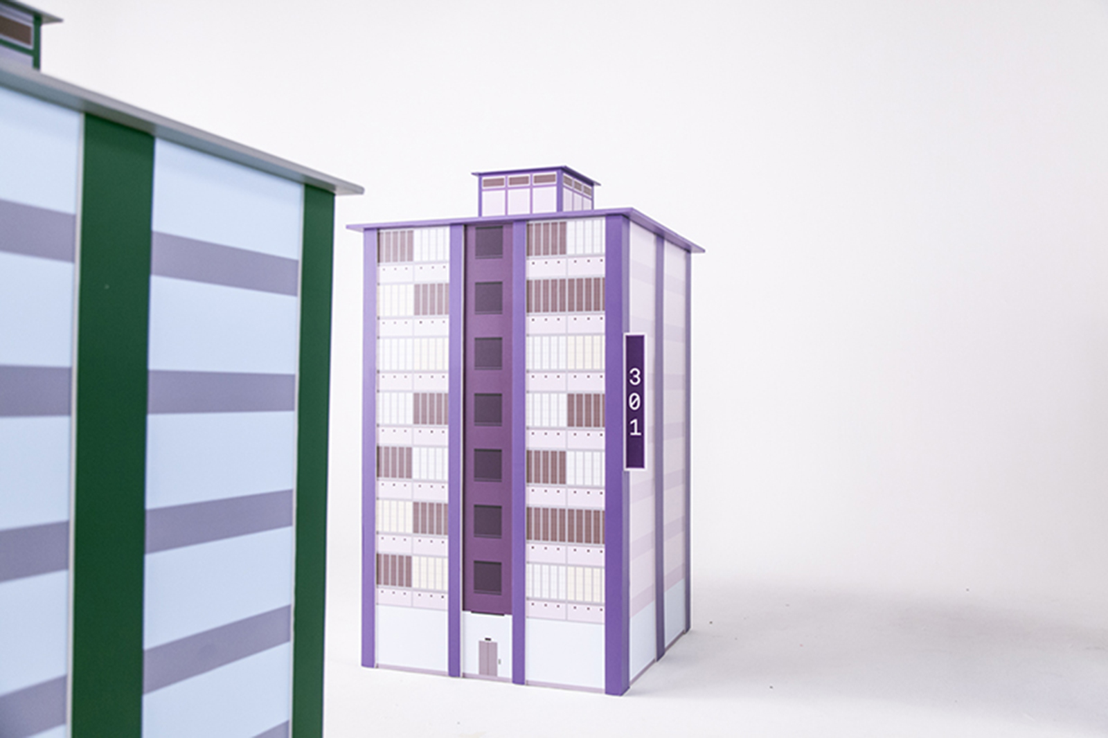
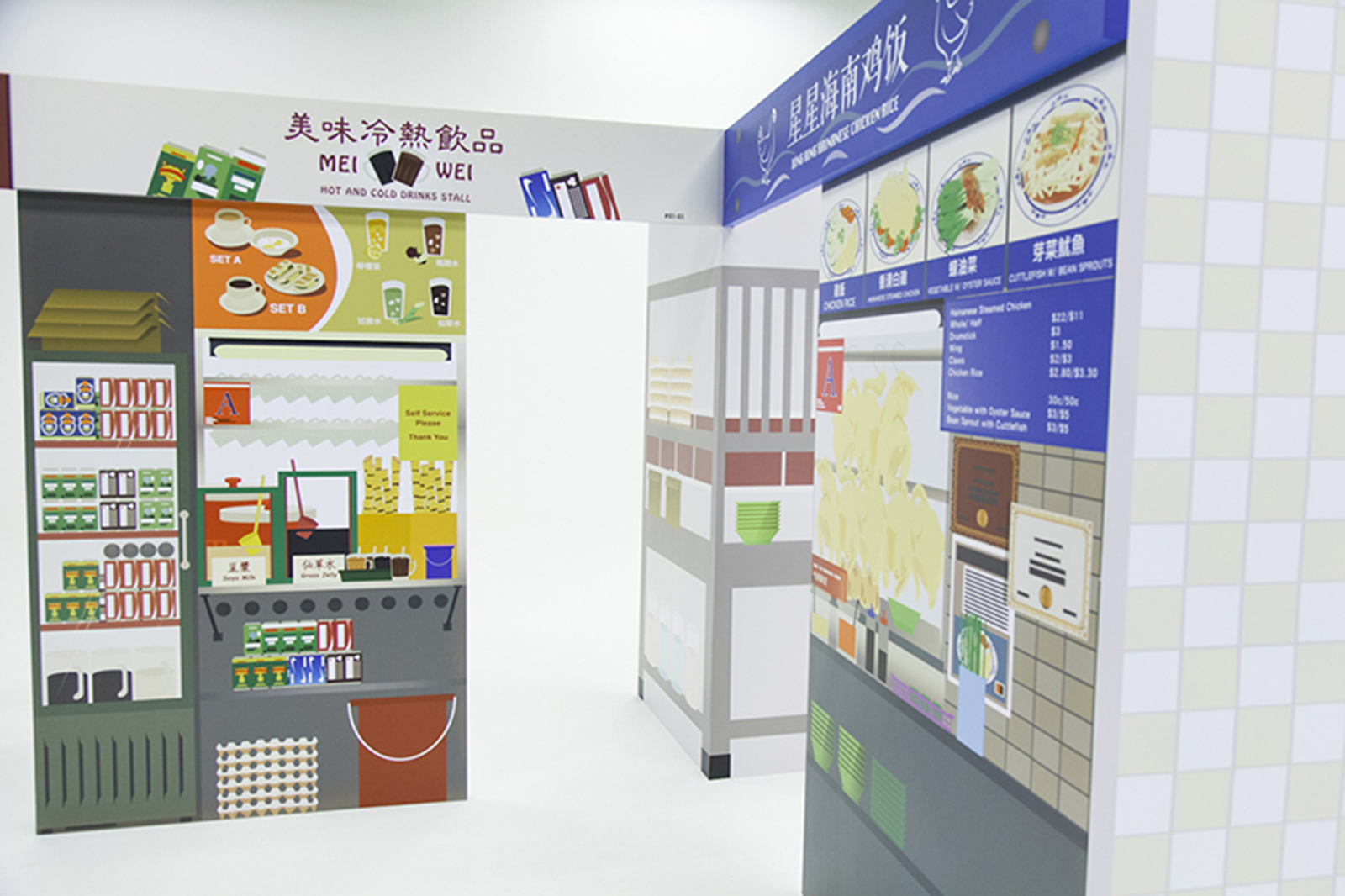
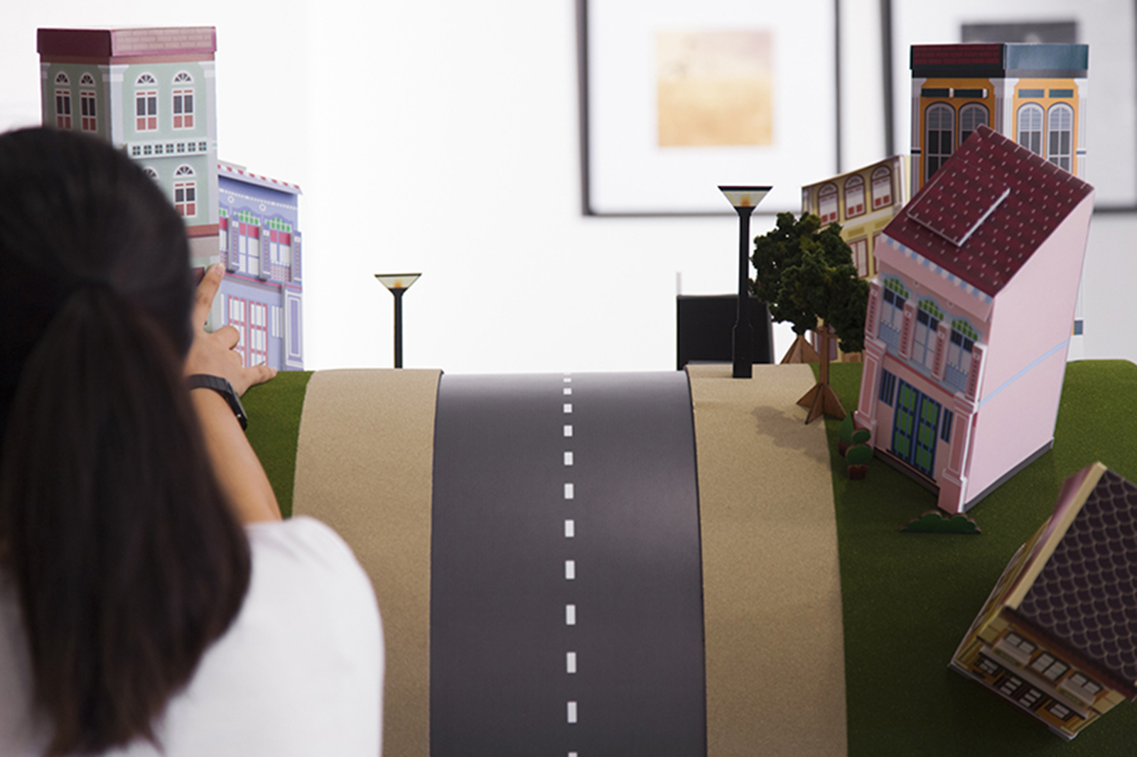
Superfat Designs is a multi-disciplinary interior and architectural consultancy firm, with a keen interest in visual arts, photography, sustainability and contextualism. They pride themselves in synthesising clients’ needs with contextualization and sympathy to the built environment, producing a design uniquely tailored to suit the lifestyles of their clients.

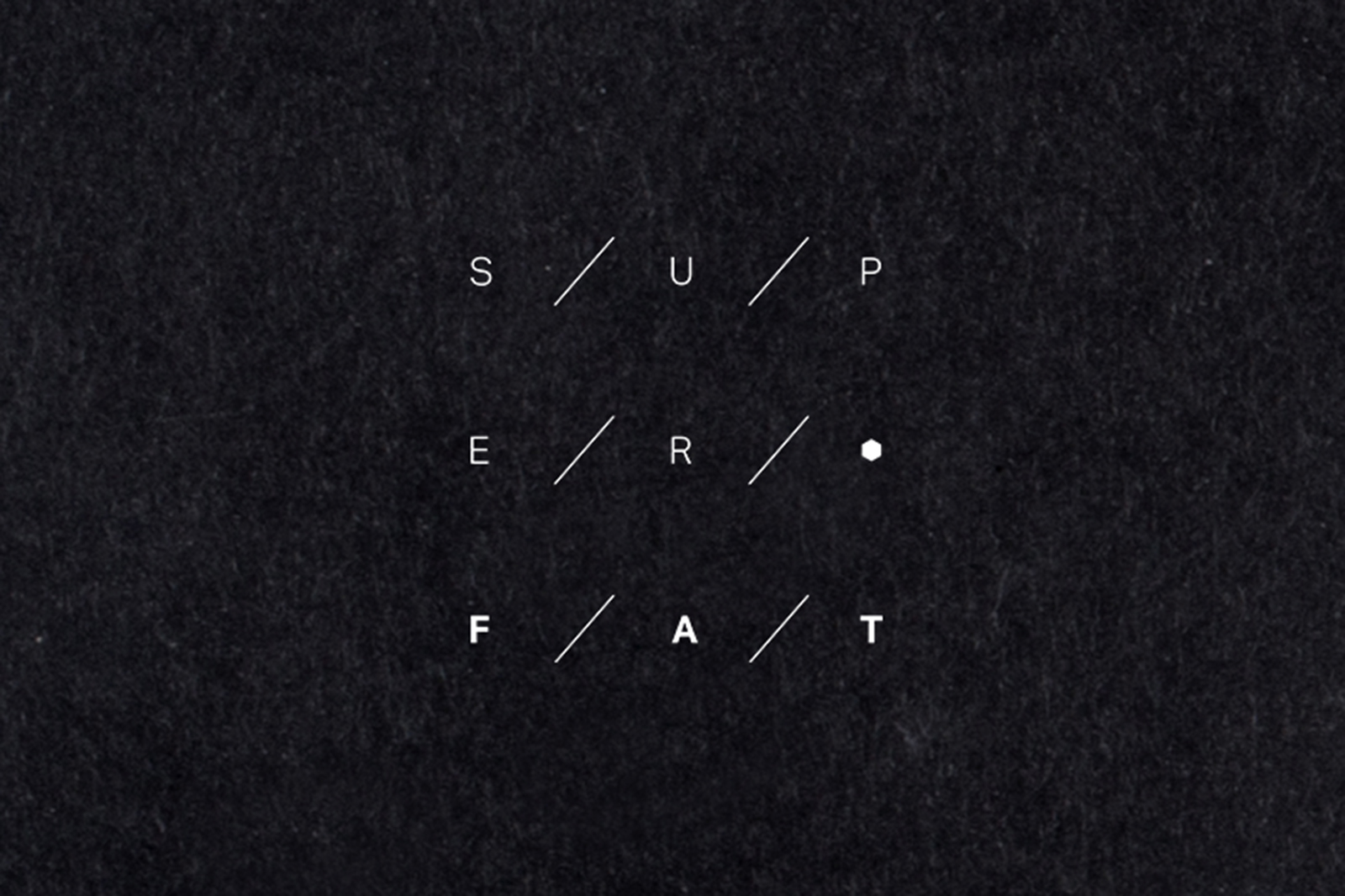
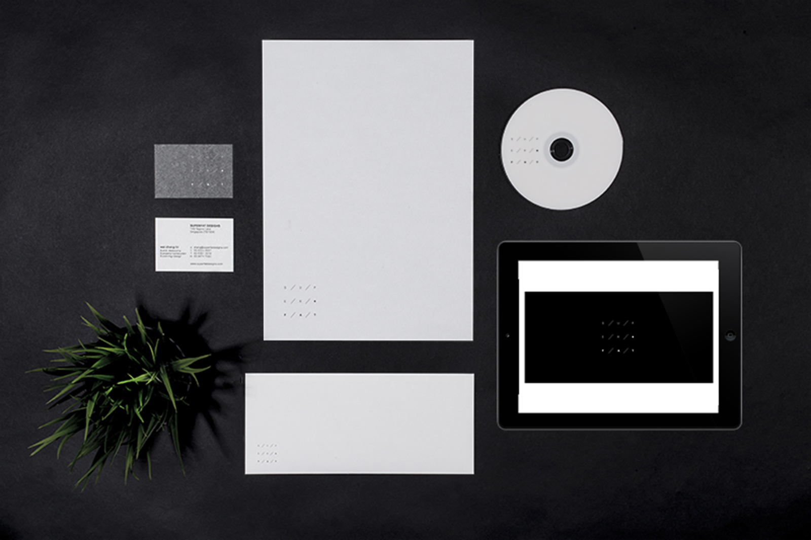
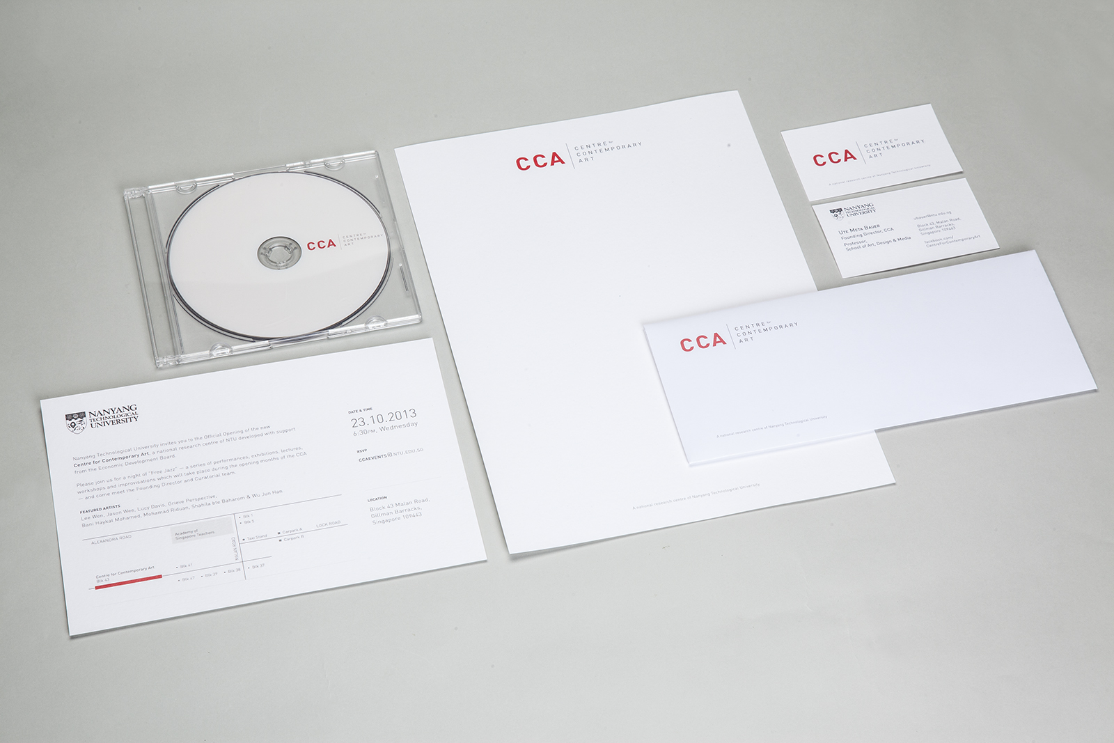
Used to be called Fat Designs, we were tasked to a conduct a rebranding exercise for Superfat Designs which highlights its repositioning towards sophistication and a wider range of work; a brand new set of identity to be applied across all print & online media.

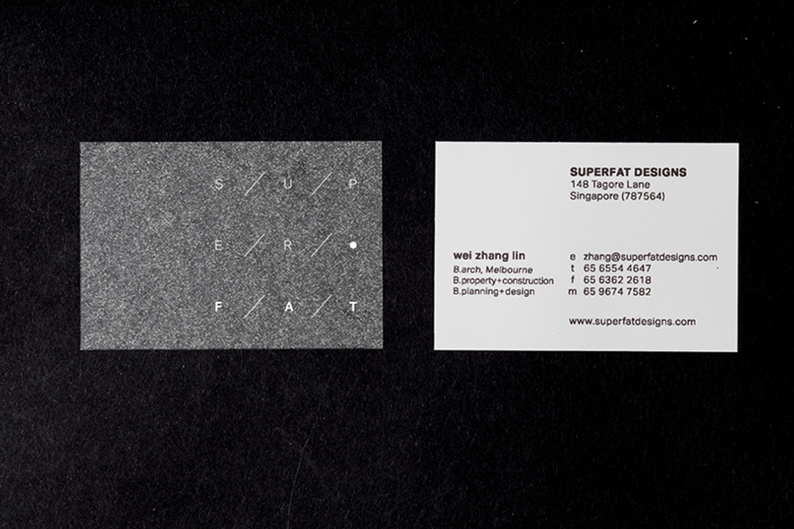
We designed a modern brandmark shaped to resemble the bird’s eye view of a floor plan. The strokes and letterforms within speak about people and objects interacting in a dynamic and modular space – which is the essence of Superfat designs’ philosophy: To inform, transform and create form.

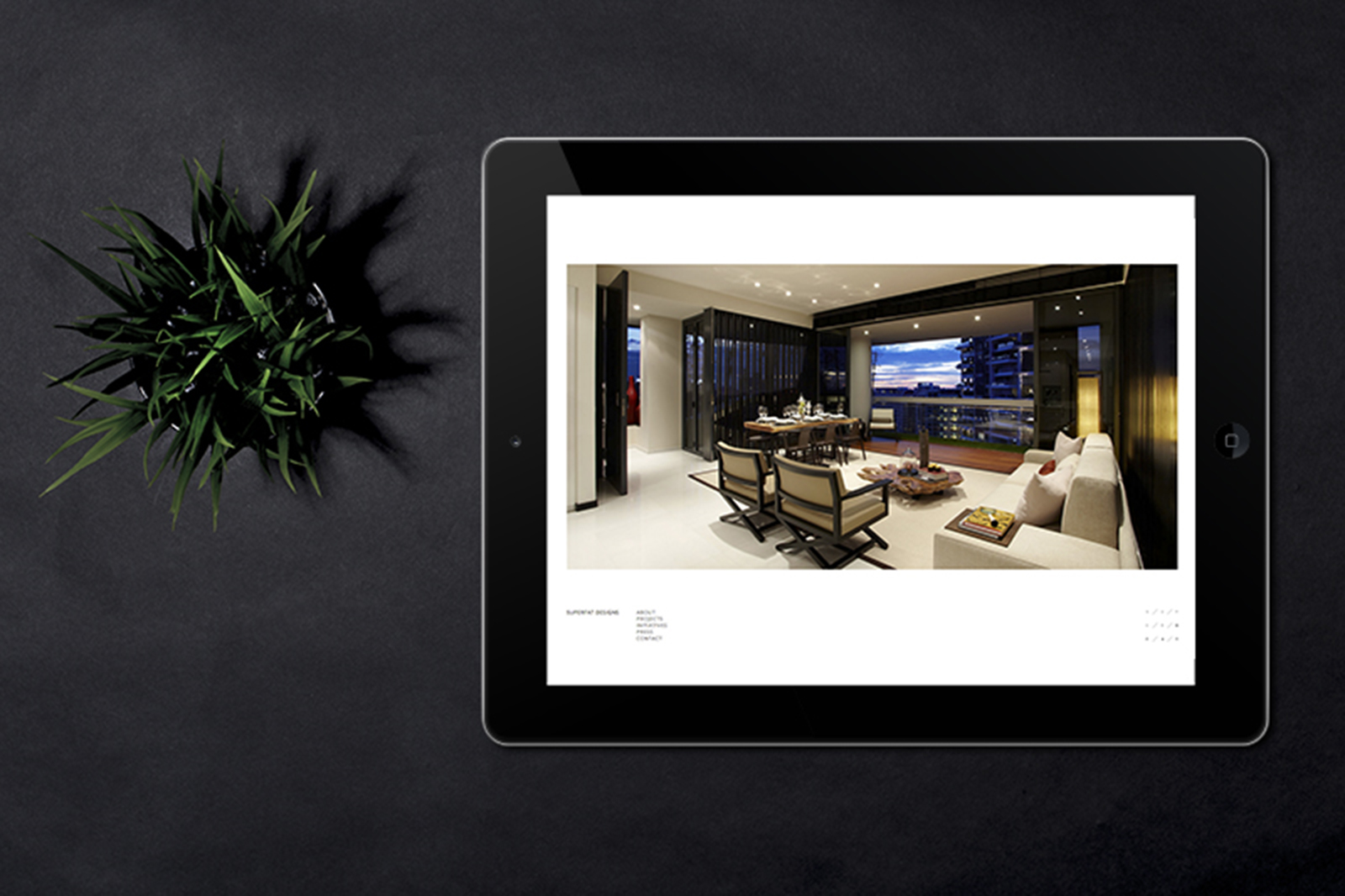
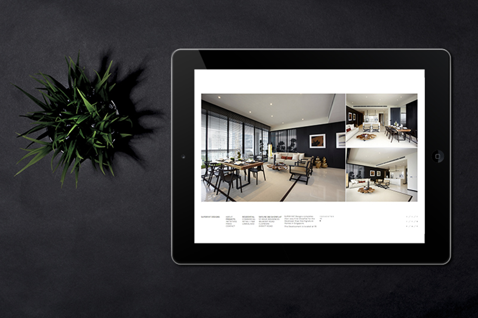
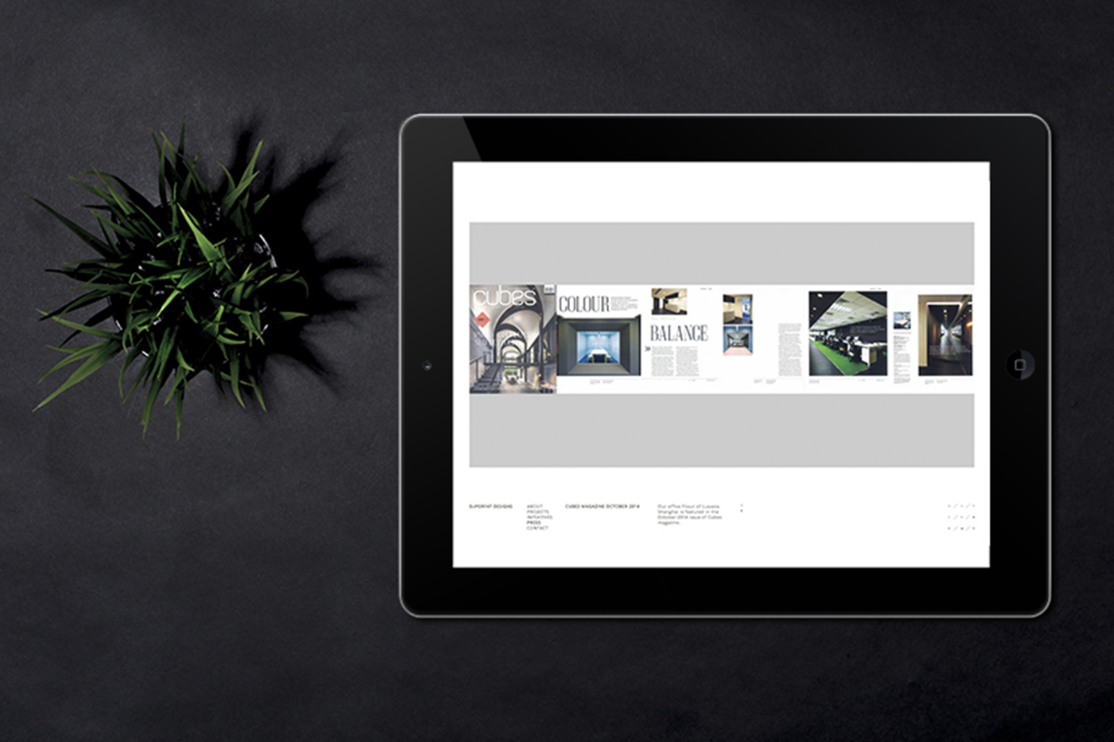
On top of that, the clean and bold website design we crafted echoes the studio’s strive for the perfect synergy of logic and creativity.

Visit the website here: www.superfatdesigns.com


Yik Zhuan Orchid

2015

Yik Zhuan Orchid Garden is one of the largest Singapore orchid growers with at least 30 years of experience in nurturing and growing of orchids. Over the years of their operations, Dendrobium has been the main focus of the business, with a wide range of Dendrobiums either exported as freshly cut flowers or sold wholesale for the local market.

We were tasked on the rebranding of the Orchid garden as part of the expansion of their business operations. This was done in conjunction with the construction of their new fully equipped, state of the art greenhouse suited for growing a new breed of orchid, Phalaenopsis.

A brand new set of identity for Yik Zhuan Orchid Garden was designed across print and digital mediums to highlight its strong position as a market leader as well as to differentiate itself from its competitors. The brand mark with a calligraphic portrayal of its Chinese name, with five buds of Orchids in various stages of flowering encapsulates the Yik Zhuan methodology — A traditional trade infusing technology to equip itself for the future. Gold foil effects were used in conjunction to echo the brand’s elegance and history, whilst acknowledging the prestige Orchids carry, being known as the national flower of Singapore. Custom namecards were also created for each of their staff to showcase the new species of orchids the garden carries.

Visit their website here: www.yikzhuanorchid.com


Pufferfish Partners

2015

Pufferfish Partners is an acceleration partner for technology oriented businesses looking to expand in Asia Pacific.

We were tasked to create a distinctive and iconic set of identity for Pufferfish Partners, taking inspiration from the services provided by the company, as well as its unique methodology of accelerating technology businesses, whilst combining people and process.

Inspired by the concept of making things happen, we created a Pufferfish logo that stems from connecting dots to form tangible results. The introduction of a full bodied teal and dark blue colour creates form from the initial lines & dots which injects fresh energy & movement into the logo. The overall effect is intelligent, energetic and powerful.

The concept was strengthened further through the infographics driven case study designs, where a Pufferfish is depicted taking a ‘Deep Dive’, exemplifying the idea of how the company is able to take its customers’ businesses safety through tough waters.


ADM Show 2014

2014

A rubber band is a simple object that could represent many things. Its adaptive nature allows it to stretch and take on any shape: shapes that are limited only by one’s imagination.
 
The annual ADM Graduation Show is a showcase of ideas from the graduating batch of students. In this aspect, the rubber band, in its original state, represents the birth of an idea. Limitless possibilities arise when combined with a student’s creativity.
 
The identity for this show is based around a bold uppercase sans-serif logotype. It accentuates the contrast between different planes and movements, forming a visual representation of the quality of adaptivity that captures the dynamism of the show and unifies its themes of creativity, fluidity, and visual impact.

admgradshow.com


Centring the logotype in the midst of the rubber bands, we thrust it into the limelight, celebrating the pushing of one’s limits and the excitement of possibilities.
 
For this exhibition, we developed an identity which made use of the rubber band as a primary narrative, applied across all print, digital, & environmental mediums using a bold and extremely eye catching color palette. We also tied in the idea of each student being uniquely creative through the photo shoot; whereby each student is dressed in a manner that befits their personalities and creative ideals.


Full Set of Collaterals


Exhibition Catalogue


Special insert opens up to a spread containing photographs of the graduating students


An app designed for the show on both iOS & Android platforms that contains nifty features such as being able to browse through all the graduating students’ portfolios on the fly, contacting the students directly through the app (either though e-mail, calls or messaging) and also finding out about the latest events.

Download links: iOS / ANDROID


Website: admgradshow.com

S.Sudjojono: Lives of Pictures

2014

Organised by ADM Gallery, S. Sudjojono: Lives of Pictures features artworks by the late Indonesian painter, S.Sudjojono (1913-1986), considered the father of modern painting in Indonesia. It is is part of Seabad S.Sudjojono 1913 – 2013 (The Centennial Celebration of S.Sudjojono) to commemorate the 100th anniversary of the birth of this Indonesian artist who continues to influence artists in Indonesia and beyond.
 
The exhibition excavates the untold stories of Sudjojono’s artworks, revealing their varied and changing histories, telling about their displays and reception, their acquisitions, changes of ownership and stories that speak of how they are remembered by individuals. These narratives are made visible by archival materials that are presented for the first time, including photographs, writings by Sudjojono, and video interviews with the artist that enable reconstructing the ‘lives’ of these works and illuminating our appreciation of them.
 
For this exhibition, we developed an identity which took inspiration from the archival and celebratory nature of this exhibition that was applied across print, web and environmental graphics. Teal was heavily used, especially seen in the poster and catalogue design as a symbolic representation for, in S.Sudjojono’s terms, the color of Indonesia.
 
Credits
Event Documentation: Fareez Ahmad


ADM Graduates Programme

2014

Nanyang Technological University’s School of Art, Design and Media is Singapore’s first professional art school to offer the complete suite of Bachelor, Master and PhD programmes. Through the incorporation of creative practices and research, ADM’s graduate programmes are an incubator for the development of creative ideas spanning across disciplines and the graduates are expected to transform the field.
 
We designed an interesting multi-fold brochure to highlight the programme information as well as the application procedures. The brochure opens up to display the beautiful facade of the campus.


Paradise Lost

2014

Paradise Lost is the inaugural exhibition of the newly established Centre for Contemporary Art in Singapore, January 2014. Conceived as a constellation of three artistic productions that together explore narratives of travel and migration, place and displacement, the personal intertwined with colonial history. The exhibition juxtaposes trans-generational perspectives, bringing together three major installations of moving image: Surname Viet Given Name Nam by Trinh T. Minh-ha, Yellow Patch by Zarina Bhimji and Disorient by Fiona Tan. While all three artists are of Asian descent, their education and artistic practice unfolded in Europe and the US, and gained international exposure from there. This is the first time these works are shown in Asia in an exhibition context.
 
Paradise Lost introduces an imaginary Asia — Asia as a space of projections and desires stemming from an experience of dislocation and asynchronicity. We took inspiration from this for the exhibition branding, creating a distinctive identity which express notions of nostalgia and poetry across all print, marketing and environmental design.


CCA Talks

2014

In conjunction with Art Stage Singapore 2014, the Centre for Contemporary Arts (CCA) presented CCA Talks at Art Stage, which featured an exciting array of artists, curators, writers, academics and other art world personalities. This series of talks focuses on the challenges and particulars of the regional art landscape. Convened by Lee Weng Choy, CCA’s Deputy Director and Senior Curator (designate), this year’s programme engages the ‘We are Asia’ theme of the art fair in three sessions: Hong Kong vs Singapore, Art & Knowledge and Local Art Institutions: New Horizons.
 
For this, we designed an interesting promotional brochure which detailed the schedules of the talks and the profiles of the various speakers. The brochure also doubled up as a poster when fully opened.


Centre for Contemporary Art

2014

The CCA—Centre for Contemporary Art is a research centre of Nanyang Technological University (NTU), developed with support from the Singapore Economic Development Board, officially opened in October 2013.
 
The CCA embraces artistic, academic and scholarly research, and views contemporary art as a form of knowledge production in its own right. Through a holistic approach, the CCA’s three main areas of activity—exhibitions, residencies and research—are intertwined and feed into each other, shaping organically the profile and programme of the institution.
 
We were commissioned to develop their brand identity ranging from their logo, stationary & marketing materials as well as way-finding systems. During its inaugural phase, we also designed a series of materials to promote the “Free Jazz” events, a series of programmes where creatives, cultural producers and intellectuals come to improvise together and contribute to the thinking and envisioning of the potentials for this new Centre for Contemporary Art.


“Free Jazz” Event Poster


Free Jazz, Performance by trio Bani Haykal, Ila and Syv Bruzeau, December 2013.

Photography: Luca Lum


Free Jazz Inaugural Event, Lee Wen performing: “WE HERE SPEND TIME # 2”, Collaborative action conceived by Jason Wee and Lee Wen in collaboration with Angie Seah, Karl Kerridge and Jordan Rais, October 2013.

Photography: Wahid Subarmah


Free Jazz Inaugural Event, OFFCUFF performance (Bani Haykal, Mohamad Riduan, Shahila Baharom and Wu Jun Han), October 2013.

Photography: Wahid Subarmah