2015
What do we see when a ball is travelling through the air or rolling across a surface? Some may marvel at the effortless grace with which a simple object moves through space and time, but for most of us, a ball in motion is an ordinary occurrence bound by the laws of physics.
But it is more than that. The ball achieves momentum, gains speed, passes by and through the pressures that could slow it down or bring it to a halt. It becomes greater than a simple shape – it’s a circle, a wheel, a cell, an atom, an organism. It takes flight, it clashes and connects with others, and through that friction gains strength, intensity and direction. It is projected into the world; its reach and potential amplified.
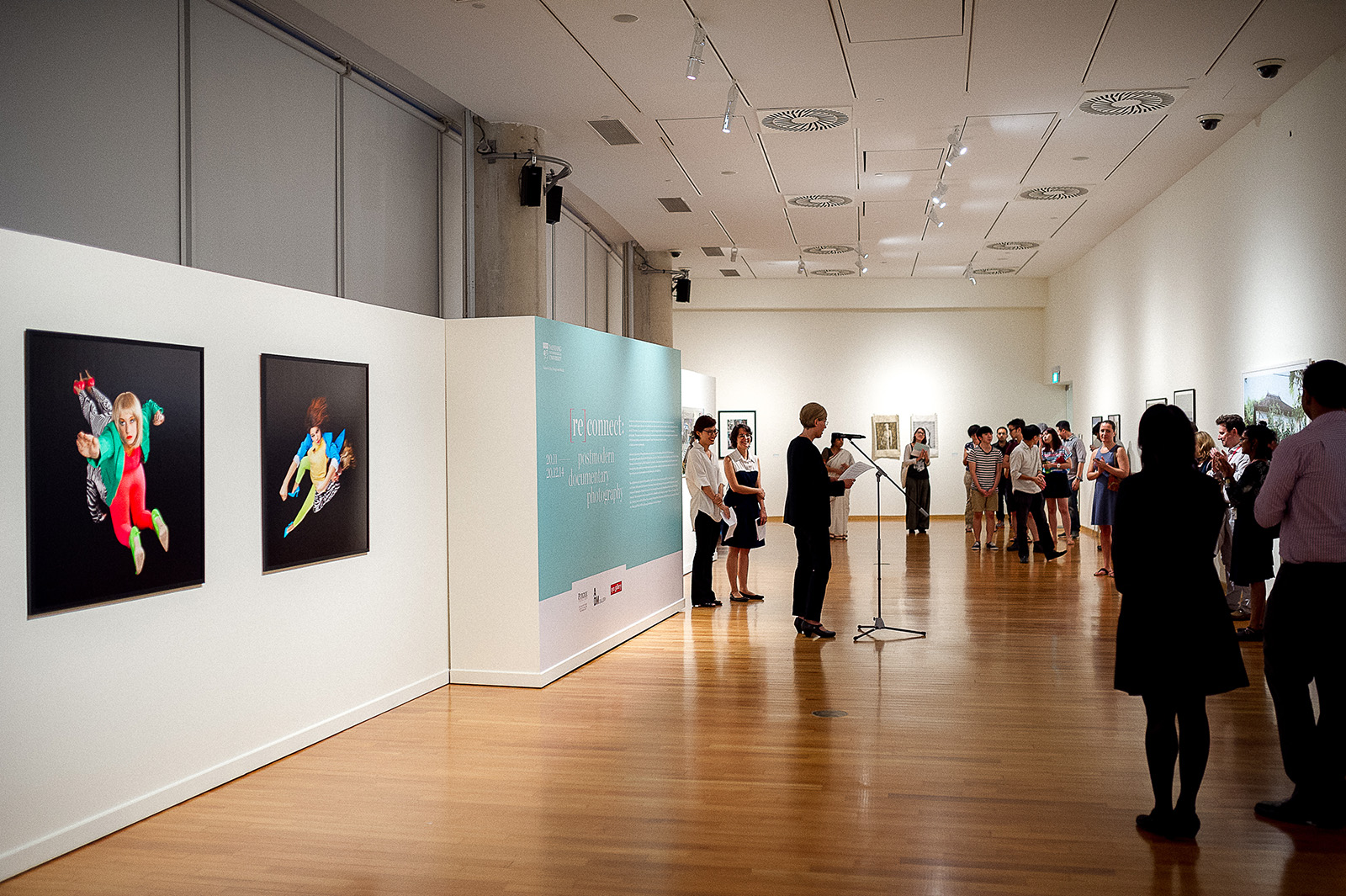
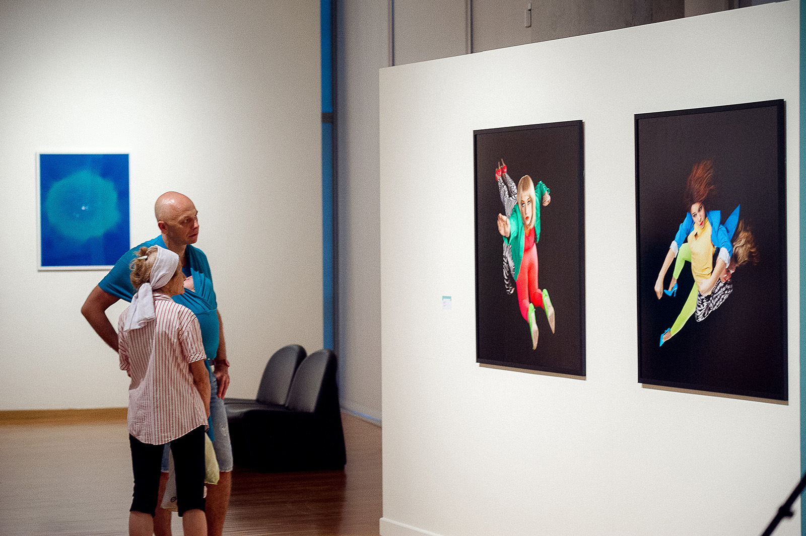
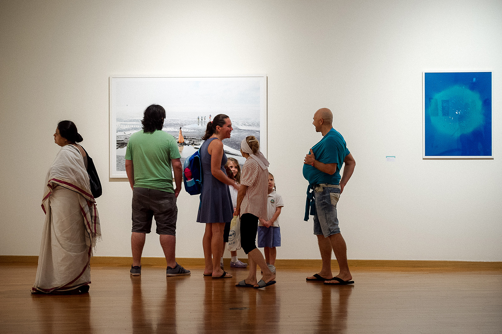
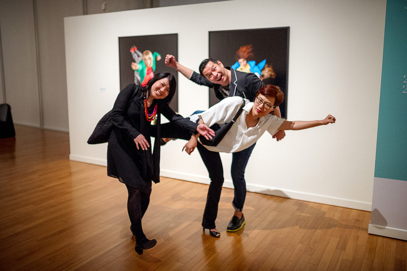
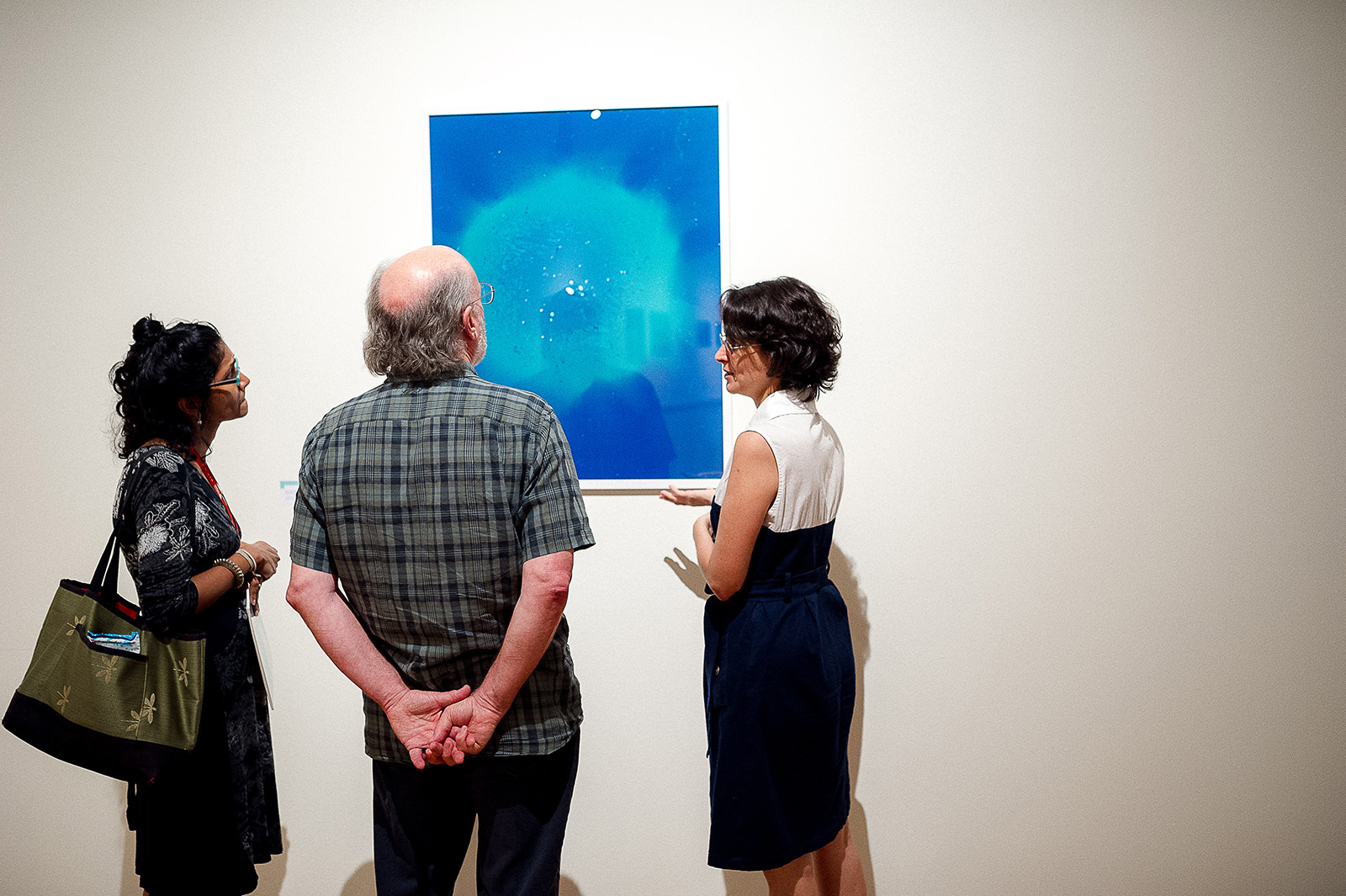
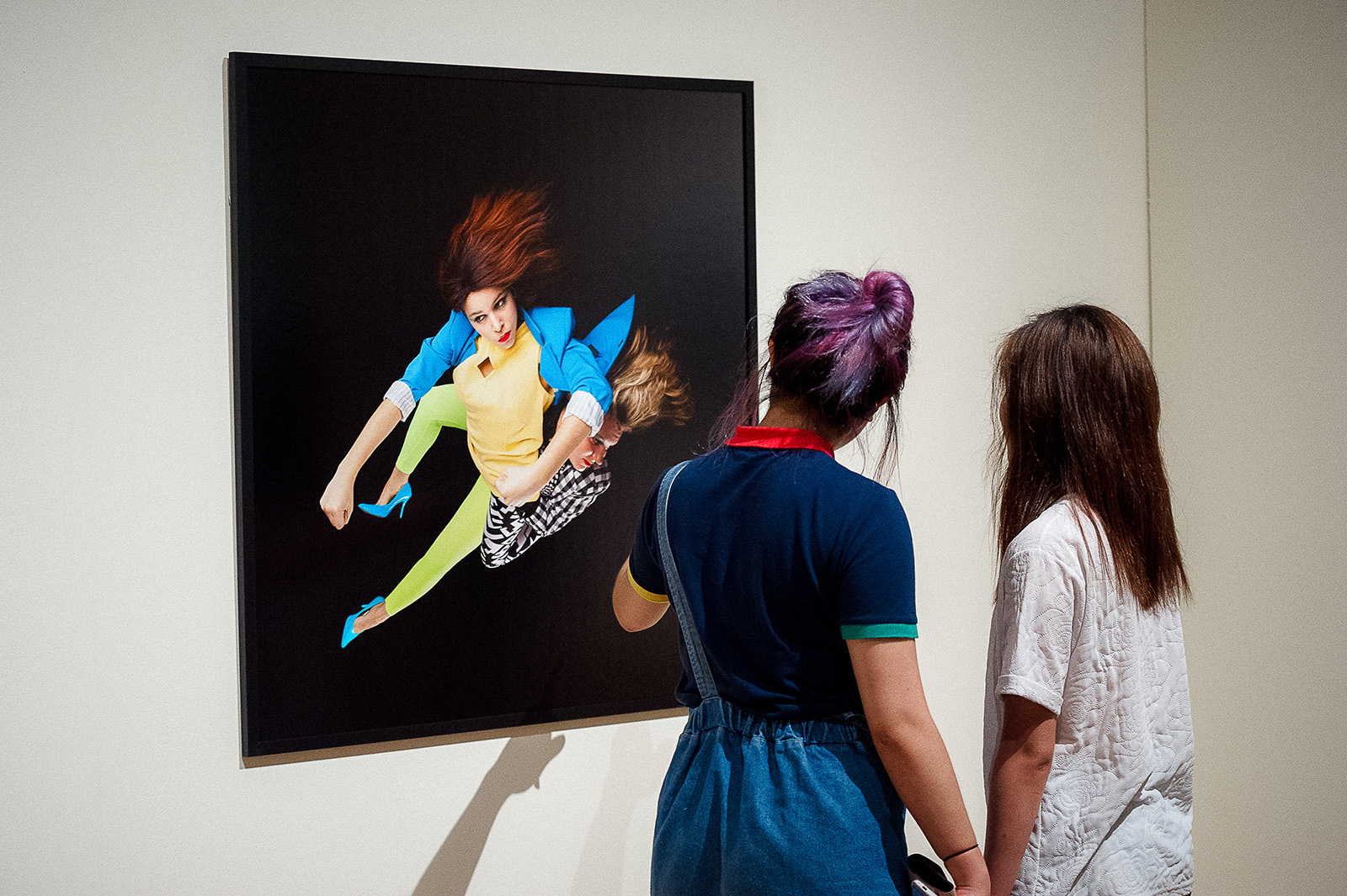
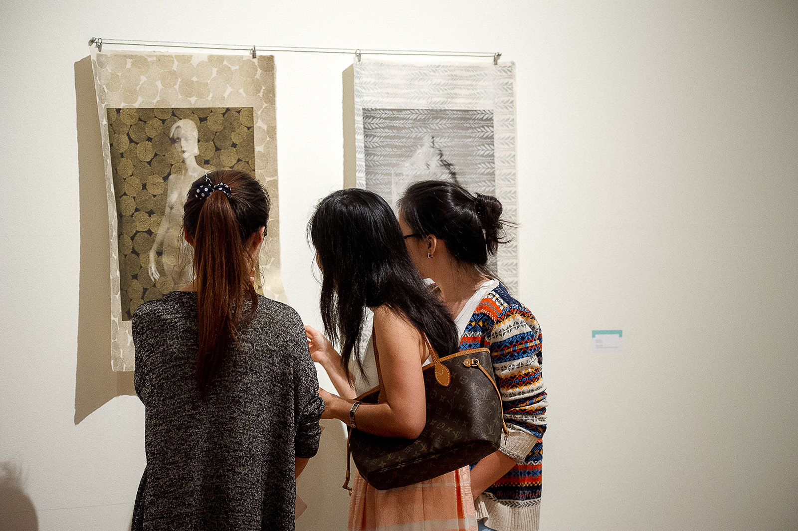
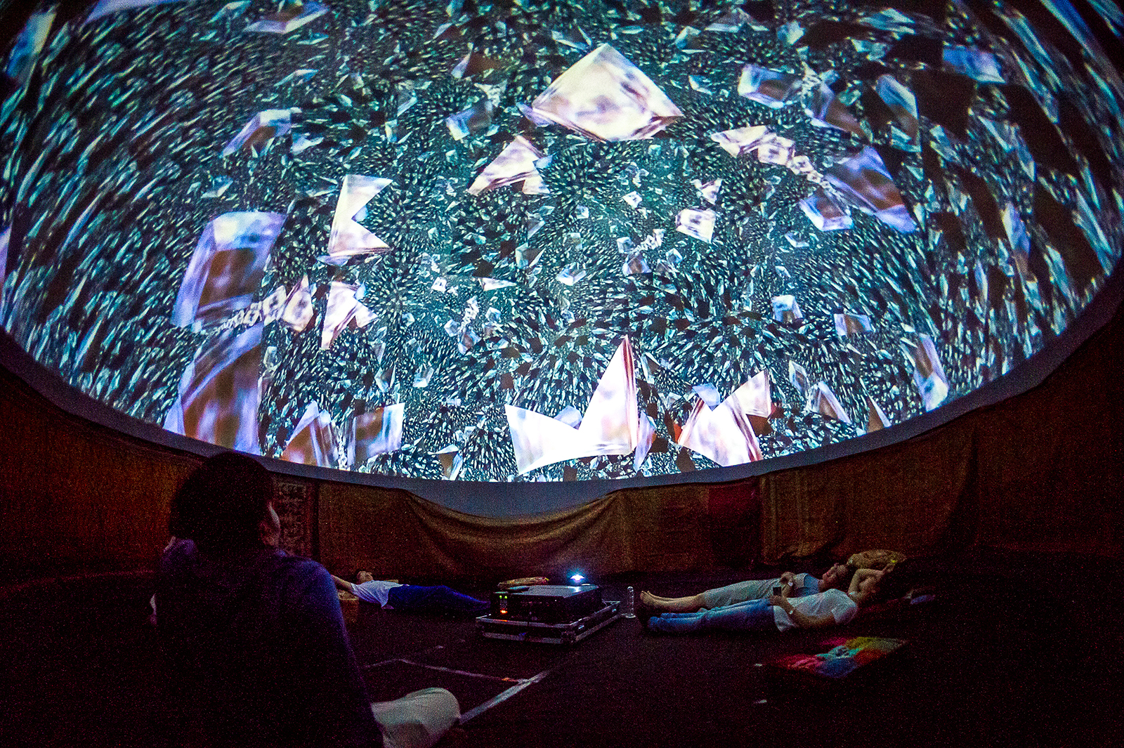
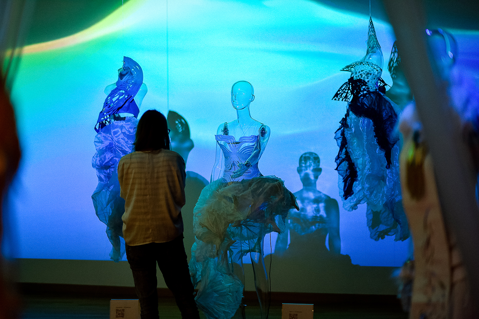
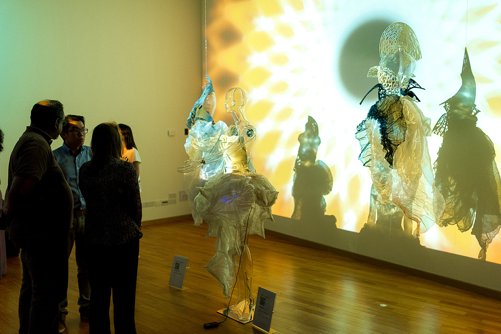
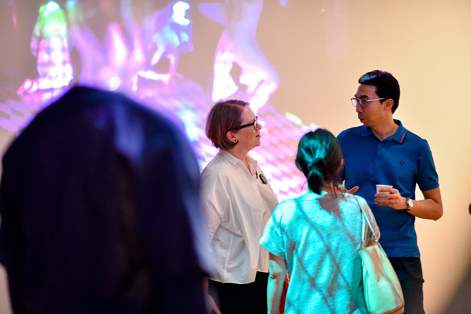
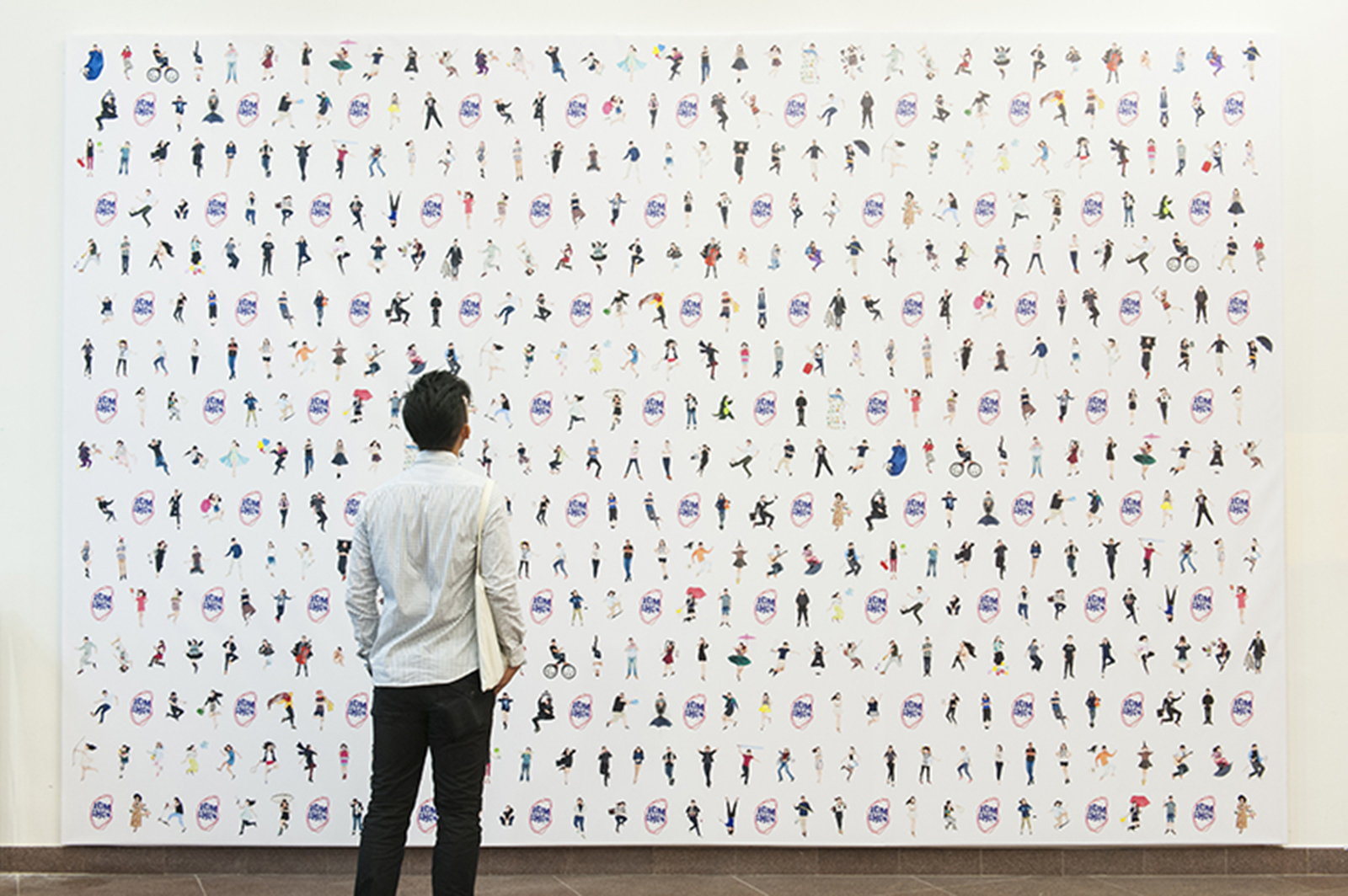
This arc parallels the journey that students undertake at the School of Art, Design and Media (ADM). The pathway of the ball is a symbol of their growth and the amplification of their potential, which is showcased during the annual ADM show.
AWARD(S)
DFA Design For Asia Awards 2016 (DFA 亚洲最具影响力设计奖) – Bronze
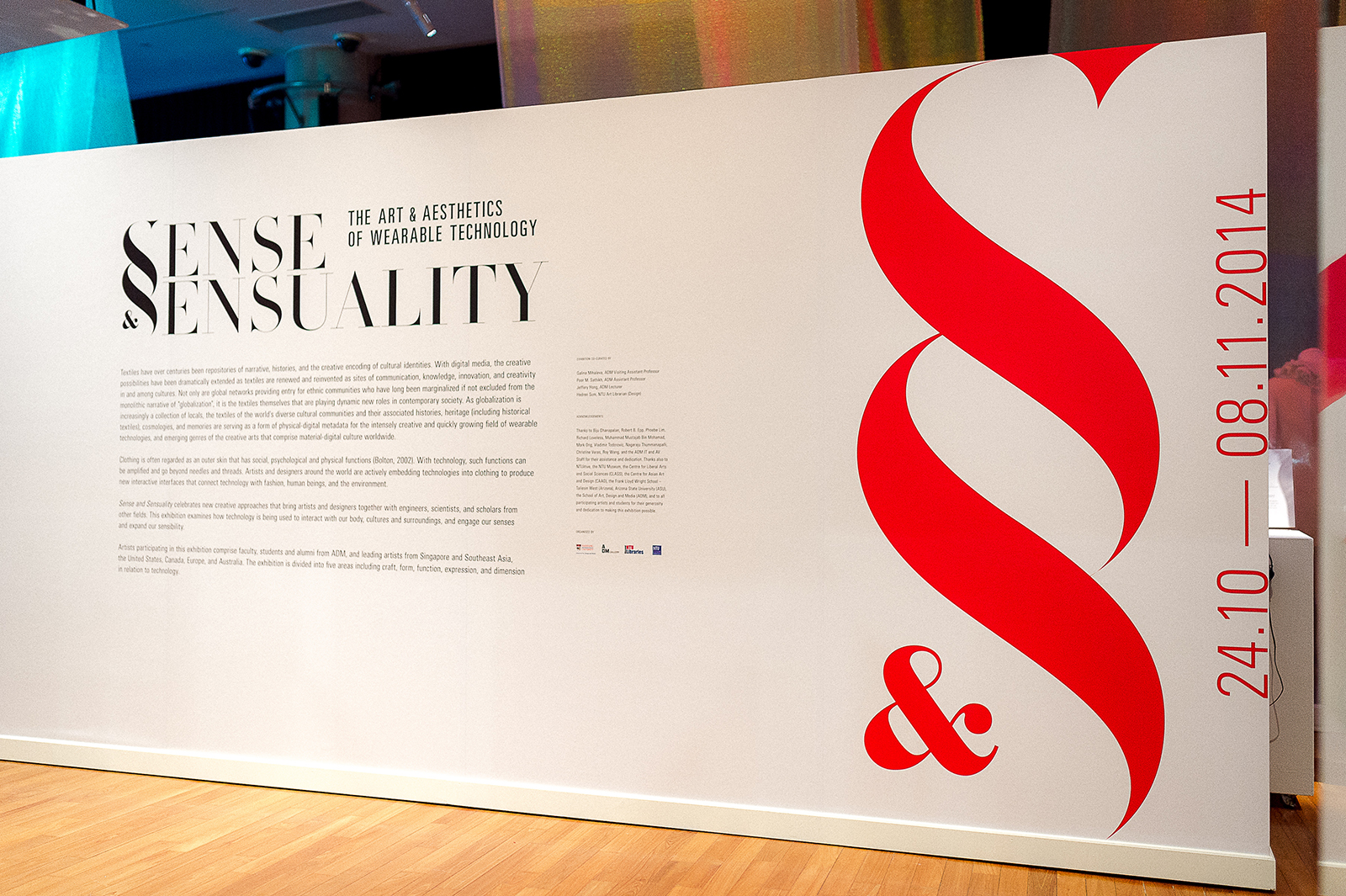
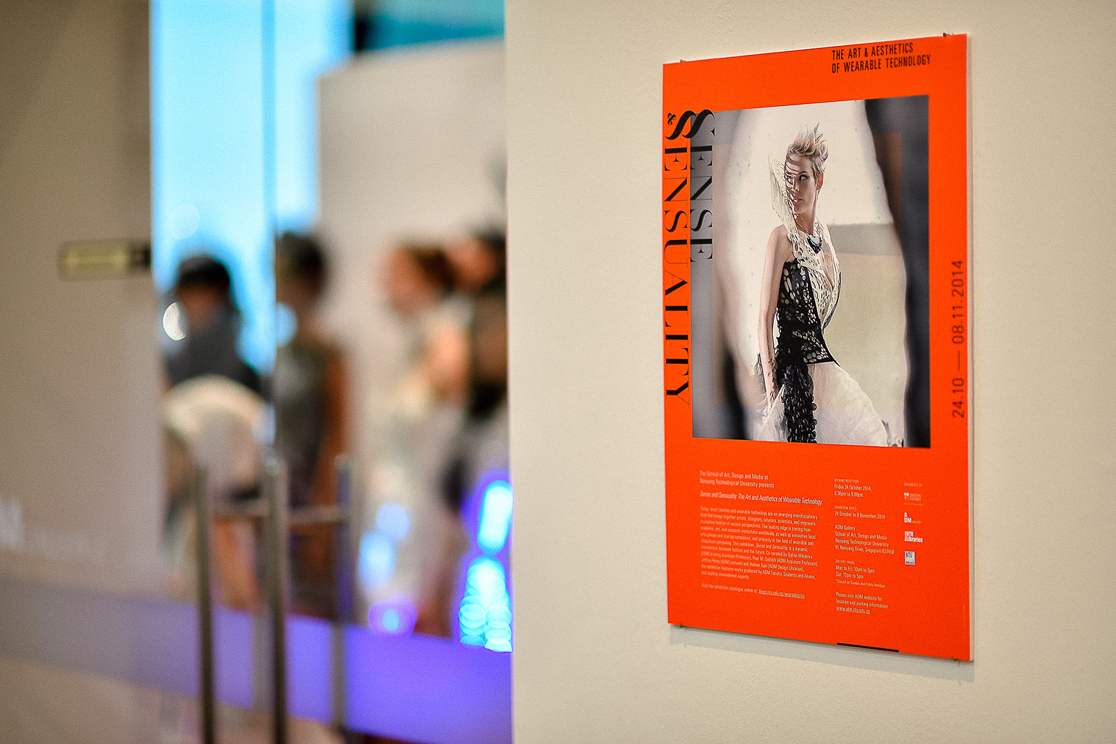
This year, the show’s identity uses a bold, deconstructed hybrid logotype, complemented with the image of a ball that projects the title of the exhibition. While the ball symbolises the possibilities of student potential, the letters in the typographic stack evoke dynamism and vibrancy. Between the division of lines and planes, the message behind the logo is simple: to project creative talent into the world – as our graduates will when they complete the final stage of their journey through ADM.
A customised typeface was designed to convey the spirit of ‘Amplification’ the key theme in this year’s show identity and it is used throughout all print, digital & environmental materials to strengthen the visitors’ experience.

Full Set of Collaterals


The invitation this year was based off the idea of a Thaumatrope, an interesting way for us to portray the idea of Amplification for the show identity to be represented within a 2D printed material.

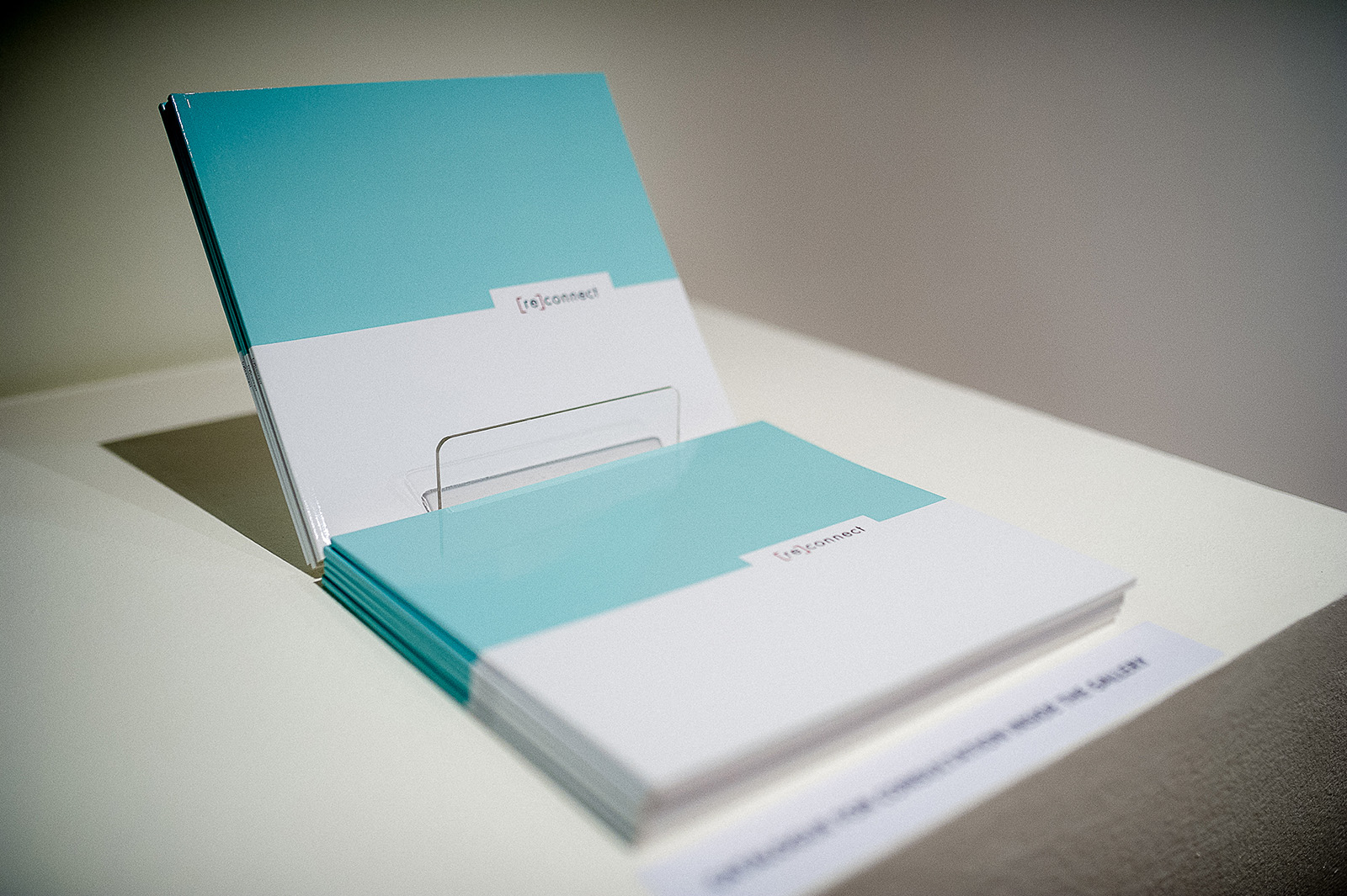
Exhibition Catalogue


An app designed for the show on both iOS & Android platforms that contains nifty features such as being able to browse through all the graduating students’ portfolios on the fly, contacting the students directly through the app (either though e-mail, calls or messaging) and also finding out about the latest events.
Download links: iOS / ANDROID

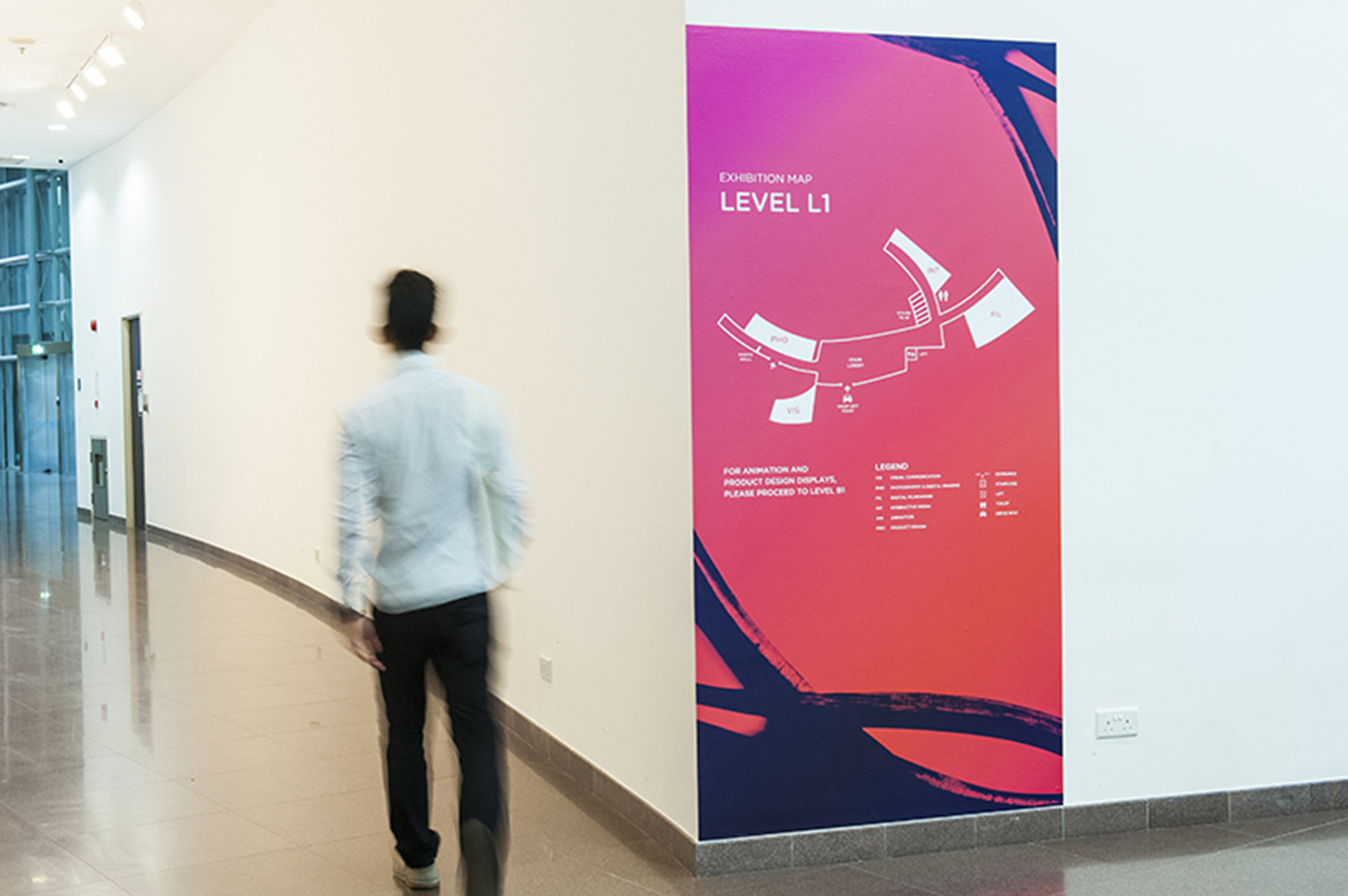
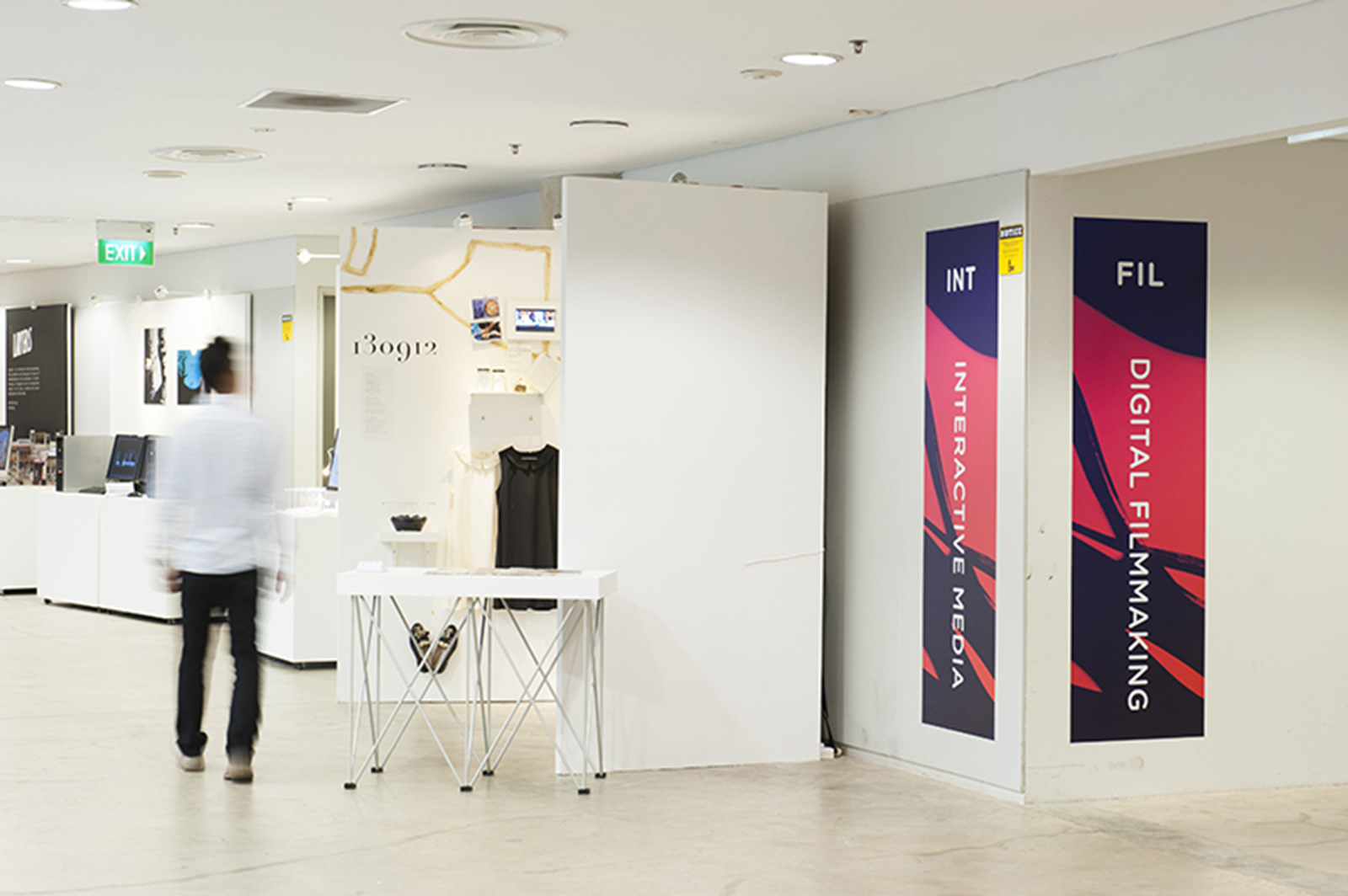
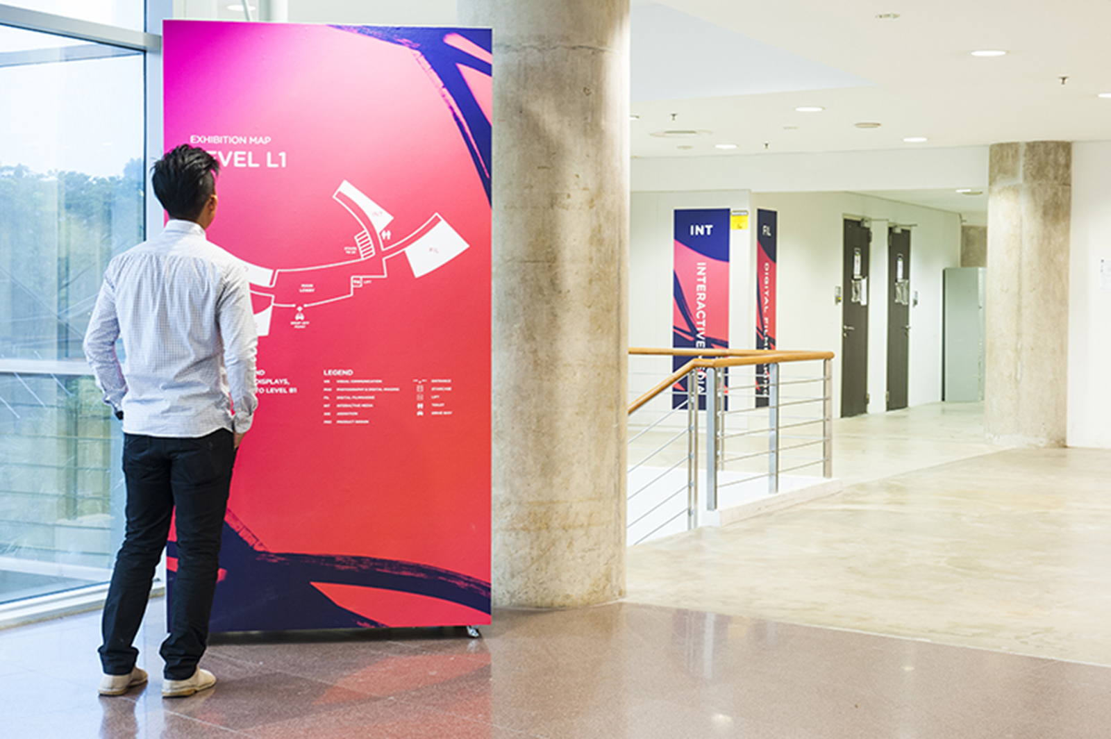
Wayfinding