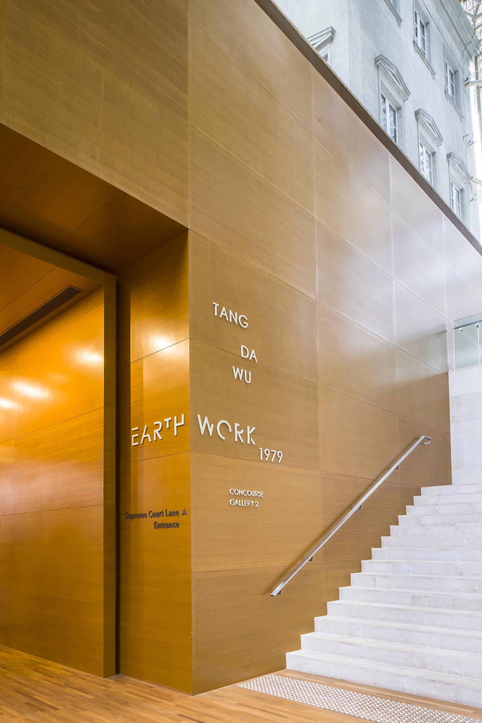
2017
The exhibition Iskandar Jalil: Kembara Tanah Liat (Clay Travels) held at National Gallery Singapore seeks to map Iskandar Jalil’s artistic practice comprehensively as a dialogue between the modern and traditional. Also, it aims to reinforce ceramics as an important but overlooked thread of history of modern art of the region through its adaptation of materials, literature; as well as a reinvention of pictorial idioms and forms.
In collaboration with Superfat Designs.
Gong 2017 Creative Circle Awards – Silver for Non Commercial Exhibitions
IDA Design Awards 2019 – Honorable Mention

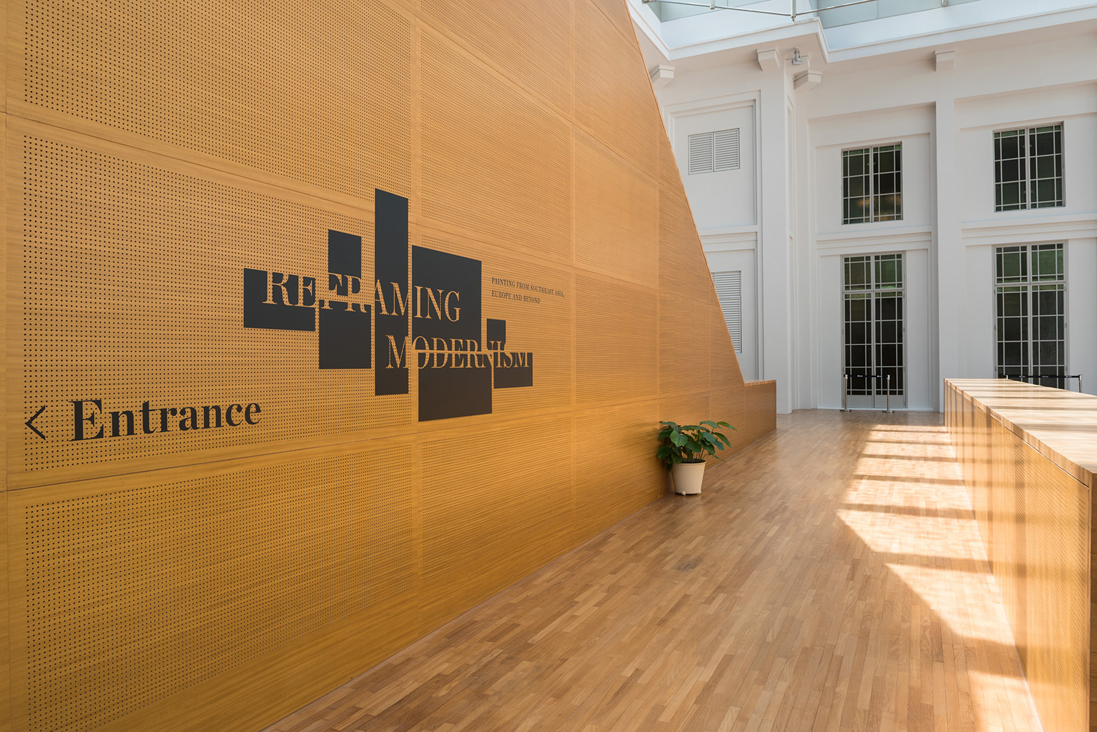
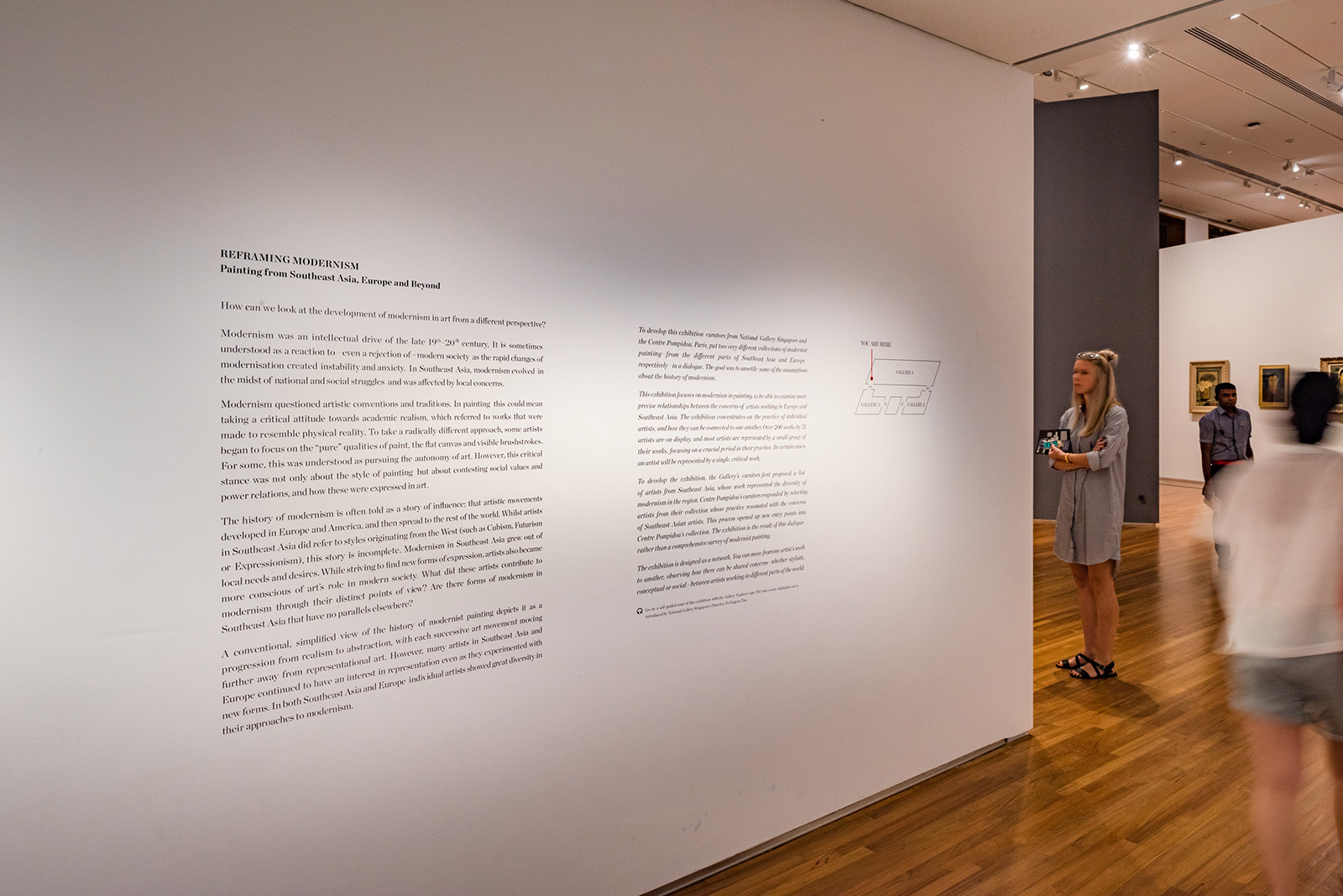
Title Wall
The title wall was hand plastered and painted to create a tactile introduction to the show, a nod to the nature of ceramics presented in this exhibition. The color chosen was also called an ‘Iskandar Blue’, in reference to a few hues of blue the artist favoured in his artworks.


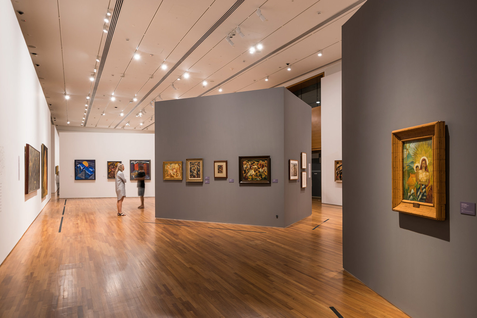
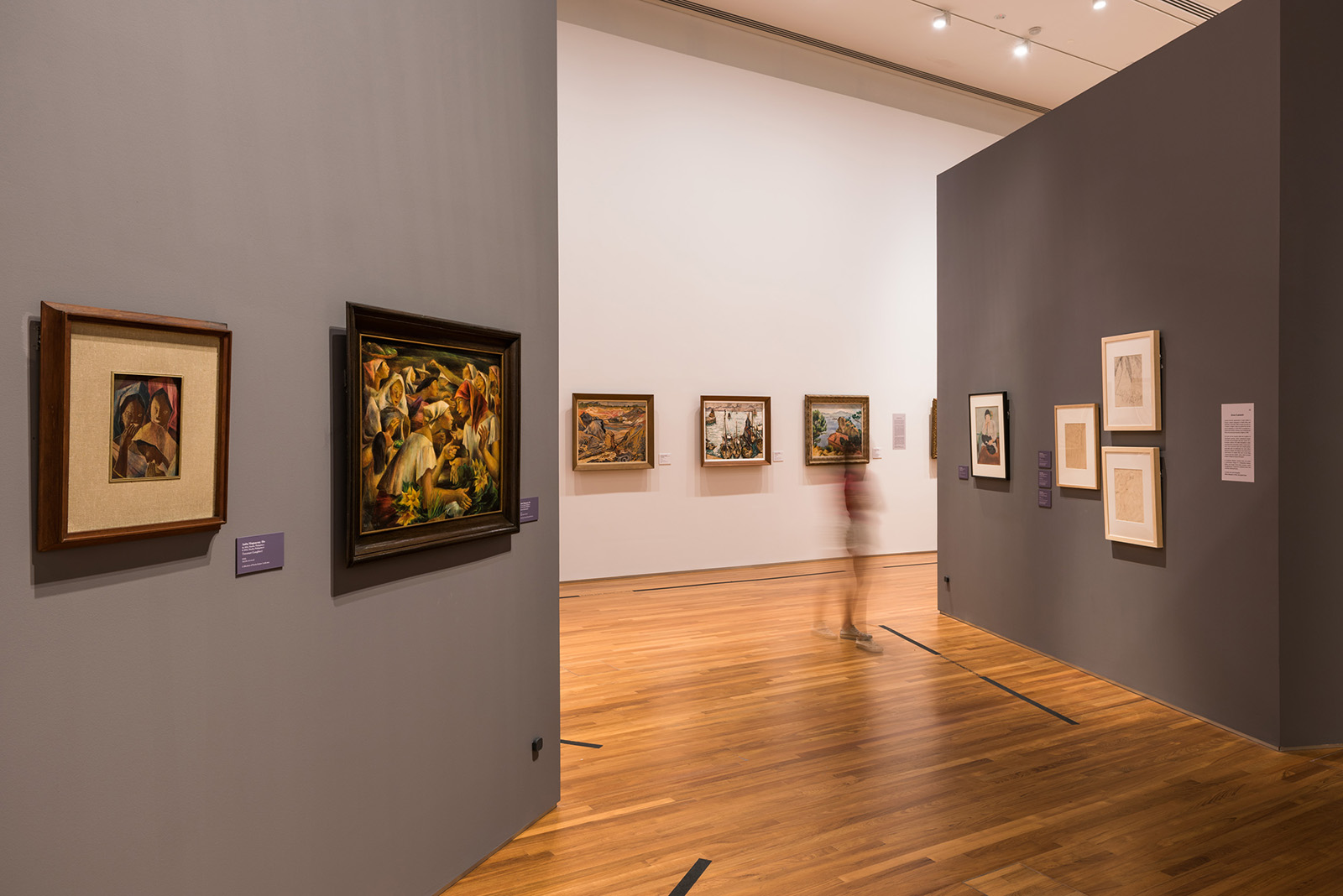
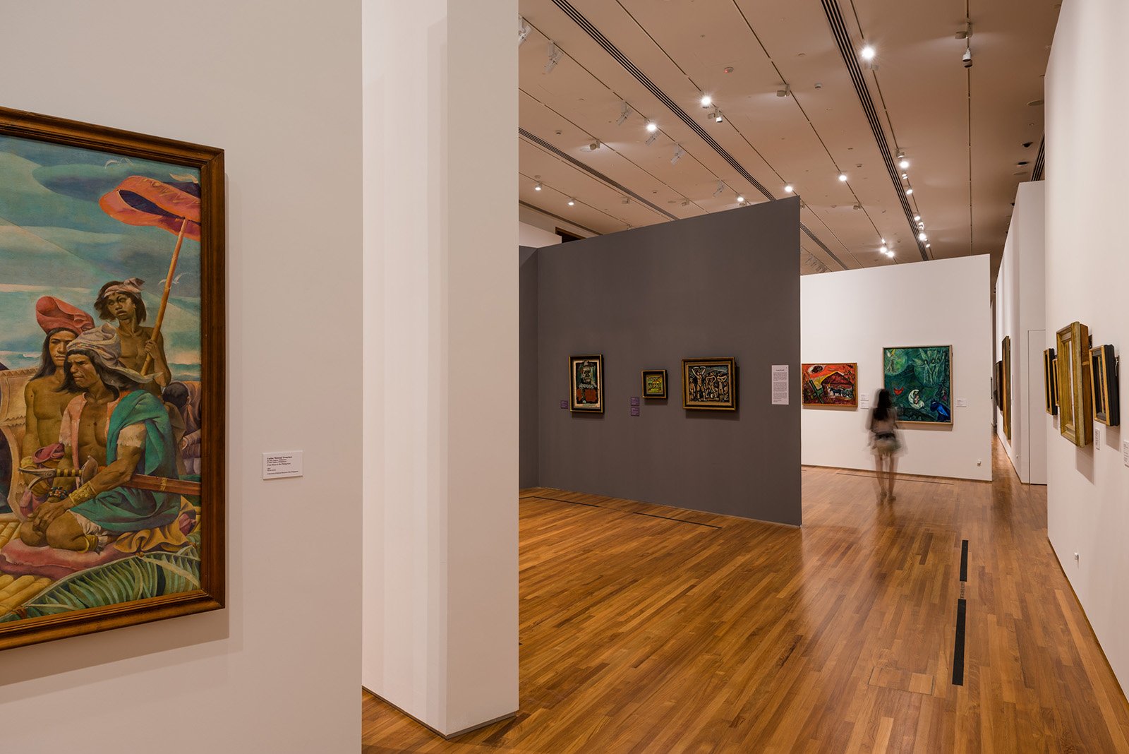
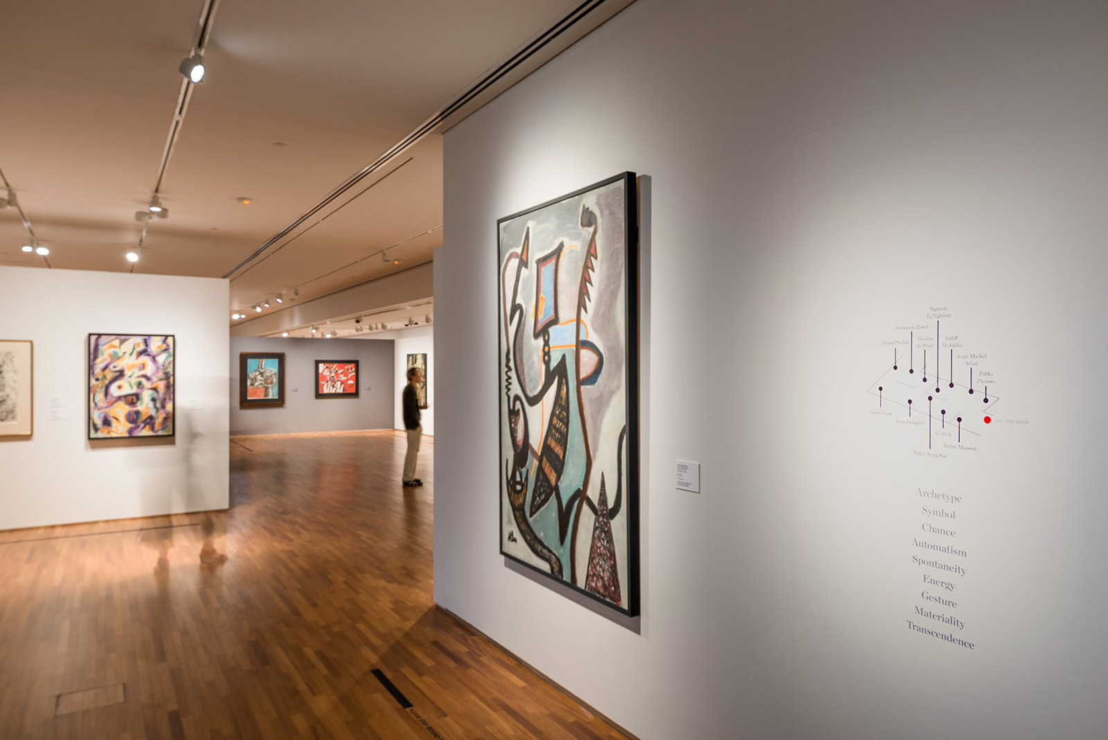
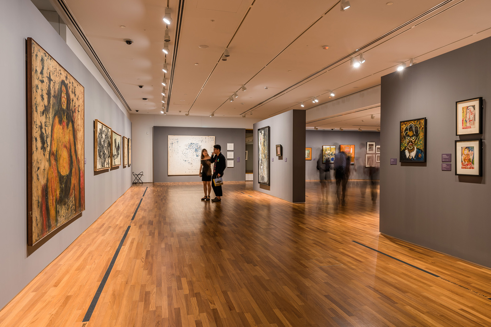
Spatial
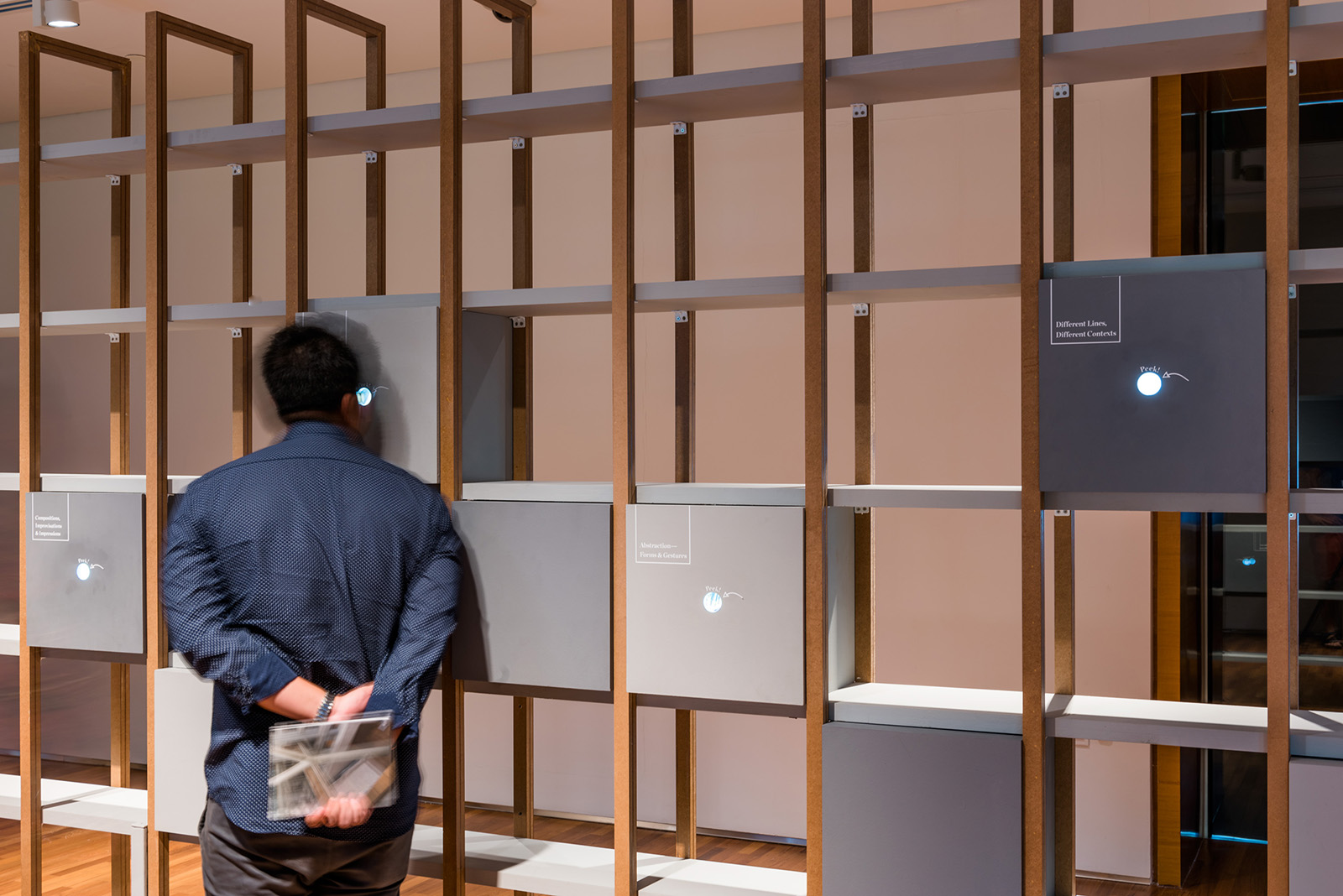
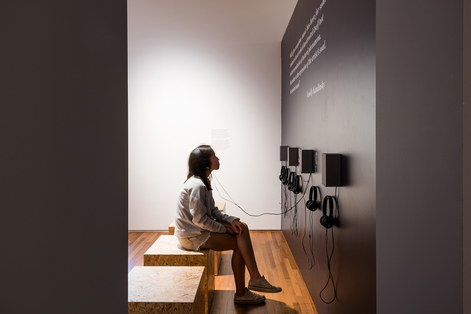
The exhibition design seeks to evoke the idea of an Archipelago, with the landscape re-imagined from the terraced hills of islands to overhanging curtains of fabric representing low clouds over the hills. Spatially, the scheme takes on curvilinear shapes with different treatments, heights and materials, leaving the exhibition open as visitors meander through it, discovering the art pieces with a view of what happens in their foreground, middle ground and background in their peripheral vision; a reflection of the viewing of a traditional landscape art piece. This allows a contemplation of Iskandar’s works through the ages and how his thinking has changed and developed over the course of his career.

")


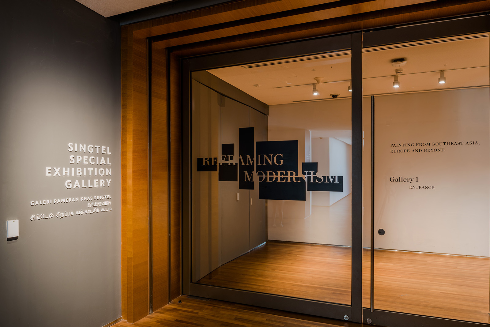
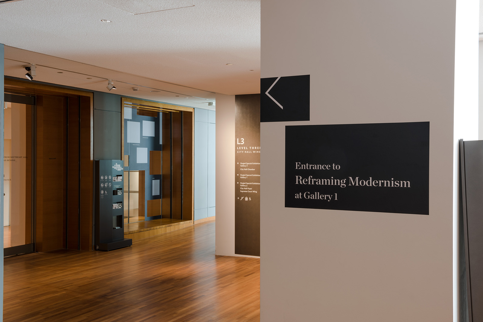
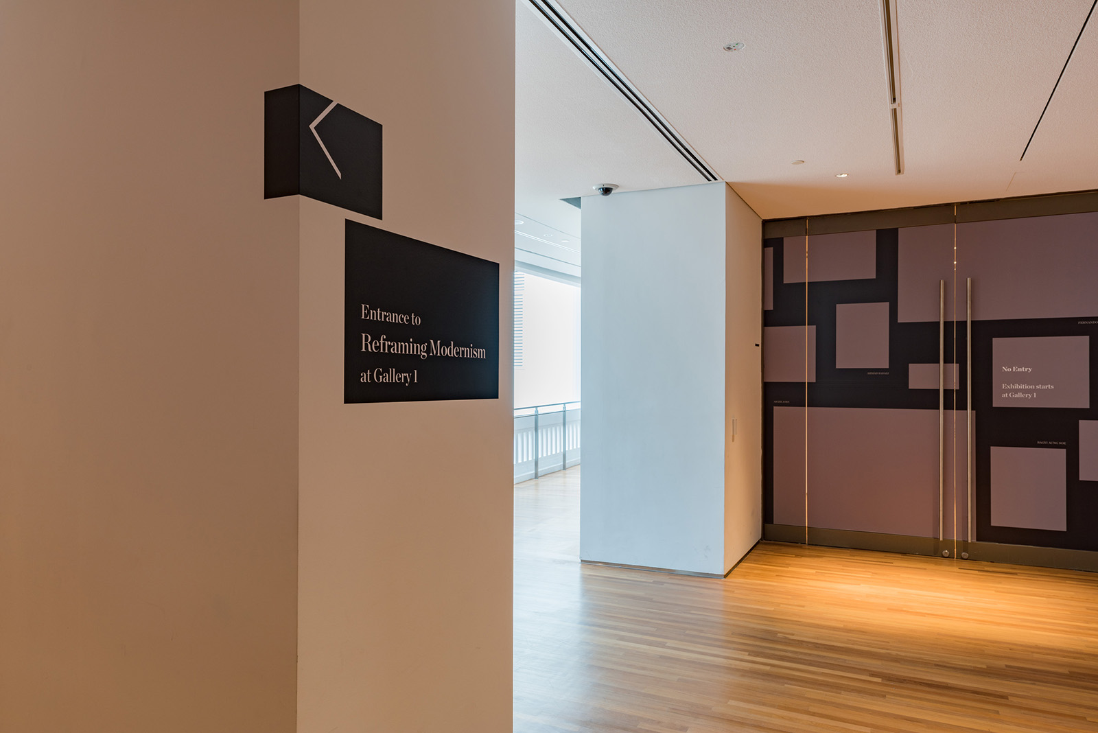
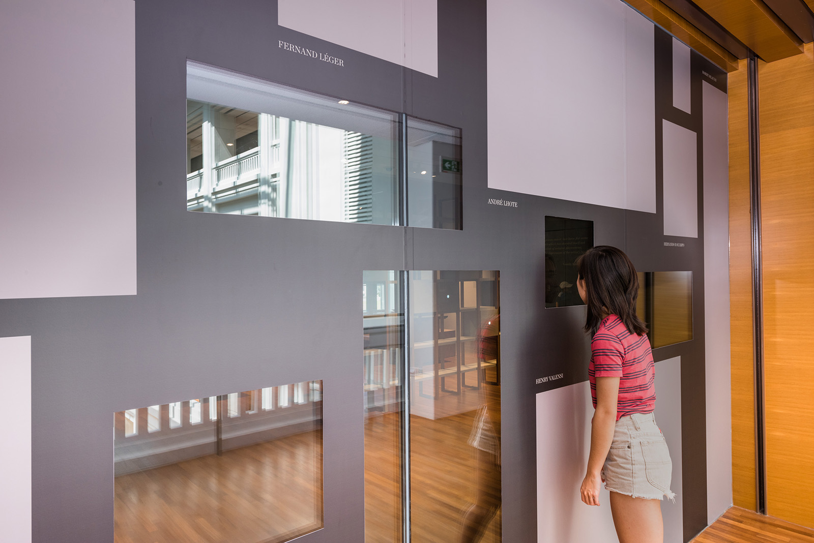
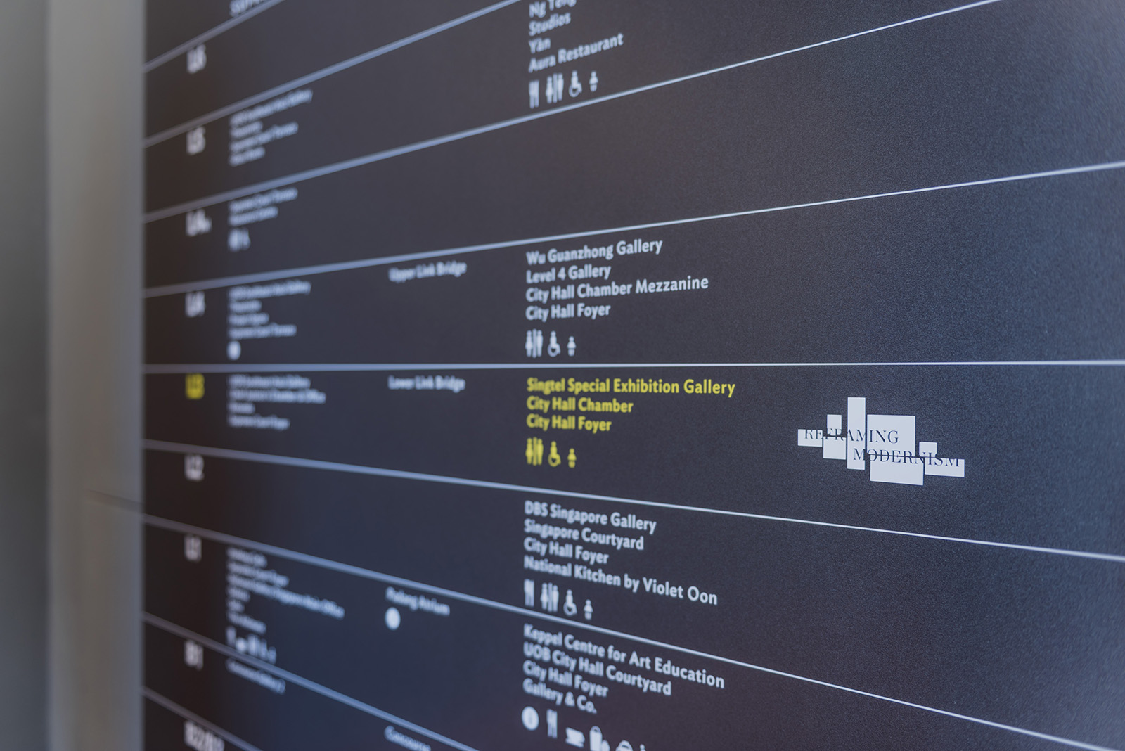
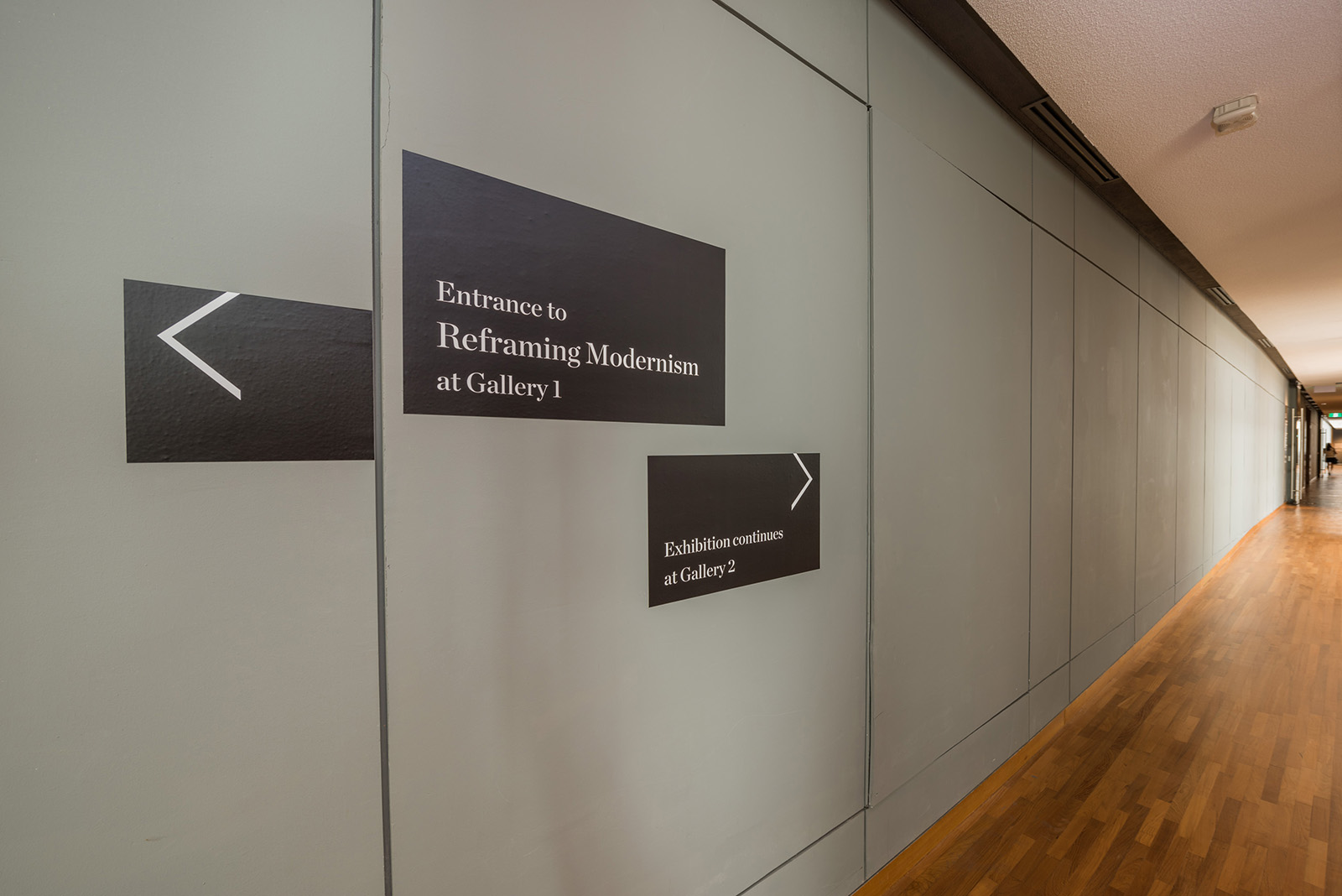
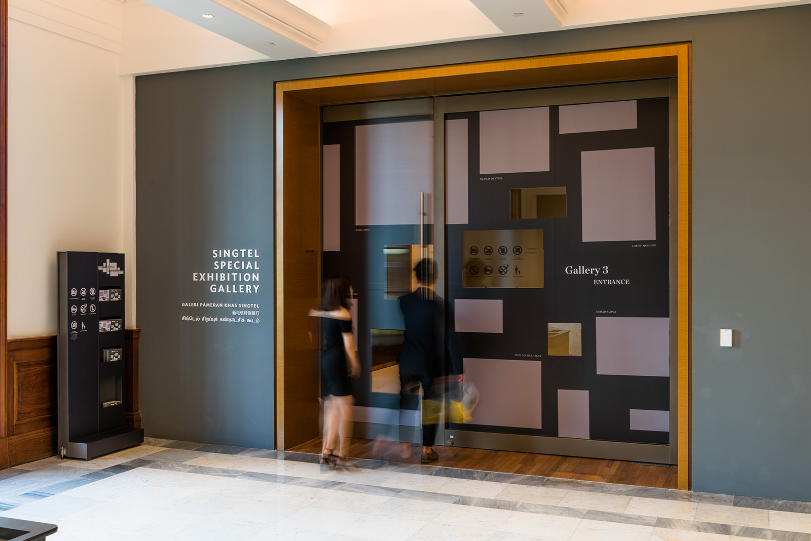
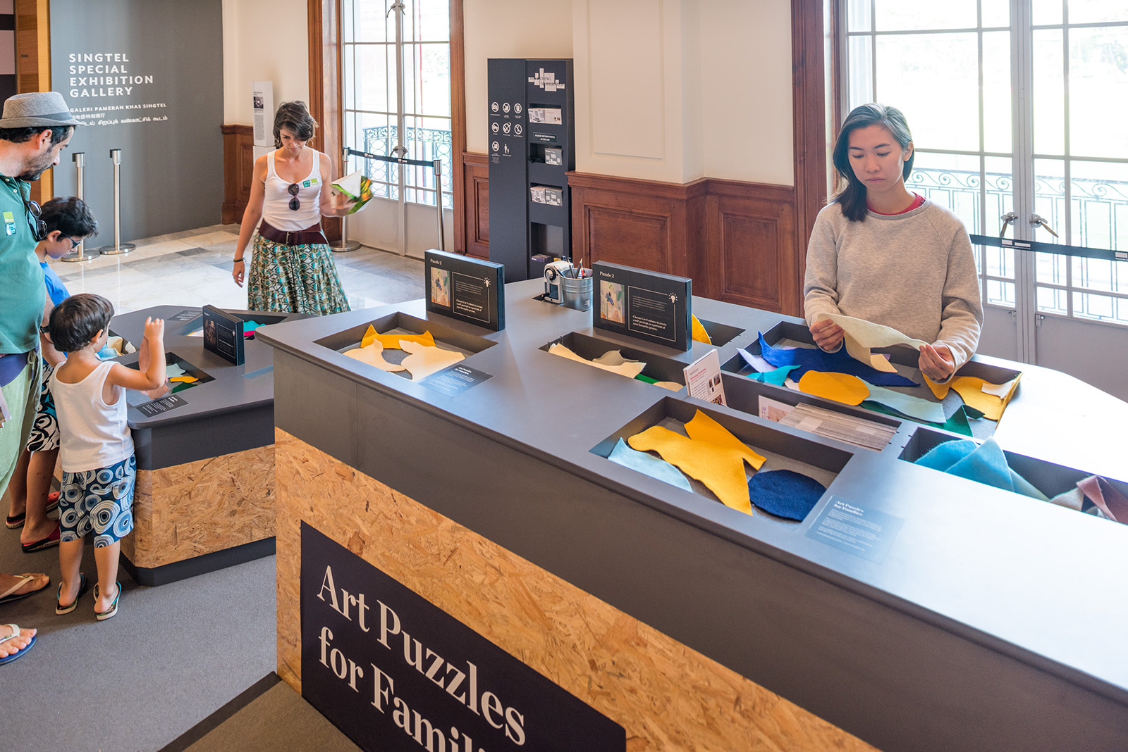
Wayfinding
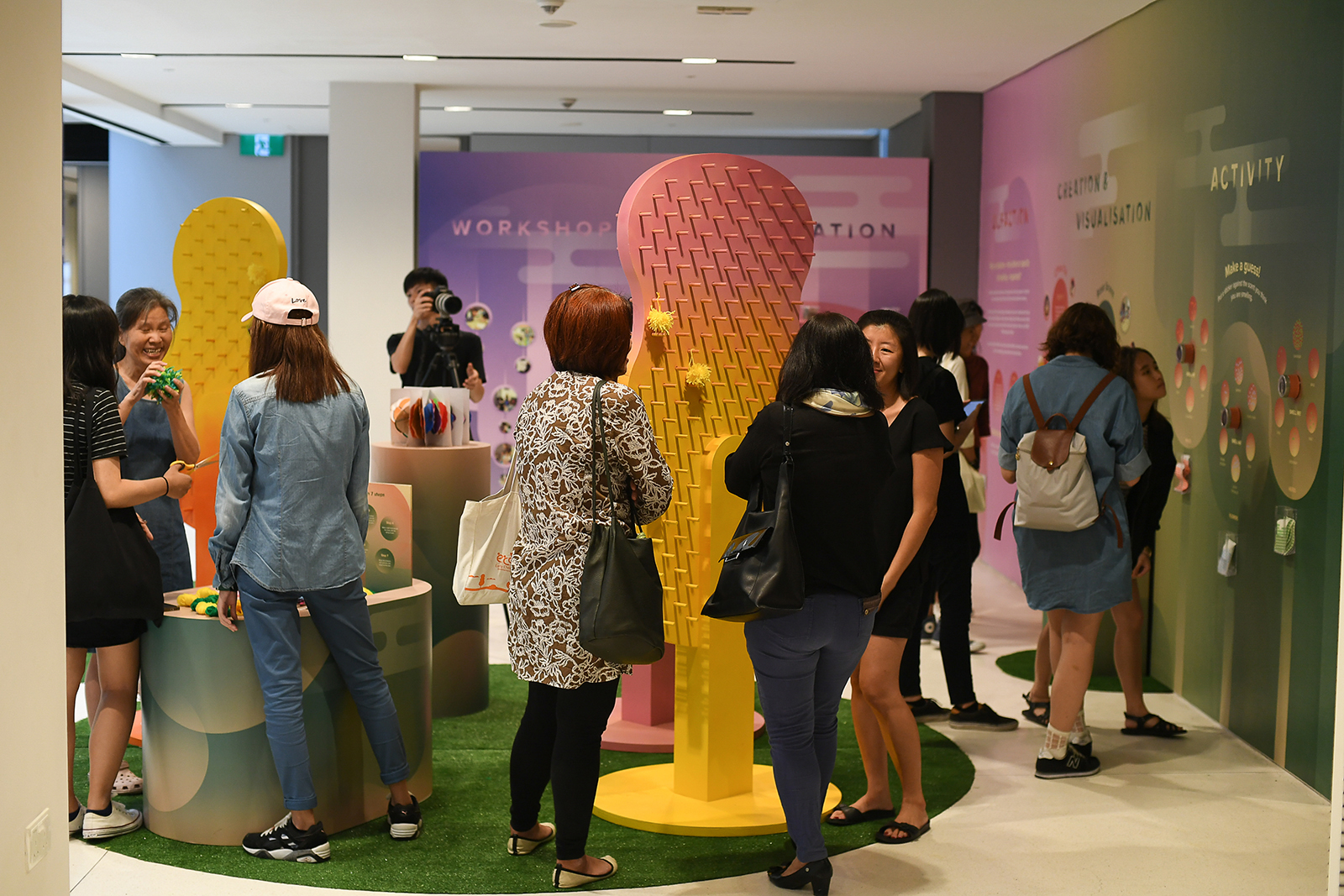
The exhibition is made up of 2 galleries, separated by 40 metres long corridor. As such, we designed a wayfinding system formed by the recurrent motive of archipelagos, presenting an immersive experience as visitors navigates through the space.


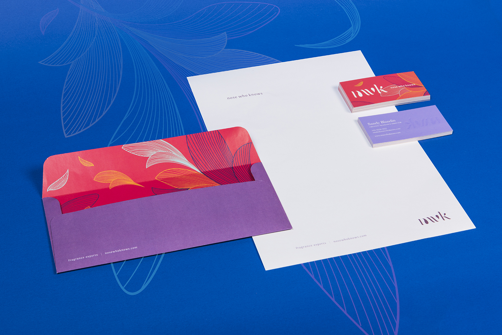
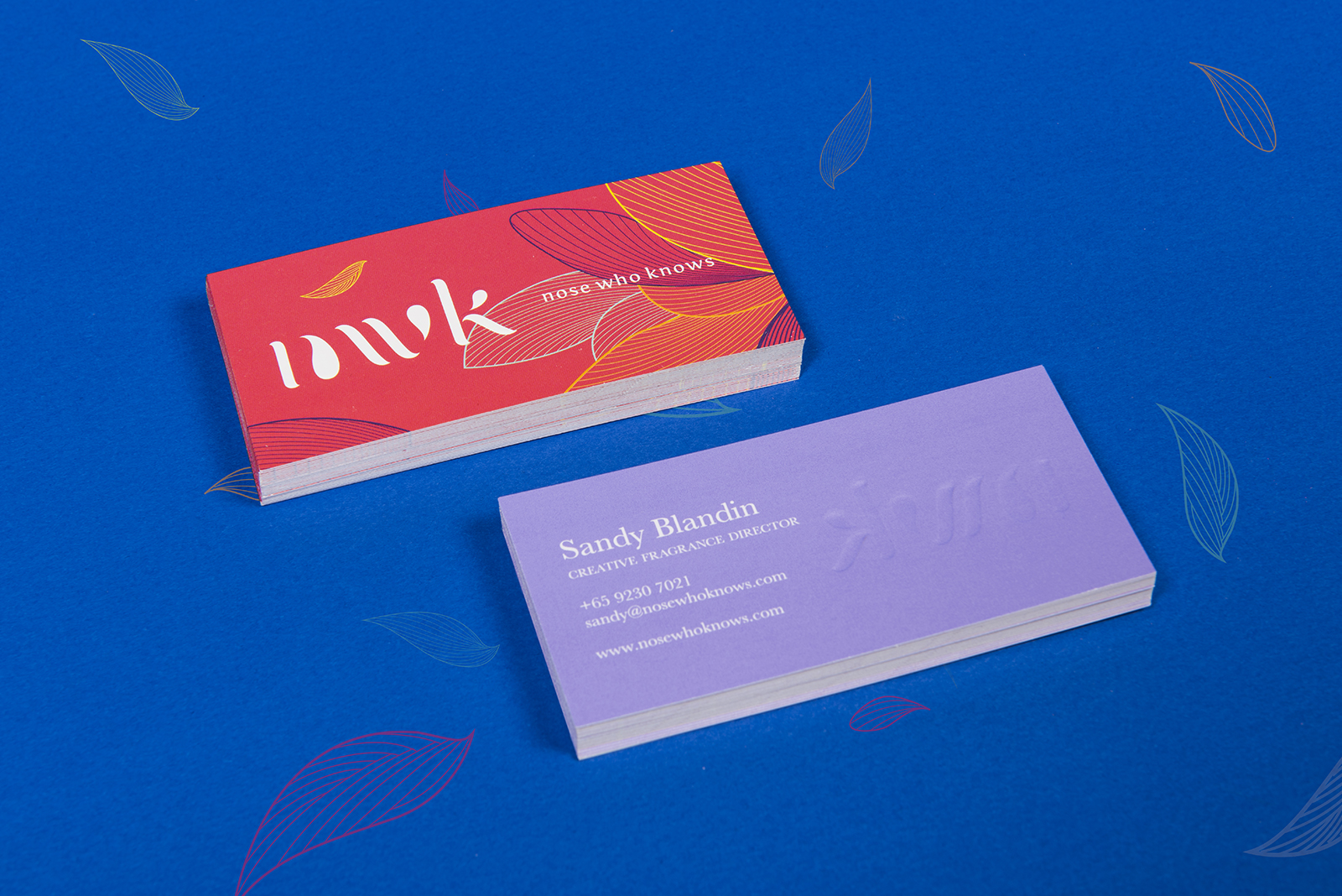
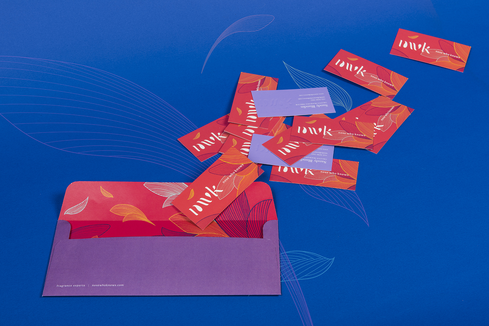
Invites
The concept of the archipelago was extended to the print invites, featuring a 3D blind emboss effect.


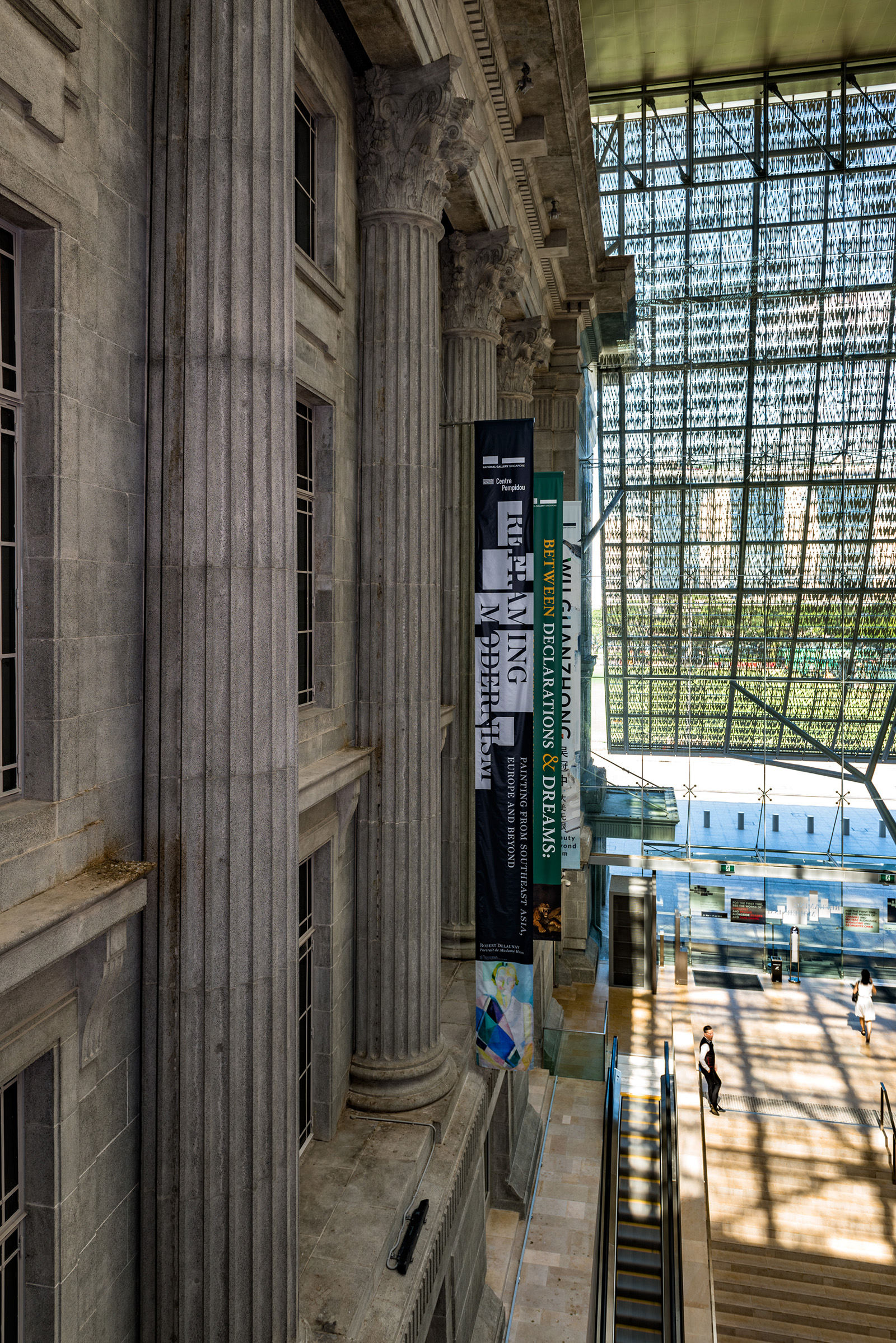
Poster

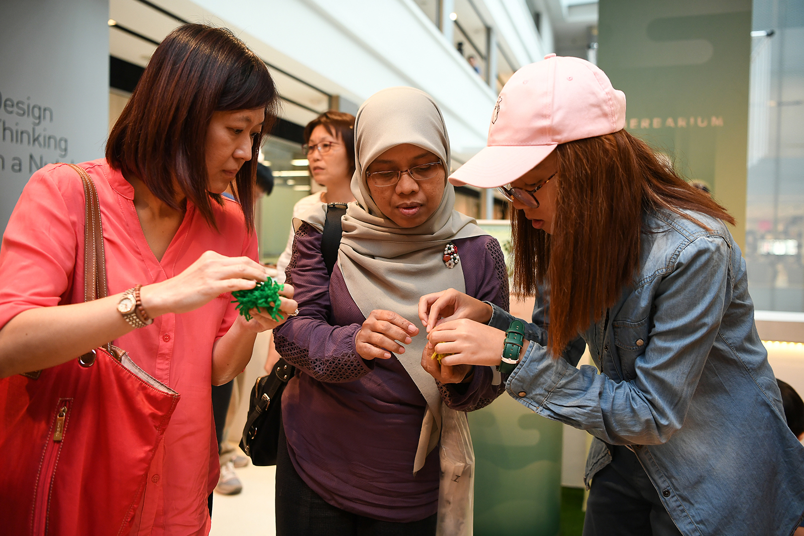
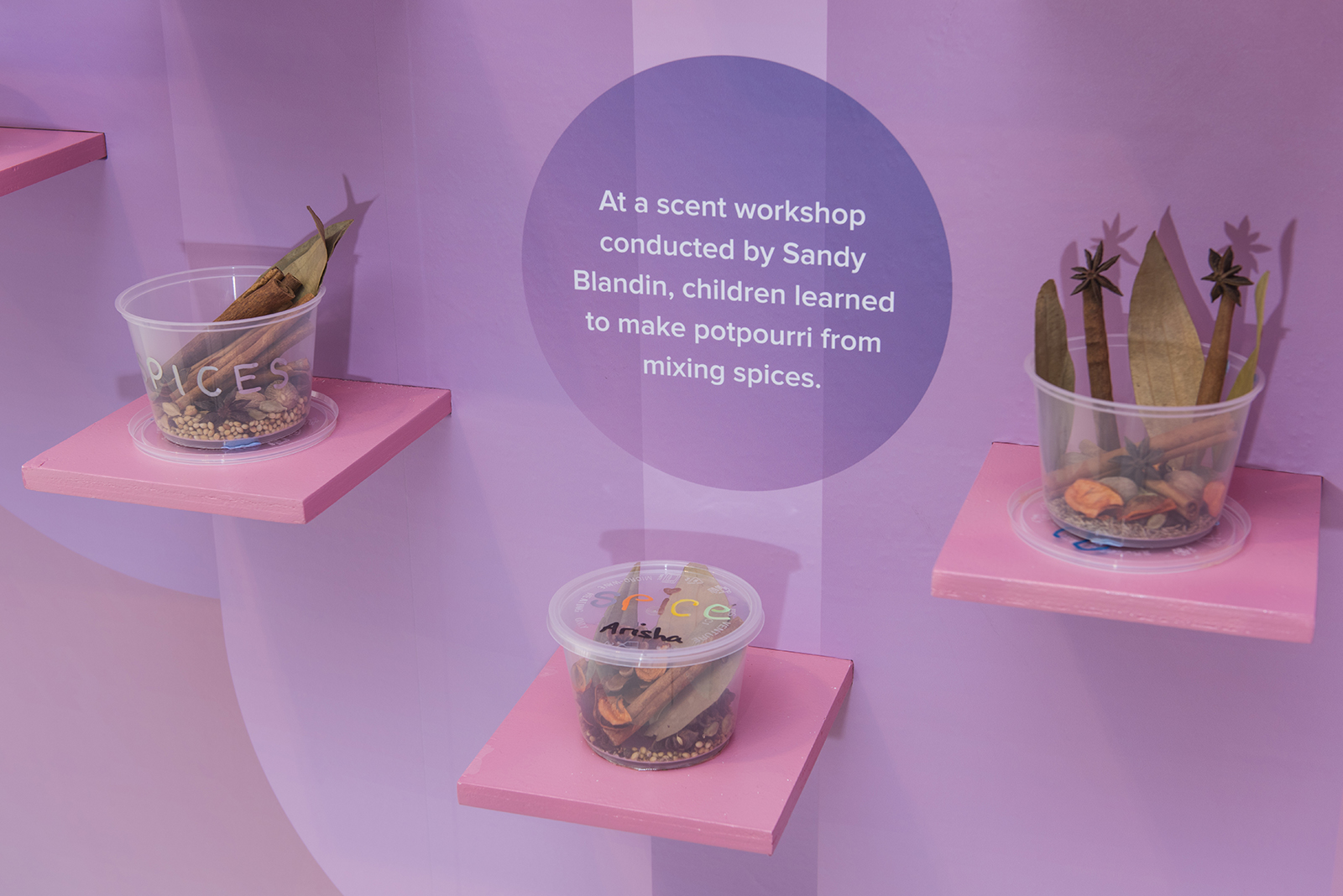
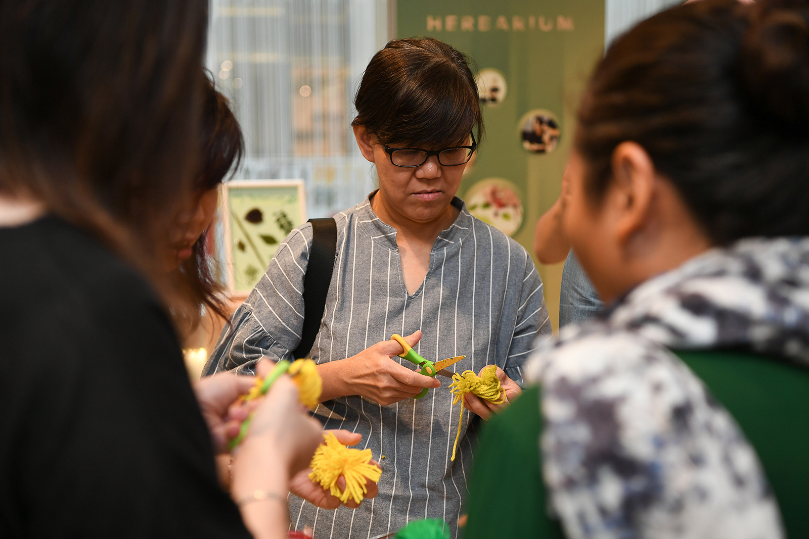
Activity Brochure