REFORMATIONS: Painting in Post 2000 Singapore Art

2019

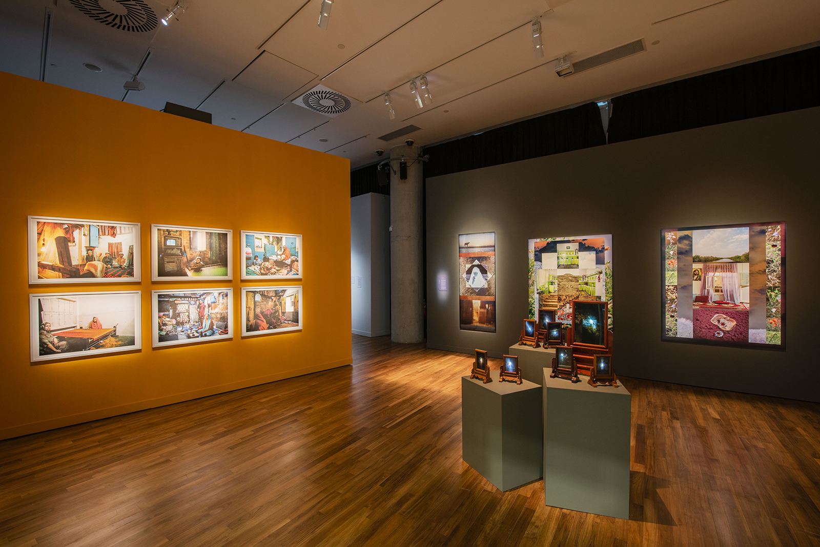
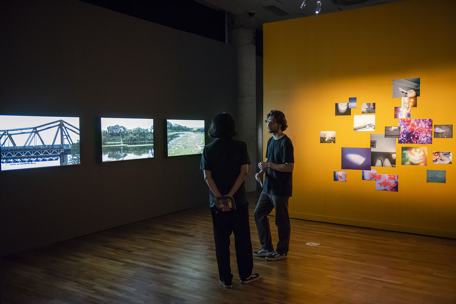
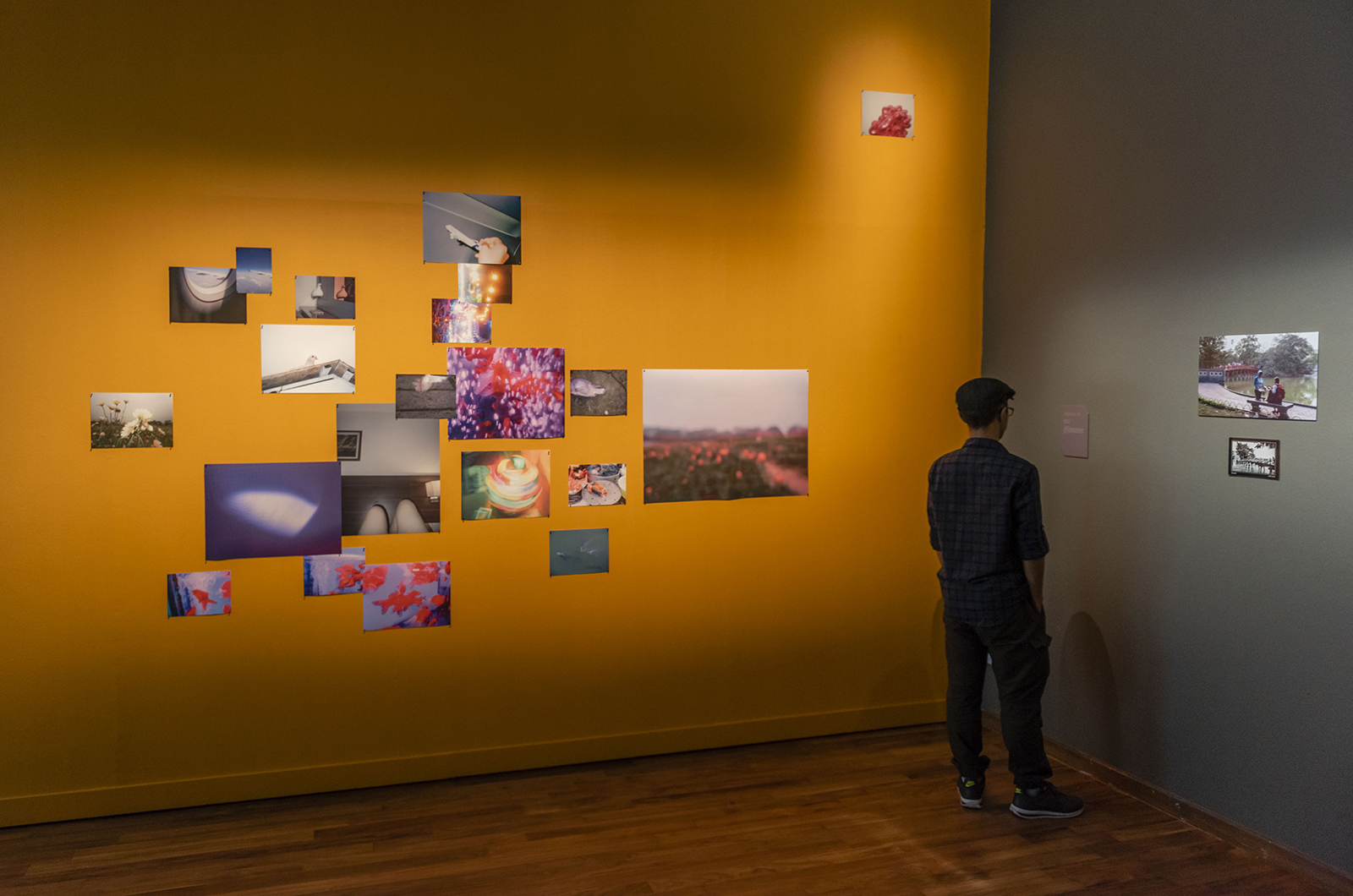
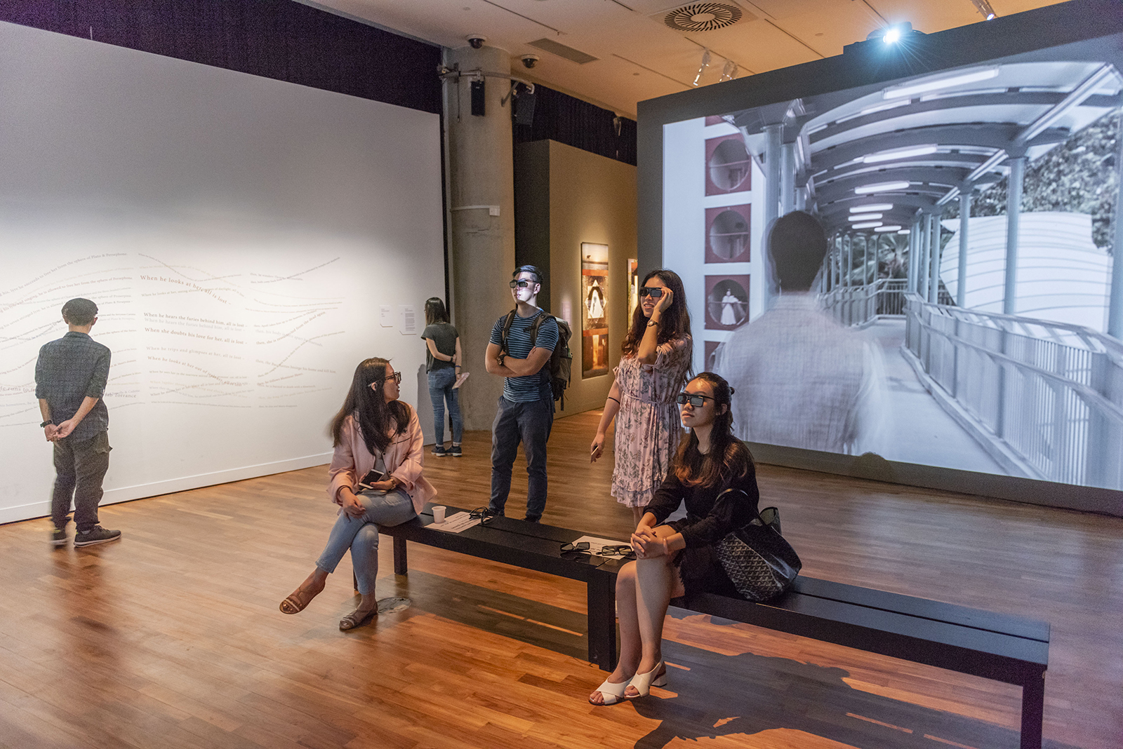
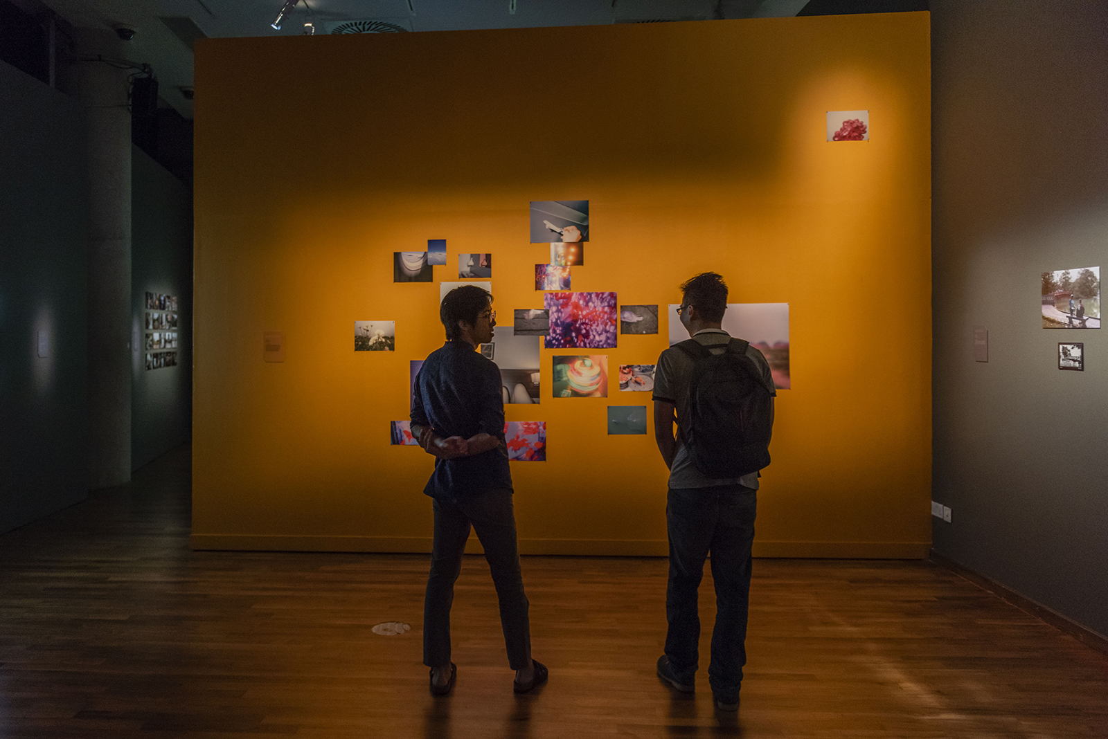
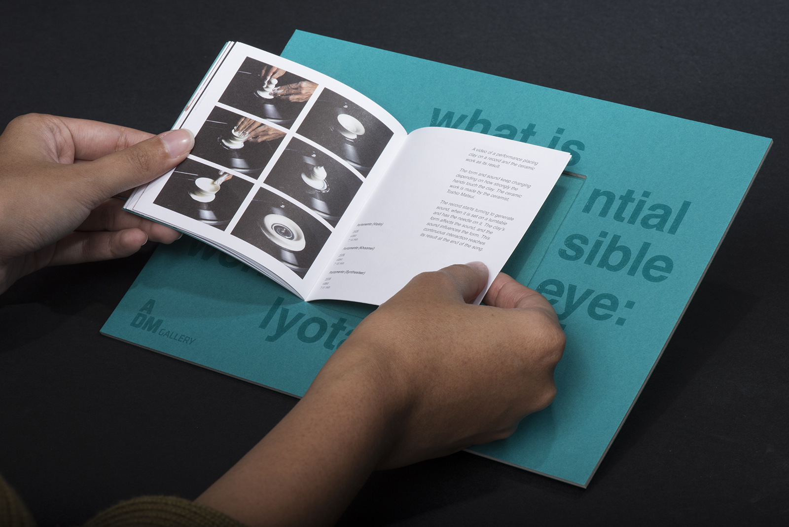
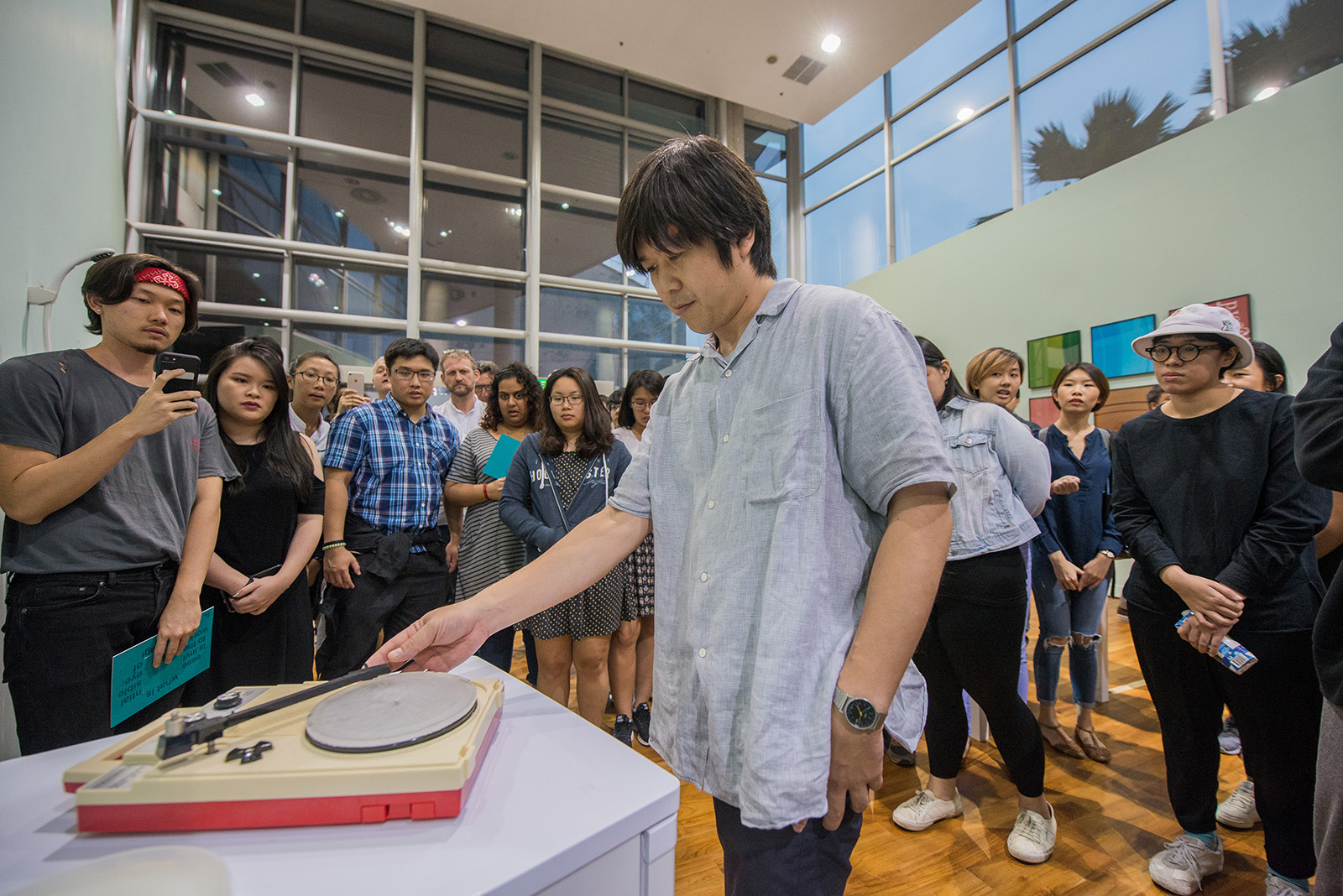
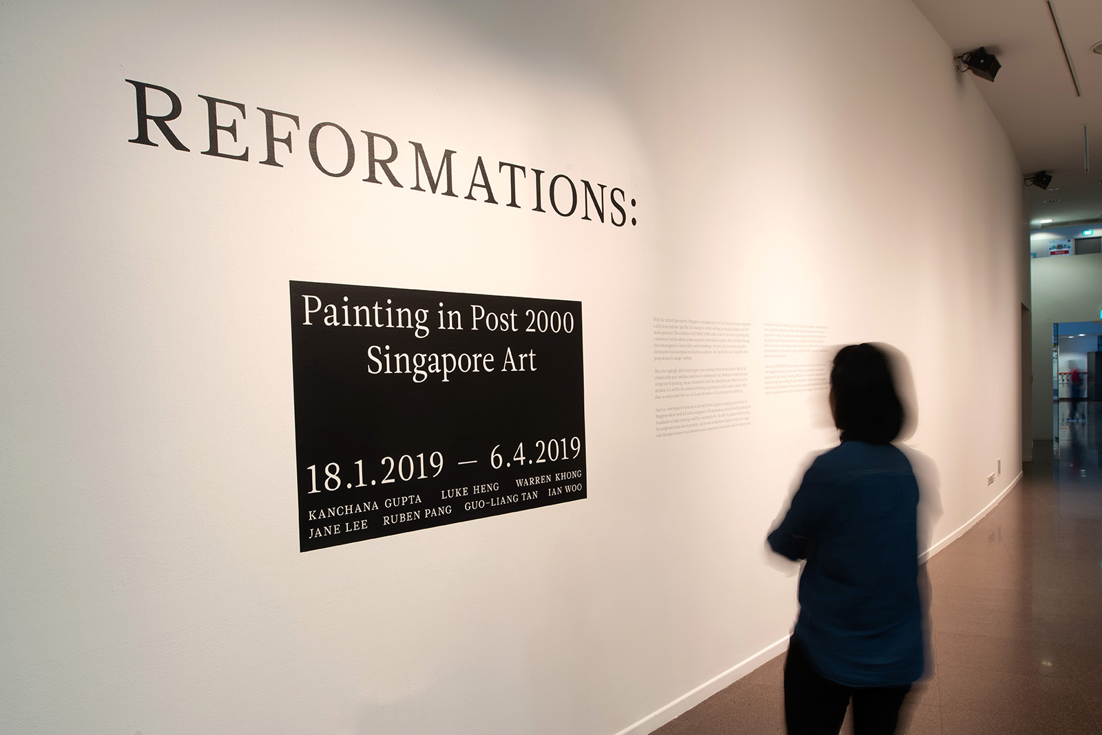
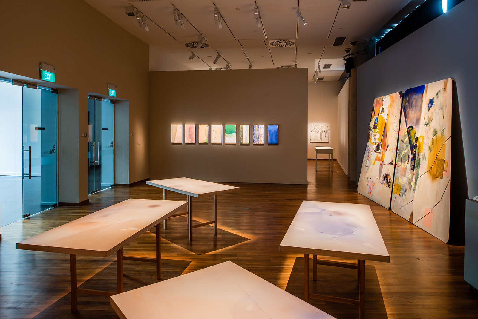
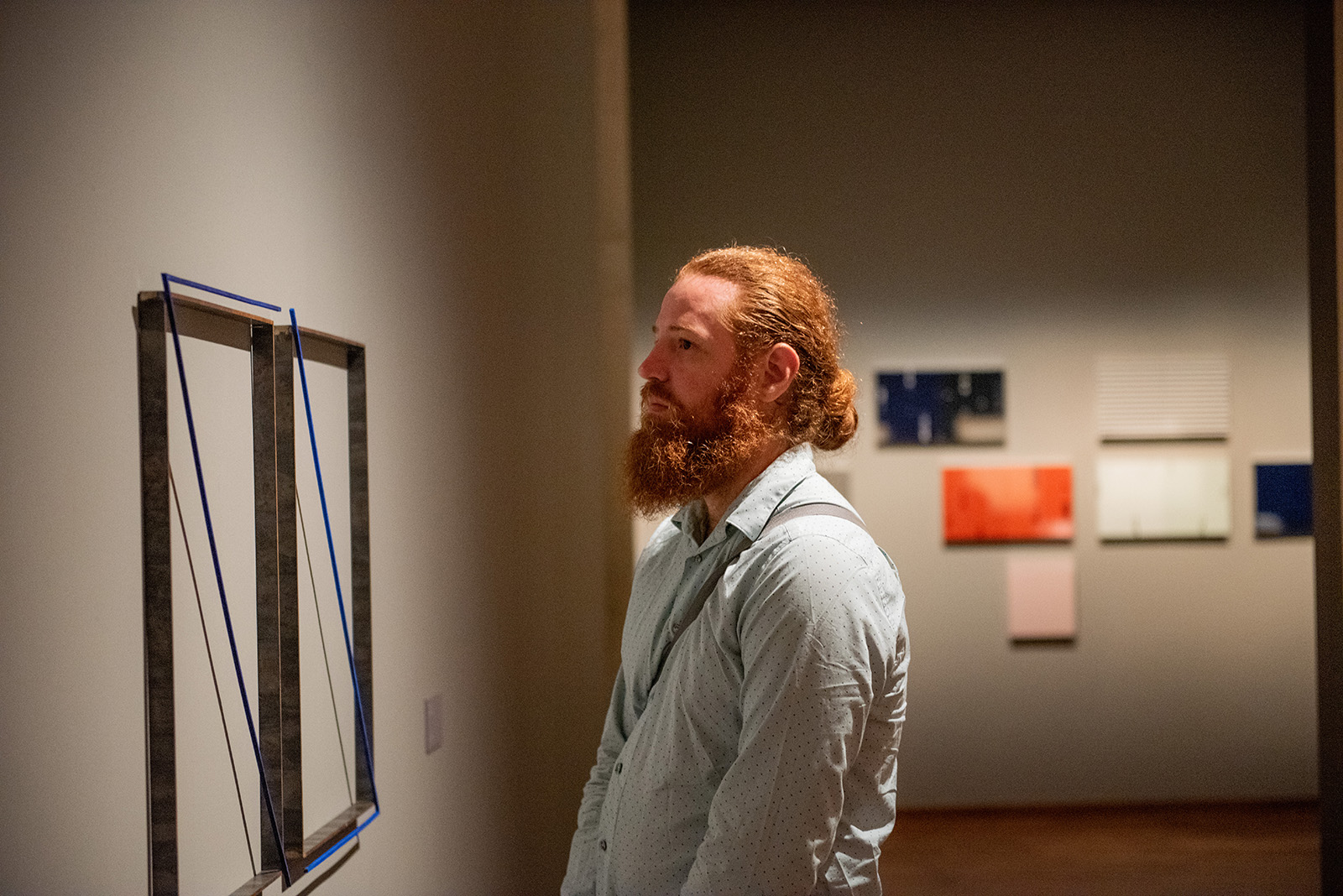
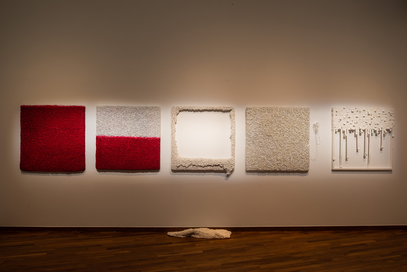
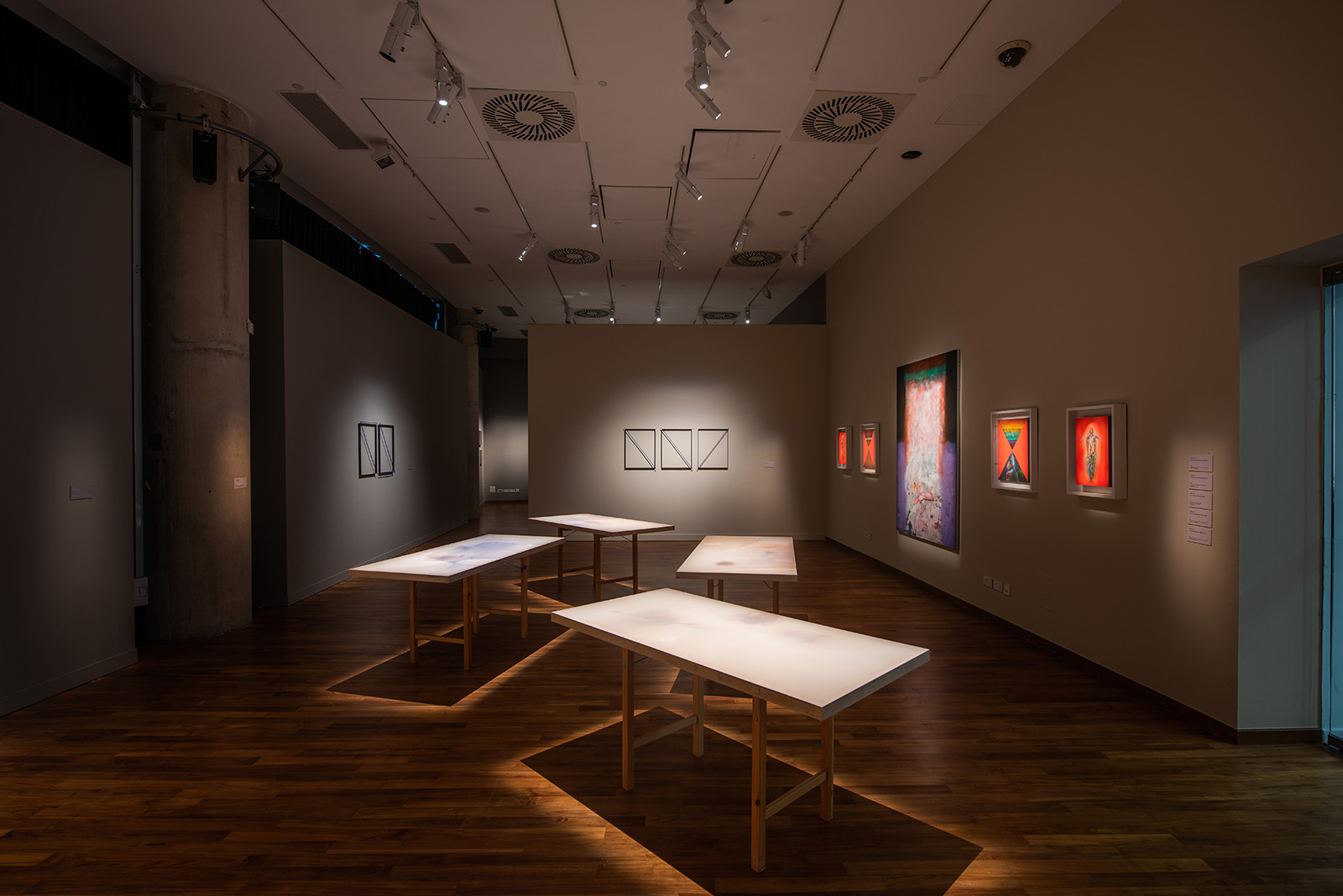
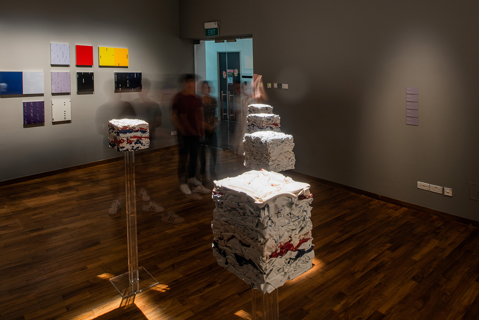
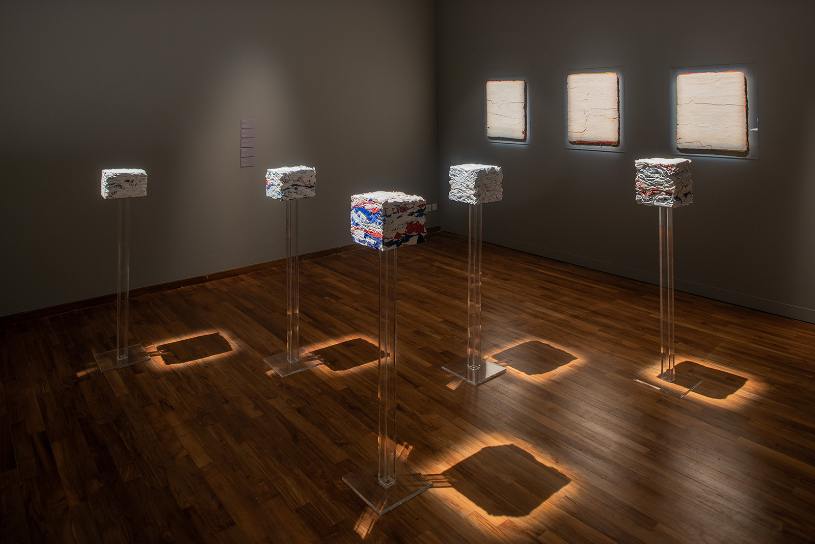
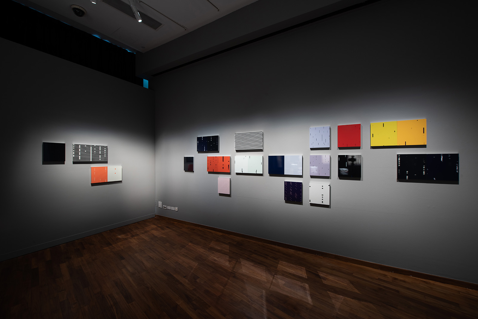
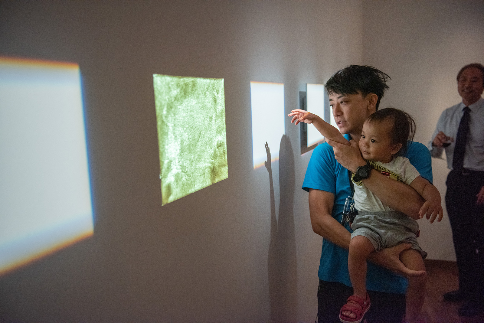
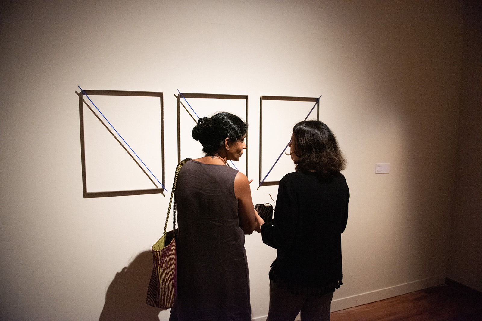
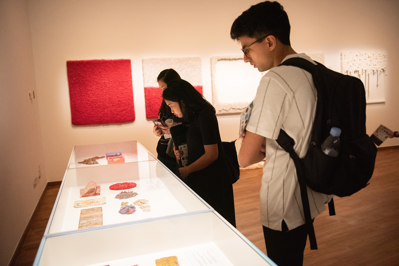
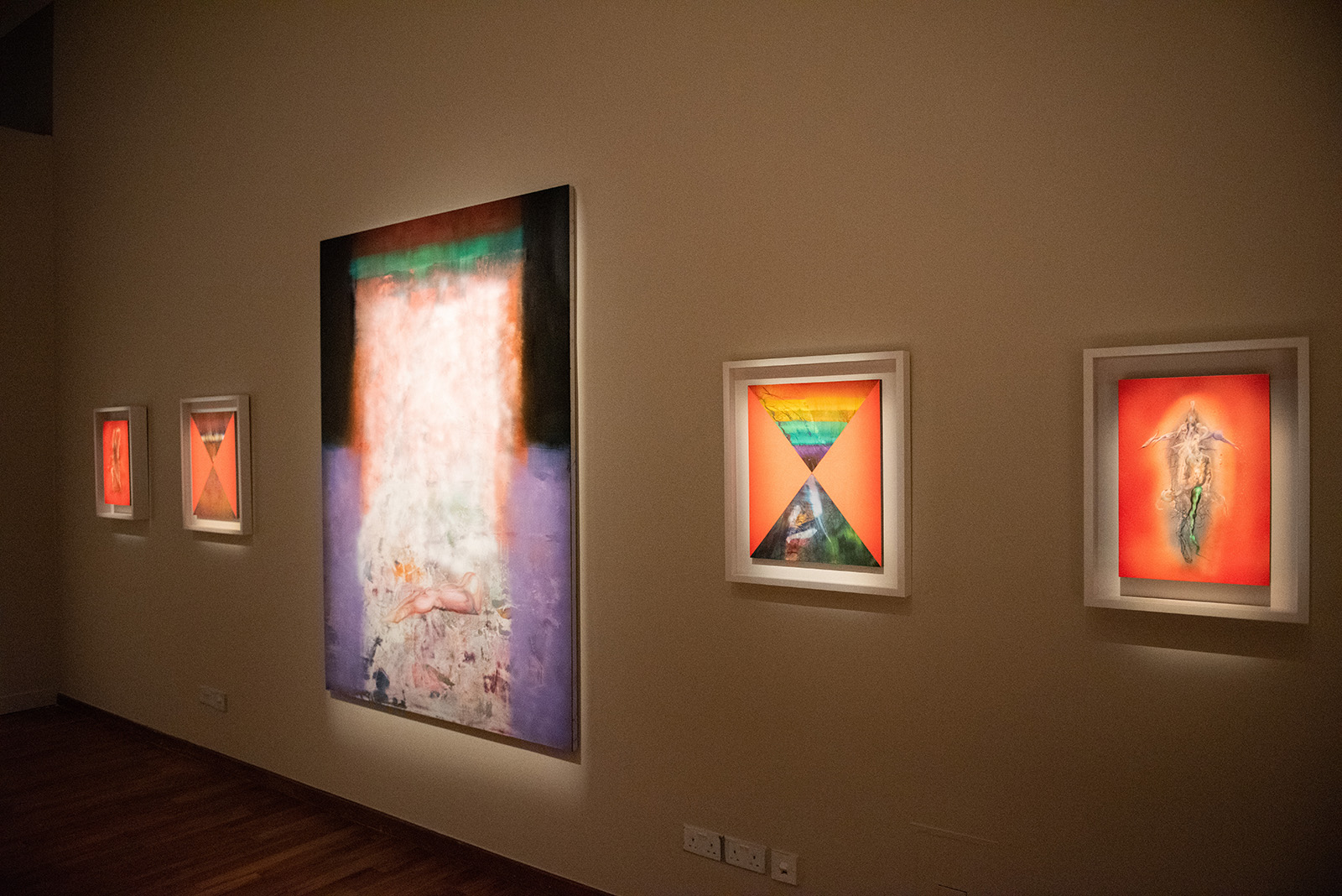
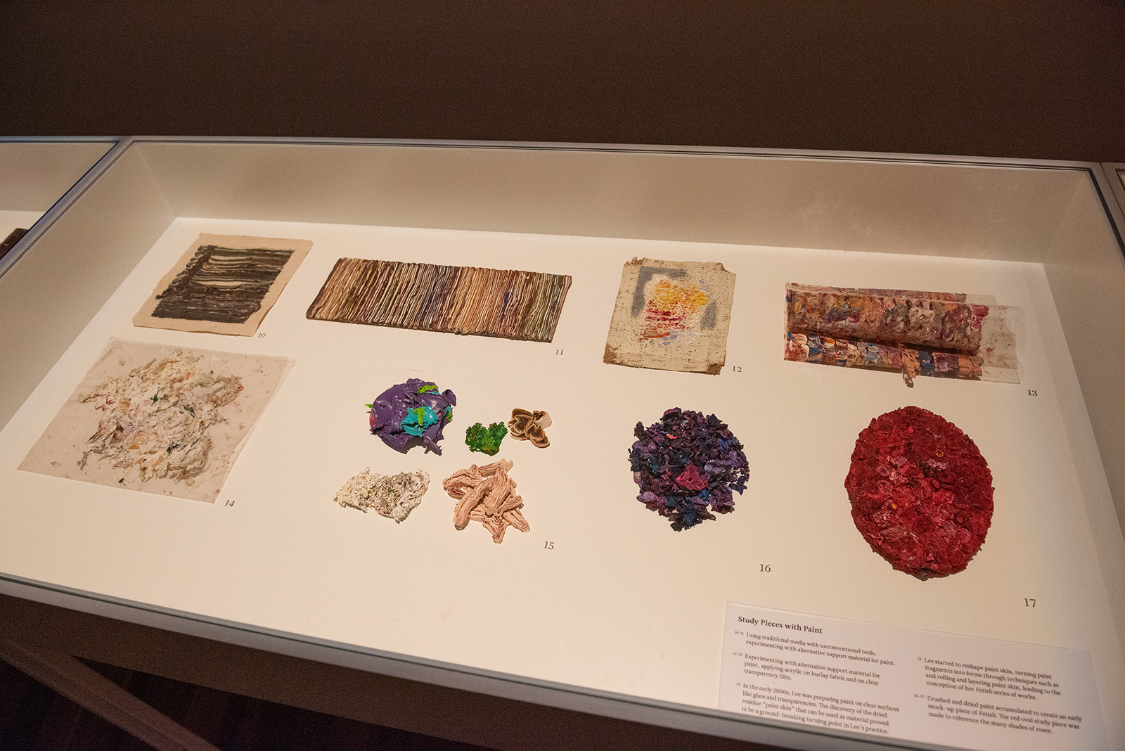
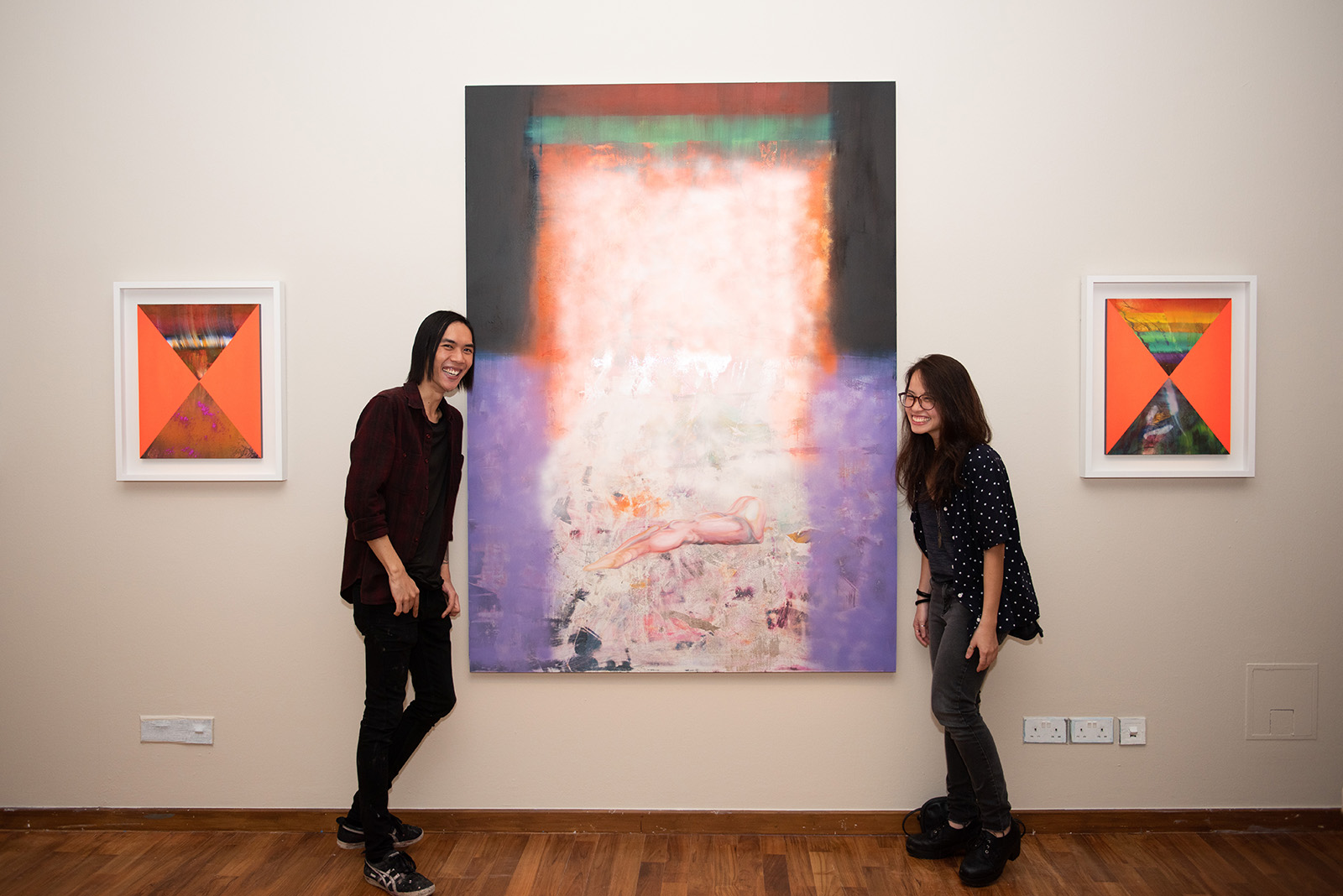
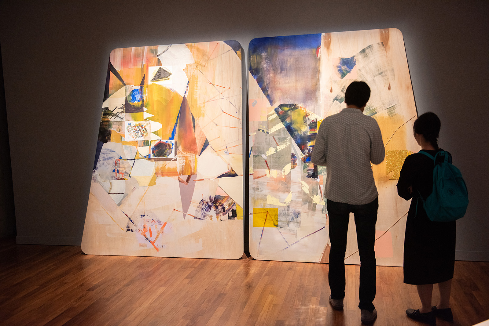
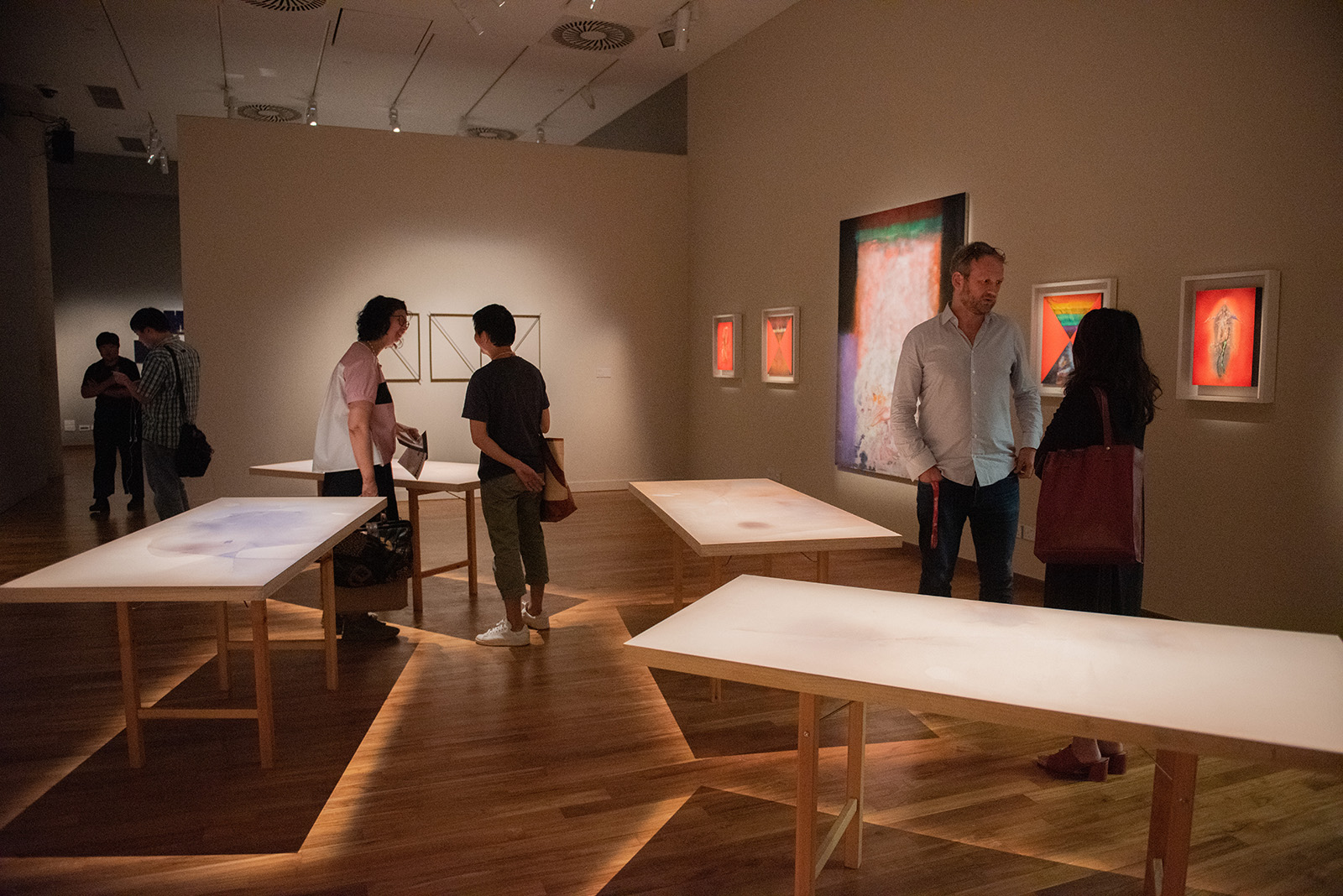
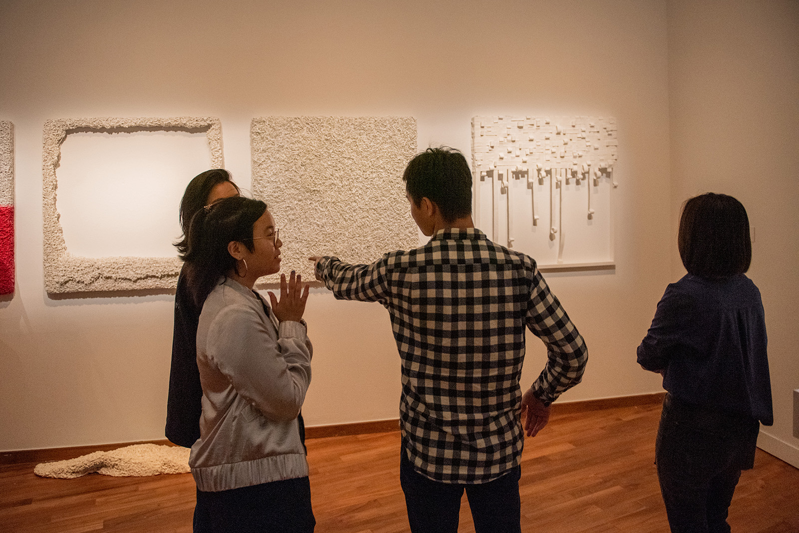
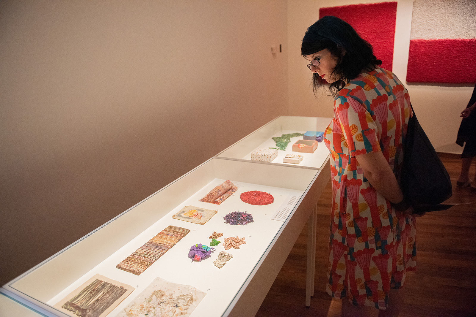
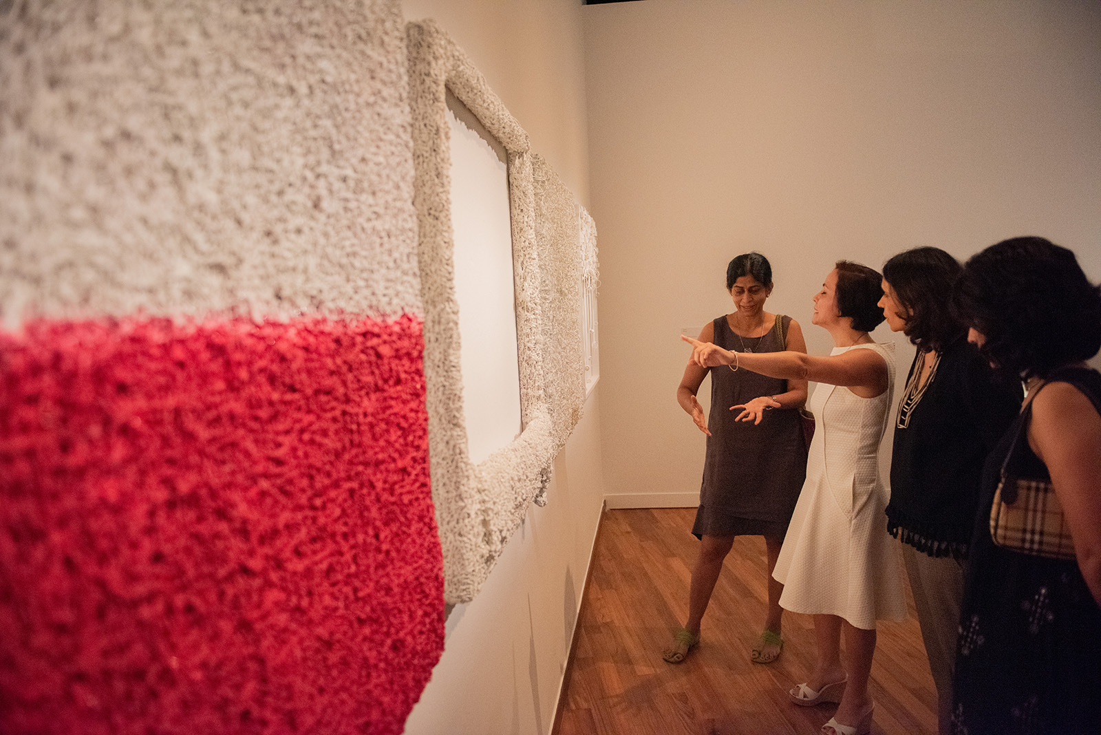
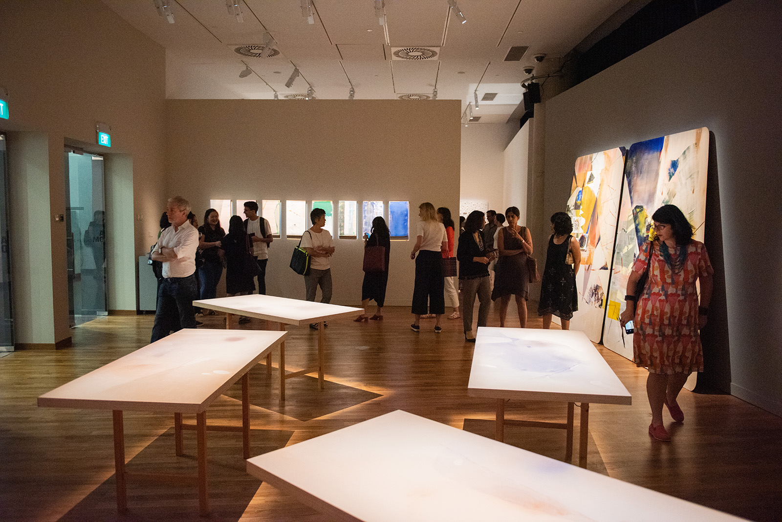
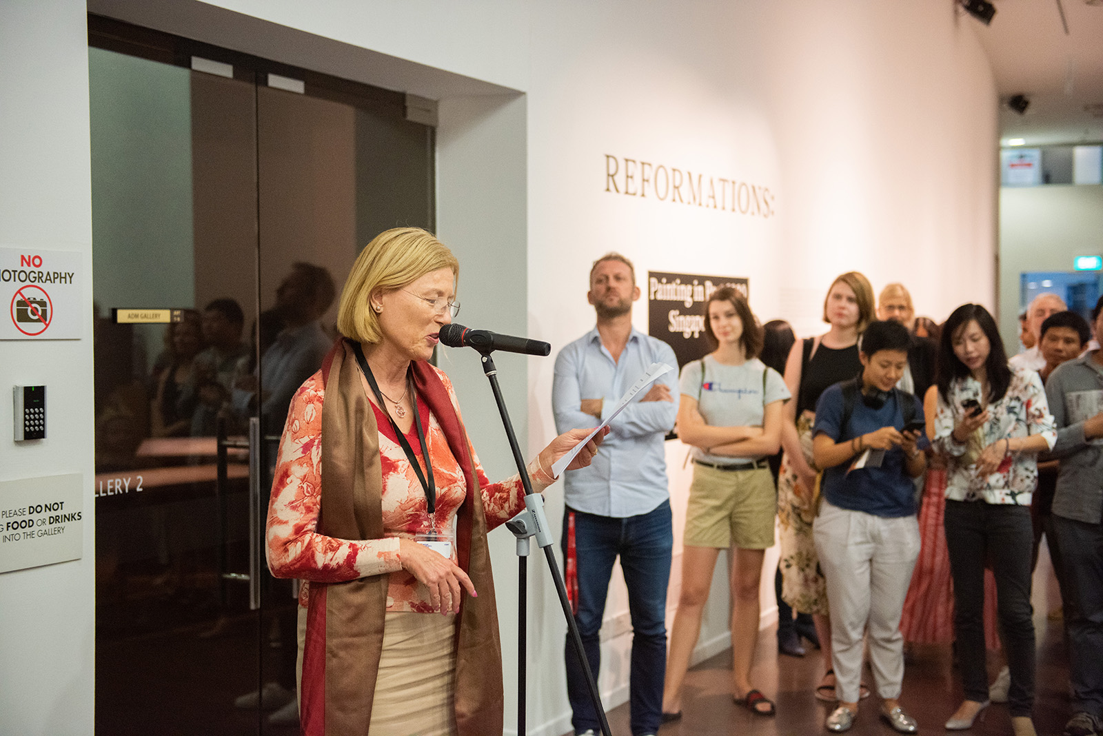
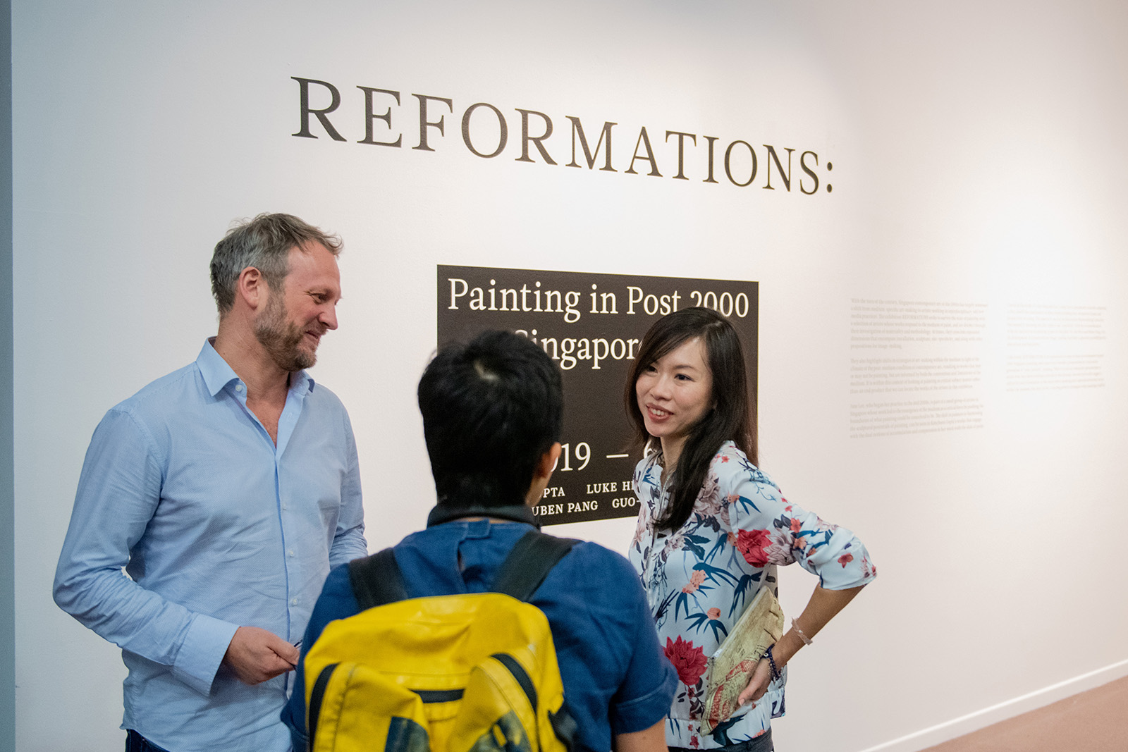
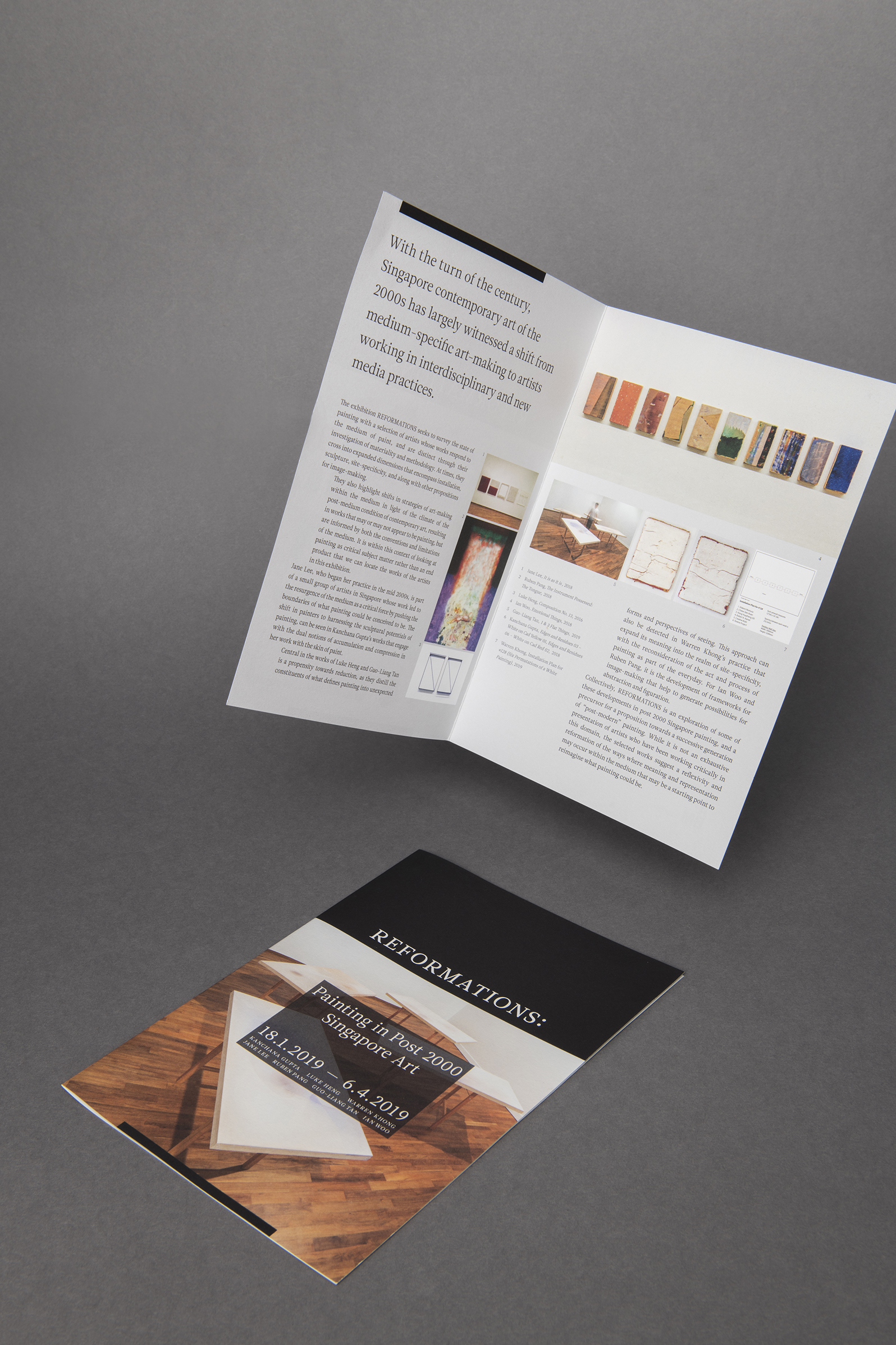
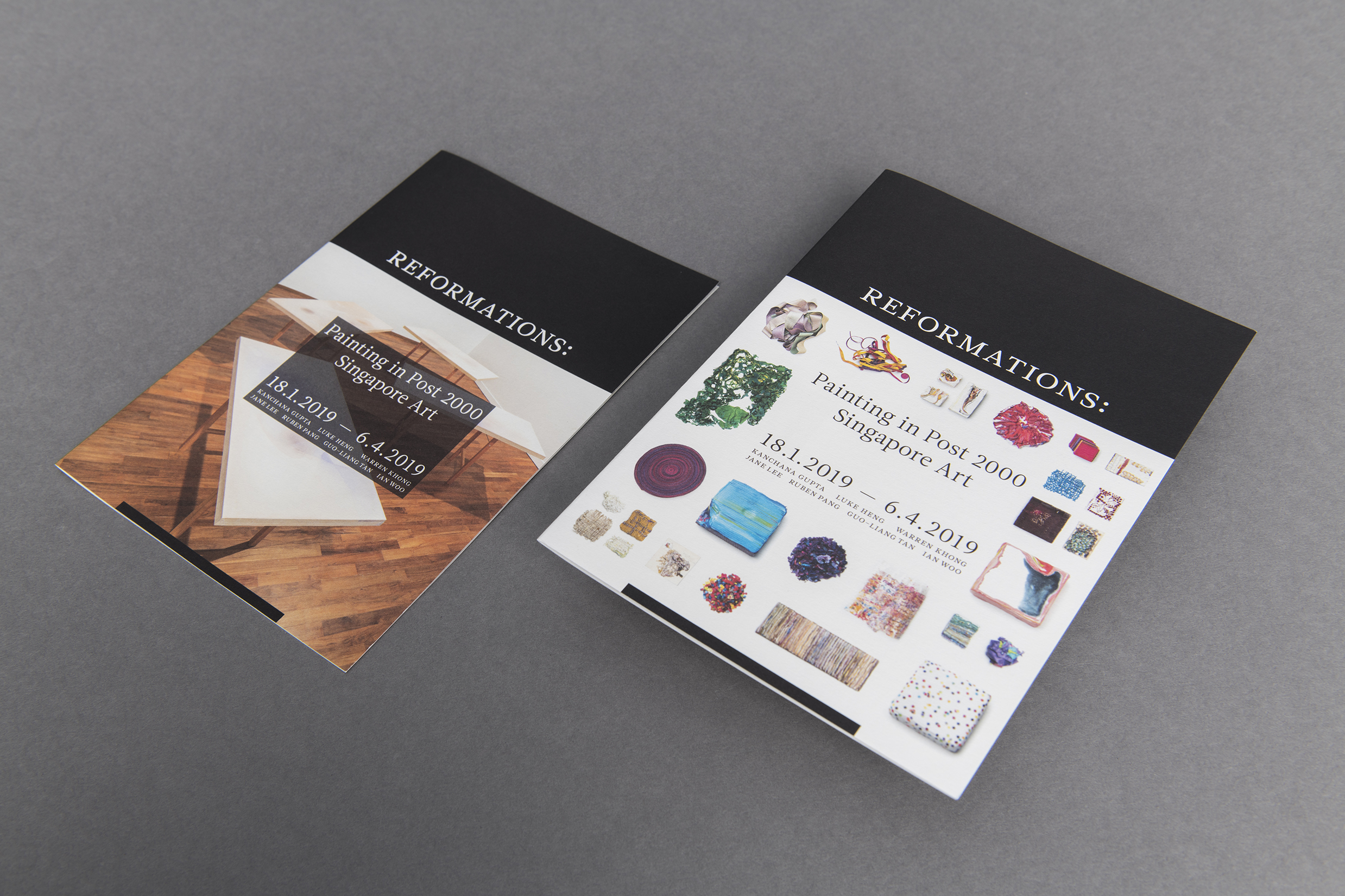
With the turn of the century, Singapore contemporary art of the 2000s has largely witnessed a shift from medium-specific art-making to artists working in interdisciplinary and new media practices. The exhibition Reformations: Painting in post 2000 Singapore Art held at ADM Gallery in Nanyang Technological University is a survey of artists whose works respond to the medium of paint, and are distinct through their investigation of materiality and methodology in painting. At times, they cross into expanded dimensions that encompass installation, sculpture, site-specificity, along with other propositions for image-making. Featuring artists Kanchana Gupta, Luke Heng, Warren Khong, Jane Lee, Ruben Pang, Guo-Liang Tan and Ian Woo, the exhibition is an attempt, and precursor for a proposition towards a successive generation of “post-modern” painting.

The exhibition identity features a bold black box; the abstraction and figuration of the very idea of what a canvas represents. This concept responds to the featured works in this show which suggest a reflexivity and reformation of the ways where meaning and representation may occur within the medium that may yet be a starting point to imagine the forms of progression in Singapore painting.


Sound & Vision

2019

Sound & Vision, a group exhibition presented by FOST Gallery features works from Zul Mahmod, Ng Joon Kiat, Wyn Lyn Tan and Ian Woo.

Curated by Michelle Ho, the exhibition presents artists working in conditions of abstraction, highlighting the means of composition in their art making that engage with notions of repetition and rhythm, tonality and intensity, and unity and dissonance, and how these are being interpreted in artistic practices across mediums.

Music and painting are interconnected in some ways, a premise that has been a recurrent proposition in the history of painting. The exhibition identity we designed draws inspiration from sound waves, presenting affinities and corresponding relationship between the depictions of image and sound.


Studio Flex

2018

Studio Flex is one of Asia's leading designer furniture store and manufacturer. The concept of the identity is a nod to the studio's promise, to 'Make Function Beautiful'; achieving the perfect notes between form and function whilst deriving holistic solutions for their clients. The result is a bold and confident monotone brand-mark, mirroring and emphasising the effortless clarity of this balance.


Hovie

2018

Hovie is a Shenzhen based international media group with vested interests in film production, event strategy, media promotions and film related investments. We was tasked to rebrand the company, giving it a new image of confidence and flair that would resonate with its clientele comprising media personalities, multi-national firms, and government bodies.

The logo features a central symbol resembling a ray of spotlight. Used as a encasing device, it houses their key word mark in both Mandarin & English. The straightforward beacon-like logo speaks boldly of their company's vision; to be in the lead and focal point of the region's burgeoning media industry.


Animation done in collaboration with Semicolon


108 Brothers

2017

108 Brothers <108 兄弟> is a new brand of beer launched in China by parent beer company Yanjing Beer <燕京啤酒>, targetted at the younger generation of consumers. We were approached to design the branding and packaging, as well as engage the client in a year long market testing and launch of this new product.

Inspired by the Chinese classic Shui Hu Zhuan <水浒传> which is considered one of the four great classical novels of Chinese literature, it tells a tale of how a group of 108 outlaws gather at Mount Liang to form a sizable army before they are eventually granted amnesty by the government and sent on campaigns to resist foreign invaders and suppress rebel forces.

The essence of the tale is based on the strong brotherhood, loyalty and friendship amongst the characters, qualities which are extremely relevant in the urban packed environments of today's Chinese big cities where many people leave their hometowns and congregate from all other parts of the country in search of work; their closest sense of kin are through these bonds formed with the new friends they make.

We designed the brand mark around a fist bump; a universal symbol for brotherhood and shared values, an invitation to form a bond by having a drink together which revolves around the tagline <我不靠山,我靠兄弟>. 108 characters were illustrated based on characters in the novel, which were used to create 108 different beer can packagings.


Electric 8

2017

Electric 8 is a Singapore based, hands-on, digital consultancy that specialises in Product, UX, Design and Growth. We were approached to create a branding identity for this exciting startup which targets clientele at post-revenue stage looking for a formulaic way to scale their businesses.

Right off the back, we wanted to inject a sense of confidence, a less in your face undercurrent that shouts of the soul & energy associated with this forward–thinking firm through the design of the identity.

We crafted a contemporary and disciplined word mark that plays upon the notion of negative space; transforming the brand mark as a vehicle and container which depicts the subtle underlying buzz. The identity intelligently takes on whatever background colour and imagery it sits upon, a nod to how flexible and adaptable the firm's capabilities are.


Xun Tea

2017

Xun Tea (寻茶) is a new tea brand based in Beijing, China, targeting the gifting market. We were approached to design the brand identity and packaging for this new brand.

Inspired by the imagery portrayed in the painting Wanderer above the Sea of Fog by Caspar David Friedrich, we wanted to capture the spirit of adventure and curiosity embedded within an explorer, and project the understanding of how new experiences brings forth a new way of seeing the world around you into the brand. Through this, we created a brand personality called Mr Xun (a play on the phonic of the chinese word '寻', which means to seek). Through Mr Xun's journeys around the world, he brings back new and exotic teas as gifts; through his teas, you are connected with the world.


Uber Vernacular

2018

Featuring the works of faculty members and students from the School of Art, Design and Media’s photography department, the exhibition explores how notions of place, and their ever-changing facets that are subjected to individual and collective experiences, can open themselves to other domains of inquiry, from the social and the cultural, and to the personal and the political.

Drawing upon the unique characteristics that define environments, habitats and spaces, each presentation in UBER-VERNACULAR can be seen as an observation, a reflection or a meditation on the manifold languages that can define the essence of a place across memory, space and time.

We designed the brand mark and collaterals to embody the spirit of this exhibition; utilising a typeface with distinct slants and offbeats to punctuate, reflecting how the common language and culture of a place when seen and presented through the lens of photography offers a shift in perspective.


What Is Essential Is Invisible To The Eye: Works of Lyota Yagi

2018

What is Essential is Invisible to the Eye, held at ADM Gallery of NTU School of Art, Design & Media, presents the works of Lyota Yagi which traverses a wide range of media and deconstructs their conventional modes of usage and reception. Central to his investigation of the properties of sound is how this ephemeral medium intersects with object-making in art, at times creating unforeseen forms of representation beyond the visual domain, providing viewers glimpses of the invisible aspects of the everyday through the experience of art, as well as conjuring one's imagination and ways of encountering that which may be inherently known, but often unseen.

We designed the exhibition brand mark using negative space to highlight and suggest what is actually there; an illusion which forces the viewers to imagine and fill in the gap, bridging the experience of what is invisible yet essential.


The print collateral builds upon the concept of 'encountering the invisible'. Hidden in the negative space within the exhibition brand mark is a mini exhibition catalogue that is saddle-stitched, stuck down and flushed with the top surface.