Singapore Children’s Society Annual Report 2024

2025

Our design for the 2024 Annual Report for Singapore Children's Society, Quiet Efforts, Visible Change, draws inspiration from the quiet resilience and strength of nature. Central to the visual narrative is a flourishing tree, its roots anchored by the unwavering dedication of the Society’s staff, who work tirelessly behind the scenes to create a nurturing and safe environment. The tree’s sturdy base and vibrant canopy symbolise an interconnected system of care, where every thoughtful act, no matter how small, contributes to visible, lasting impact.

Illustration forms the heart of this year’s design approach. While imbued with a playful, child-like spirit, the style is carefully calibrated for adult readers, balancing warmth and professionalism. Smiling plants and harmonious colour palettes highlight the happiness and well-being of children and families touched by the Society’s work, reinforcing the idea that while the efforts may be quietly carried out, their outcomes are unmistakably transformative.

To meet the needs of today’s digital audience, the report is presented as an interactive PDF, enhanced with clickable links and designed with mobile readability in mind. This thoughtful integration of design and functionality ensures that the report is as accessible and engaging as it is impactful, mirroring the Society’s own commitment to seamless, compassionate service.

Read annual report here.

Singapore Children's Society Annual Report 2024

Glisten

2024

Glisten is the seventh instalment of the Ng Teng Fong Roof Garden Commission series, showcasing the work of internationally renowned artist Lisa Reihana. We were commissioned by National Gallery Singapore to design the accompanying catalogue, reflecting the intricate beauty and celebratory spirit of the artwork.

The sculpture itself, composed of over 114,000 shimmer discs and an evocative soundscape of wind chimes, responds dynamically to sunlight and wind, creating a multi-sensory experience. This interplay of light, movement, and sound inspired the publication’s design, which captures the sculpture’s kinetic energy and cultural resonance.

Intricate patterns drawn from Songket and Māori Tāniko weaving traditions are a recurring motif throughout the book, extending across the pages like a rich, continuous tapestry of colours and textures. These patterns not only reflect the visual identity of the artwork but also honour the meeting of Southeast Asian and Aotearoa traditions that underpin Reihana’s practice.
A vibrant spectrum of colours and dynamic graphic elements give the catalogue a sense of movement, echoing the shimmering surfaces of the sculpture. Layering, depth, and repetition create shifting vantage points, inviting readers to engage with the pages as they would with the sculpture itself; actively, thoughtfully, and with wonder.


Glisten by Lisa Reihana

On The Mat with Yee I-Lann

2024

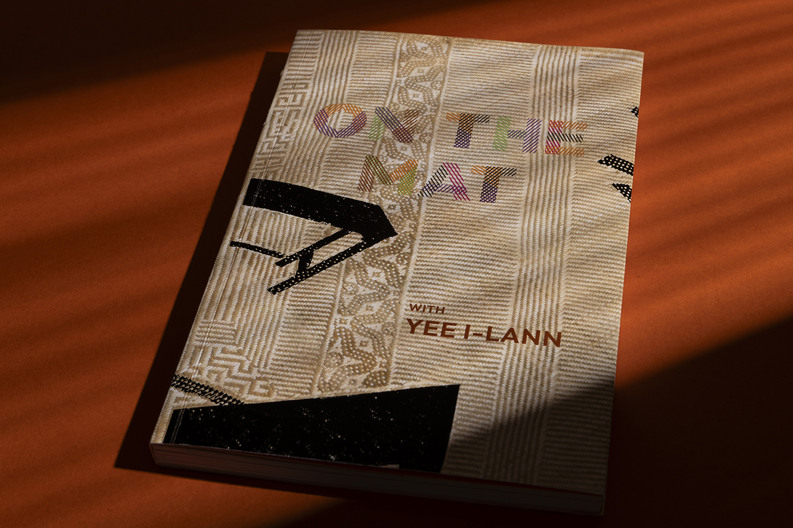
Commissioned by the Singapore Art Museum, we designed the exhibition catalogue for Yee I-Lann: Mansau-Ansau, a publication that invites readers to explore the textured aesthetics of the Sabah-born artist's versatile practice. Yee I-Lann's work spans photomedia, batik, weaving, and video, reflecting two decades of engagement with critical themes like colonial critique, power, and politics, and their alternatives in egalitarian forms, language, and economies.

Mansau-Ansau in Dusun (the language of the Dusun and Kadazan of Sabah) means to walk without a predetermined destination. It evokes a wandering path that welcomes chance and possibilities. Translated into a weave, it manifests as a pattern without pattern, a pattern that follows its own rhythm. The design concept was inspired by the curatorial vision articulated by lead curator June Yap: "The book is like a mat – a place to be in each other's presence, to give space, and to engage." This idea of the mat, not only as a woven form but as a space of connection and exchange, became the guiding metaphor for the publication's structure, aesthetic and textural influence.

Titled On The Mat with Yee I-Lann, each chapter begins with a bold, vibrant colour, creating a visual rhythm that reflects the dialogue between regional and international voices, including writers, curators, and critics. These sections seamlessly transition into spreads featuring beautifully reproduced full-colour images of Yee’s works, offering a rich interplay of textual and visual narratives.

The design emphasises both the tactile and conceptual qualities of Yee’s practice, echoing the interwoven threads of the mat while giving prominence to the layered philosophies underpinning her art. The result is a publication that not only complements the exhibition but also stands as a reflection of Yee I-Lann’s enduring legacy and the critical conversations her work inspires.


On The Mat with Yee I-Lann

Write a Christmas Card 2024

2024

#WriteaChristmasCard is our studio's yearly self-initiated campaign to encourage people to send a handwritten note or a card to someone they care about for Christmas. Through the joy of receiving a beautiful and uniquely themed card from us, we hope it in turn inspires the recipients to do the same.

For the 13th edition of this series, we’ve reimagined festive cheer with an out-of-the-mould design that features a cleverly concealed secret compartment housing whimsical thing-a-ma-jigs; an invitation to unwrap wonder and the magic of Christmas.


Write a Christmas Card 2024

Meyer Blue

2024

Blue has no dimensions; it is beyond.
— Yves Klein

The colour blue represents both the sky and the sea and is associated with freedom, imagination, and inspiration. The blue dimension, much like the sea itself, is an invitation to transcend the ordinary and immerse oneself in a realm where luxury knows no bounds.

To launch the new freehold luxury waterfront property MEYER Blue by UOL Group Limited and Singland, we crafted a branding strategy that revolves around creating an immersive, experiential luxury that redefines expectations. This approach transcends conventional marketing, encompassing above-the-line, below-the-line, showroom, print, and digital platforms, ensuring a cohesive and memorable experience across every touchpoint.

The experiential branding strategy is meticulously crafted to resonate with discerning clients who seek not just a home, but a lifestyle. This involves curating experiences that appeal to their senses, with bespoke interactions that showcase the property's distinct architectural design, premium features, and waterfront views.

On top of that, we created a VIP package, designed to offer potential buyers an exclusive and personalised preview in the showroom, evoking the essence of luxury living.

Visit Meyer Blue Digital Experience here


Meyer Blue
Meyer Blue
Meyer Blue
Meyer Blue
Meyer Blue
Meyer Blue
Meyer Blue
Meyer Blue
Meyer Blue
Meyer Blue
Meyer Blue
Meyer Blue
Meyer Blue
Meyer Blue
Meyer Blue
Meyer Blue

Pinetree Hill

2023

Pinetree Hill is more than just a home; it is a sanctuary where nature, design, and lifestyle converge seamlessly. Nestled within the exclusive Mount Sinai neighbourhood, this property embodies the perfect blend of urban sophistication and the restorative embrace of nature. To launch this new nature inspired property by UOL Group Limited and Singland, we drew inspiration from the core concepts of A Desired Locale, Elevated by Nature, and Honed to Perfection, crafting a comprehensive, multi-channel branding that reflects an aspirational lifestyle for discerning homeowners who seek balance, beauty, and serenity.

A modern and elegant wordmark was crafted using stylized pine tree motifs within the letterforms. The logo represents both exclusivity and the natural inspiration behind the development. A harmonious blend of forest green, earthy taupe, and soft gold, accented with touches of bright tones create a colour palette that echoes the natural surroundings and luxurious living experience. Our scope covers the full visual identity package, Above-The-Line and Below-The-Line campaign, digital platforms, showroom design and all print media.

We also created an unconventional experiential touchpoint for the showroom gallery in the form of a nature bathing walkway; a sensory prelude to the main showroom gallery. An immersive panoramic forest walkway greets visitors as they walk through light filtering in from the canopy, taking in the earthy pine scents, and listening to the gentle rustling of leaves, immersing them in the restorative essence of nature.

Visit Pinetree Hill Digital Experience here


Pinetree Hill
Pinetree Hill
Pinetree Hill
Pinetree Hill
Pinetree Hill
Pinetree Hill
Pinetree Hill
Pinetree Hill
Pinetree Hill
Pinetree Hill
Pinetree Hill
Pinetree Hill
Pinetree Hill
Pinetree Hill
Pinetree Hill
Pinetree Hill
Pinetree Hill
Pinetree Hill
Pinetree Hill
Pinetree Hill
Pinetree Hill

9th Singapore International Photography Festival

2024

The 9th Singapore International Photography Festival (SIPF) organised by DECK explores the conscious mind as a repository of memories, emotions, and fleeting moments, much like a collection of photographs. To embody the festival's title, In Search of Lost Time, the branding concept we designed employs portals in motion as a central visual metaphor, representing the passage of time and the ephemeral nature of memories. These portals, applied across all print, digital and spatial assets, act as windows into the various exhibits and themes, where fragments of recollections briefly surface through a fog of time before fading away, evoking the sensory and emotional experience of memory itself.

As a dynamic asset, the portal's shape and animation evolve across mediums by expanding, contracting, or gently oscillating—mimicking the fluid nature of memory. Each venue in the festival adopts a distinct colour scheme, reflecting a unique emotional tone or thematic focus. We also reworked the festival's brand mark, balancing modern minimalism with subtle distortions through stretched or faded letterforms to mimic breath and pause, allowing readers to linger on each word as they would on a photograph. All these touchpoint work together to reinforce the festival’s sensory identity, guiding audiences on a multi-layered journey through time.


9th Singapore International Photography Festival

OH! Kampong Gelam: Palimpsest

2024

OH! Kampong Gelam: Palimpsest (2024) by OH! Open House is a guided art walk that explores how maps have constantly rewritten the story of Kampong Gelam, also known as Singapore’s Muslim Quarter. Prior to colonisation by the British in 1819, the area was home to the Malay aristocracy of Singapore. 12 site-specific art installations leads visitors to understand and unearth stories within this neighbourhood.

Lines and boundaries, scraped and scratched into the surface over and over, until they blend into a palimpsest of fickle lines and faithless memories. For each road drawn, each building gazetted, each heritage plaque erected, there is a missing story that speaks of fractured spaces and communities long gone. This neighbourhood still holds its scars, scrapes and scratches, its dreams and tragedies.

The visual identity we've designed for this art walk centres around the concept of 'palimpsest', defined as something reused or altered but still bearing visible traces of its earlier form. The 'patchwork map' visuals draws references from the historical context of this neighbourhood, how maps, plans and blueprints have remade this place again and again, in spite of, and against the lived experiences of the community.

Along the road of Sultan Gate sites the ruins of Pondok Jawa, a former lodging house for the Javanese in Kampong Gelam. That was also the previous site of the famous Banyan tree, a community landmark which has since fallen. We've incorporated the cross section of a tree as a platform for storytelling, personifying the unfolding of the hidden narratives of these contested spaces and displaced communities. The visual language is applied across all key channels such as the field-kit, digital communication materials and way-finding prints.


OH! Kampong Gelam: Palimpsest

S.E.A. FOCUS 2024

2024

S.E.A. Focus is a leading showcase and art market hub dedicated to Southeast Asian contemporary art. It aims to bring together a fine curation of established and emerging artistic talents to foster a deeper appreciation of contemporary art and artists in the region.

In the realm of information processing, the human brain stands unparalleled in its capacity for parallel multitasking, effortlessly synthesising colour, motion, and form. Conversely, computers, while exacting, operate in a methodical, stepwise manner. As automation continues its trajectory, the implications of Artificial Intelligence surpassing human cognition loom large. What implications arise in such a paradigm? And to what extent would this emergent technology embody our collective history and ethos?

Curated by John Tung, Serial and Massively Parallel presents a curated assembly of regional artworks, each offering profound insights into our intrinsic human identity in the midst of an impending technological confluence.

We are proud to have been commissioned as the official brand designers for the third edition running, for this anchor event of the Singapore Art Week 2024.

To visually express the this year's theme, we pulled motifs from the S.E.A. Focus's existing logo mark to communicate the ideas of how rapid linear adaptations form networks and forge new multi-connections through the merging of systems. It is purposefully cinematic, meant to evoke the world of possibilities in art as a result of its co-existence with technology. For this edition, we also refreshed the vivid colour palette to reflect an expanding audience group with more youths being exposed to the world of Southeast Asian contemporary art. The brand identity is then further expanded to other expressive states across all print, digital, and environmental mediums.


S.E.A. FOCUS 2024
S.E.A. FOCUS 2024
S.E.A. FOCUS 2024
S.E.A. FOCUS 2024
S.E.A. FOCUS 2024
S.E.A. FOCUS 2024
S.E.A. FOCUS 2024
S.E.A. FOCUS 2024
S.E.A. FOCUS 2024
S.E.A. FOCUS 2024
S.E.A. FOCUS 2024
S.E.A. FOCUS 2024
S.E.A. FOCUS 2024


We are pleased to have also helped the main sponsor Bank of Singapore to design a lounge for their guests to enjoy throughout the event.


S.E.A. FOCUS 2024
S.E.A. FOCUS 2024
S.E.A. FOCUS 2024
S.E.A. FOCUS 2024

Write a Christmas Card 2023

2023

#WriteaChristmasCard is our studio's yearly self-initiated campaign to encourage people to send a handwritten note or a card to someone they care about for Christmas. Through the joy of receiving a beautiful and uniquely themed card from us, we hope it in turn inspires the recipients to do the same. This edition's theme is Santa Claws taking over the city, featuring an exploding function that is triggered via a pull tab, spraying cat confetti in the process!

C2A Creative Communication Awards 2024
Winner 2024 / Other Print (Magazines, Newspapers, Calendars) / Other


Write a Christmas Card 2023