2017
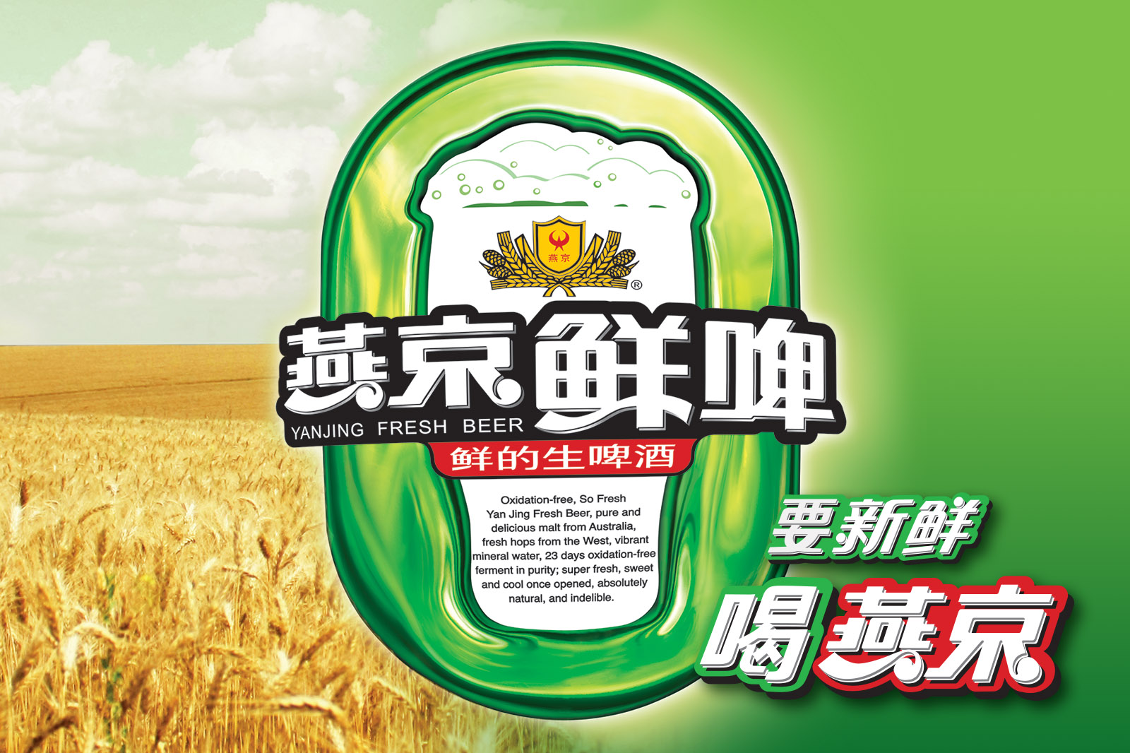
We were engaged by Yanjing Beer <燕京啤酒> to embark on a year long brand strategy rework and promotional advertisement campaigns design to improve consumer perception towards their brand, as well as to expand the target group of drinkers amongst the Guangzhou and Shenzhen audience by attracting more youths to their products.
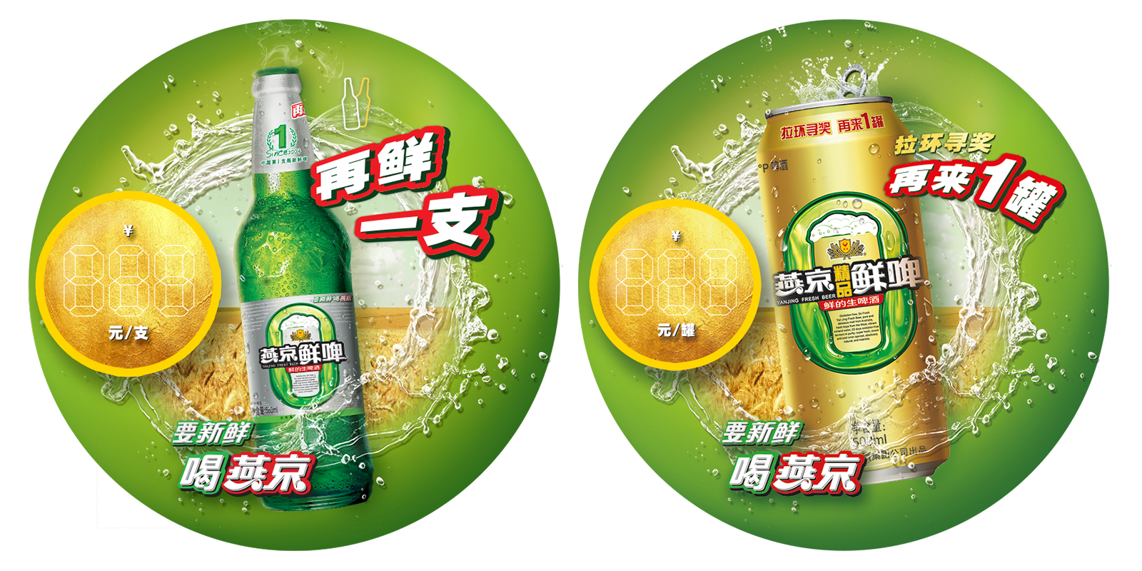
The strategy we devised involved a concurrent print and digital approach. To reach the masses quickly, we had to utilise a localised approach of targeting all the tens of thousands of distributers in the form of small & large retail shops, restaurants and bars. To achieve that, we created a print branding campaign to sell forth the idea of how freshness, or the idea of feeling fresh is co-related with the Yanjing Beer products under the tagline <要新鲜,喝燕京>. Promotional materials and point-of-sales materials were created and distributed all over the region to enforce the brand positioning.
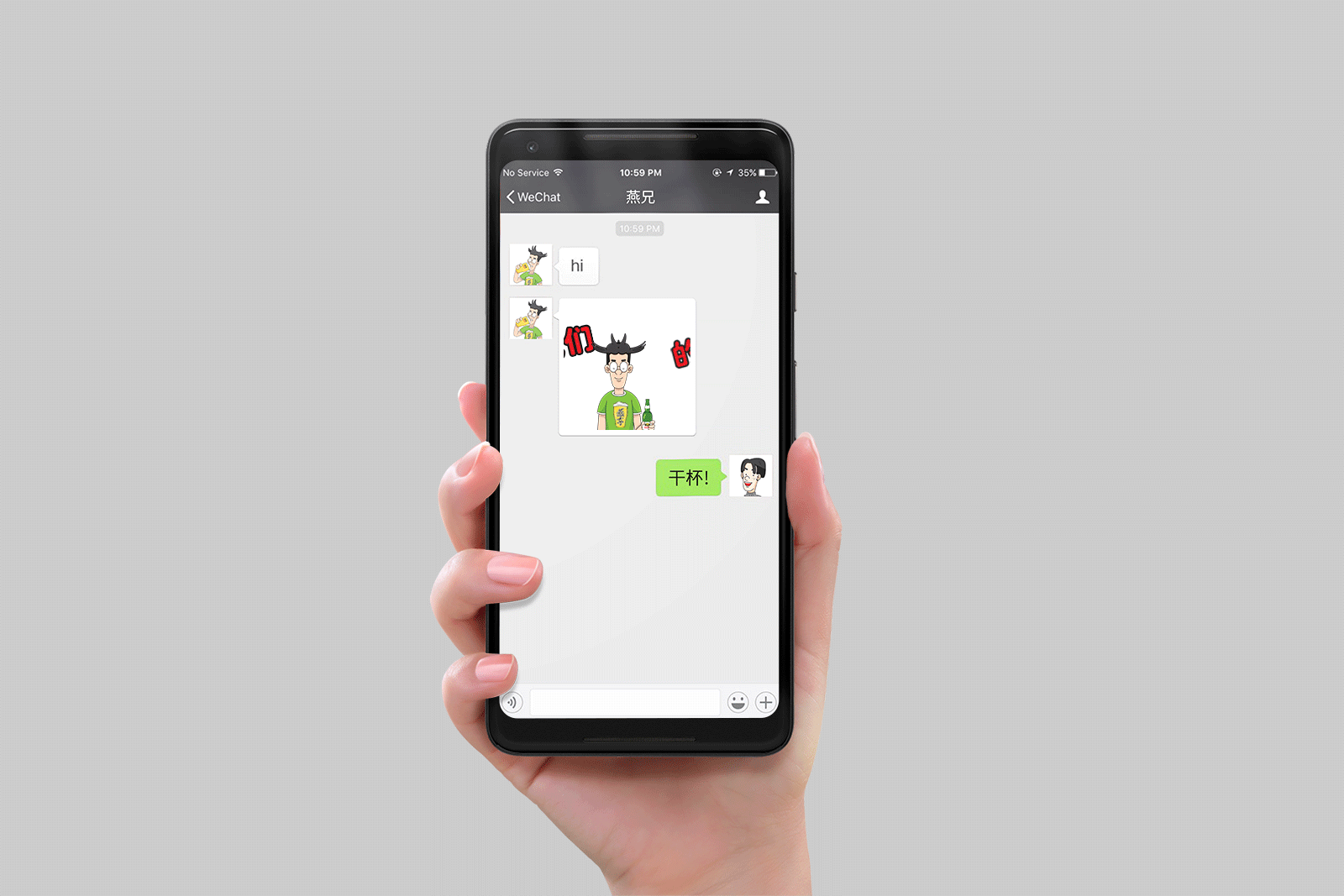
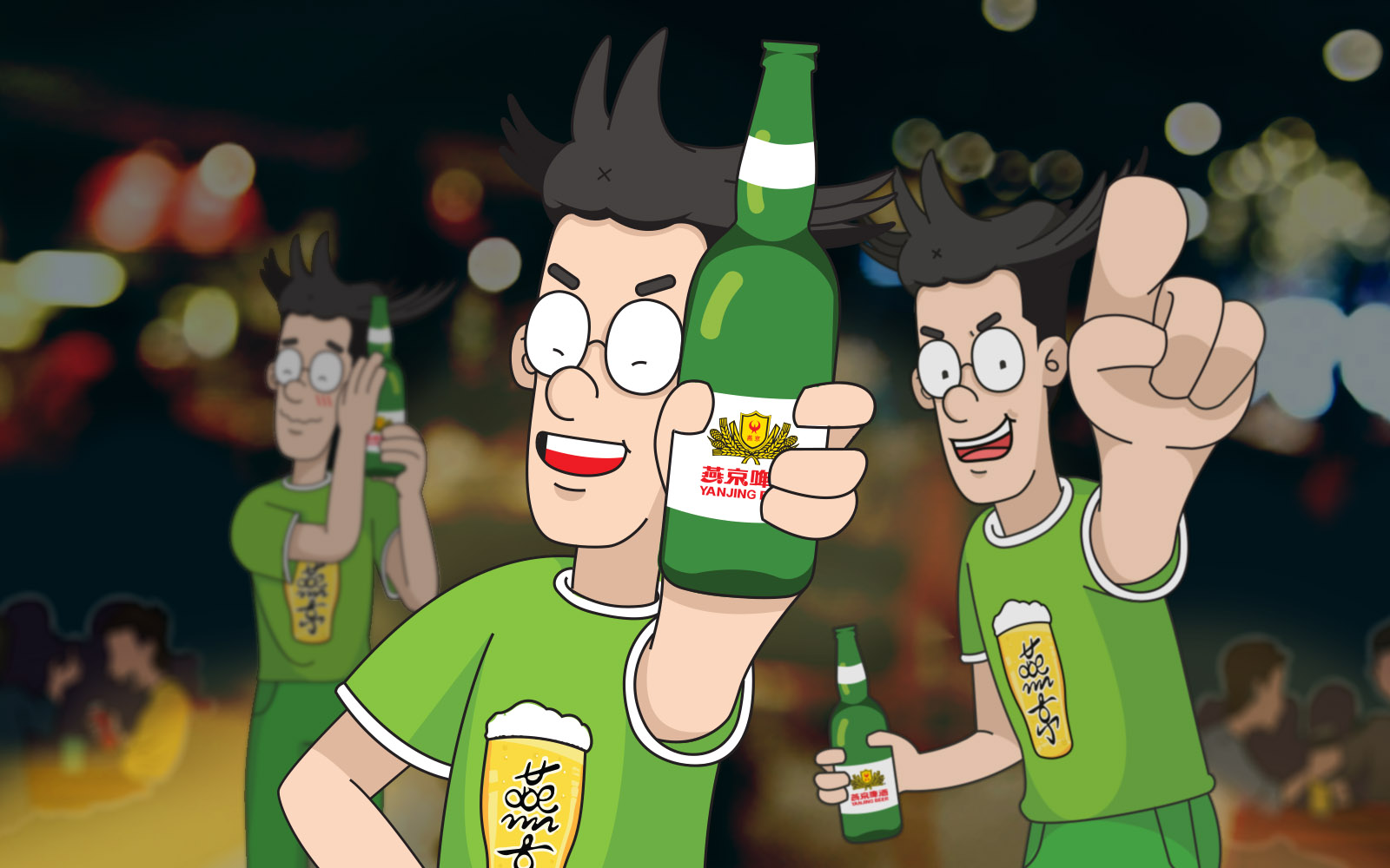
For the digital component, we launched a series of WeChat campaigns by creating a fictional character called the Yan ‘bro’ <燕兄>, the personification of the everyday guy. Two WeChat sticker <表情包> packs were also created and distributed to their followers that elaborates on the joys of having a beer with your friends, as well as the everyday life of people captured through whimsical emojis and quotes.
-800×1040")