Write A Christmas Card 2018

2018

TIRED OF FEELING LIKE A FOOL WHEN YOUR CHRISTMAS CARDS DON’T LOOK COOL? Our CHRISTMAS CARD PACKAGE is the answer!

For the forth edition of the our #WriteaChristmasCard project, we went full corgi and Christmas wonderland. Shine brightly this Christmas with a little help from Santa's favourite dog! Who needs Rudolph when you have the Christmas Corgi Cards!

Check out the 2018 edition here!

Revisit the past campaigns here: 2017 / 2016 / 2015

A series of Kitsch videos to promote this year's campaign.


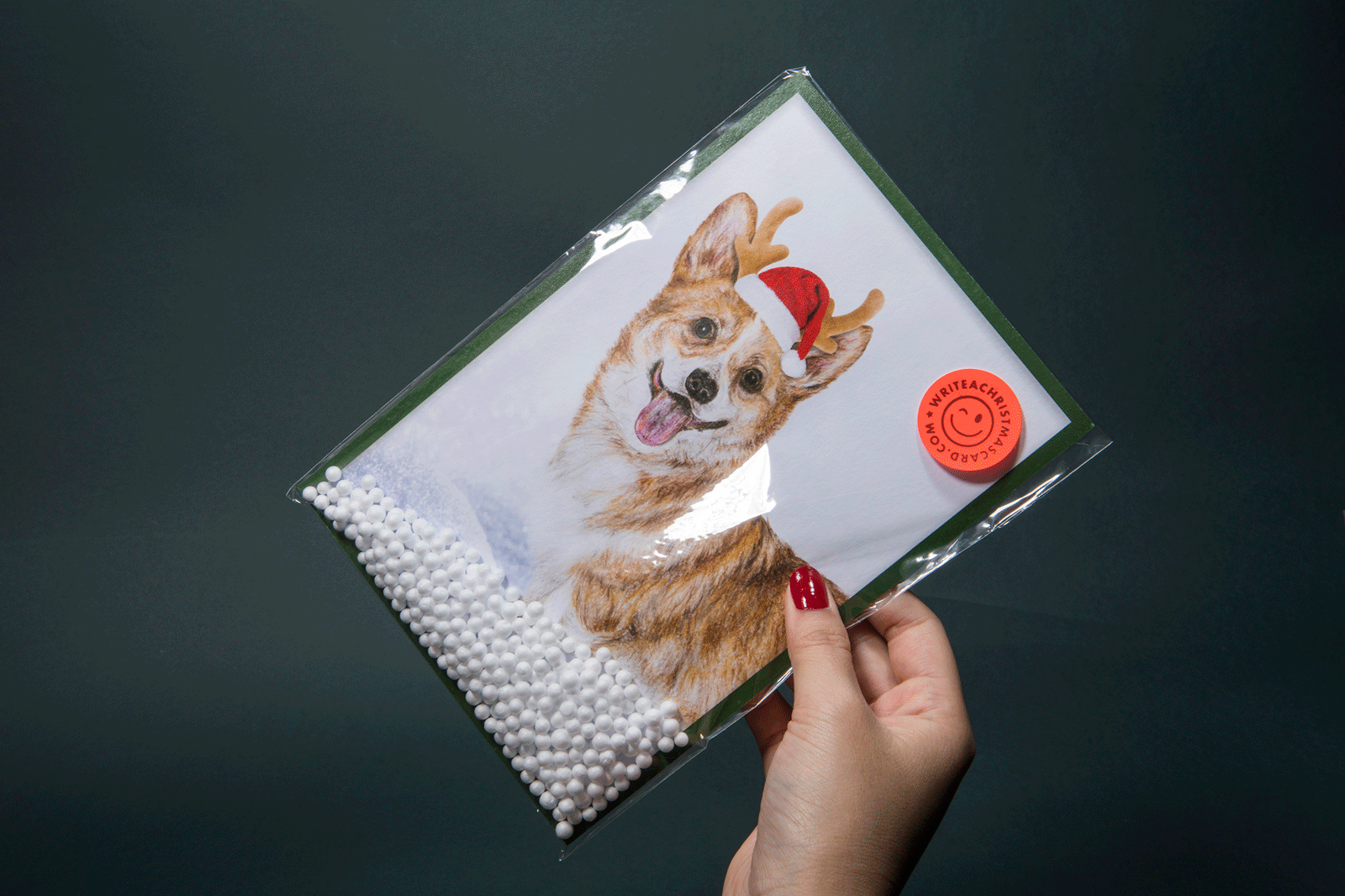
HO–HO–HOLY SH*T! It's a Corgi! You heard that right. No more boring old Santa — spice your Christmas up with these adorable corgis!


Tired of feeling like a fool when your Christmas cards don't look cool? Well, you've come to the right place!


Hey, there fella! Do you want your Christmas this year to be cool or do you want it to be A LOT COOLER? Blow all your friends' socks off by sending them our Christmas cards!


Having trouble finding the perfect Christmas card? Say no more! Well here comes the solution!


Tired of the same fat jolly old man? Out with the boring old Santa and welcome our adorable Christmas corgi!

ADM Show 2018

2018

A wave disturbs the status quo; it disrupts the surface – less like a ripple and more like a torrent. The anticipation of the next wave charging in, ready to break boundaries and venture into new grounds. That rush of adrenaline and excitement, knowing that there’s always something new brewing at the horizon, ready to hit the next coastline.

Bold. Audacious. Inspired. The 10th graduating batch from Nanyang Technological University’s School of Art, Design and Media presents the next generation of creatives: 164 movers and shakers you cannot ignore. These are the intrepid creators that stand at the ready; ready to take chances, and ready to heed their calling.

This is not just any graduation show. It is four years worth of cumulative work, blood, sweat and tears that come together over the span of a week; a celebration of each students’ creative journeys and the exciting waters that lay ahead for them to explore.

This is ADM Show 2018. This is The Next Wave.

admgradshow.com

DNA Paris Design Awards 2020 — Winners in Graphic Design/Branding category


We started the branding campaign by asking the question: what truly excites people?

Is it the next big idea? The next film? The next game changing innovation? It is always the idea of something new at the horizons that stirs up excitement. This year, the show’s identity reflects the motion of a wave rushing forward; the new creative energy within this graduating batch as they challenge themselves as the next wave of movers and shakers in the creative industry. Combined with bold, towering typography, it lends personality and helps to reinforce the boldness of the message.


A rich body of neon colours were utilised across all applications, demonstrating the elements of wonder in the creative process and highlights the energy that comes with new ideas.


The multi-layered format of the website showcases the multi-dimensionality of this ‘Next Wave’ of graduates.

 
Being part of the 'Next Wave', we wanted the graduating batch to fully express their hopes and dreams upon graduation through this photoshoot. The messaging reinforces the campaign, and these populate our social media platforms across the entire duration.


Exhibition Design

The exhibition itself is presented over two venues:
— National Design Centre & National Library.

We adopted a tiered and layered approach to constructing the exhibition booths which creates texture and excitement in the exhibition viewing experience.

The ‘Next Wave’ idea is also presented spatially through layered dynamic movements in the key visuals and typography which are applied onto wayfinding graphics such as gigantic totems, walls and pillars wraps, helping visitors navigate through the show.


Exhibition Design (National Library)

 
In collaboration with:

Video — Semicolon

Photoshoot — Photography and Interactive Media majors from the class of 2018

Build — Creative Bulb

A Land Imagined

2019

A Land Imagined 《幻土》, winner of the Golden Leopard at the 71st Locarno Film Festival is the second feature film by director Yeo Siew Hua. Set in industrial Singapore, police investigator Lok must is looking for missing migrant worker Wang. Wang suffers a worksite accident and is afraid of repatriation. Unable to sleep, he frequents a dreamy cybercafé in the dead of the night. Hoping to look for some form of human connection in this foreign land, Wang forms a virtual friendship with a mysterious gamer that takes a sinister turn. When Wang suddenly disappears, Lok digs deep into the trail leading to a land reclamation site and uncovers the truth beneath all that sand. In a diverse land where identity is inherently foggy, Yeo suggests that becoming another person is as easy as dreaming it.

The typeface on the titleblock references shimmering  waves and evokes the feeling of shifting landscapes.

Identity formation in Singapore is fluid and schizophrenic, like our ceaselessly shifting shorelines reclaimed from sand we appropriate from so many places. The colors and treatment of the poster reflects the connection and tension between all these people in the same imagined land responding to the imagined world.


SINGAPORE GALA PREMIERE


We also designed the red carpet gala premiere held at Cathay Singapore. It features a series of large backdrops with the photos of the main leads of the film and also the festival circuit the film has been on, showcasing the international film awards it has garnered in the process.


In Random Order

2019

In Random Order is an exhibition organised by FOST Gallery featuring artists Kray Chen, Heman Chong, Grace Tan, Syagini Ratna Wulan. Each body of work functions within a structure, physical or conceptual, which is determined by a set of rules and a unified composite of interrelated and independent modular parts. Each individual artist has found ways to re-delineate the spatial and temporal boundaries, circumventing or subverting the set order. The animated exhibition identity we designed for this show presents an evident order when viewed through an obvious pattern or sequence. The monochrome scheme of it further reinforces the duality between the arbitrary and structure.


REFORMATIONS: Painting in Post 2000 Singapore Art

2019

With the turn of the century, Singapore contemporary art of the 2000s has largely witnessed a shift from medium-specific art-making to artists working in interdisciplinary and new media practices. The exhibition Reformations: Painting in post 2000 Singapore Art held at ADM Gallery in Nanyang Technological University is a survey of artists whose works respond to the medium of paint, and are distinct through their investigation of materiality and methodology in painting. At times, they cross into expanded dimensions that encompass installation, sculpture, site-specificity, along with other propositions for image-making. Featuring artists Kanchana Gupta, Luke Heng, Warren Khong, Jane Lee, Ruben Pang, Guo-Liang Tan and Ian Woo, the exhibition is an attempt, and precursor for a proposition towards a successive generation of “post-modern” painting.

The exhibition identity features a bold black box; the abstraction and figuration of the very idea of what a canvas represents. This concept responds to the featured works in this show which suggest a reflexivity and reformation of the ways where meaning and representation may occur within the medium that may yet be a starting point to imagine the forms of progression in Singapore painting.


Sound & Vision

2019

Sound & Vision, a group exhibition presented by FOST Gallery features works from Zul Mahmod, Ng Joon Kiat, Wyn Lyn Tan and Ian Woo.

Curated by Michelle Ho, the exhibition presents artists working in conditions of abstraction, highlighting the means of composition in their art making that engage with notions of repetition and rhythm, tonality and intensity, and unity and dissonance, and how these are being interpreted in artistic practices across mediums.

Music and painting are interconnected in some ways, a premise that has been a recurrent proposition in the history of painting. The exhibition identity we designed draws inspiration from sound waves, presenting affinities and corresponding relationship between the depictions of image and sound.


Nat Wu Album Art

2018

Album art design for Singaporean musician Nat Wu for his brand new EPs <This Is Goodbye> & <喜歡你可不可以>.

Listen here on Spotify: 
<喜歡你可不可以>
<This Is Goodbye>


ADM Prospectus 18/19

2018

As the NTU School of Art Design & Media welcomes its new intake of students under its brand new undergraduates programmes of Design Art and Media Art, we designed this year's prospectus as a reversible book; Design Art to be read from the front and Media Art to be read from the back. The center dividing section houses the admission criteria and information.

The cover design features a portrait which is transformed through an illusion. The negative space carved by a difference in color reveals the imagery of a second face, with each colour representing Design Art and Media Art respectively. The book is then encased in a red plastic sleeve that hides the title of the book, only to reveal when the book is drawn out.

Cover Photography: Jasper Yu
Talent: Ang Geck Geck Priscilla


Epson

2018

We intend to craft a piece that charts the evolution of communication. Whether it is a classroom or boardroom, communication is in essence a presentation and sharing of an idea. Rather than focus on a direct comparison between projectors and FPDs, we intend to show how Epson's projectors are a step ahead of FPDs - the latter belonging.

This interactive video which requires the viewer to place a fingertip on the screen of the device the video is playing from, which conveys the intuitive and interactive nature of this new product.

In collaboration with Semicolon.


Directed and Produced by: Daniel Lee
Animation Supervisor: Daniel Lee

Design: Factory 1611
Animation: Daniel Lee, Sandy Mui, Genesis Motion
Written by: Jac Min

108 Brothers

2017

108 Brothers <108 兄弟> is a new brand of beer launched in China by parent beer company Yanjing Beer <燕京啤酒>, targetted at the younger generation of consumers. We were approached to design the branding and packaging, as well as engage the client in a year long market testing and launch of this new product.

Inspired by the Chinese classic Shui Hu Zhuan <水浒传> which is considered one of the four great classical novels of Chinese literature, it tells a tale of how a group of 108 outlaws gather at Mount Liang to form a sizable army before they are eventually granted amnesty by the government and sent on campaigns to resist foreign invaders and suppress rebel forces.

The essence of the tale is based on the strong brotherhood, loyalty and friendship amongst the characters, qualities which are extremely relevant in the urban packed environments of today's Chinese big cities where many people leave their hometowns and congregate from all other parts of the country in search of work; their closest sense of kin are through these bonds formed with the new friends they make.

We designed the brand mark around a fist bump; a universal symbol for brotherhood and shared values, an invitation to form a bond by having a drink together which revolves around the tagline <我不靠山,我靠兄弟>. 108 characters were illustrated based on characters in the novel, which were used to create 108 different beer can packagings.