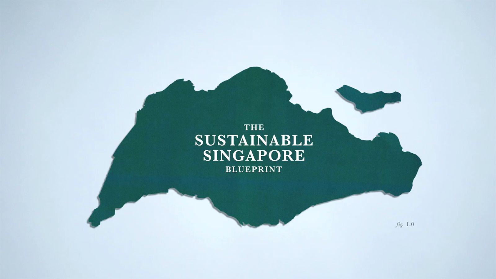


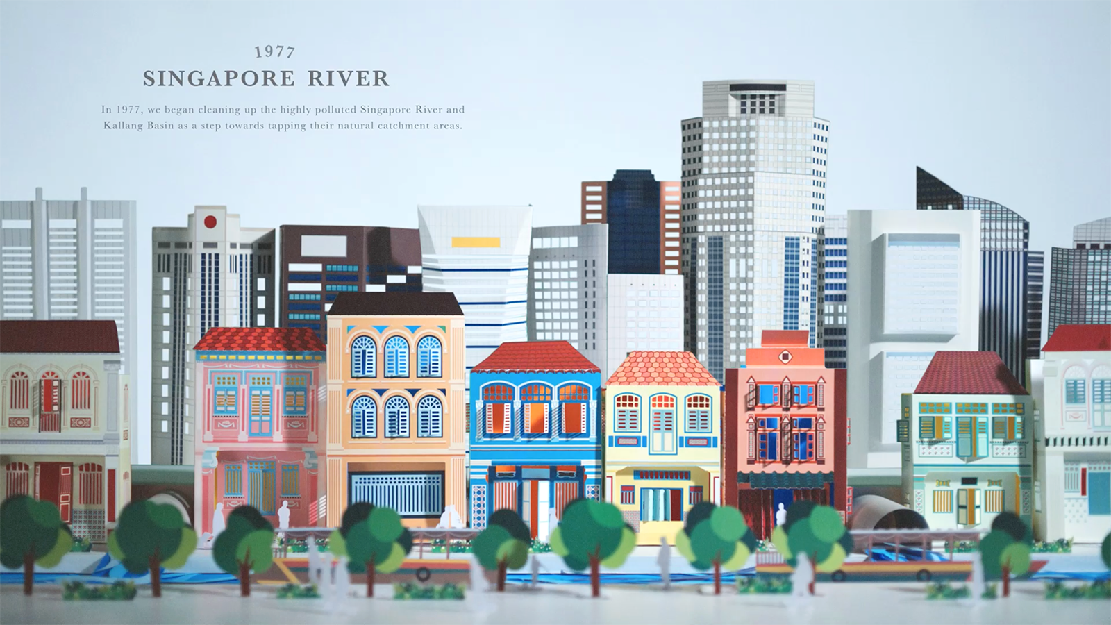

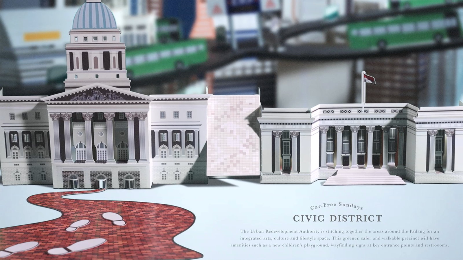
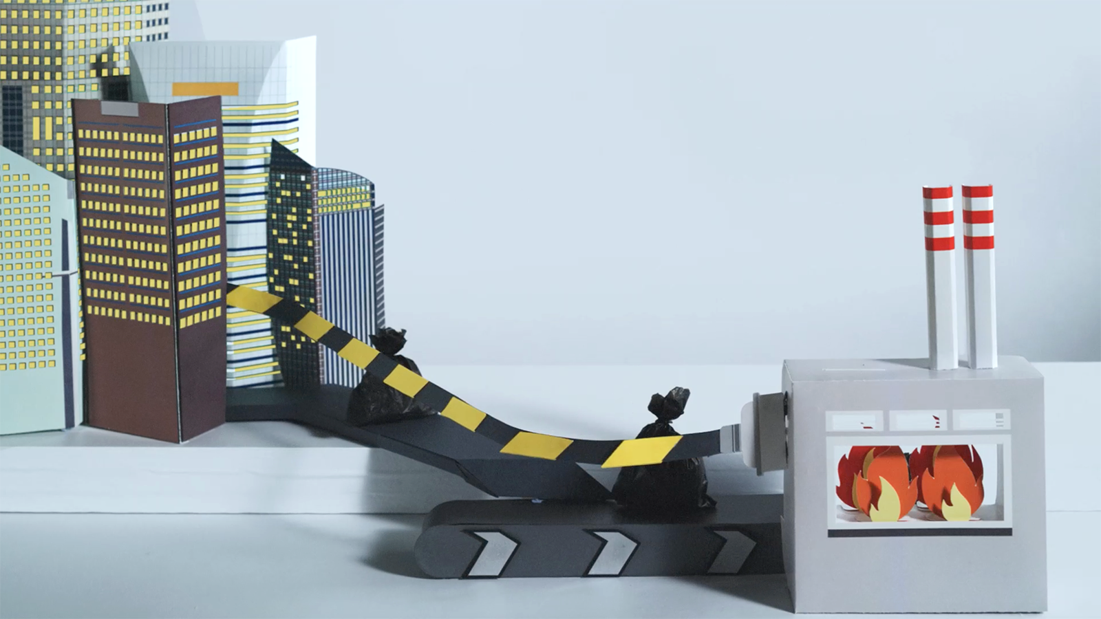
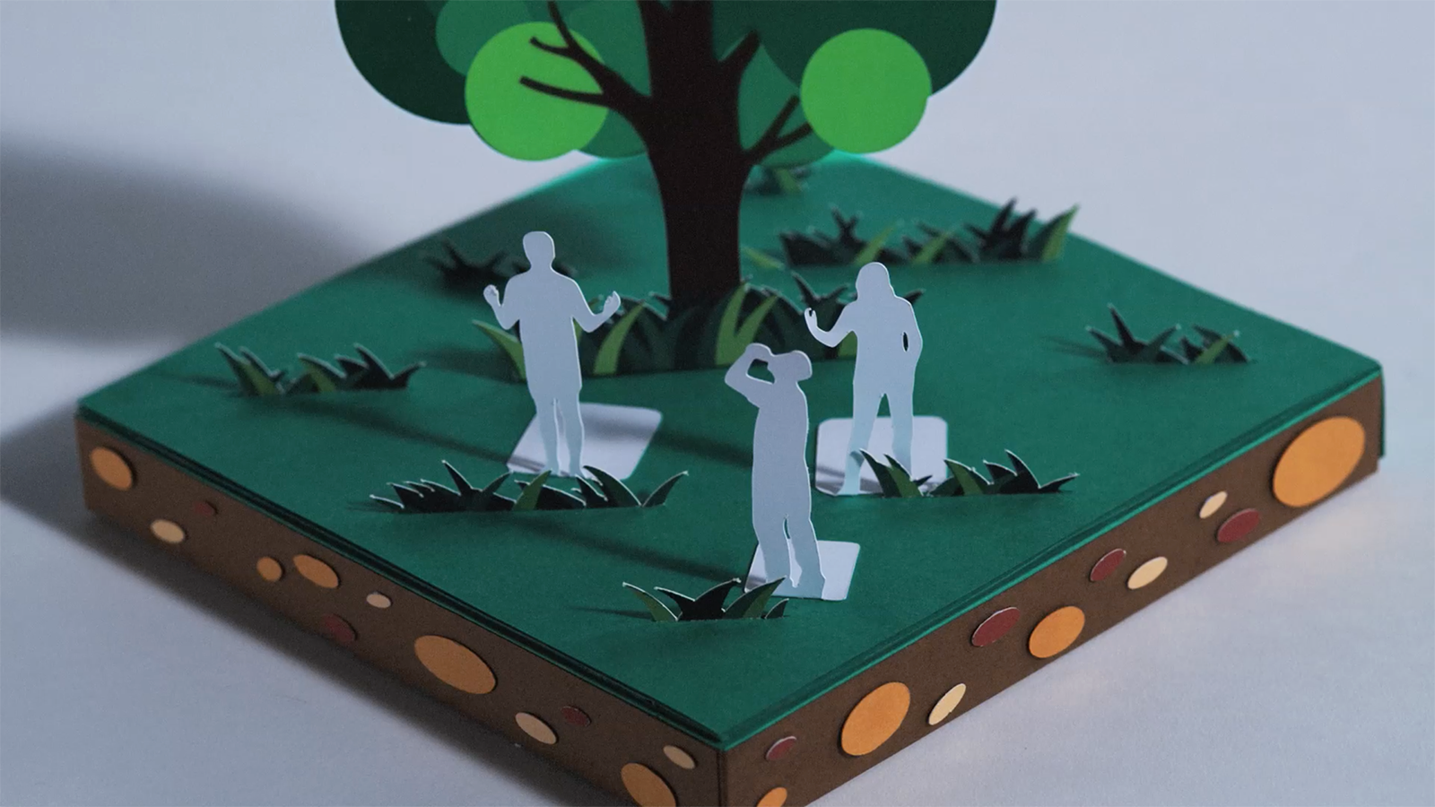
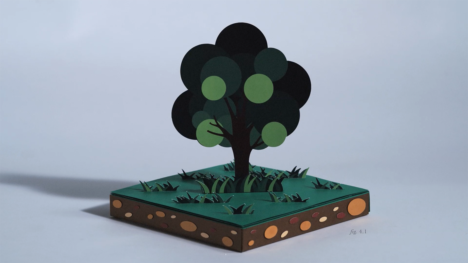

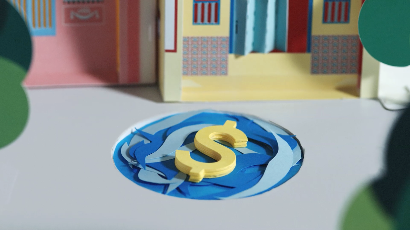
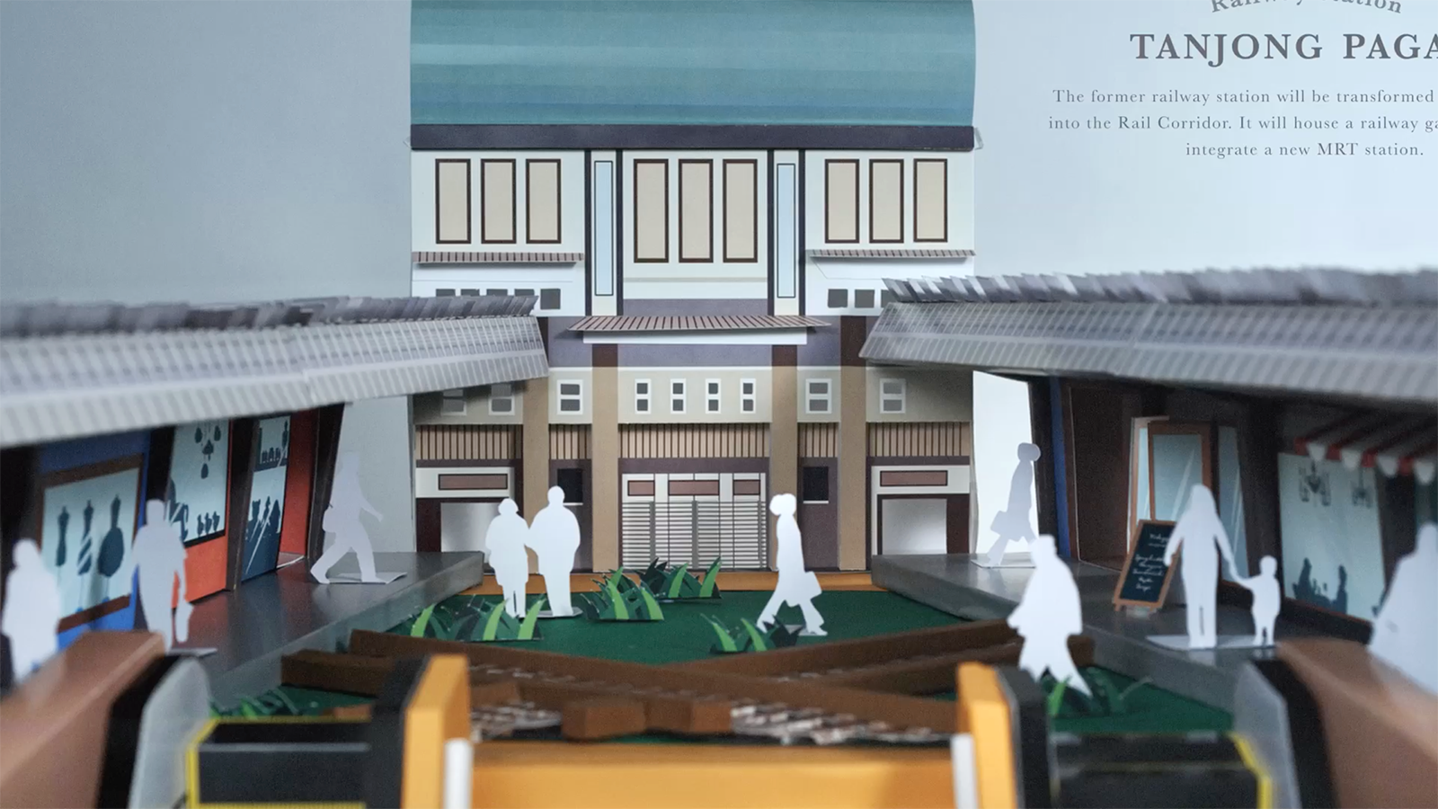
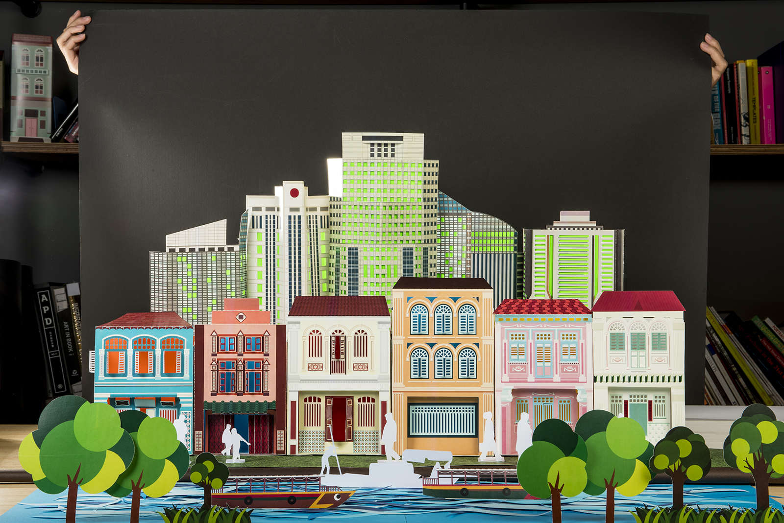
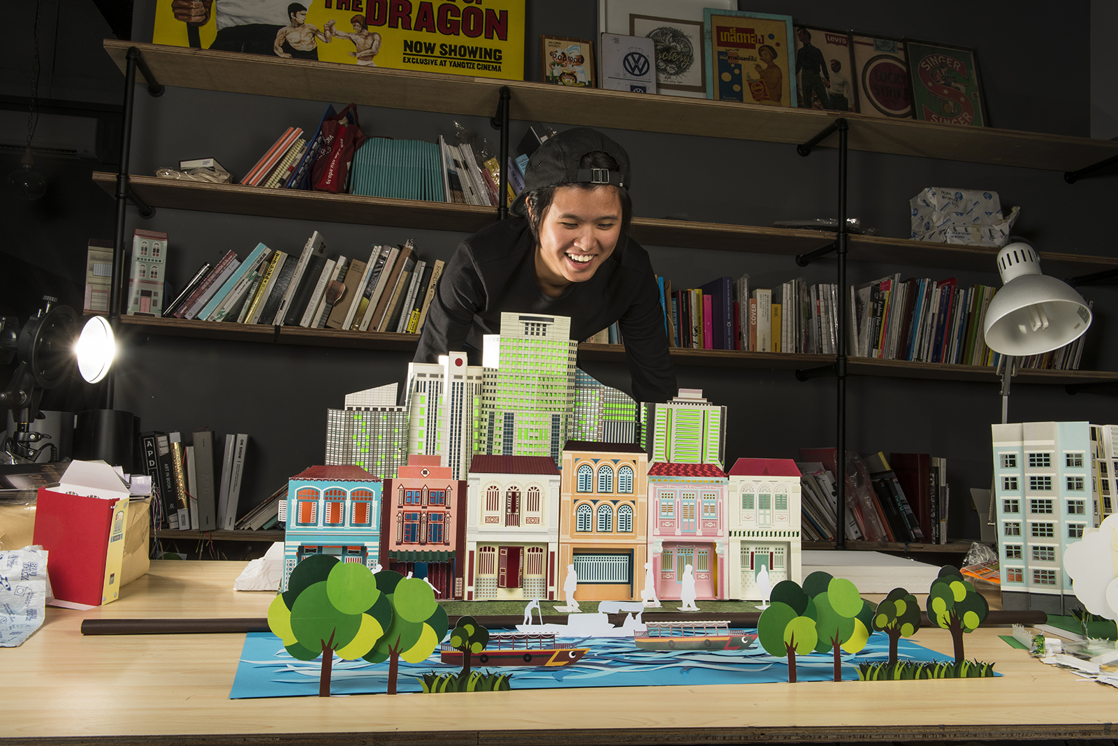
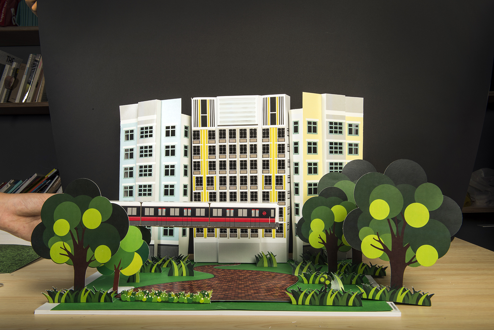
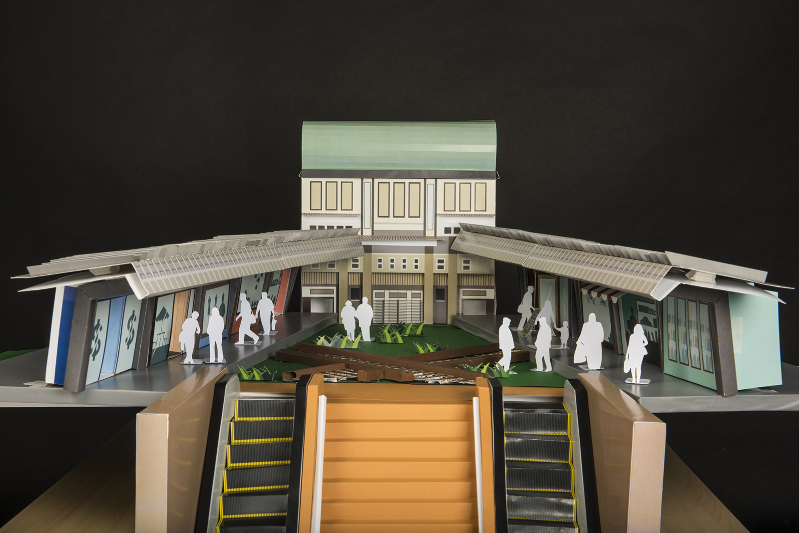
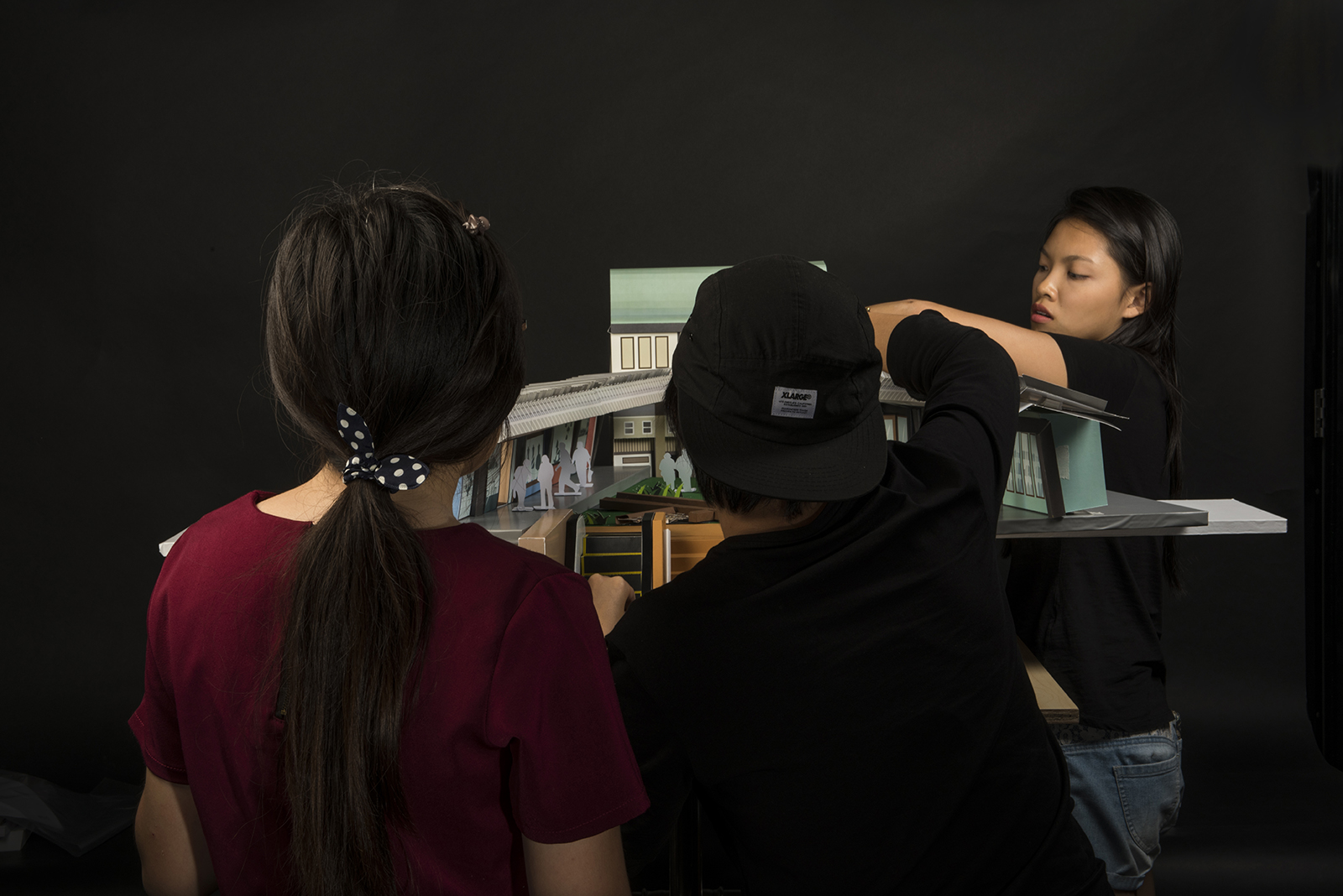

We were tasked to art direct, design and build the set for What if?, a brand film for the Sustainable Singapore Blueprint by the Ministry of the Environment and Water Resources, Singapore
We hand crafted a series of paper miniature sets that spanned over 10,000 frames for the duration of this stop-motion animation.
A collaboration with Semicolon.
Behind The Scenes
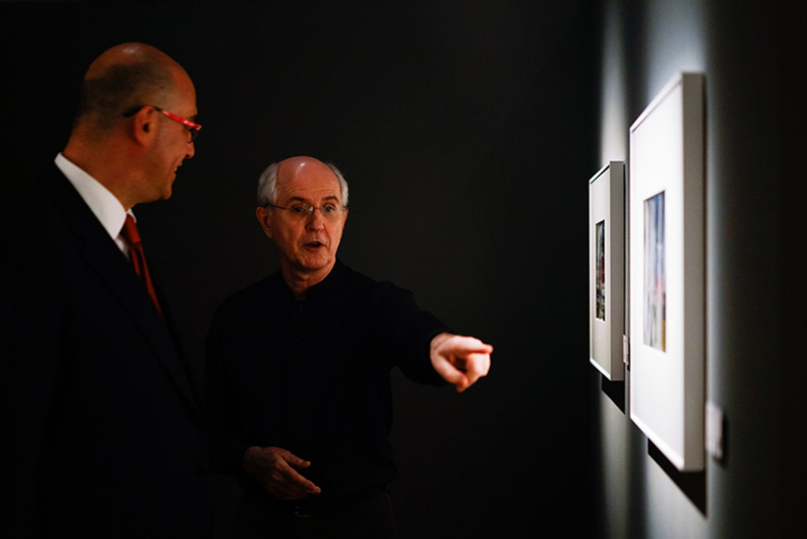
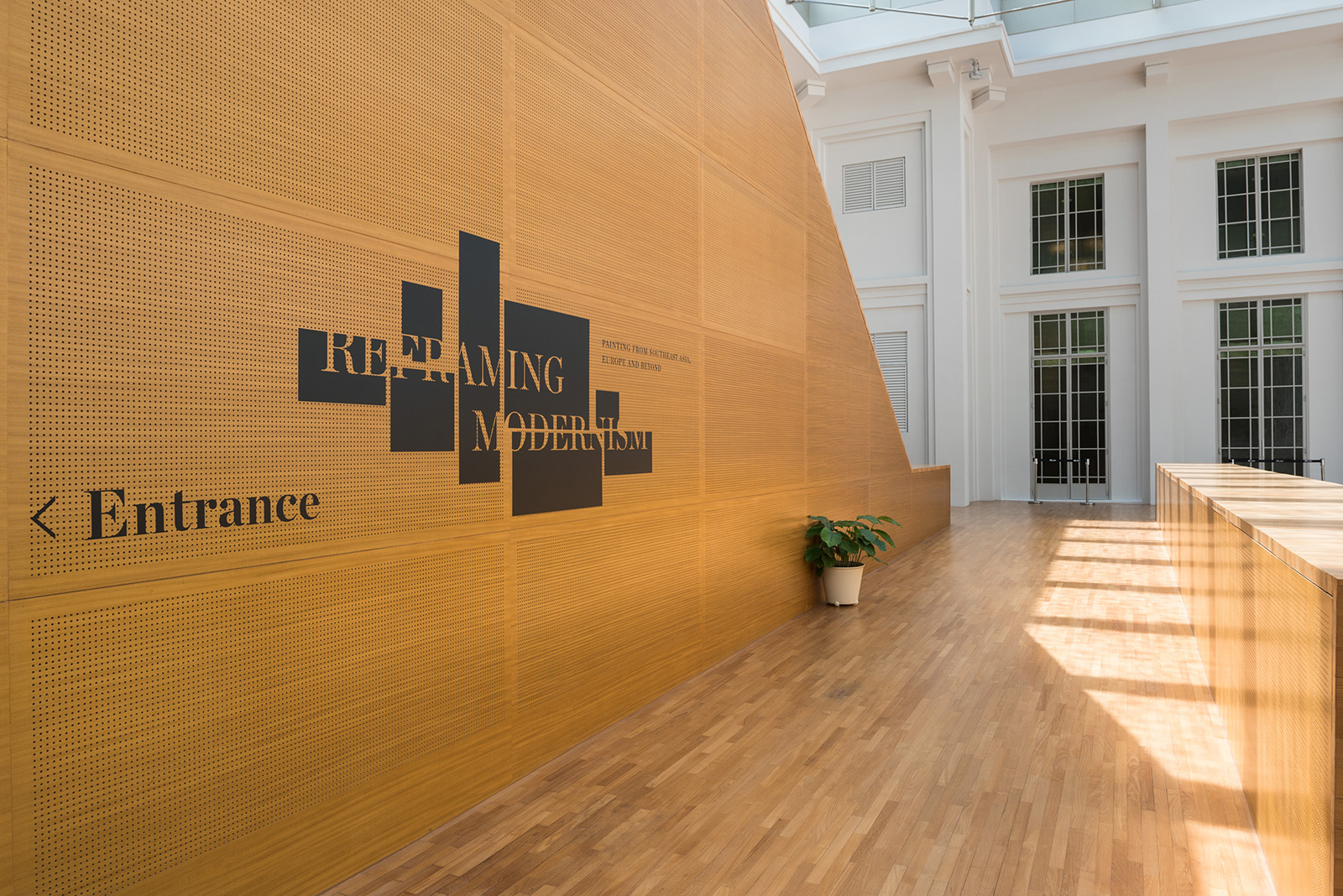
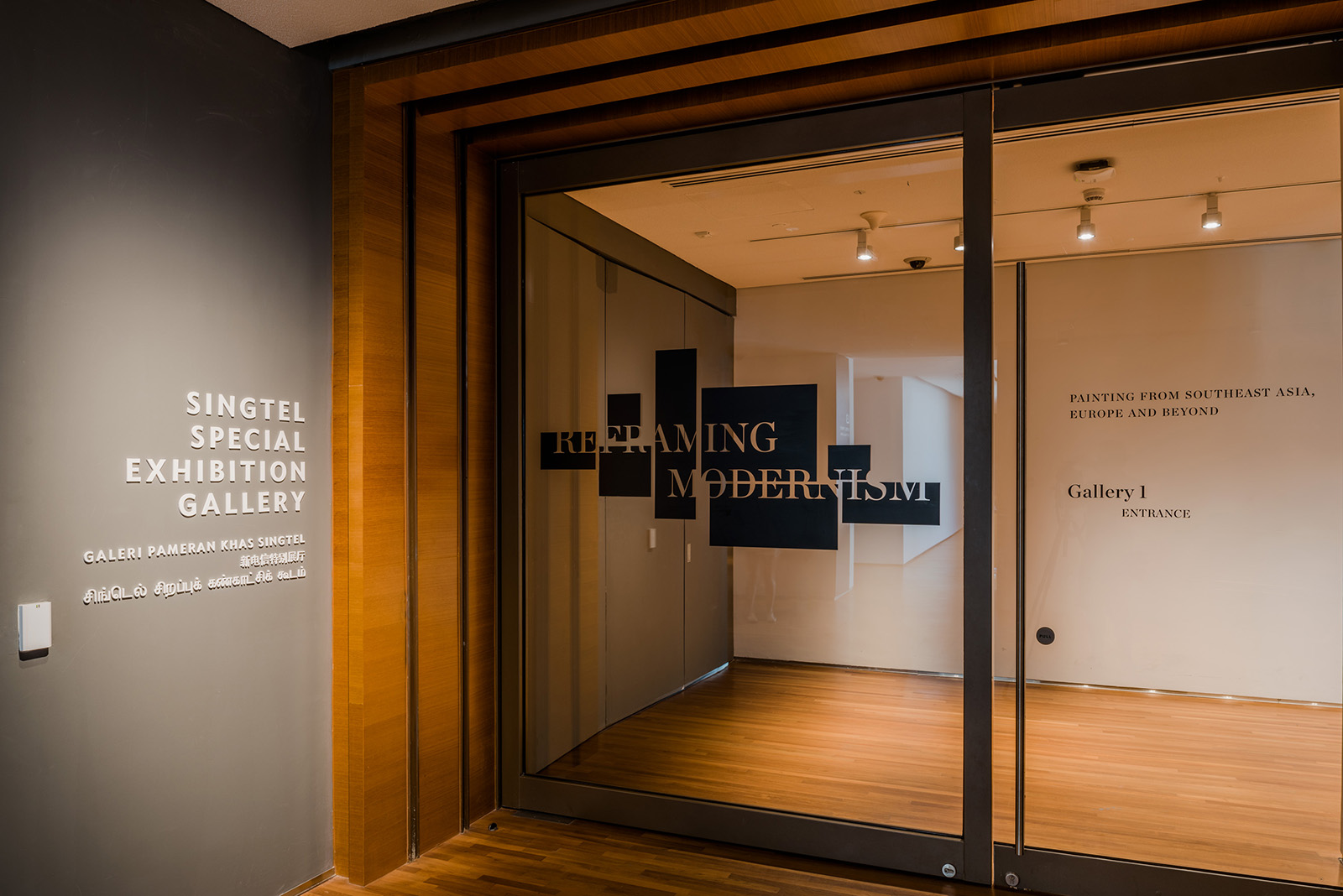
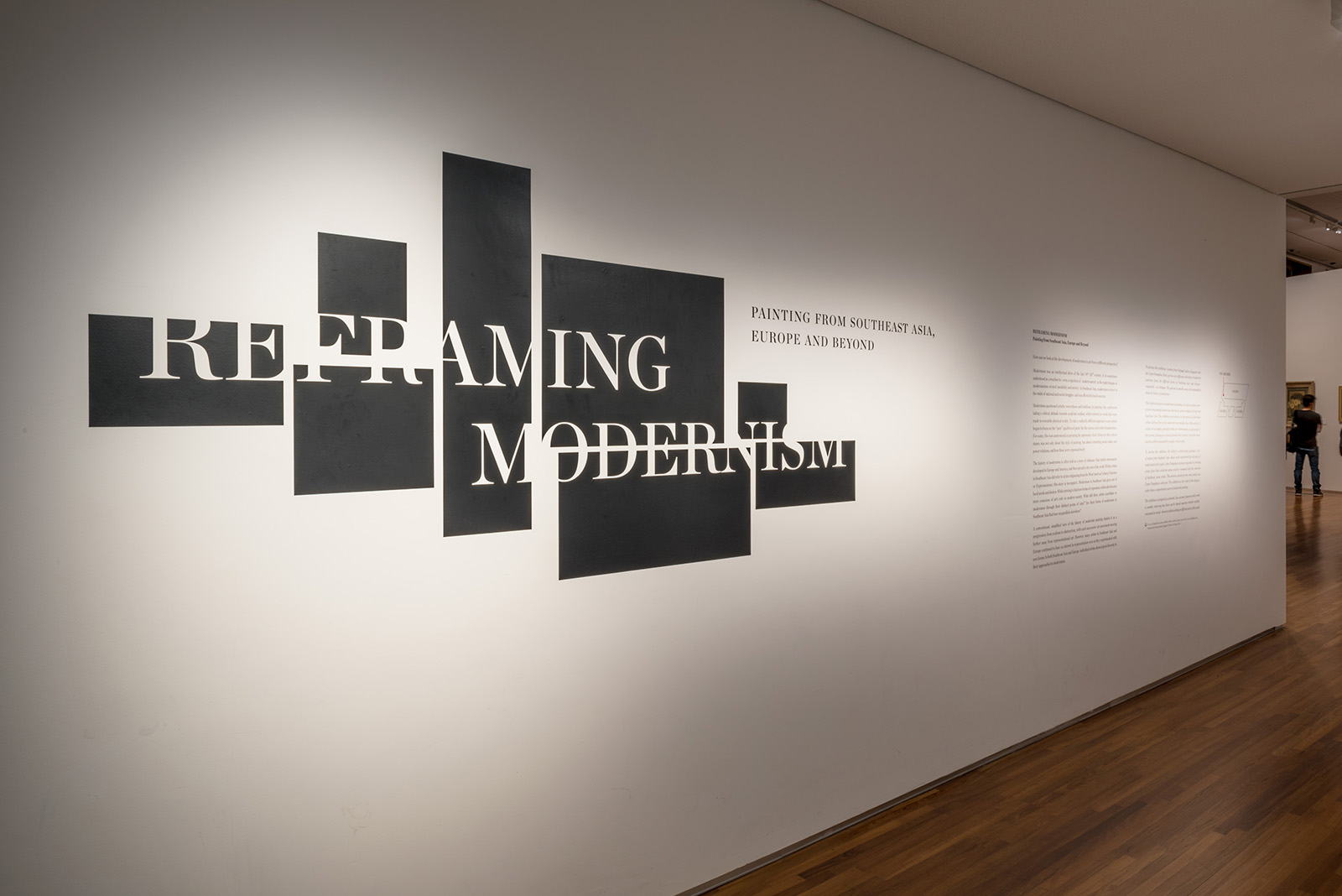
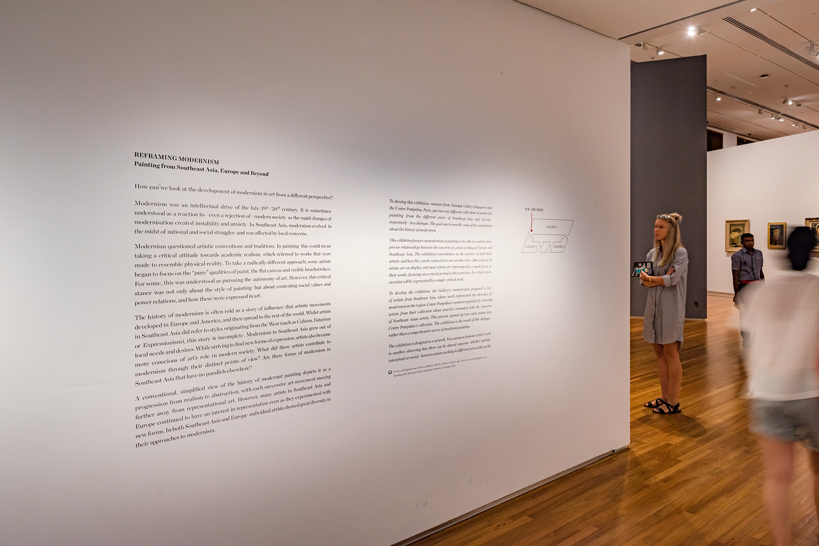
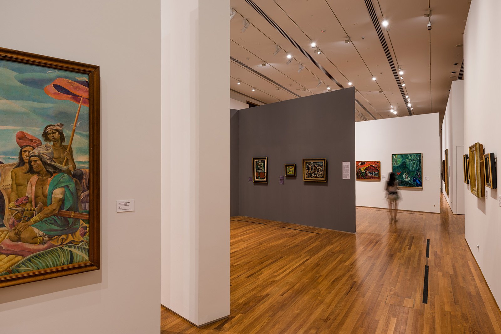
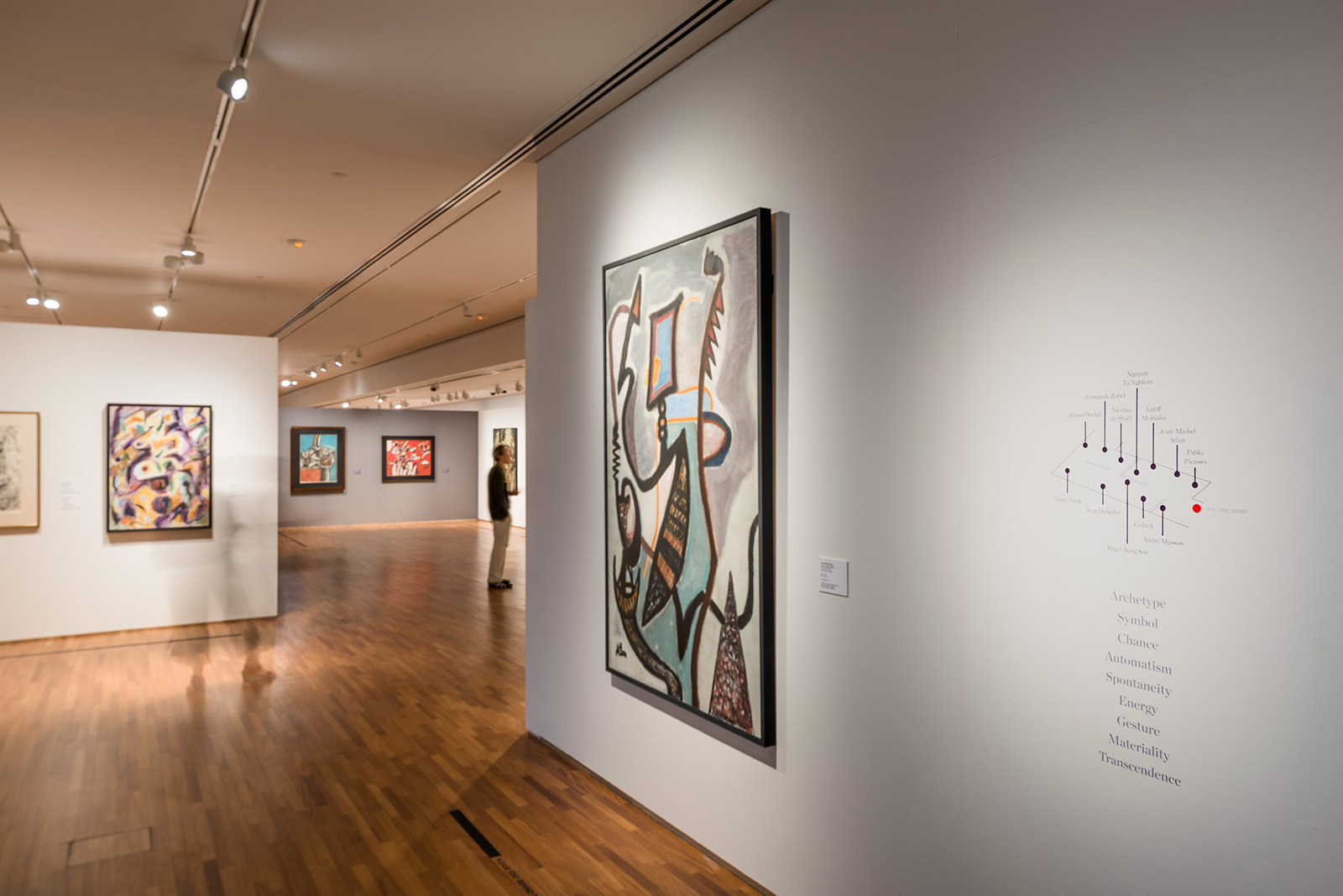
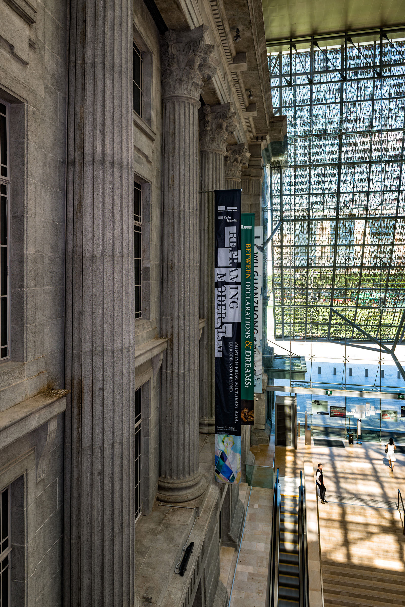
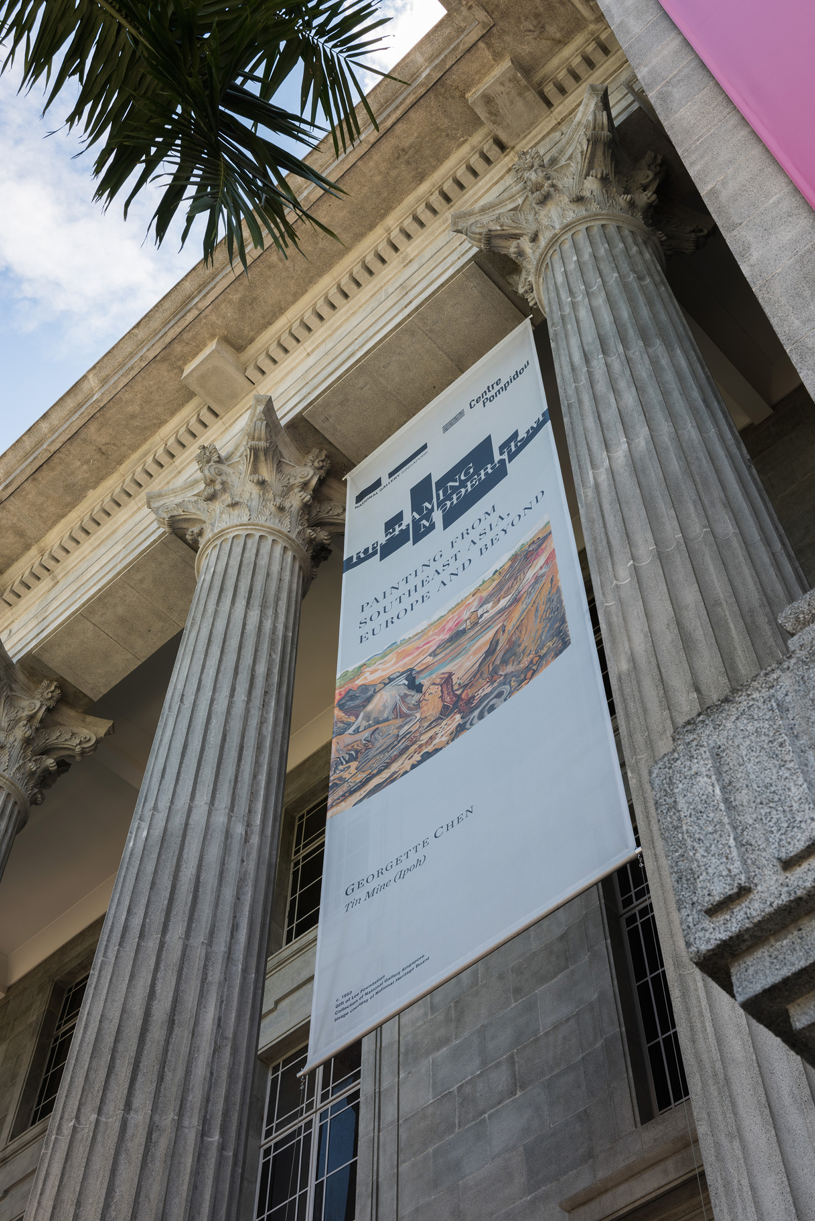
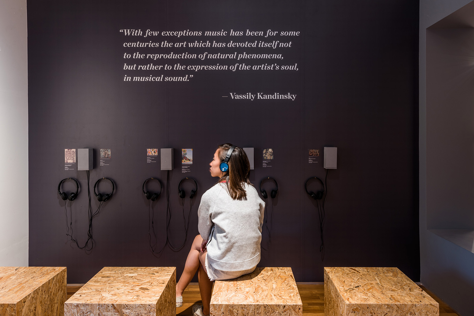
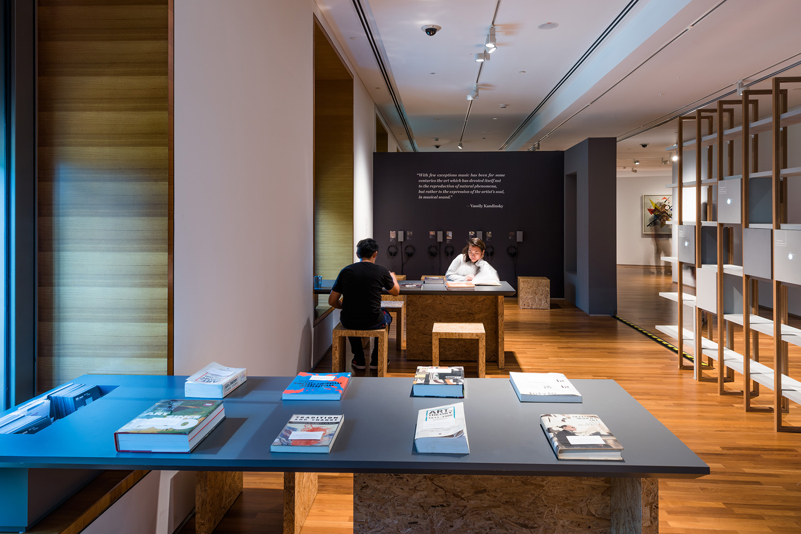
Reframing Modernism is National Gallery Singapore’s first international collaboration with Centre Pompidou, Paris. This exhibition reframes the existing paradigm of how modernist painting is understood. Drawing on over 200 iconic works by modern artists from Southeast Asia and Europe, it invites us to reconsider how artists working in different global contexts approached modern art and modernism in the 20th century.
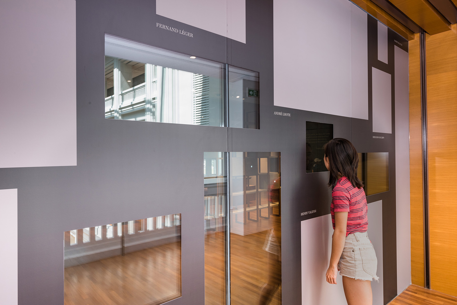
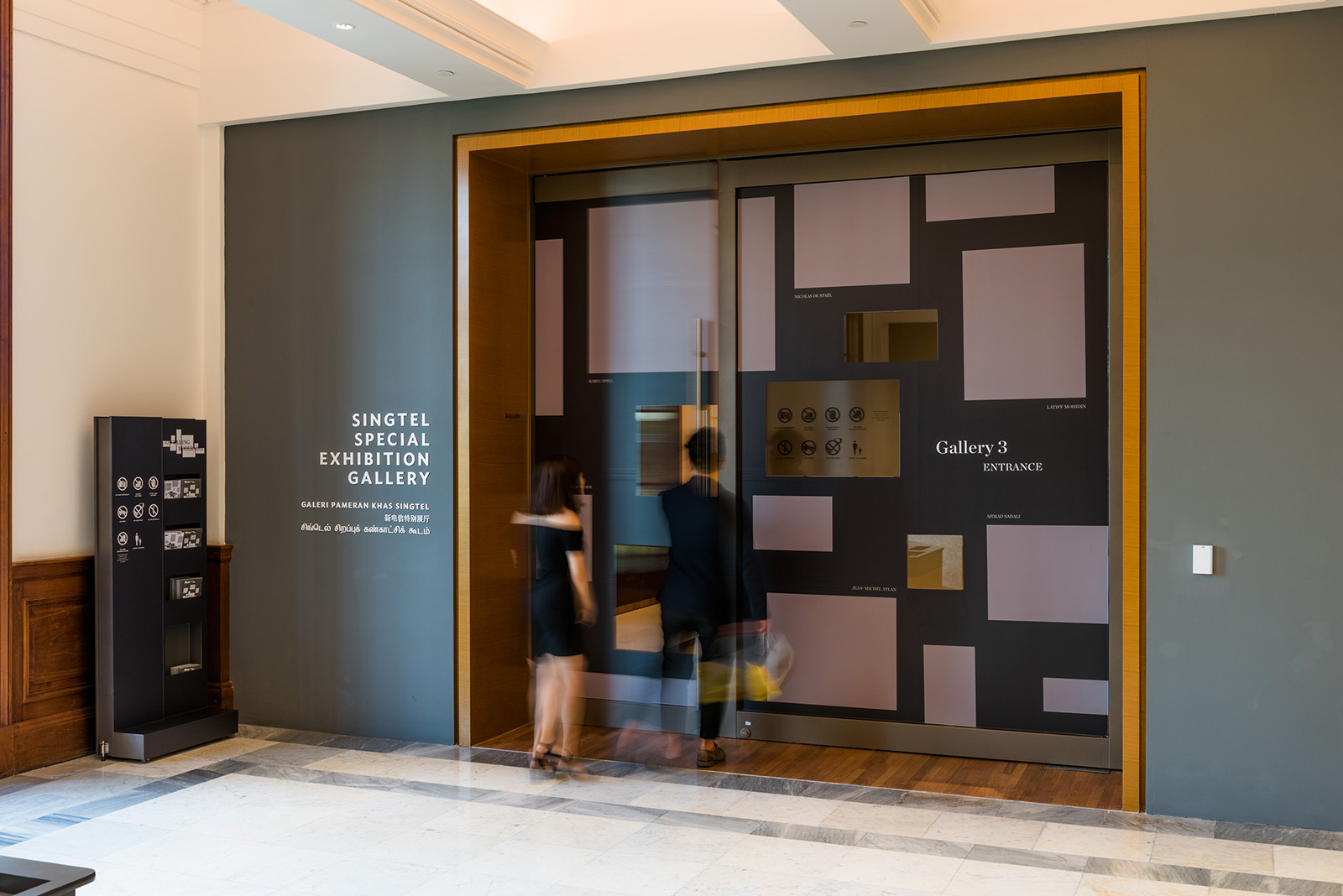
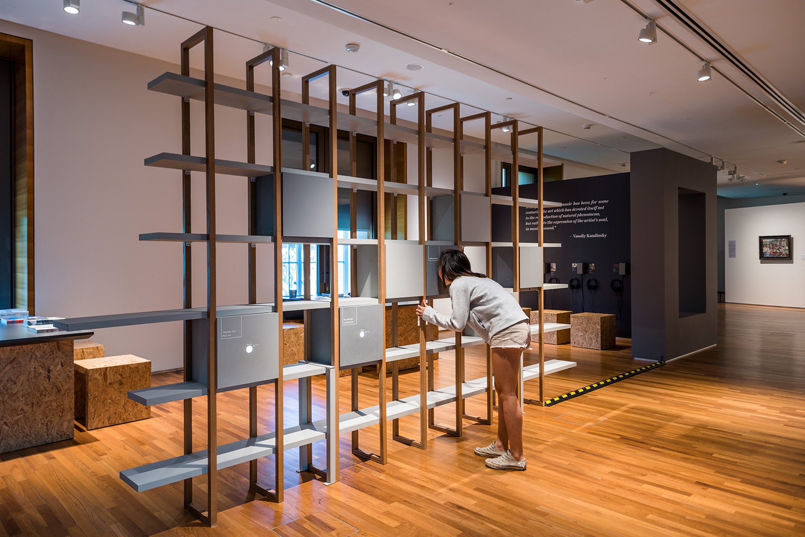
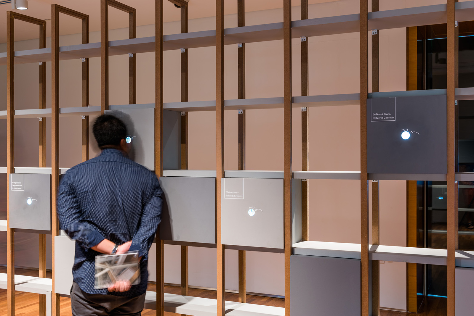
As many of the artworks feature common approaches to modernism, common ways of working and common conceptual orientations, we made use of the symbol a cluster of frames to represent the emphasis on shared qualities, mimicking how visitors will move between bodies of work across nebula like structures, thus be encouraged to make their own connections between different bodies of work. The serif logotype is deconstructed amongst the frames which bring forth a sense of broad minded dialogue and interpretation between the viewers and the artworks.
In collaboration with Superfat Designs

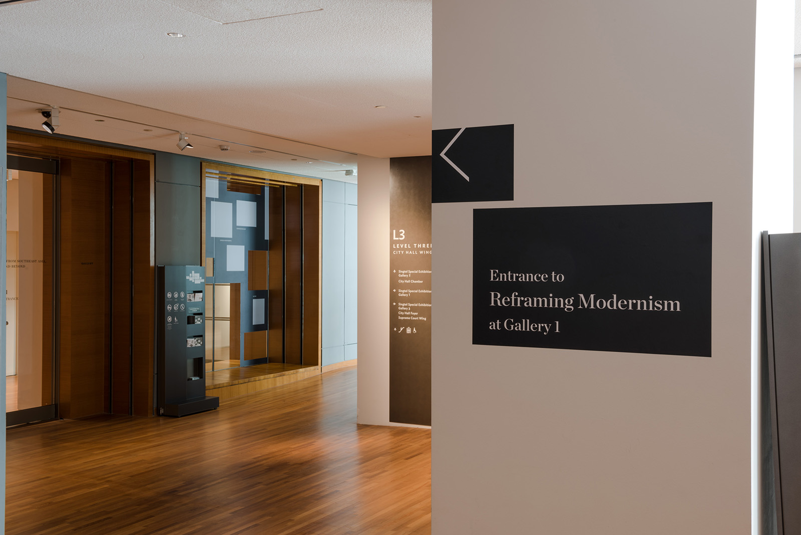
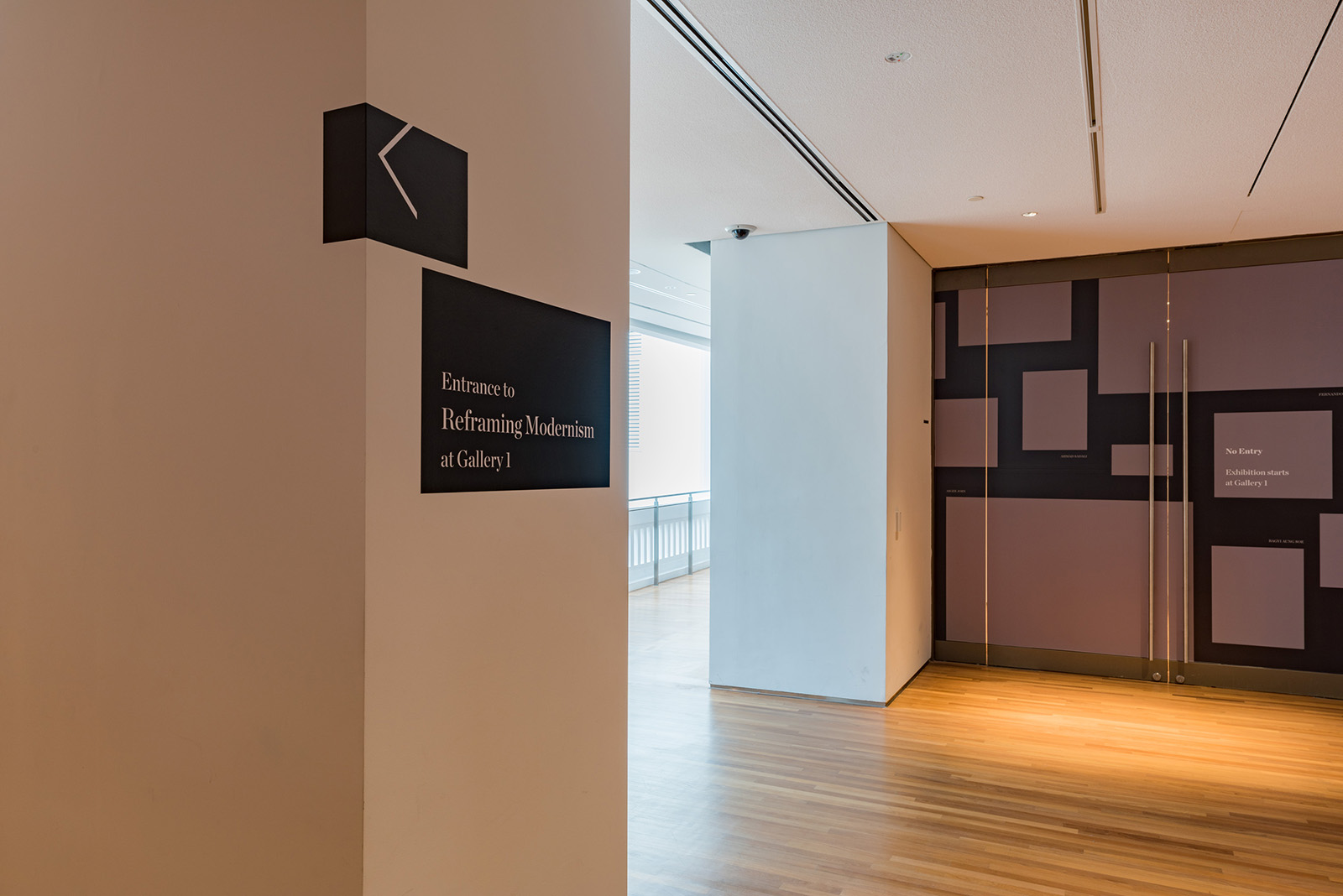
Spatial & Wayfinding Design
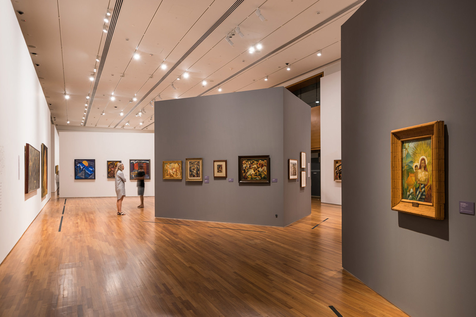
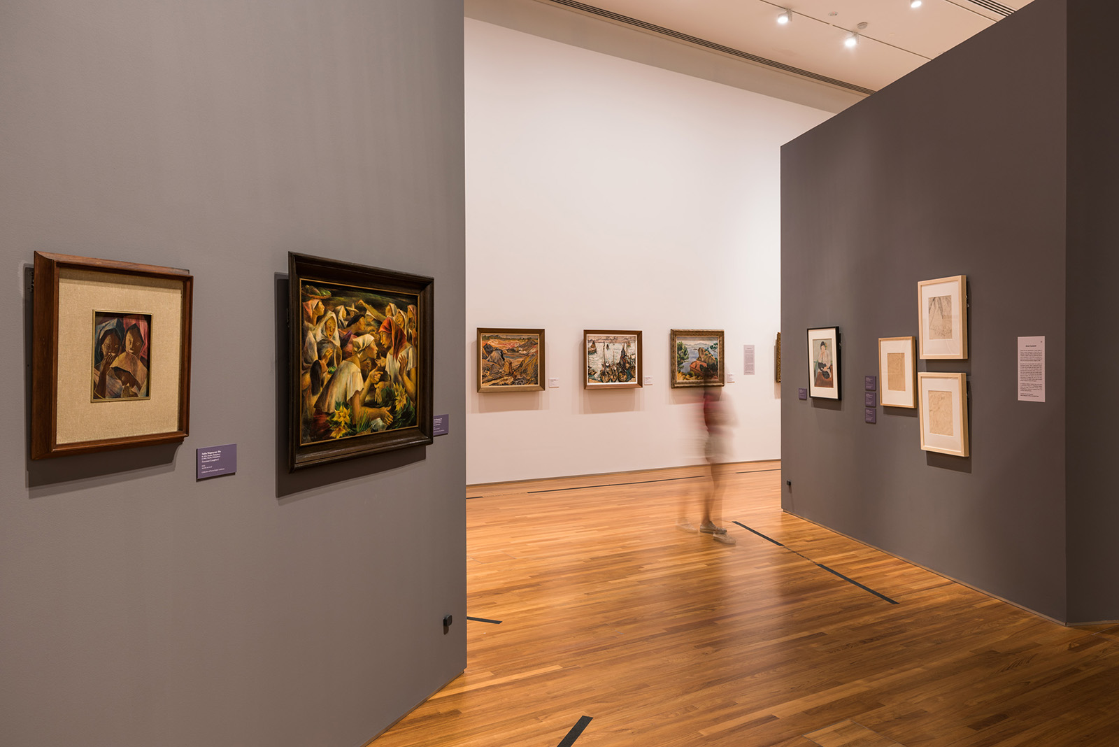
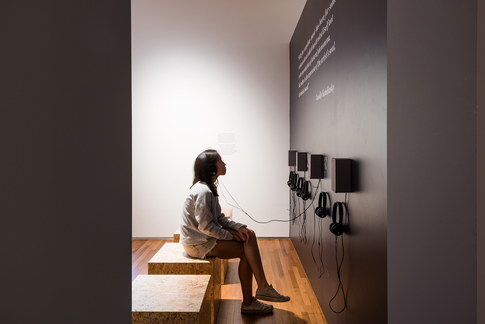
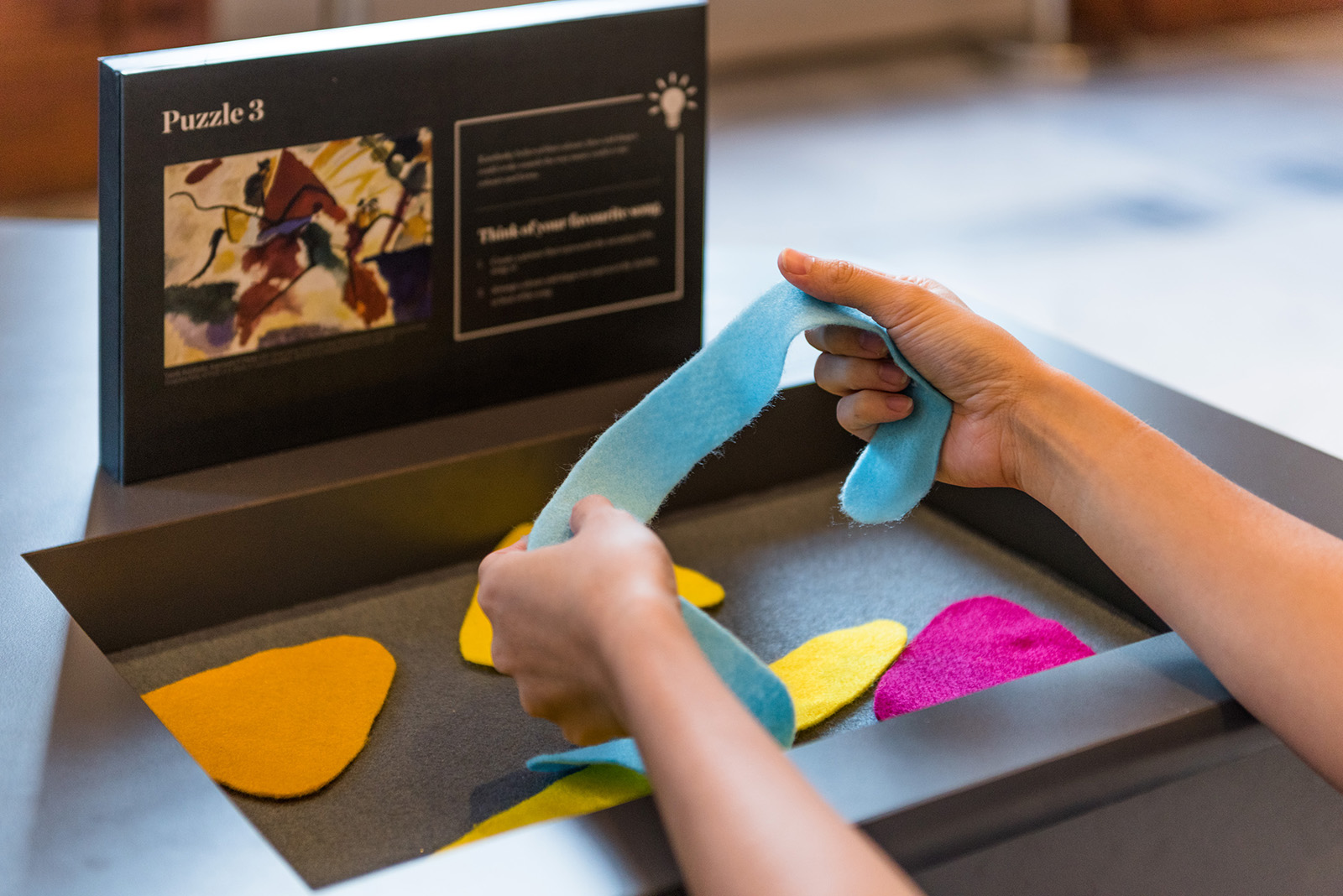
Spatially, the exhibition is designed in such a way that the eye is drawn along large horizontal walls and within nebula clusters, which creates a natural rhythm and allows viewers to be able to physically draw a direct correlation of artists from South East Asia with their European counter parts with the help of textual explanations on the walls. Portions of the artworks throughout the exhibition can be seen through gaps between walls which strengthens the notion of the interrelated case studies. The artworks are always laid out adjacent to each other to allow for with more work to be captured in the viewers peripheral vision. This leads the viewers to the next artwork and how they should be viewed.
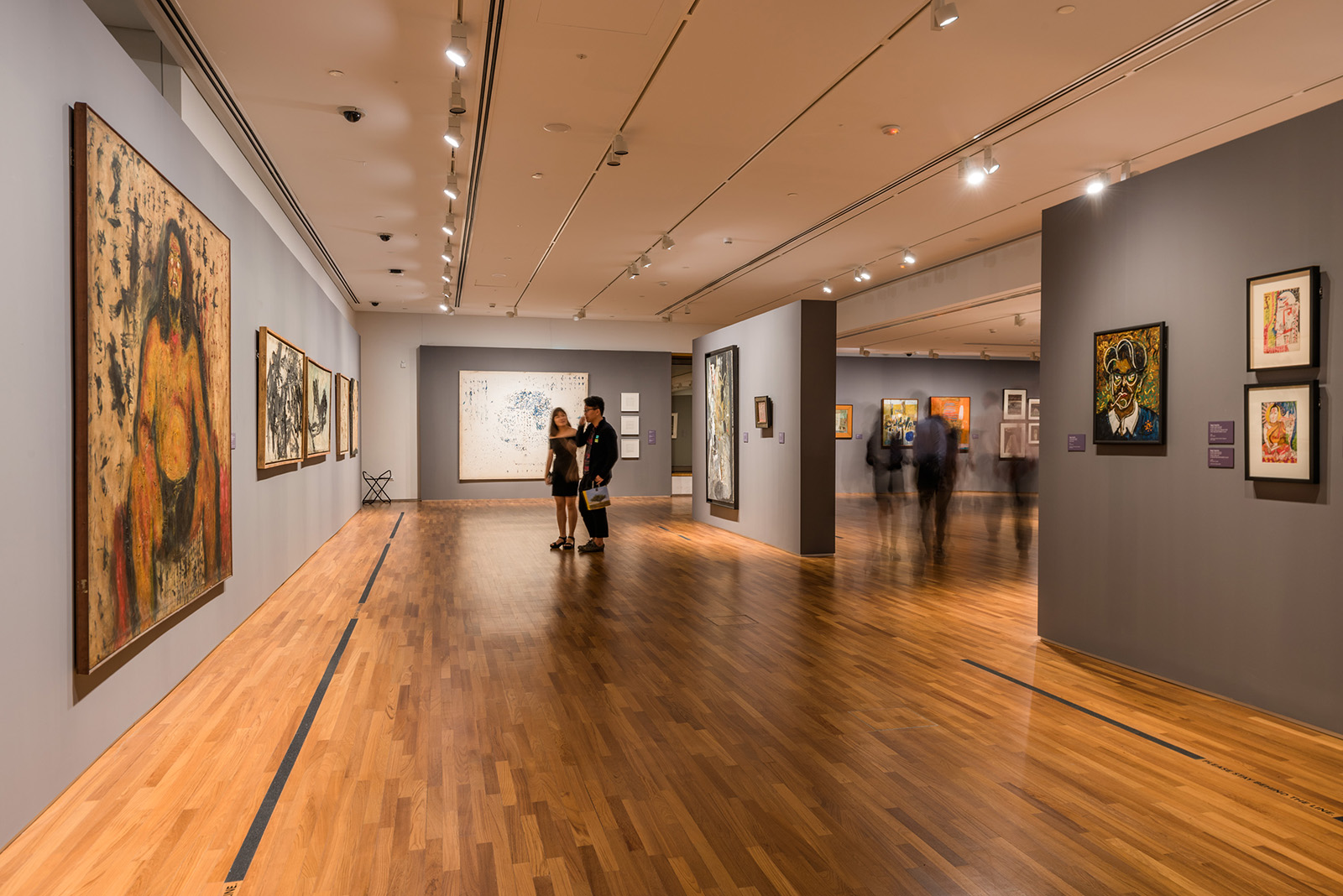
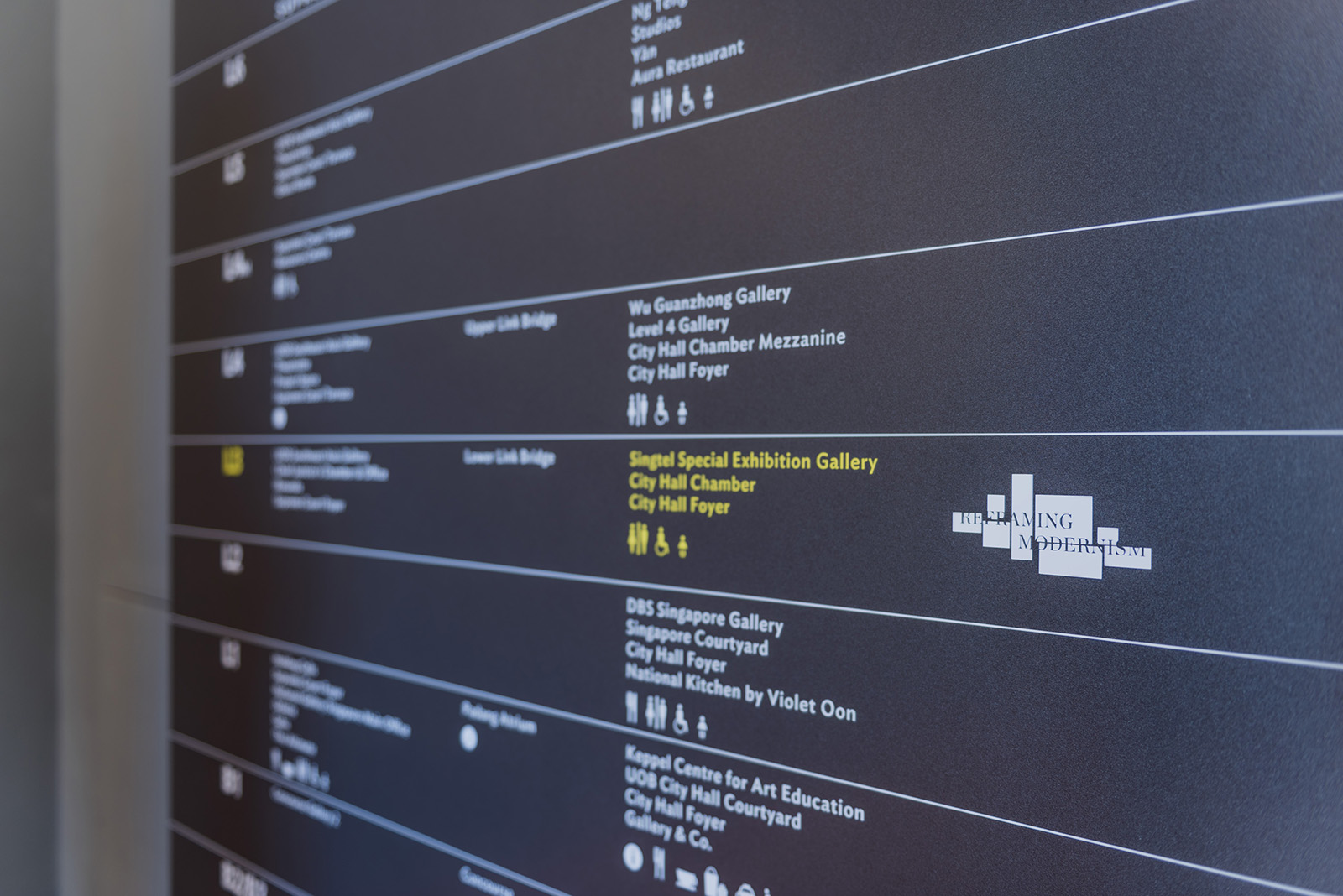
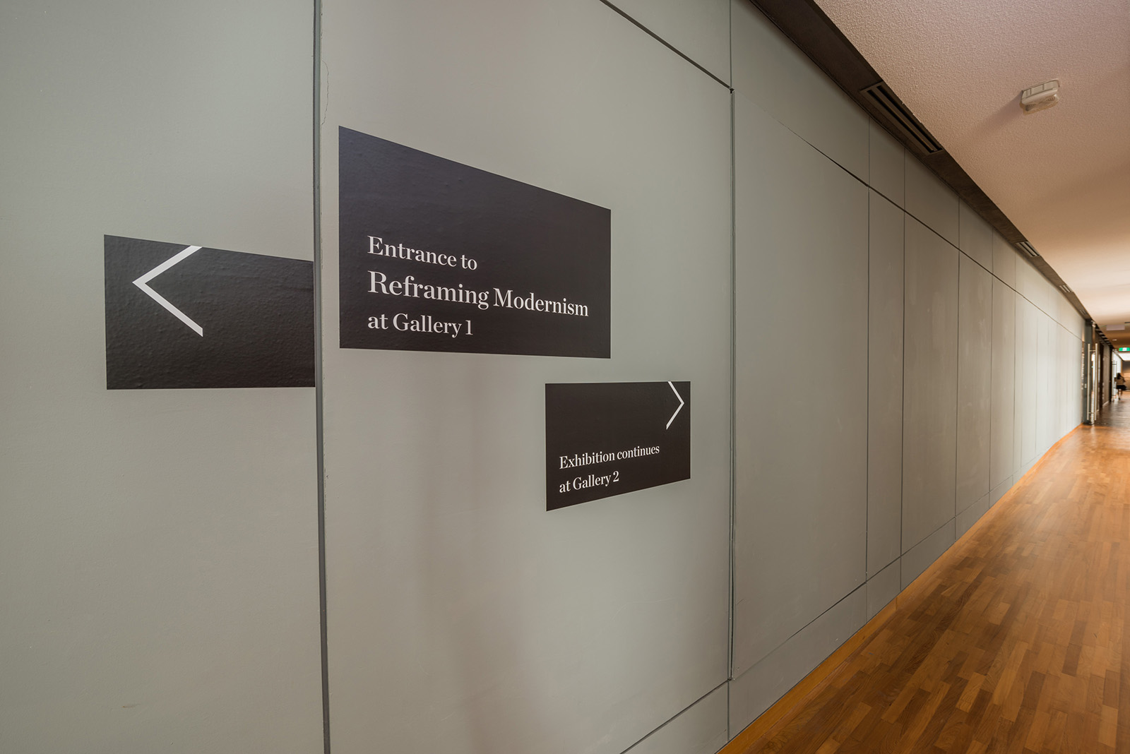
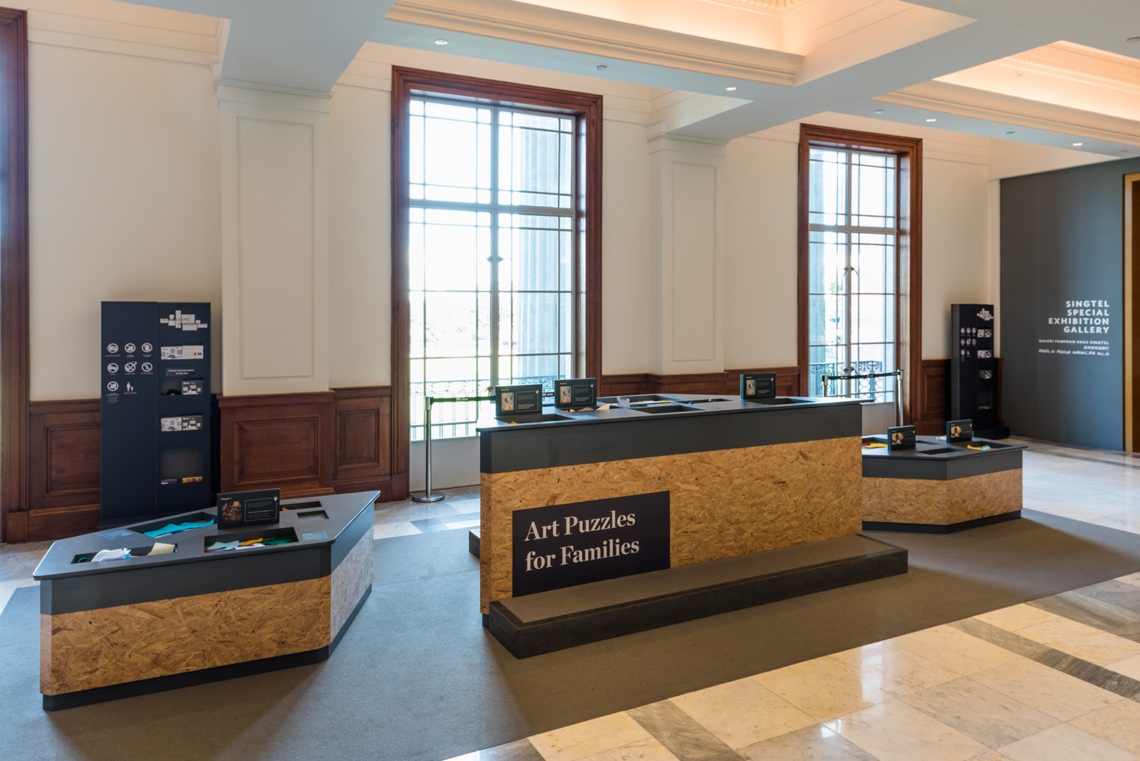
As the exhibition spans across three galleries, we also created a series of way finding devices that all ties in neatly with the branding elements we’ve created such as the frames and deconstructed text to conjure a consistent look and feel throughout, allowing for the viewers to be directed seamlessly throughout the galleries and the various activity stations.
Experience Station
Education Station
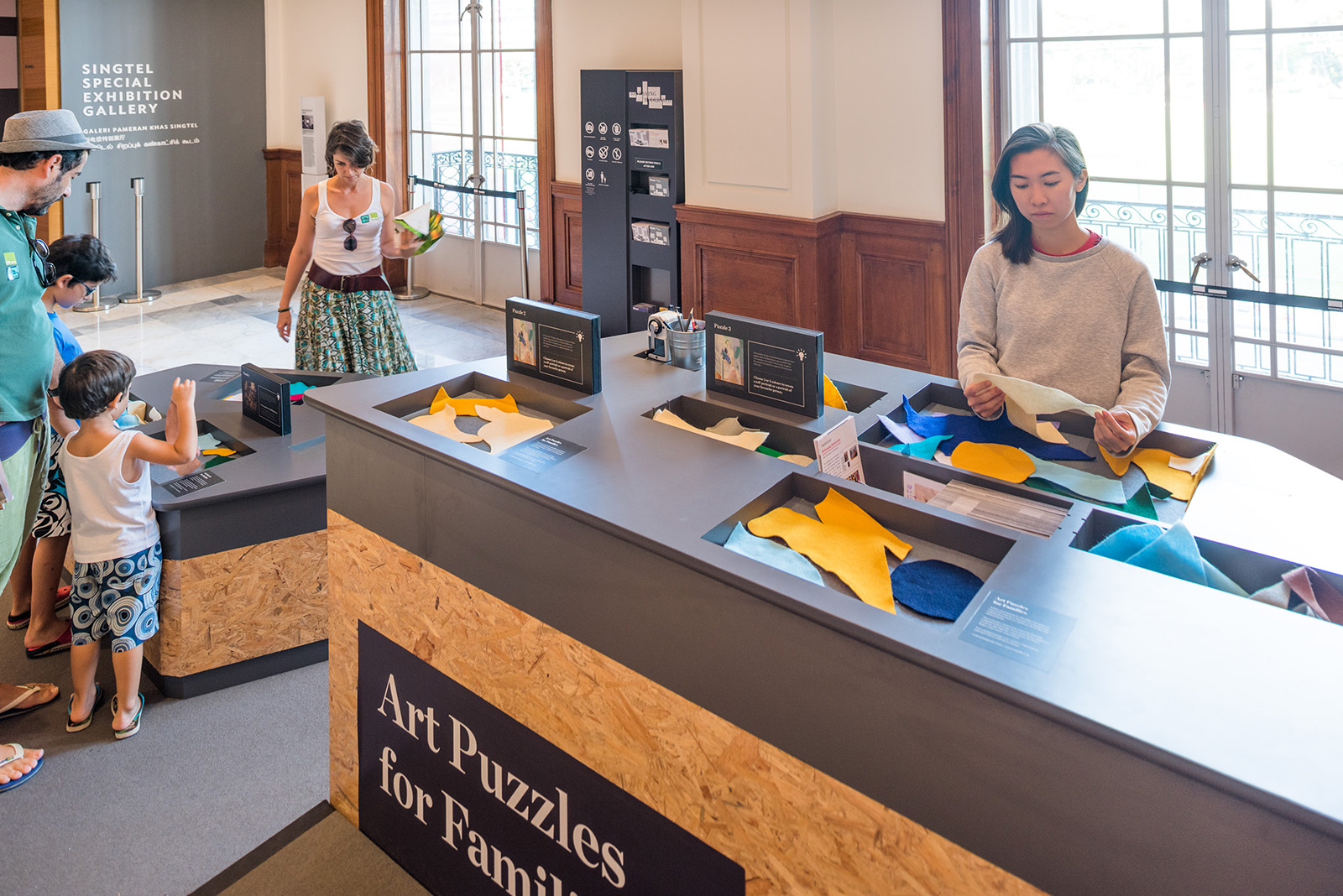
Exhibition Collaterals


Located in Gillman Barracks, the NTU Centre for Contemporary Art Singapore (NTU CCA Singapore) is a national research centre of Nanyang Technological University and is supported by a grant from the Economic Development Board, Singapore. The Centre is unique in its threefold constellation of exhibitions, residencies, research and academic education. The NTU CCA Singapore positions itself as a space for critical discourse and encourages new ways of thinking about Spaces of the Curatorial in Southeast Asia and beyond. As a research centre, it aims to provide visiting researchers and curators a comprehensive study on the contemporary art ecosystem in Singapore and the region. The Centre’s dynamic public programmes serve to engage with various audiences through lectures, workshops, open studios, film screenings and Exhibition (de)Tours.
We were tasked to design the quarterly(s) for 2016, a set of brochures launched every three months to highlight the ongoing events and activities going on in the centre. Set in an accordion fold, its grid system allows the viewer to easily locate activities and programmes they are interested in based on dates and venues. We also specially designed a taller than usual insert for the public programmes to draw people’s attention to it.


A Fact Has No Appearance held at National Gallery Singapore investigates the impact of new ideas on Southeast Asian art in the 1970s by focusing on three key artists: Johnny Manahan (The Philippines), Redza Piyadasa (Malaysia), and Tan Teng-Kee (Malaysia/Singapore), providing an insight into their approaches during a dynamic moment in the region’s history where they broke new ground, challenging the boundaries of painting, sculpture, photography, video, and performance.
In collaboration with Superfat Designs.


As the name suggests, the title can be interpreted as both a statement or a question, drawing parallels with the notion of challenge depicted by the artworks during its time. The modern san serif logotype is arranged in a free form manner to illustrate the interwoven experience of the show, whereas the words ‘Fact’ & ‘Appearance’ were deliberately deconstructed to to reflect how art making at that time provided a contrarian view to the norms.


The entrance area serves an important function to set this tone for the exhibition. The walkway is flanked by Piyadasa’s provoking sculpture A Configuration Can Never Have a Literal Existence on one side and the exhibition title wall on the other. Directly facing the entrance is a video projection of Tan Teng Kee’s The Picnic, an eye catching introduction into the exhibition space. The spatial design is created in such a way that the eye is drawn along the diagonal voluminous walls which creates a natural rhythm; portions of the artworks from the different artists can be seen throughout the exhibition which strengthens the notion of interwoven case studies. In conjunction with the launch, a special publication was also designed featuring essays, conversations, and archival images related to this series.


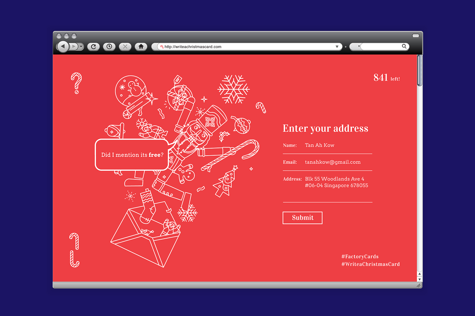
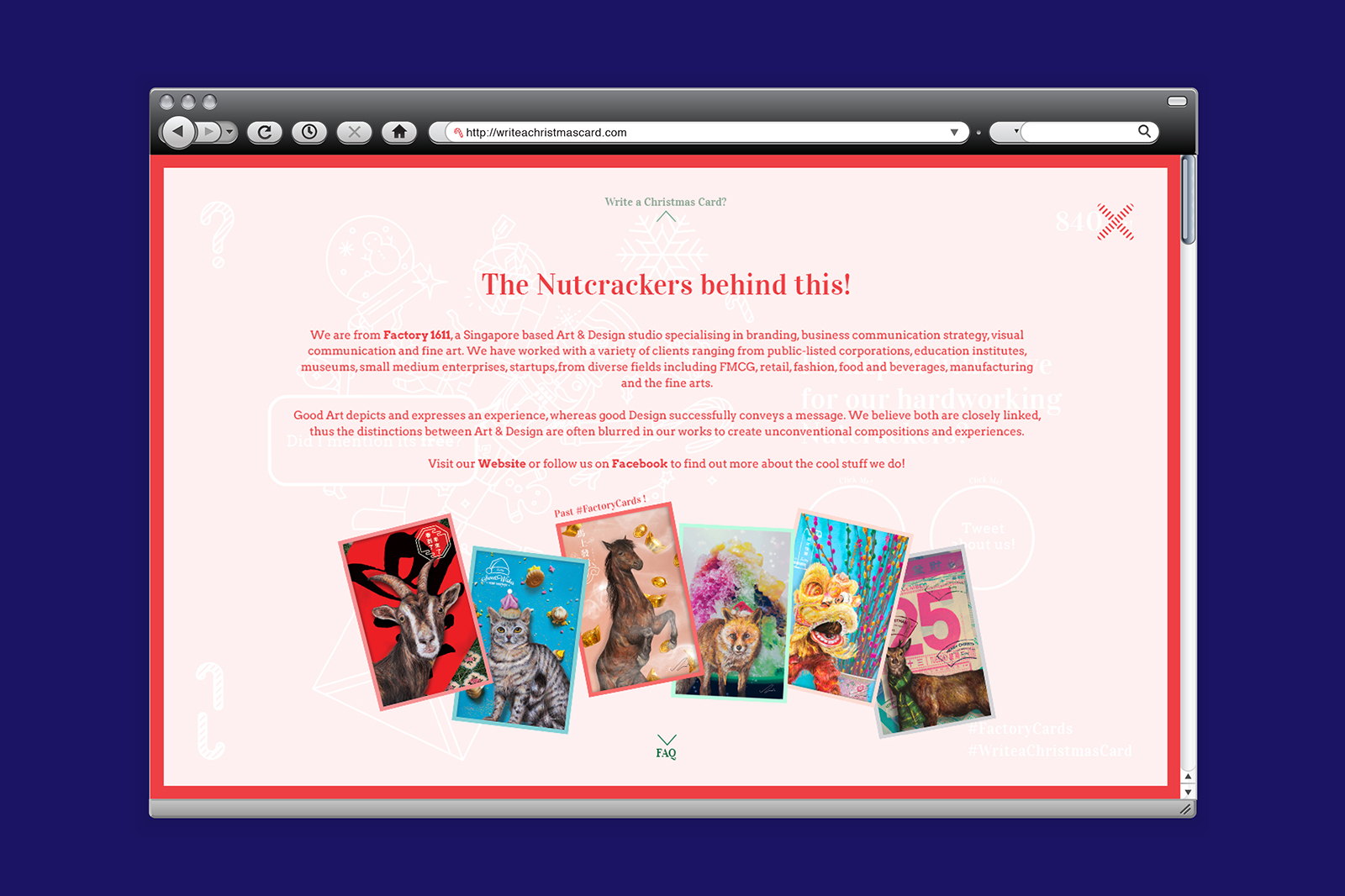
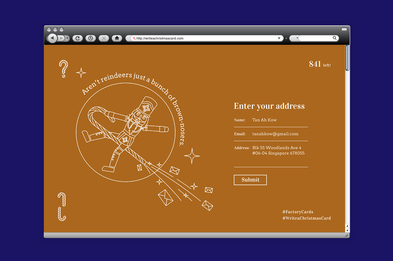
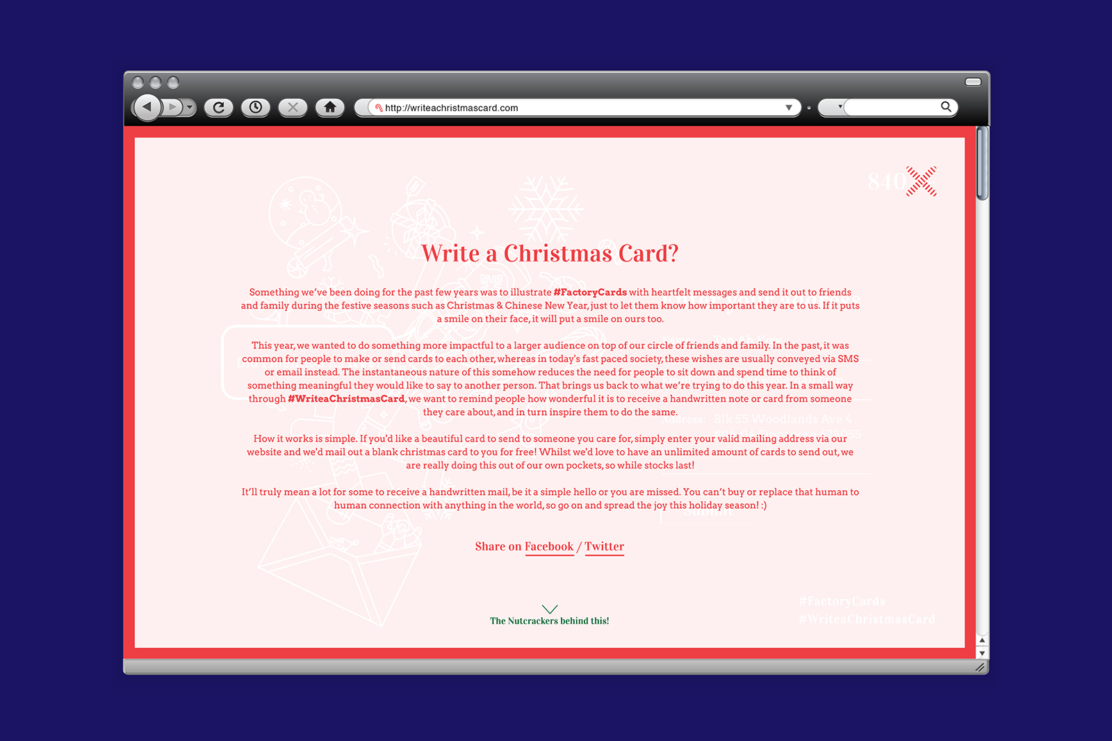
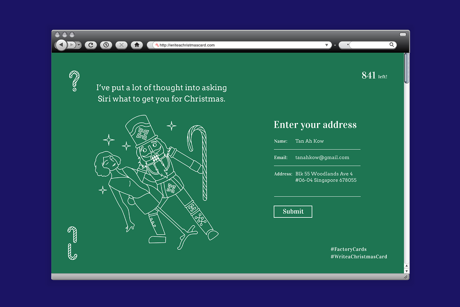
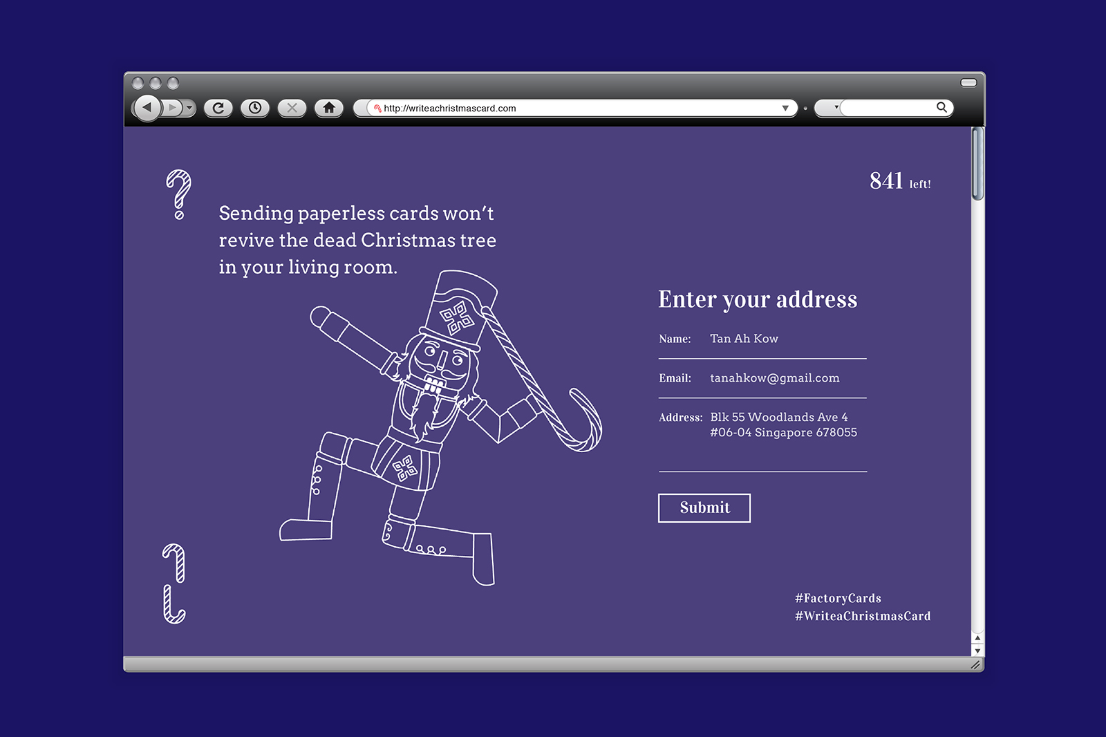
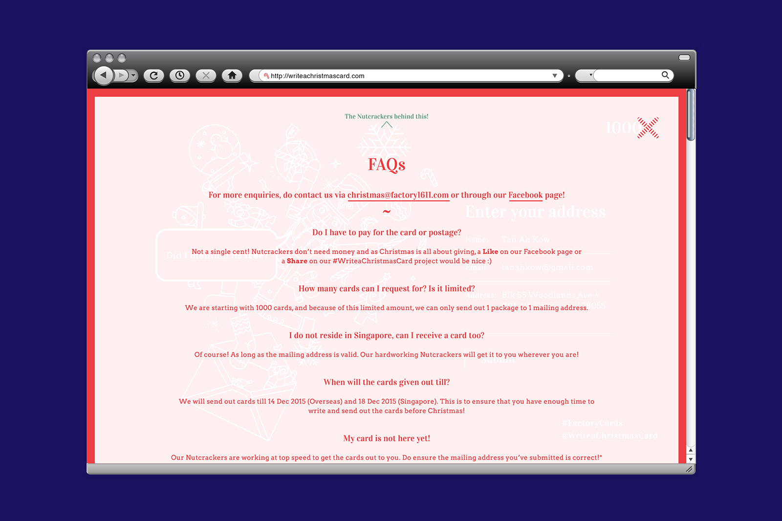
Something we’ve been doing for the past few years was to illustrate #FactoryCards with heartfelt messages and send it out to friends and family during the festive seasons such as Christmas & Chinese New Year, just to let them know how important they are to us. If it puts a smile on their face, it will put a smile on ours too.
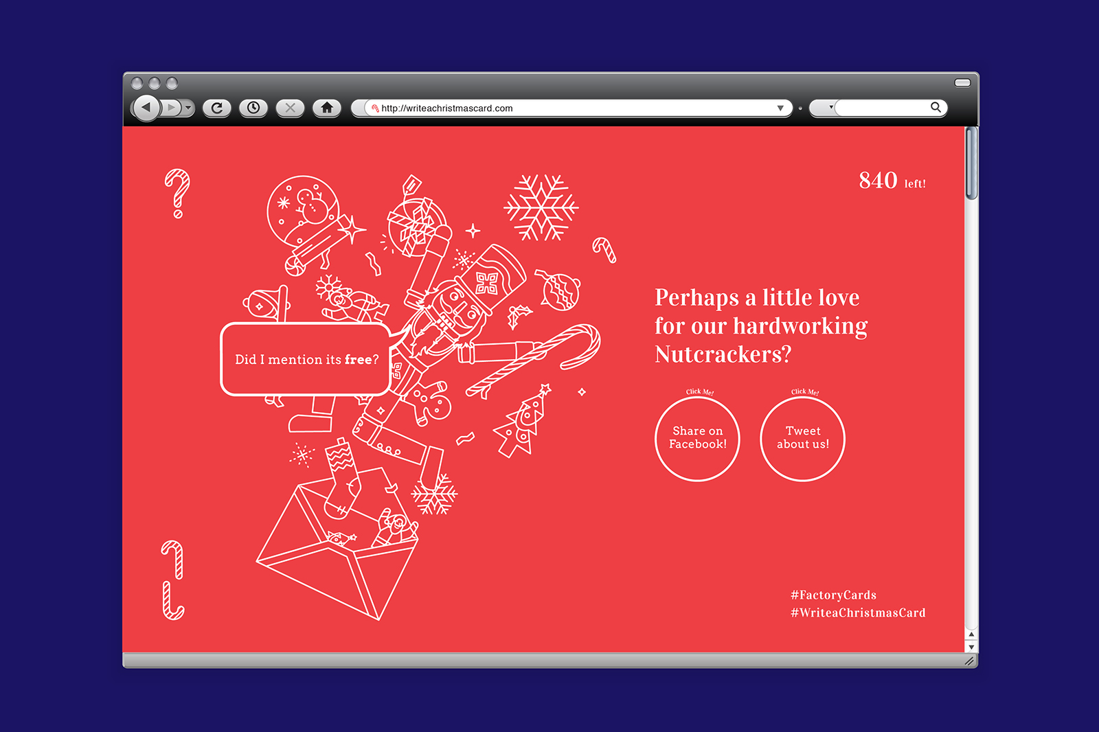
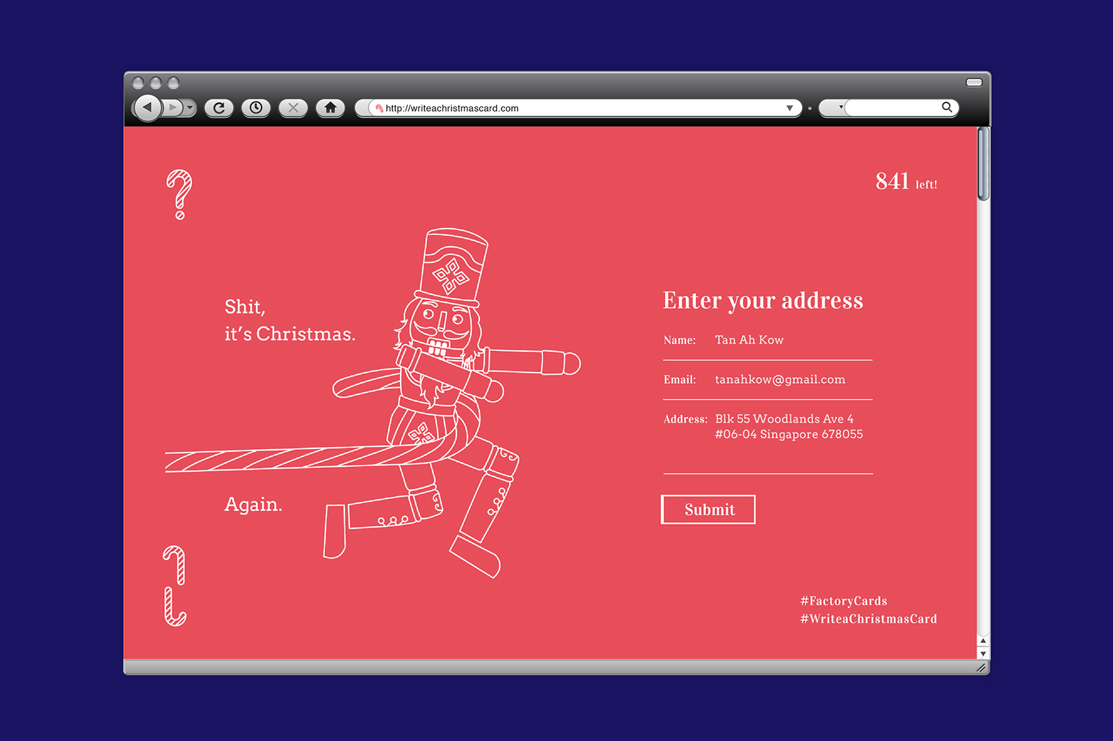
This year, we wanted to do something more impactful to a larger audience on top of our circle of friends and family. In the past, it was common for people to make or send cards to each other, whereas in today’s fast paced society, these wishes are usually conveyed via SMS or email instead. The instantaneous nature of this somehow reduces the need for people to sit down and spend time to think of something meaningful they would like to say to another person. That brings us back to what we’re trying to do this year. In a small way through #WriteaChristmasCard, we want to remind people how wonderful it is to receive a handwritten note or card from someone they care about, and in turn inspire them to do the same.
How it works is simple. If you’d like a beautiful card to send to someone you care for, simply enter your valid mailing address via our website and we’d mail out a blank christmas card to you for free! Whilst we’d love to have an unlimited amount of cards to send out, we are really doing this out of our own pockets, so while stocks last!
It’ll truly mean a lot for some to receive a handwritten mail, be it a simple hello or you are missed. You can’t buy or replace that human to human connection with anything in the world, so go on and spread the joy this holiday season!


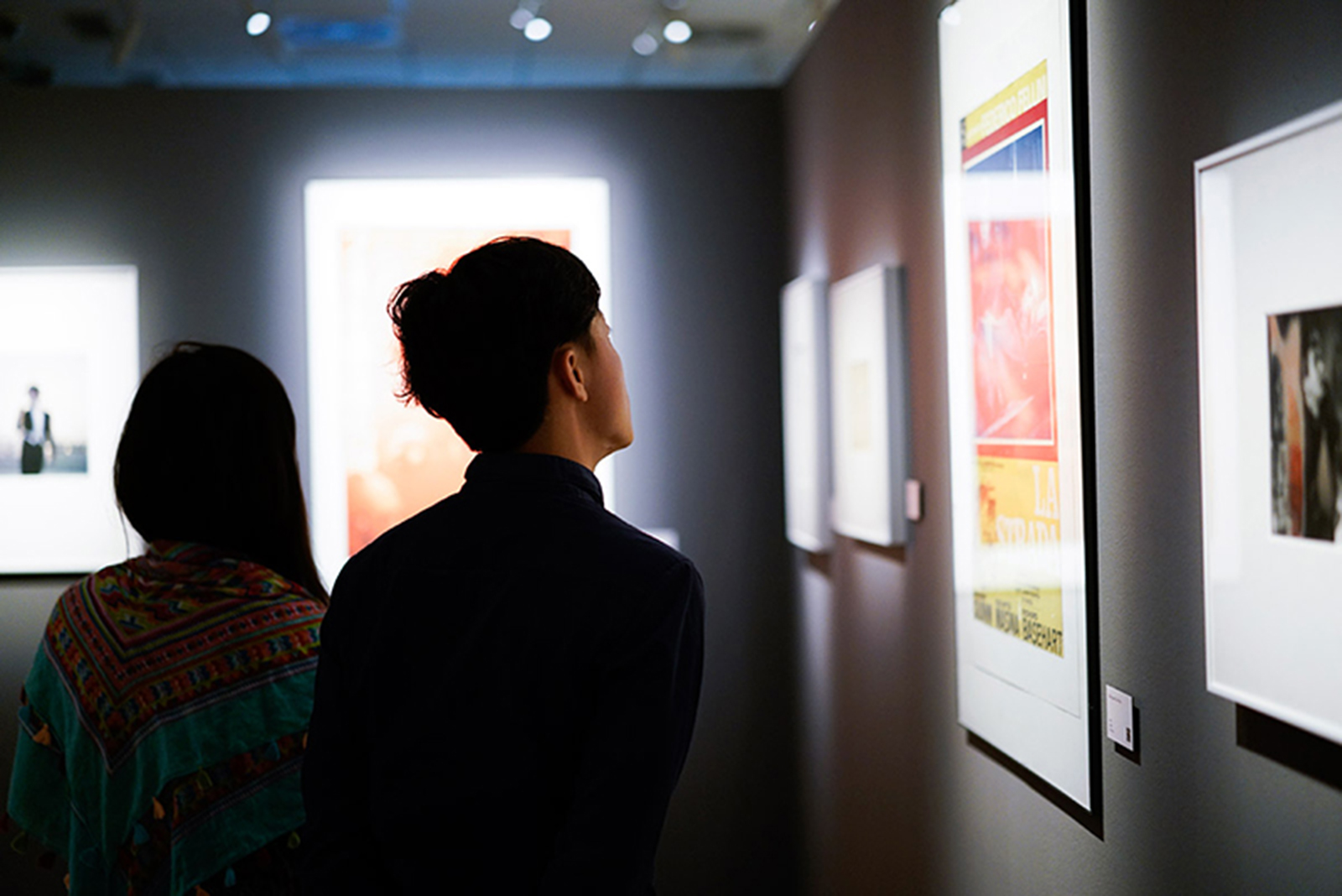
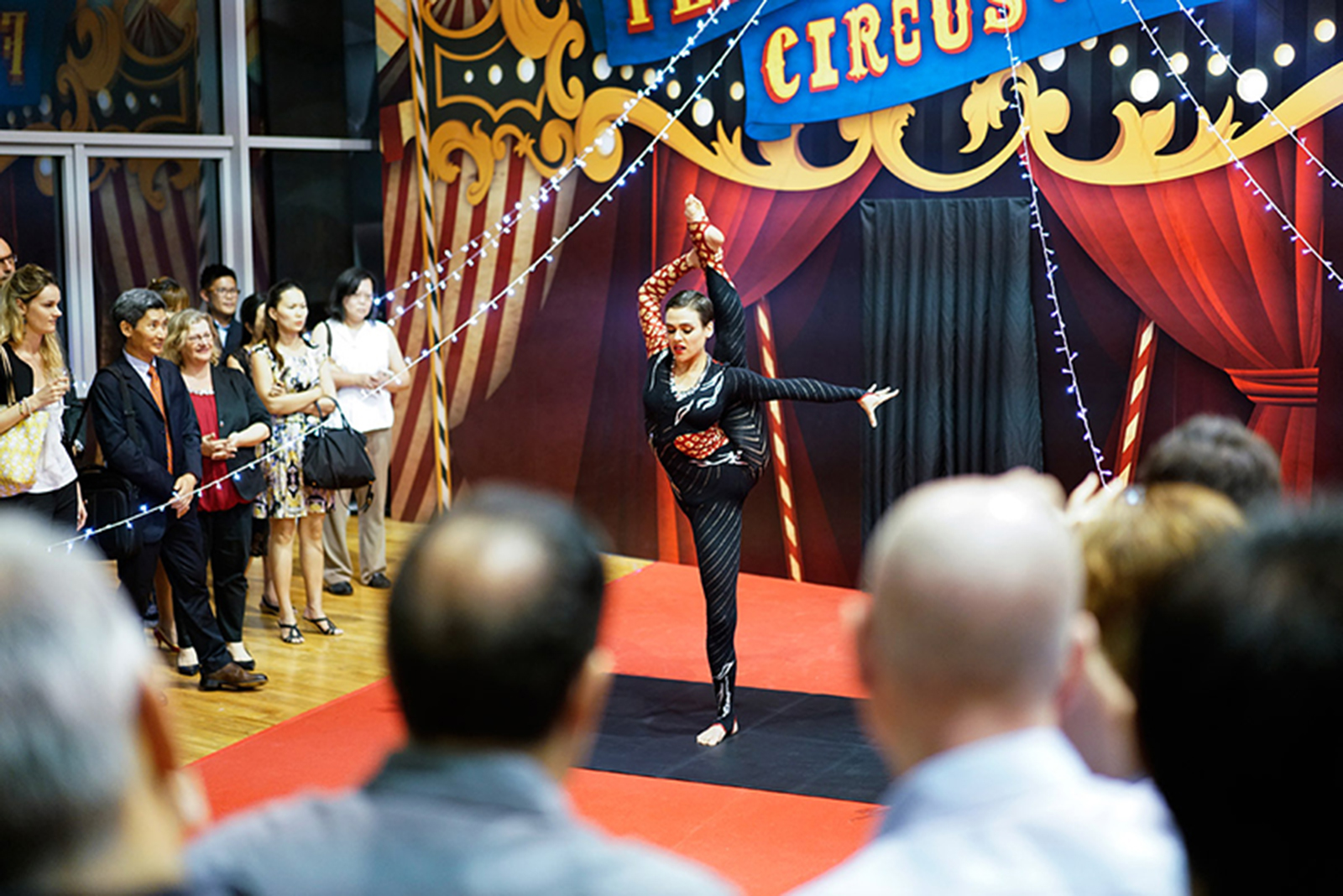
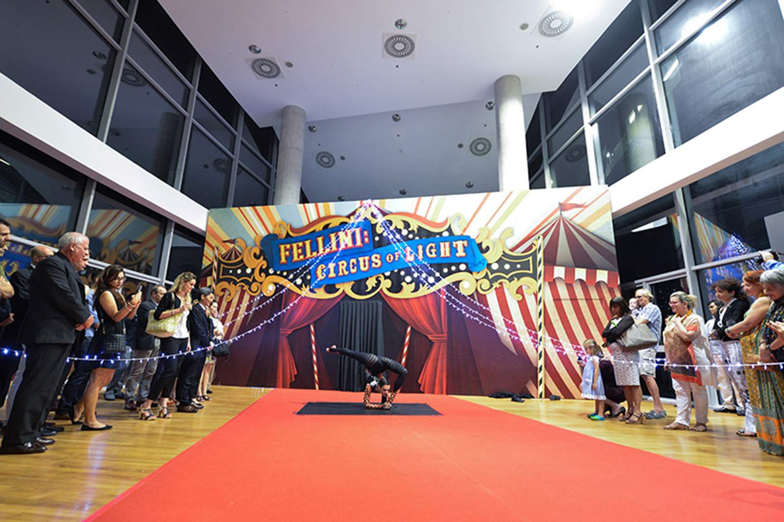
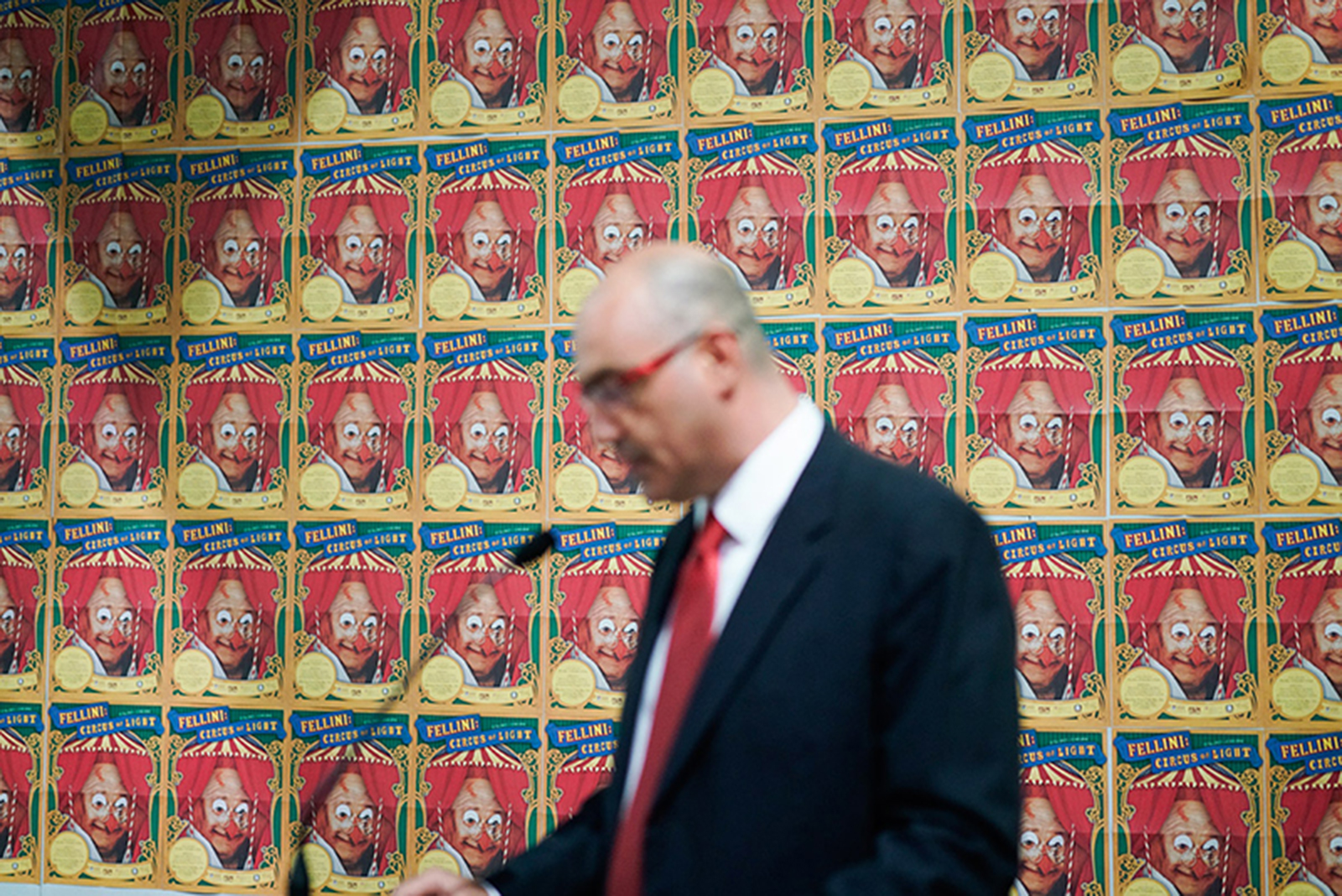
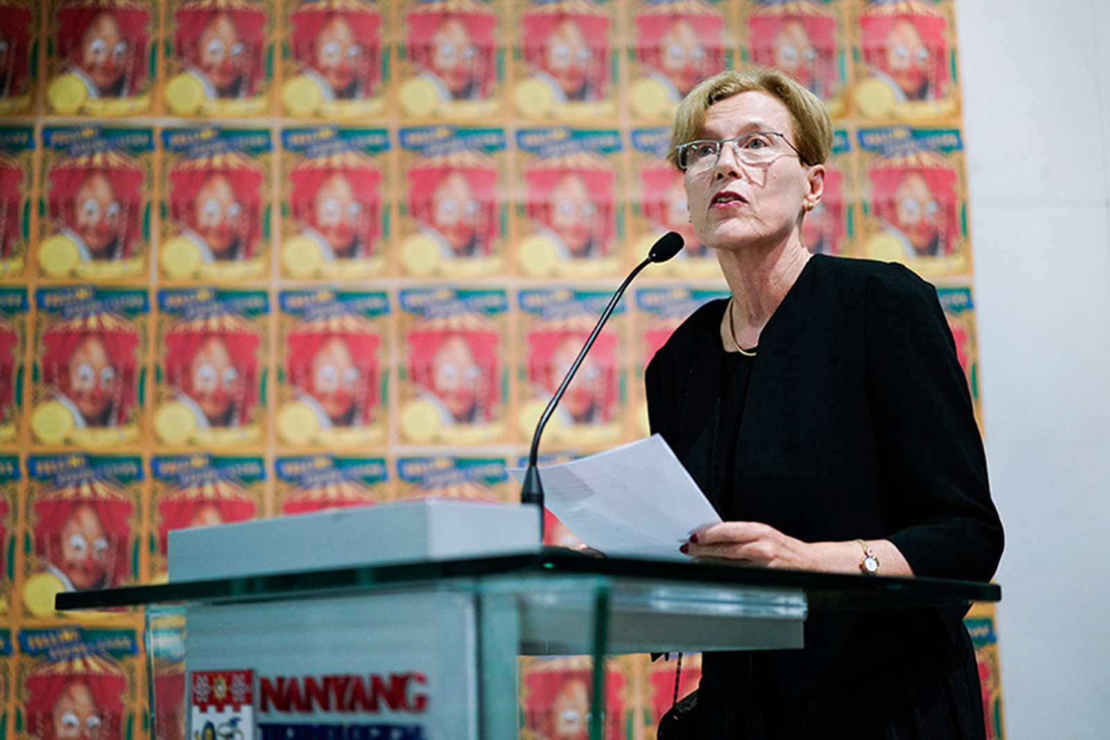
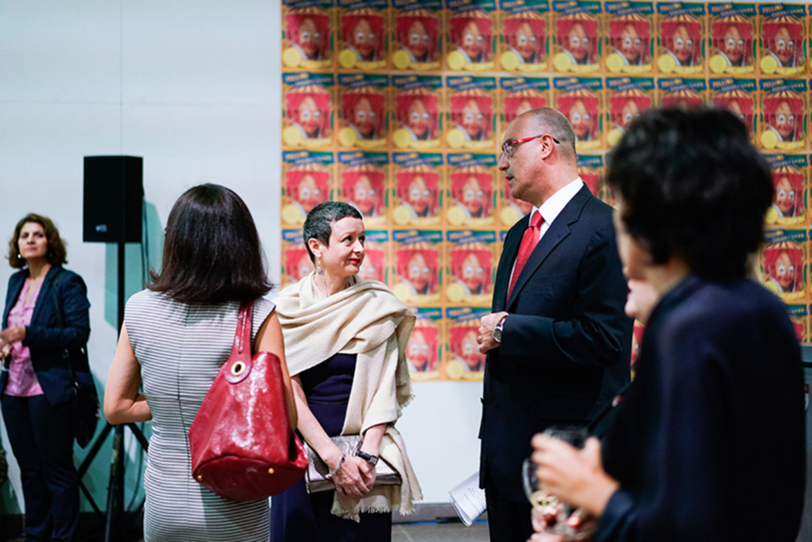
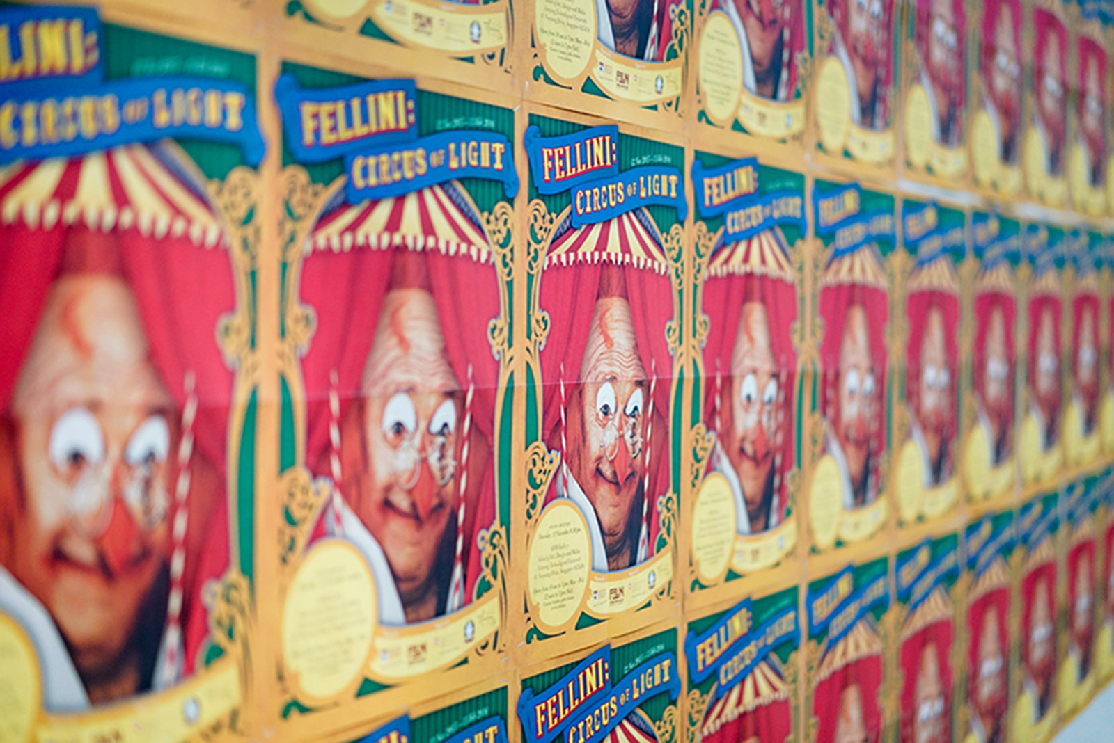
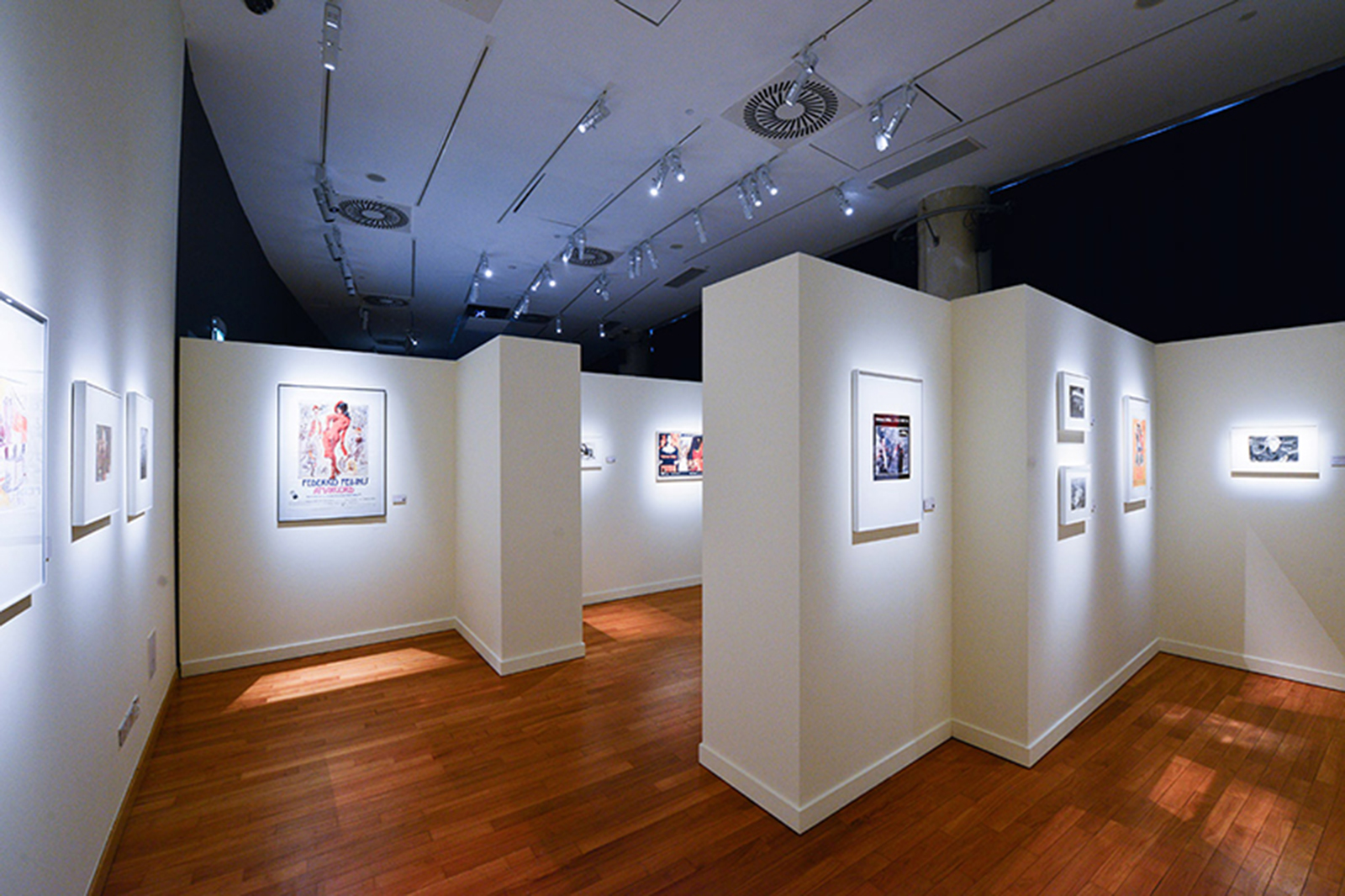
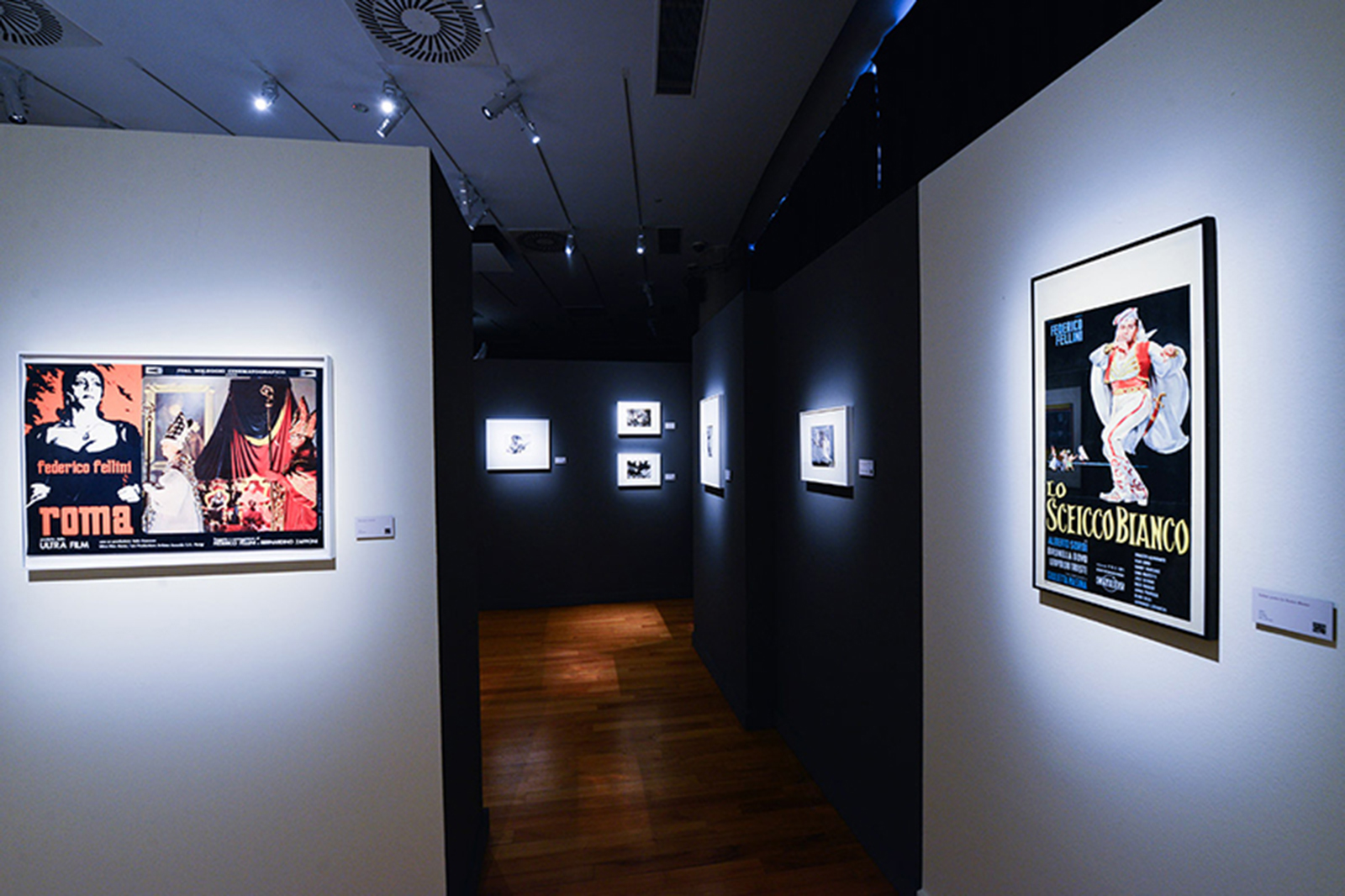
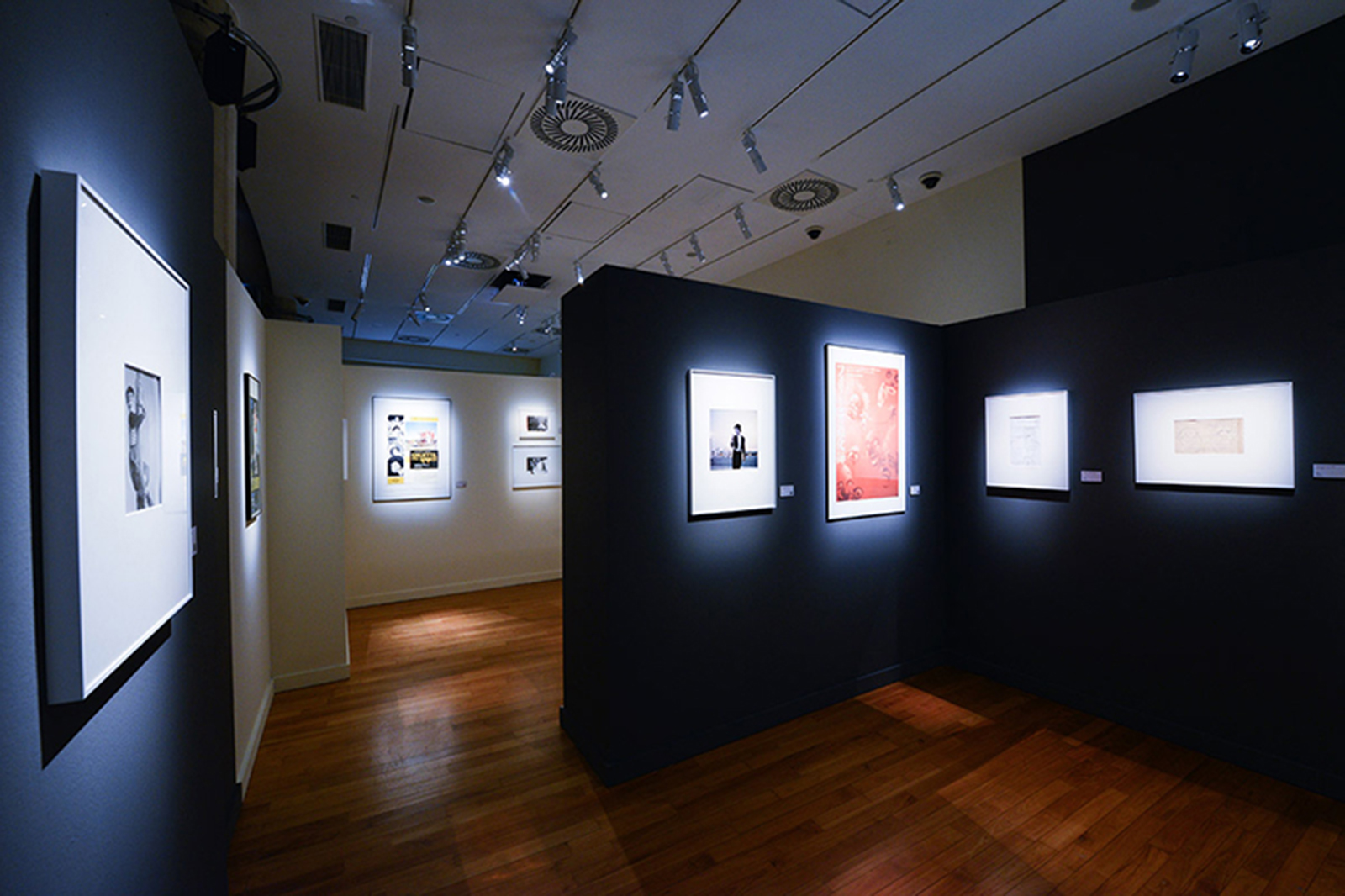
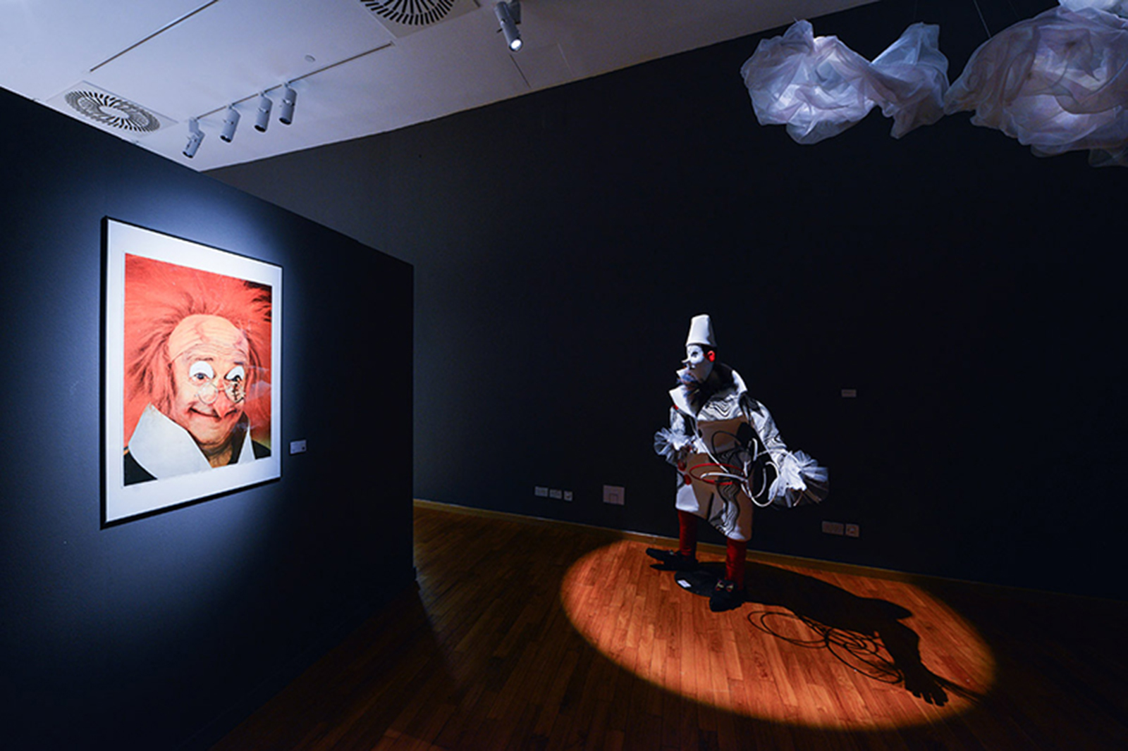
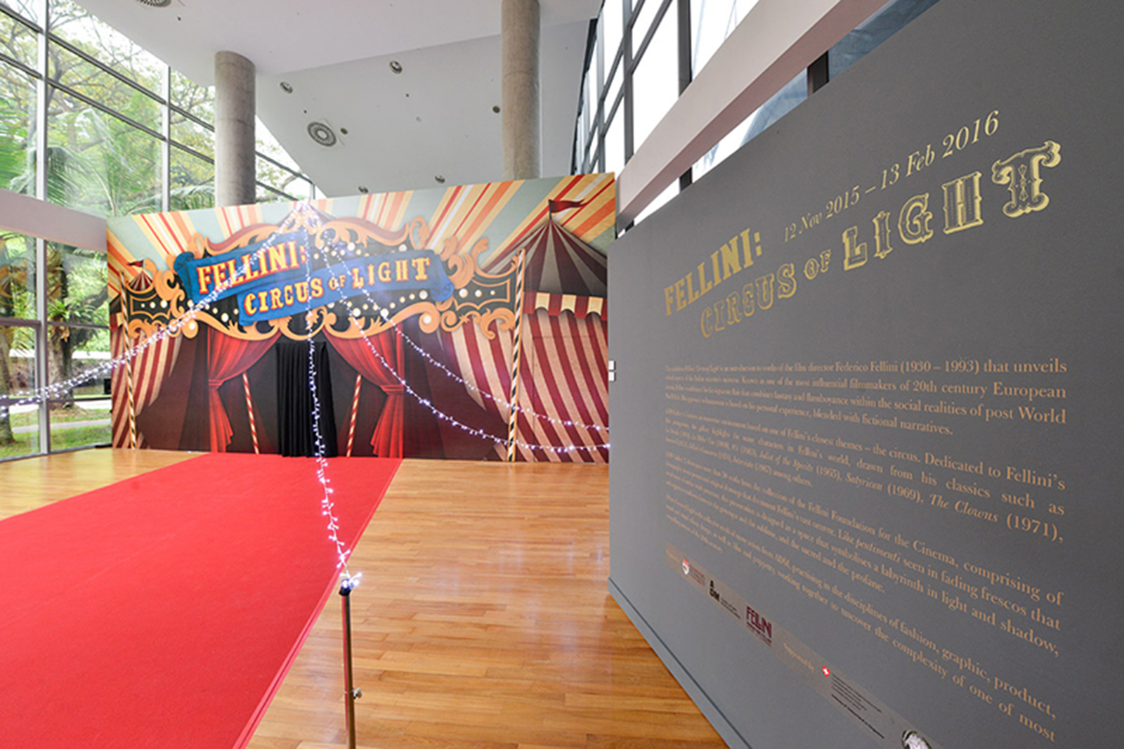
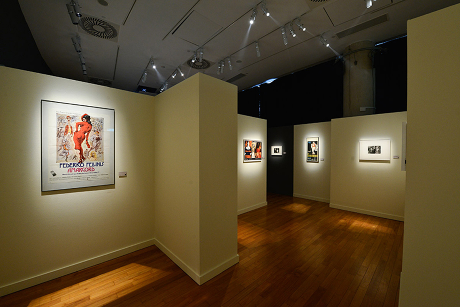
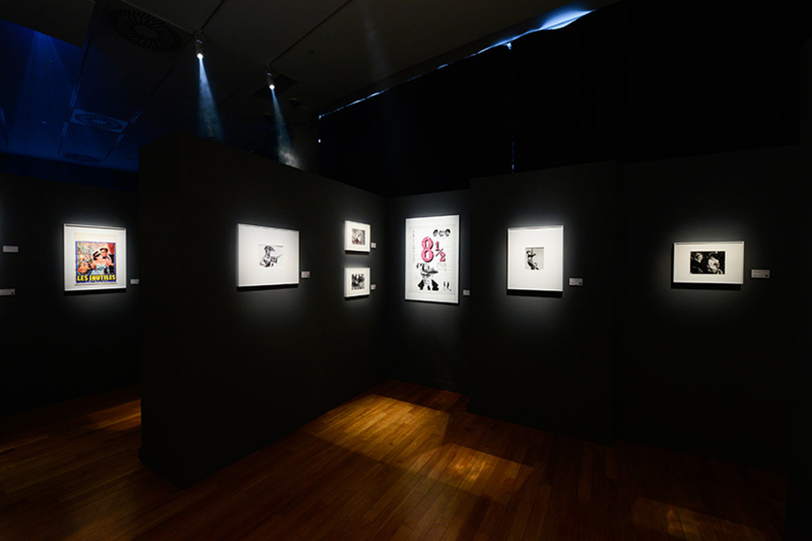
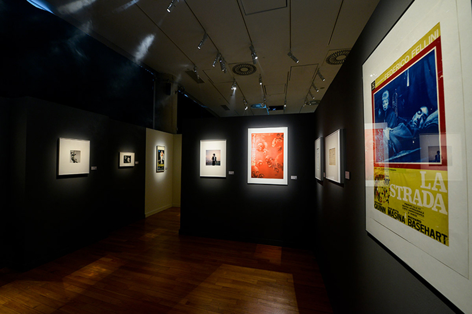
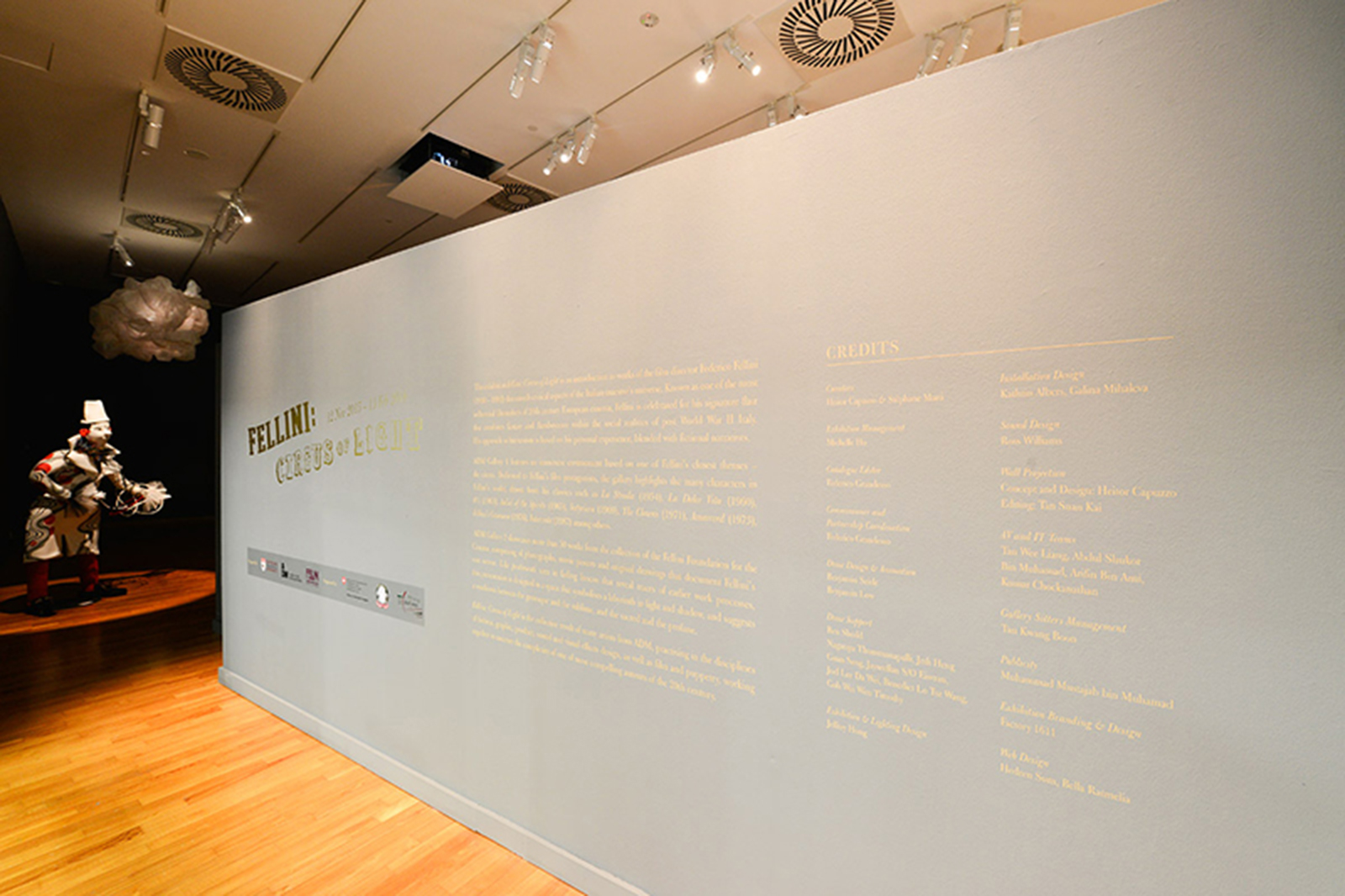
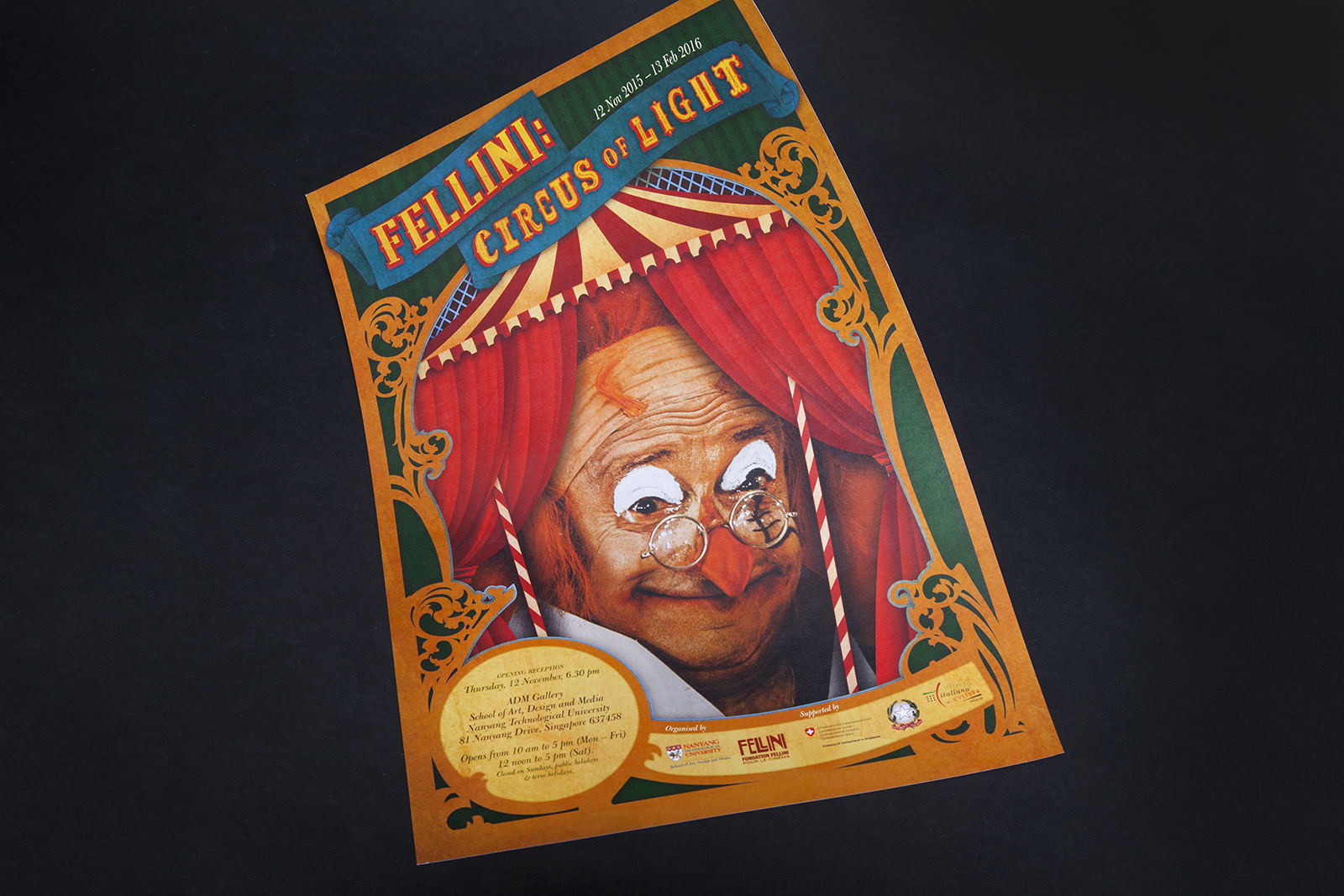
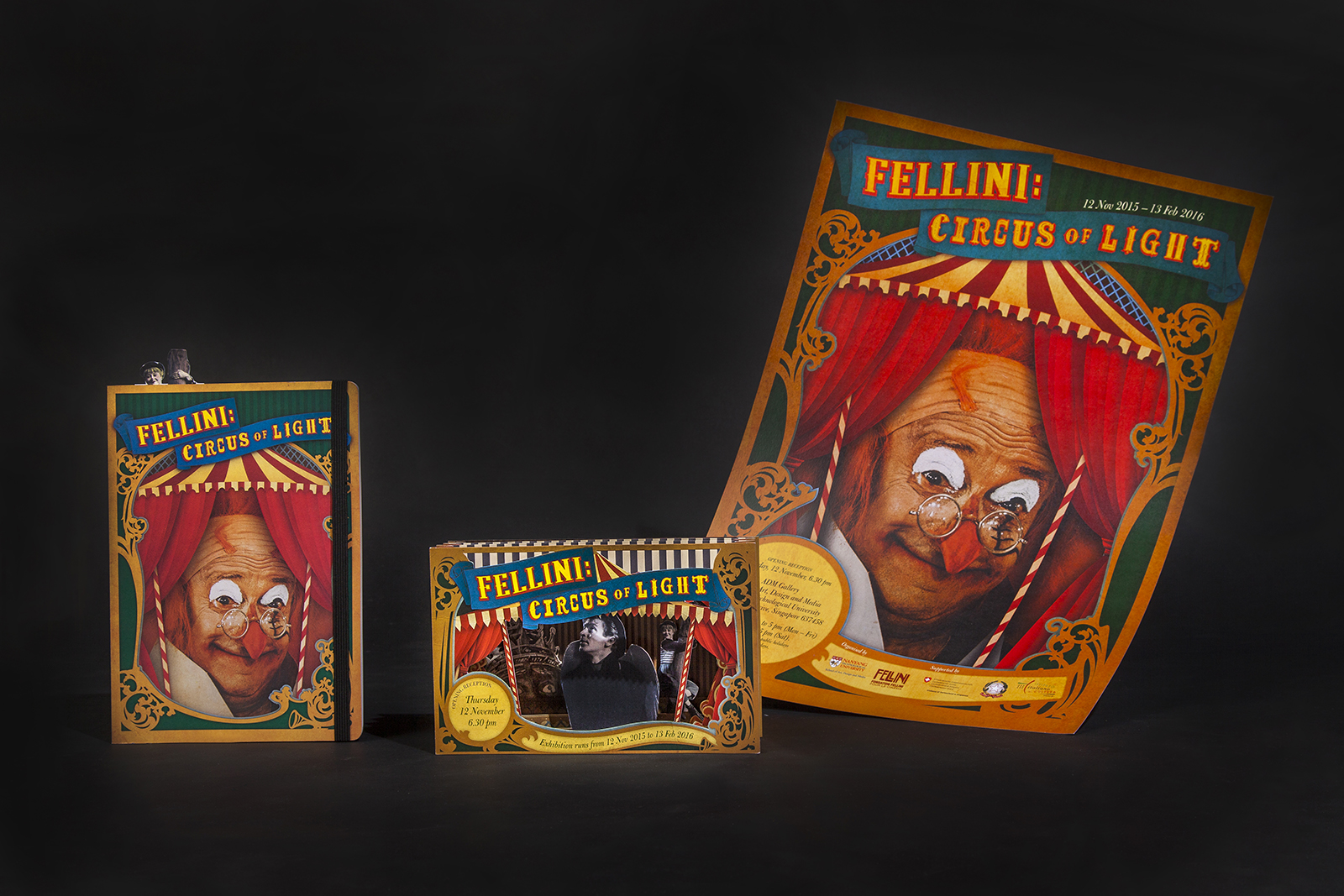
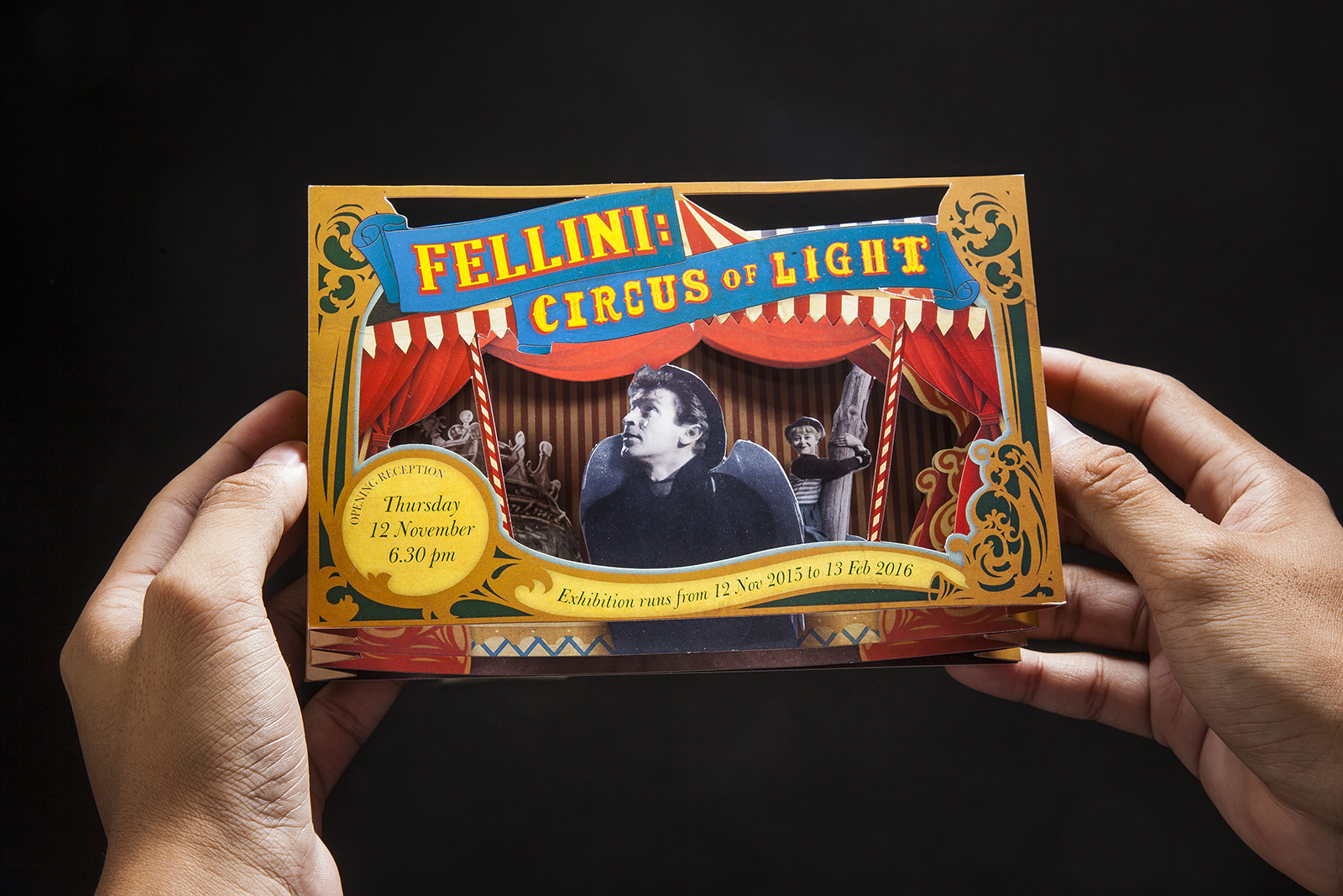
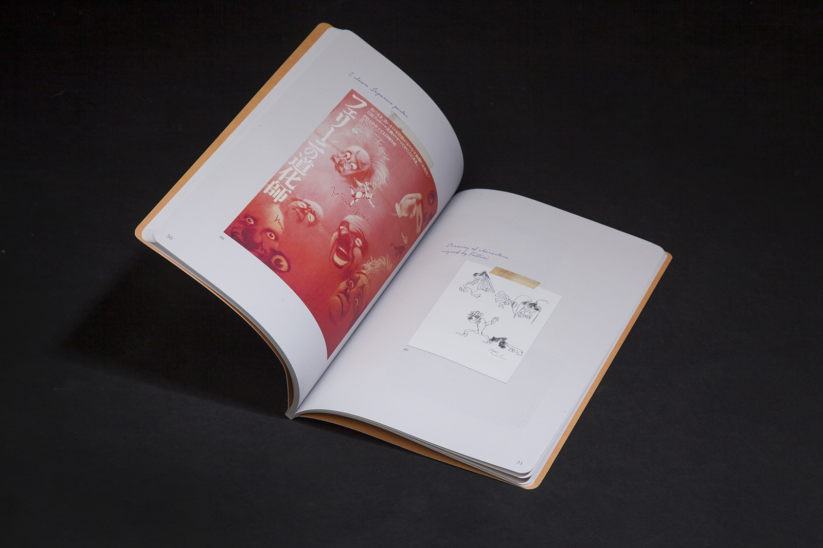
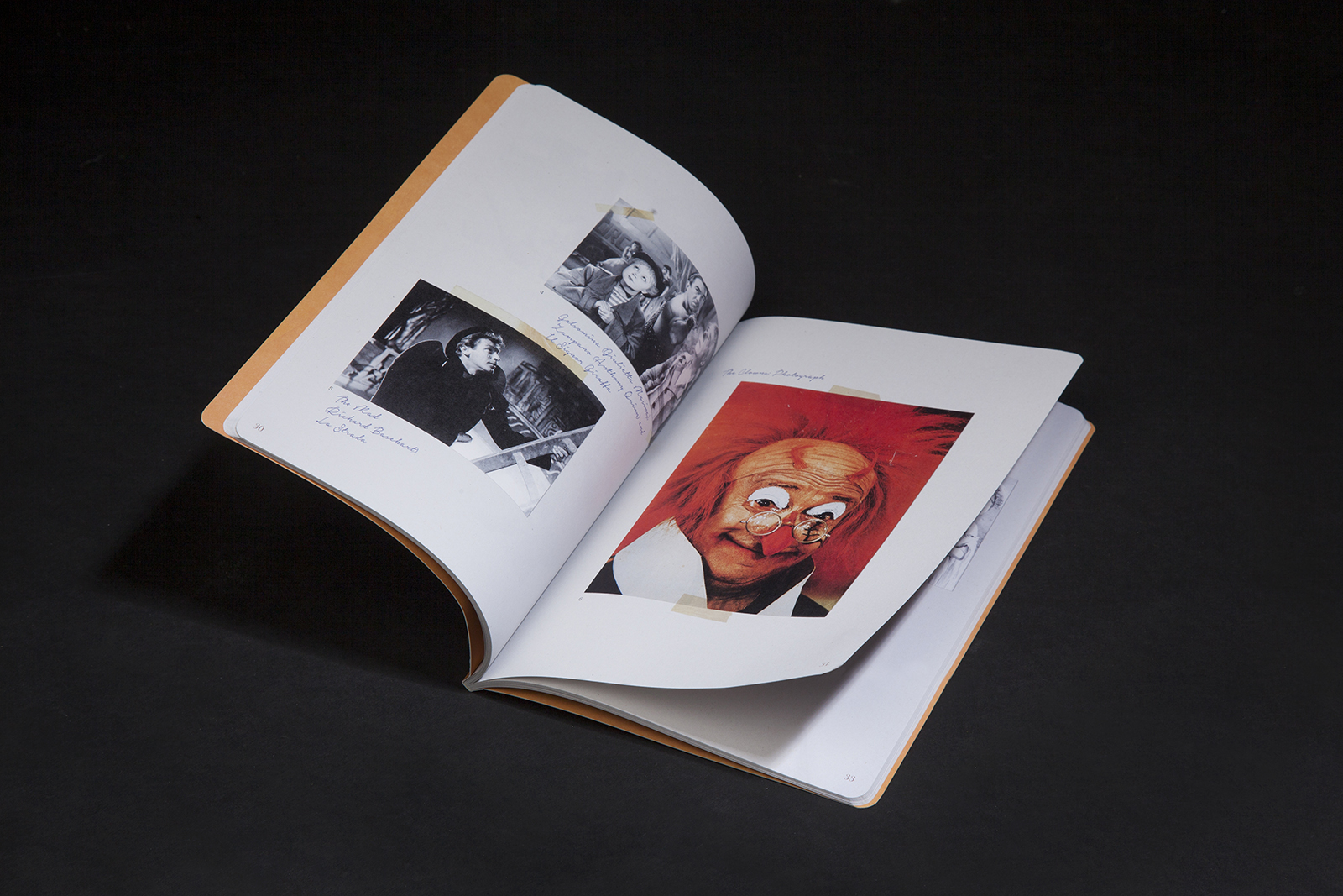
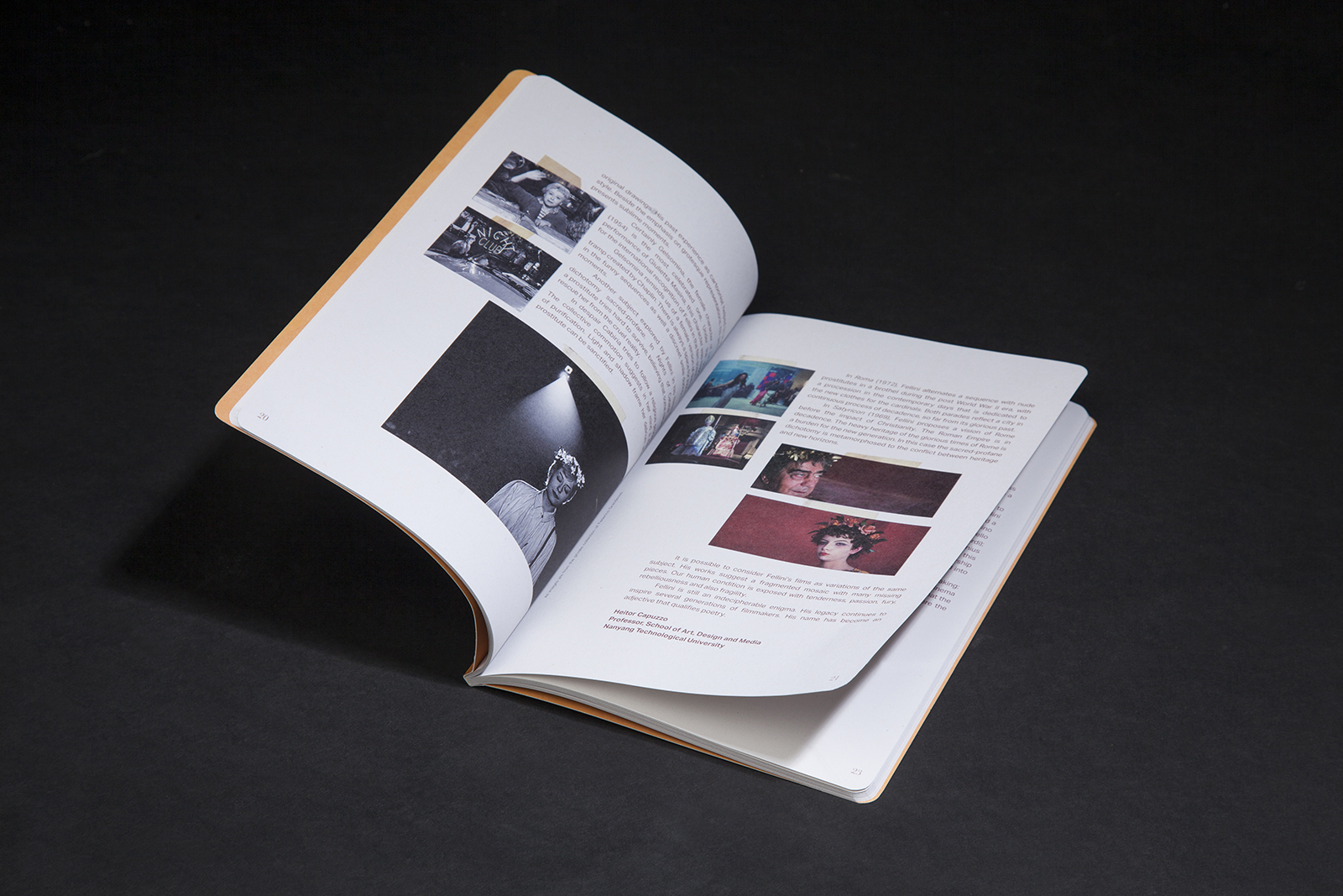
The exhibition Fellini: Circus of Light held at ADM Gallery in the School of Art, Design and Media is an introduction to works of the late film director Federico Fellini (1930 – 1993), known as one of the most influential filmmakers of 20th century European cinema and celebrated for his signature flair that combines fantasy and flamboyance within the social realities of post World War II Italy. Featuring more than 50 photographs, movie posters and original drawings from the collection of the Fellini Foundation for the Cinema that documents Fellini’s vast oeuvre, the exhibition draws from Fellini’s classics such as La Strada (1954), La Dolce Vita (1960), 8½(1963), Juliet of the Spirits (1965), Fellini Satyricon (1969), The Clowns (1971), Amarcord (1973), Fellini’s Casanova (1976), Intervista (1987) amongst others.
The exhibition unveils critical aspects of the Italian maestro’s universe as well as his approach to humanism is based on his personal experience, blended with fictional narratives. Inspired by Fellini famous statement, “the clowns are the ambassadors of my vocation…“, we crafted the exhibition identity using a whimsical circus styled typography and graphical system.
View official website here
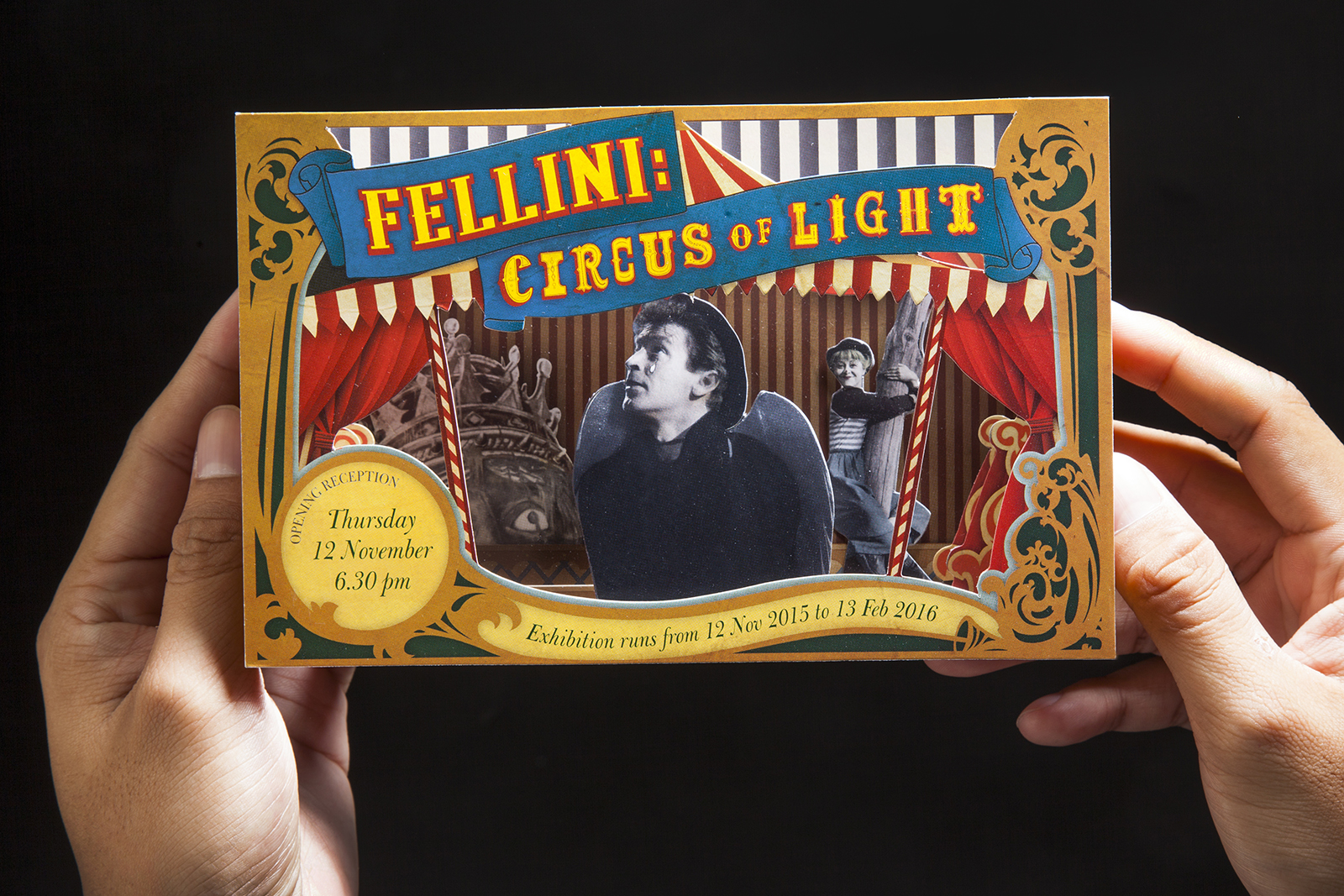
Invite
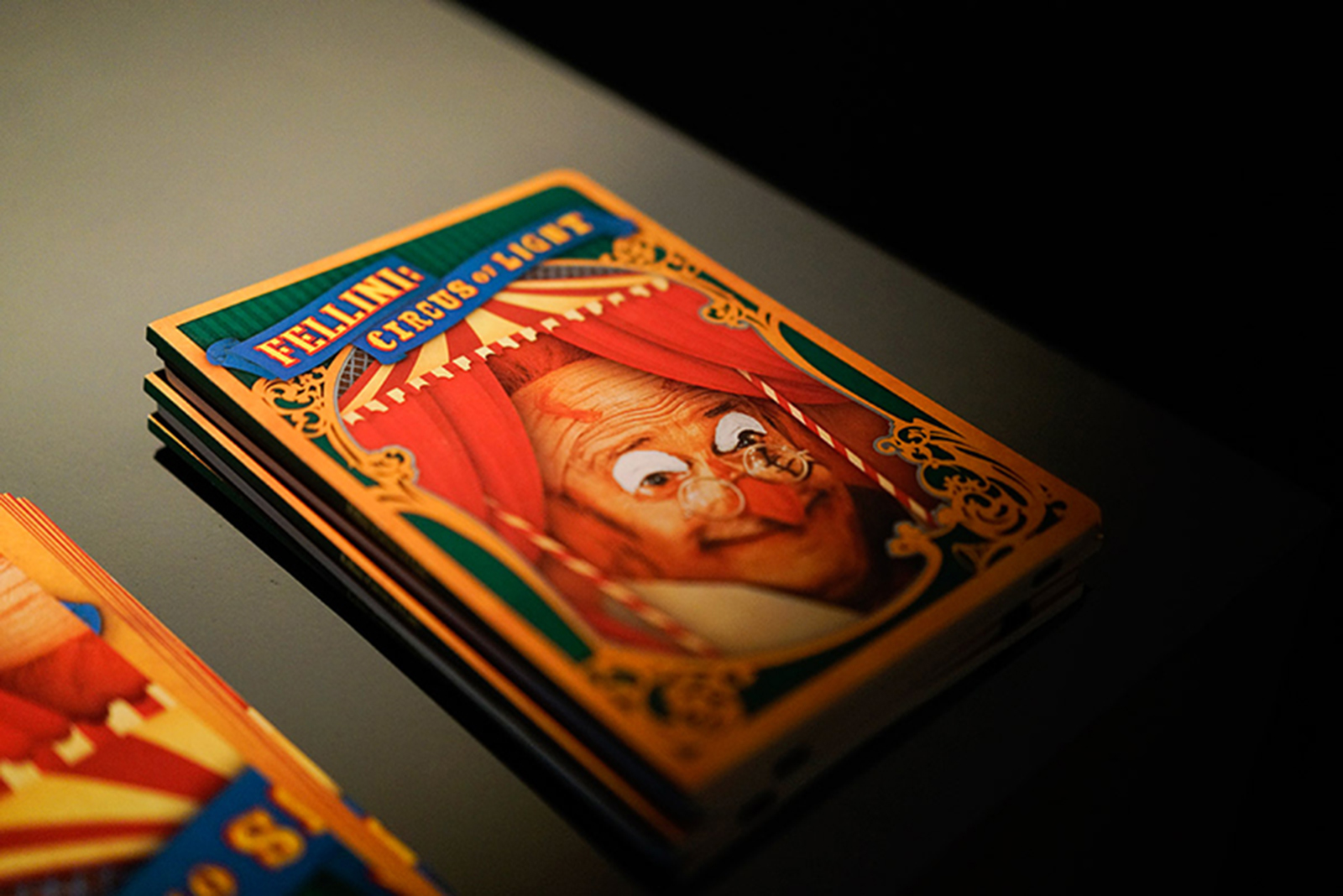
An interactive invite which uses a tunnel technique to lead the viewers into the circus atmosphere which imbues Fellini’s multi-layered works using many classic motifs from his films. It also serves as a desktop collectable for admirers of Fellini’s works.
Publication
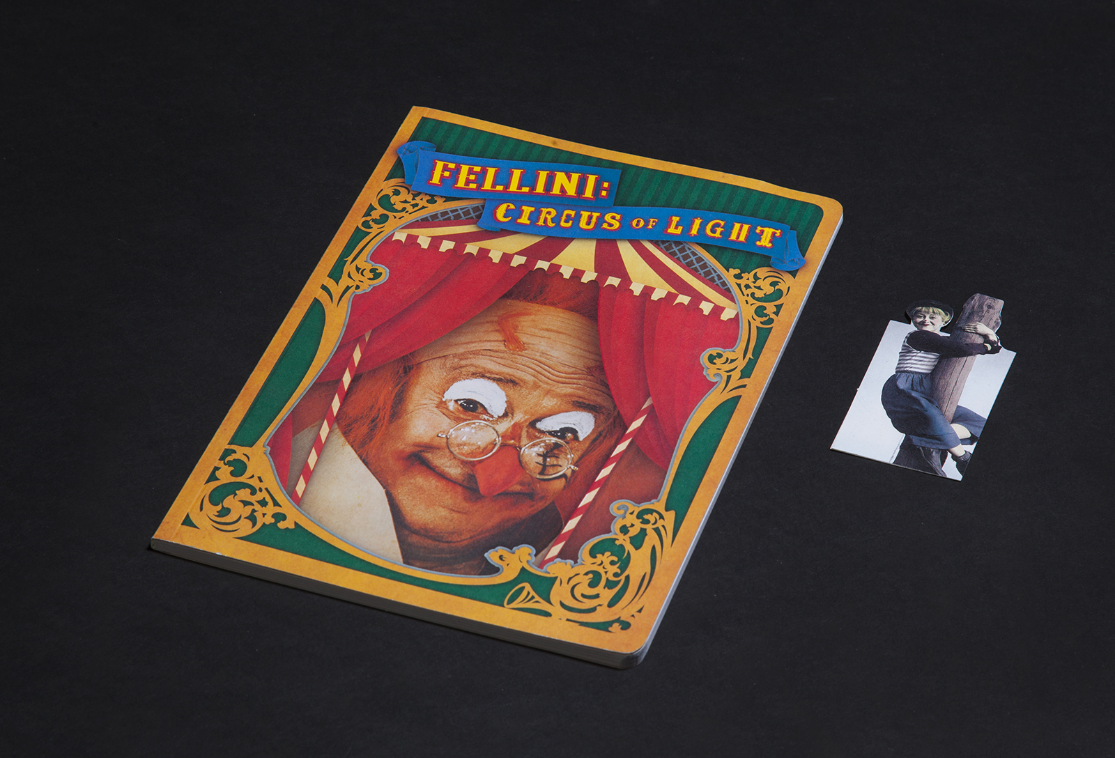
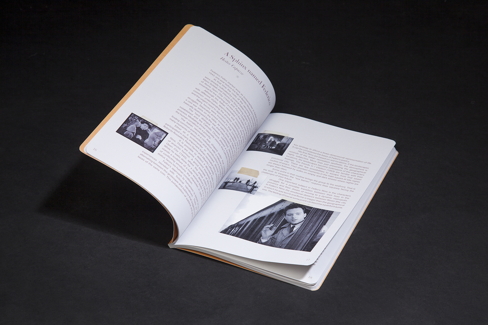
This book was published in conjunction with the exhibition, an intimate publication which features Fellini’s works on exhibit as well as essays written about him and the show. Taking inspiration from the fact that Fellini is known to be an avid cartoonist, extra attention was made to design the publication like a notebook, inspired by one of the many belonging to Fellini himself. It also comes with a die-cut bookmark featuring Fellini’s wife who played Gelsomina from the film La Strada, 1954.
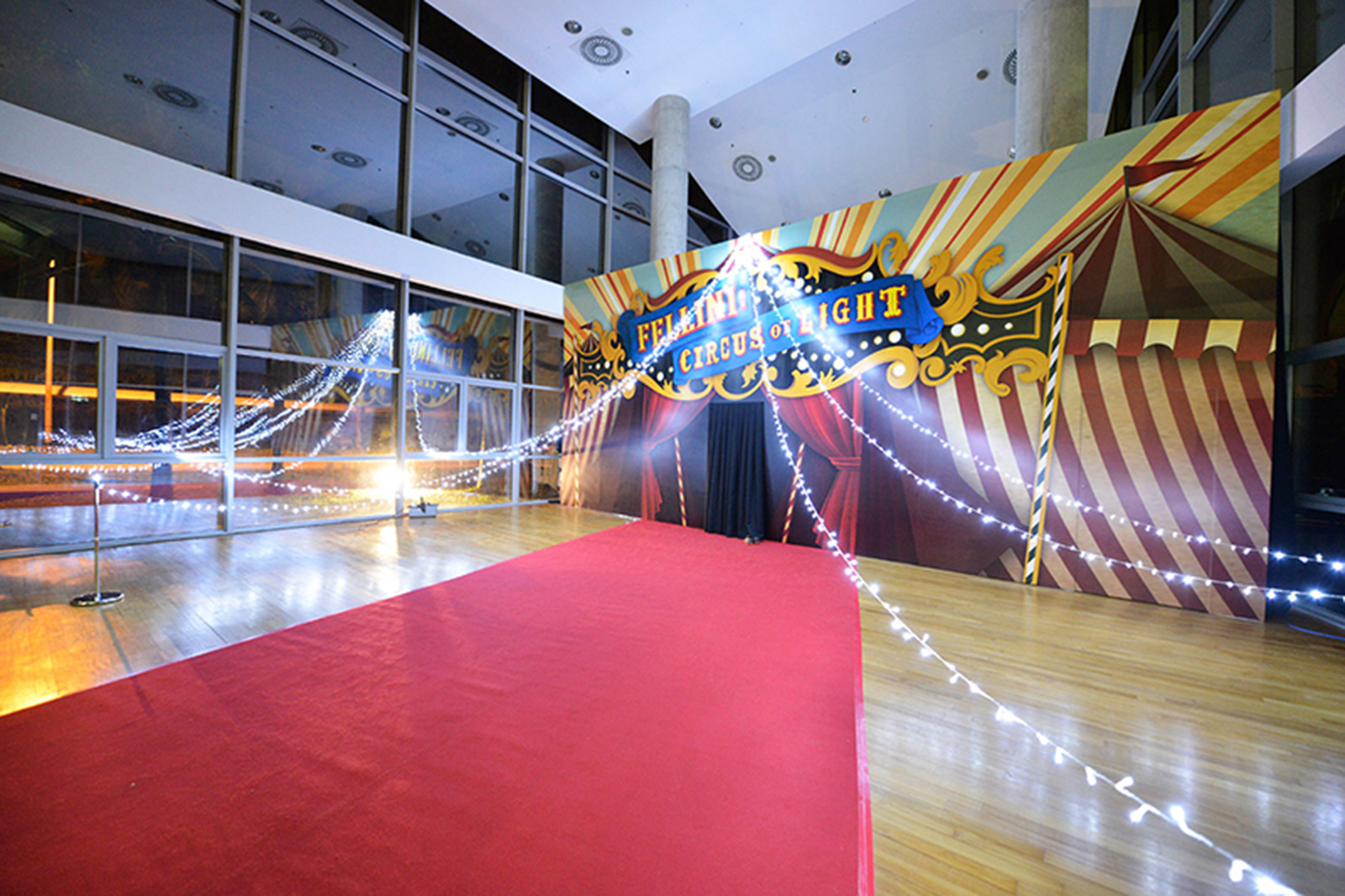
Environmental Graphics


Event photos: Credit of ADM Gallery
The Tulip Story is a commemorative book that celebrates the successful art and health initiative led by Assistant Professor Michael Tan in partnership with Parkinson Society Singapore. It showcases a collection of creative paperclay artworks created by people with Parkinson and their caregivers, offering viewers an understanding of how participation in art activities enhances the lives of the patients and their caregivers.
Inspired by the journey of these participants, a family of Tulips (the official symbol within the Parkinson’s community) is being etched onto the cover using pearl and bronze foil stamping to present the strength and spirit of the community, as well as the personal stories shared within. The warm peach cover, intimate typesetting formats and paper choice creates a quiet, yet strong identity for this very special publication. Encased within an inlet in the back cover is a set of postcards featuring Tulip clay artworks by the participants.
Exhibited in SingaPlural 2016 – Recognition Showcase


TODAY IS THE DAY is a visionary non-profit making organization based in Japan, New York, Singapore and Zurich, whose goal is to bring positive change to the world through art based activities and lectures. In July 2015, it organized “MIRACLE KUTCHIE EXPERIENCE” – An art retreat exchange program in Singapore that uses art therapy as a medium to heal children who have suffered from complex trauma from Fukushima.
We designed an interesting duo-tone origami-fold brochure and invite for the event, which opens up to articulate the purpose of the programme as well as the projected outcomes of this event.


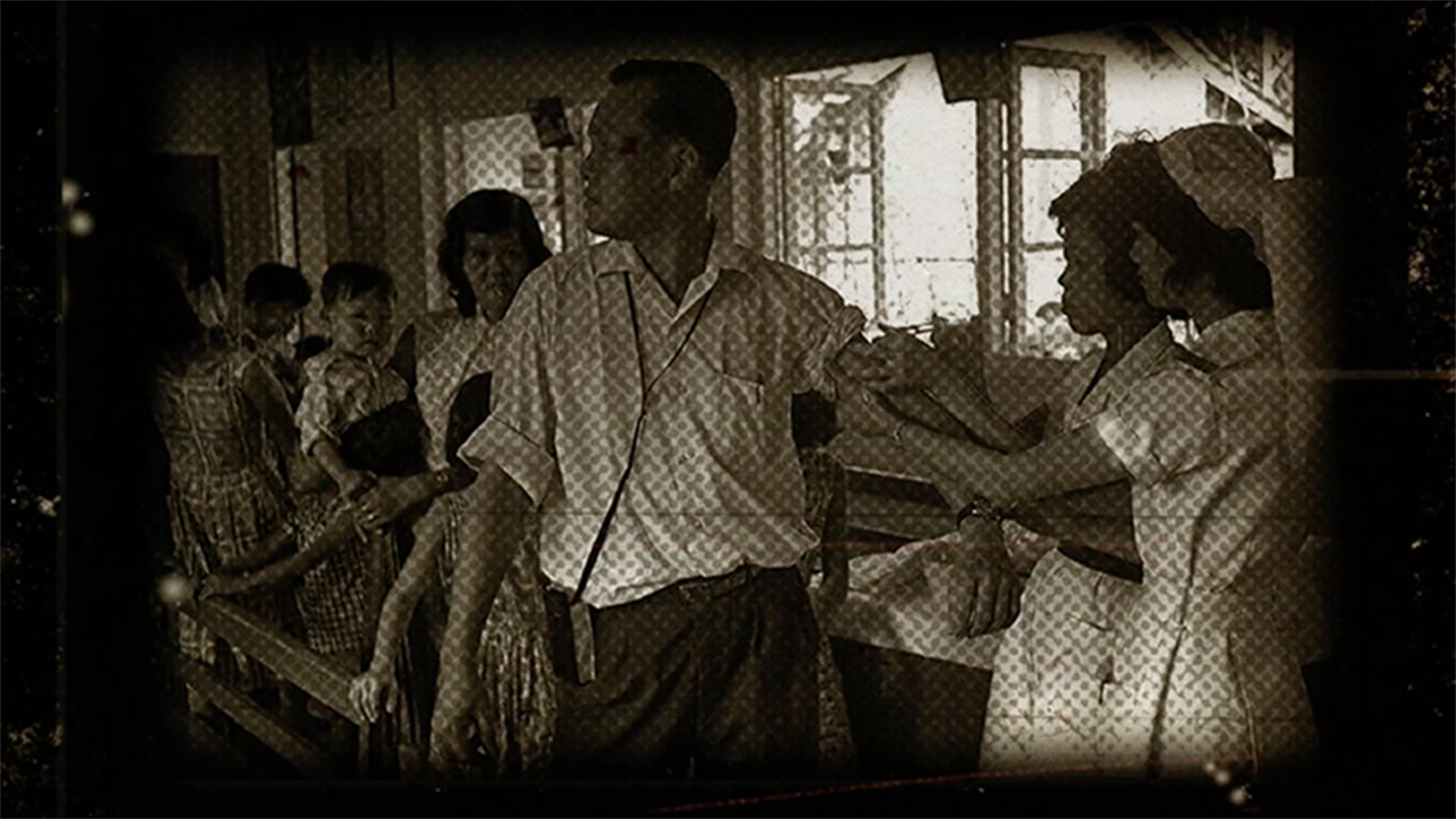
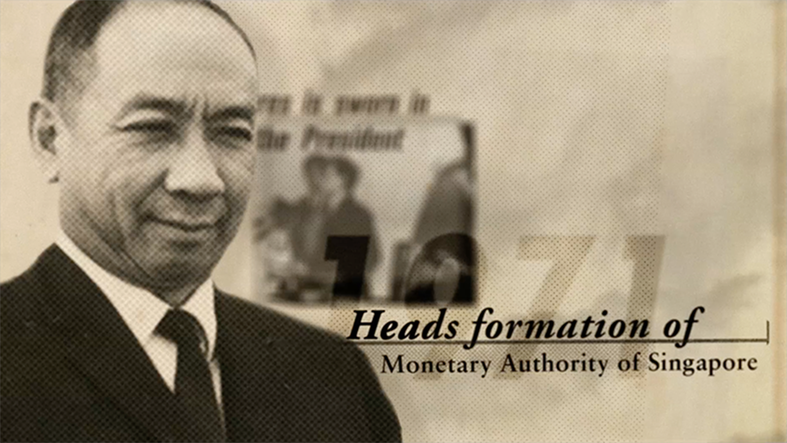
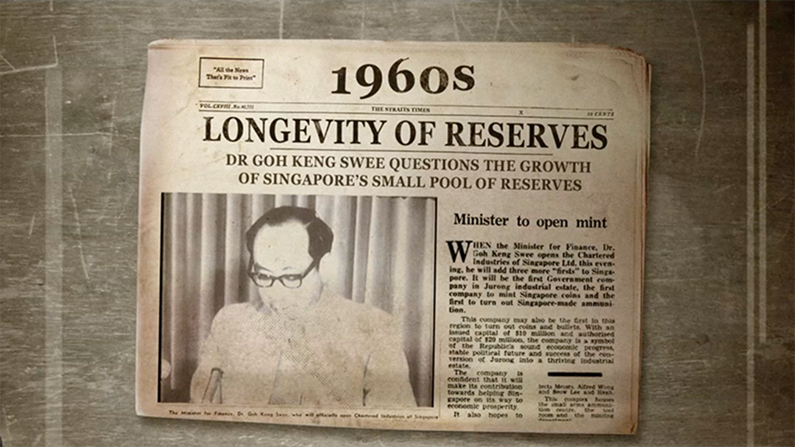
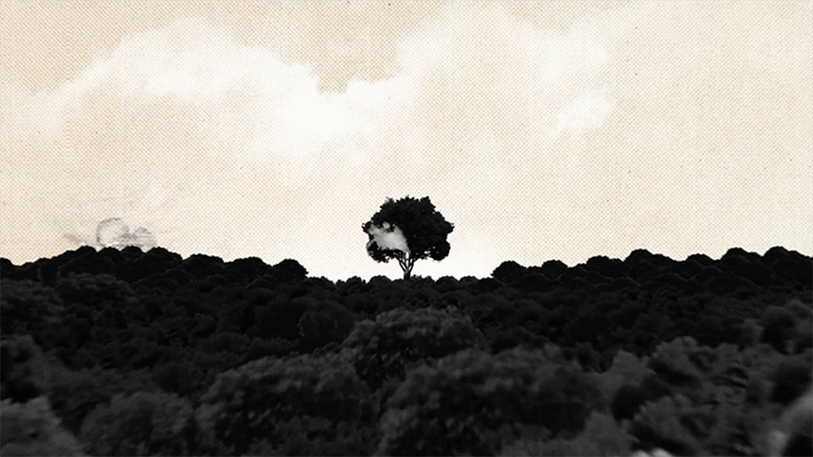
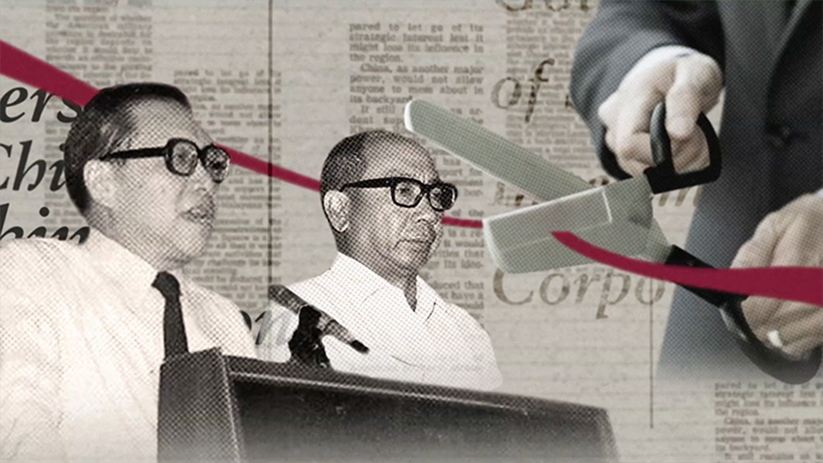
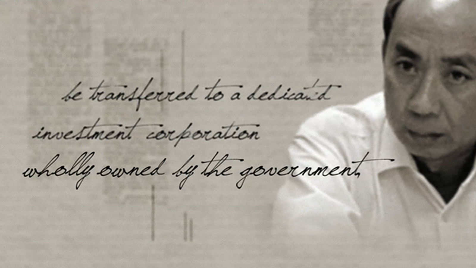
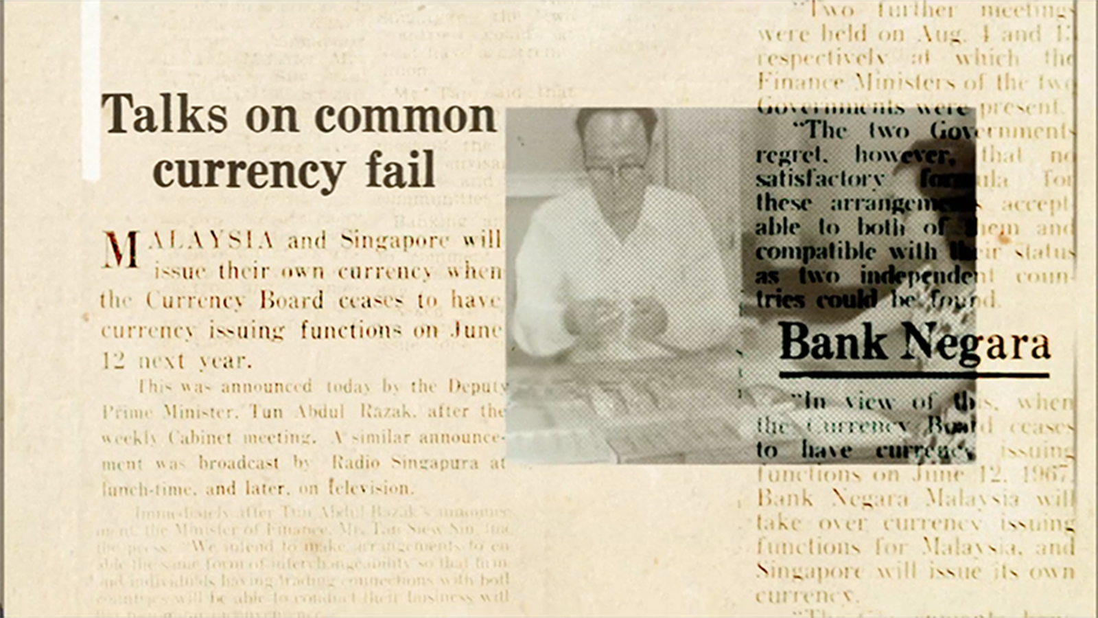
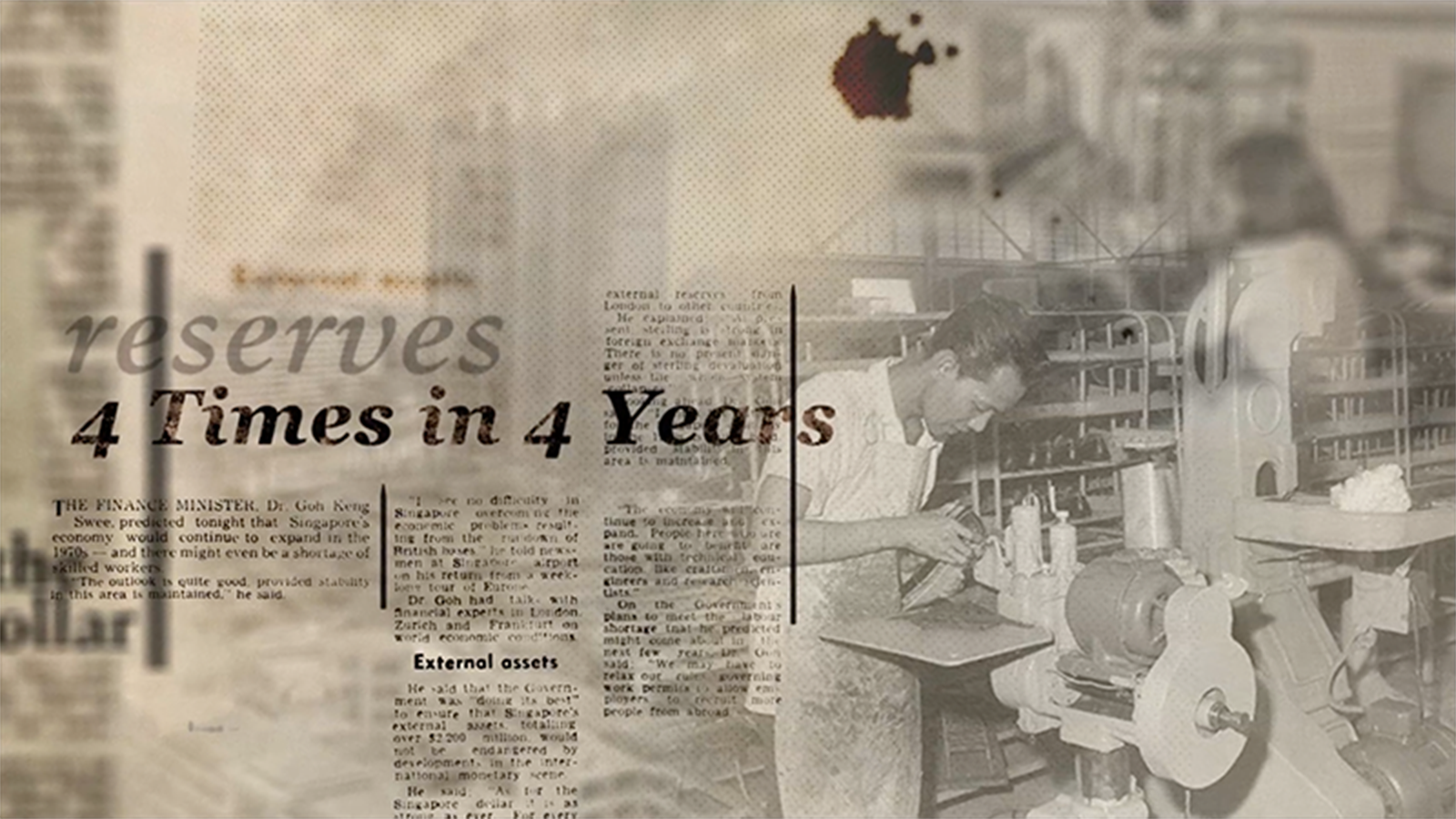
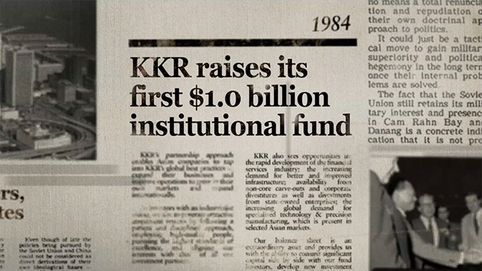
Being the first mover is very much in GIC’s history, legacy and DNA. The early days of Singapore’s founding was a time of great uncertainty, and Singapore’s pioneers dared to envision the unknown, to forge ahead and to lay the foundations for what GIC is today.
We were commissioned by GIC to produce an animated brand film to convey the essence of this very pioneering spirit through a strong narrative element. This video was screened worldwide throughout all their international offices in conjunction with their 34th Anniversary Blue and Silver day.
In Collaboration with Semicolon


Special thanks to the following organisations for source footages.
Source: The Straits Times © Singapore Press Holdings Limited. Reproduced with permission.
Source: The Sunday Times © Singapore Press Holdings Limited. Reproduced with permission.
Source: National Archives of Singapore. Reproduced with permission.
Source: Singapore Tourist Promotion Board Collection, Courtesy of the National Archives of Singapore. Reproduced with permission.
Source: Ronni Pinsler Collection, Courtesy of the National Archives of Singapore. Reproduced with permission.
Source: MediaCorp Pte Ltd, Courtesy of the National Archives of Singapore. Reproduced with permission.
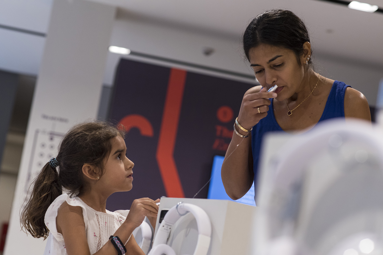
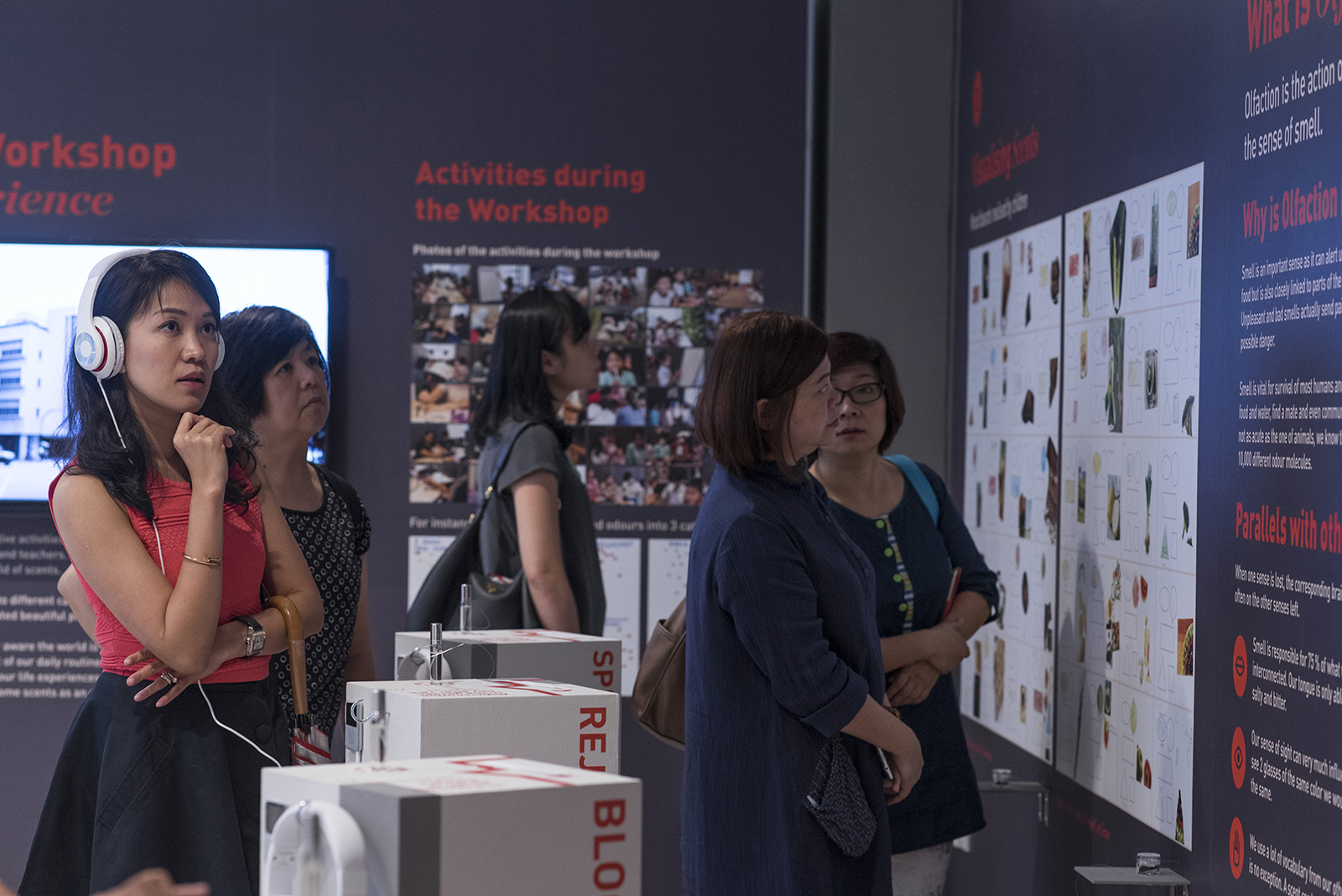
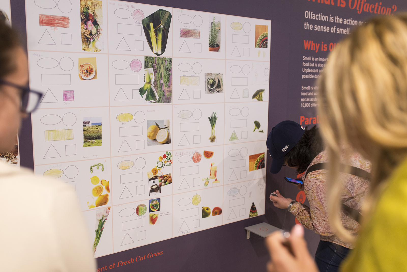
In conjunction with the ManyWaysOfSeeing (MWOS) series organised by Design council Singapore, we worked closely with fragrance experts NoseWhoKnows to handle the branding for Make Scents of the World Around You, a series of workshops, seminars for pre-schoolers and pre-school educators, and an exhibition at the end which aims to provide an immersive experience for participants, complete with interactive elements throughout designed to engage one’s senses.
The focus of the experience is to allow viewers, through the artworks and scents created by the participants of the workshops, to better understand how olfaction interacts with our other senses and our memories and how it can be utilised as a medium of expression and communication instead of relying on better-known sensory-related tools such as pictures, sounds and words. The exhibition will serve to illustrate, by example, how olfaction can be integrated over a broad range of activities.
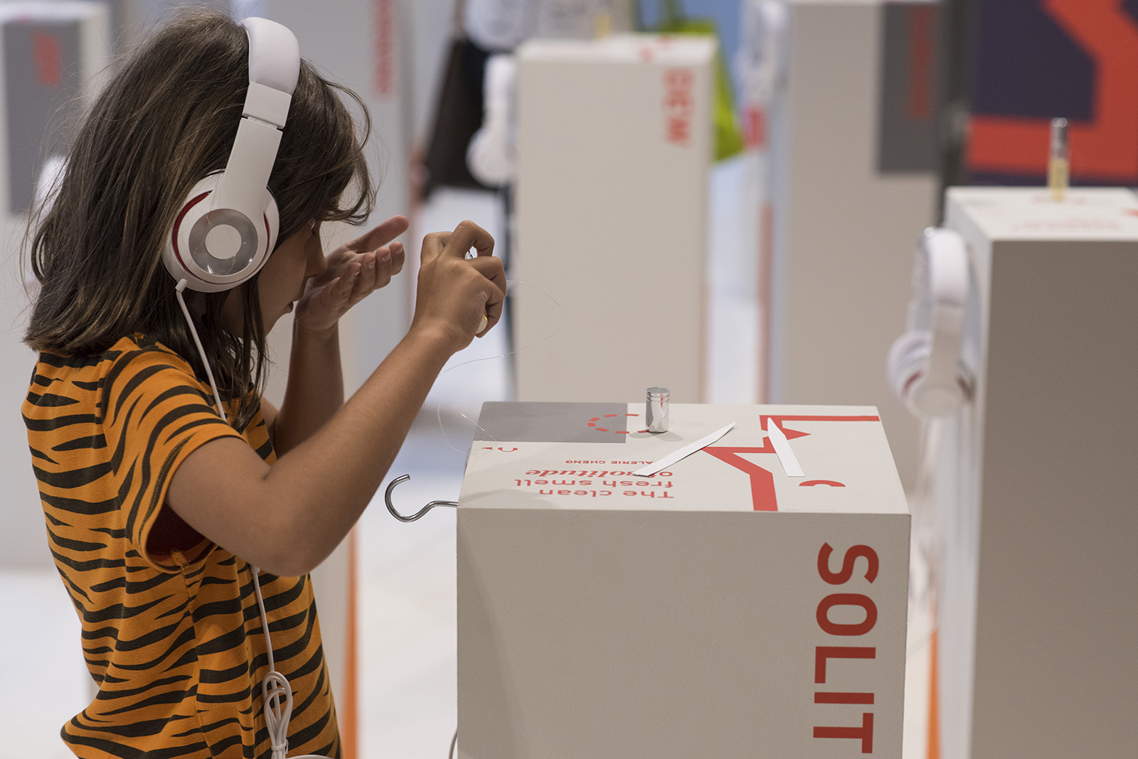
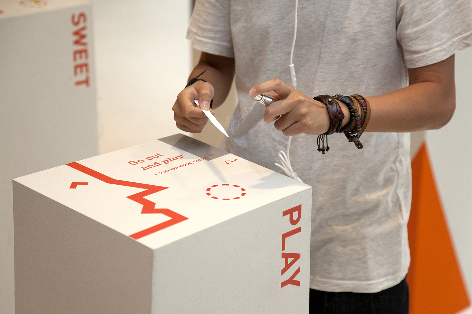
At the heart of the exhibition are twenty pedestals we designed to showcase scents which are inspired by the memories of the pre-school educators whom participated in the workshops. Smell is a powerful memory trigger, with the actual ability to smell highly linked to memory. In order to identity a scent, one must remember when he or she has smelled it before and then connect it to the visual information that occurred at the same time. With this in mind, we created these interactive kiosks which allowed viewers to immerse in the interviews with the educators as they recalled the memory which inspired the scent they created, while the viewer takes in the scent at the same time, creating a multi sensory experience.


Pedestal Top Design
Video Highlights
In collaboration with PraeImpact Studios
Workshop & Exhibition