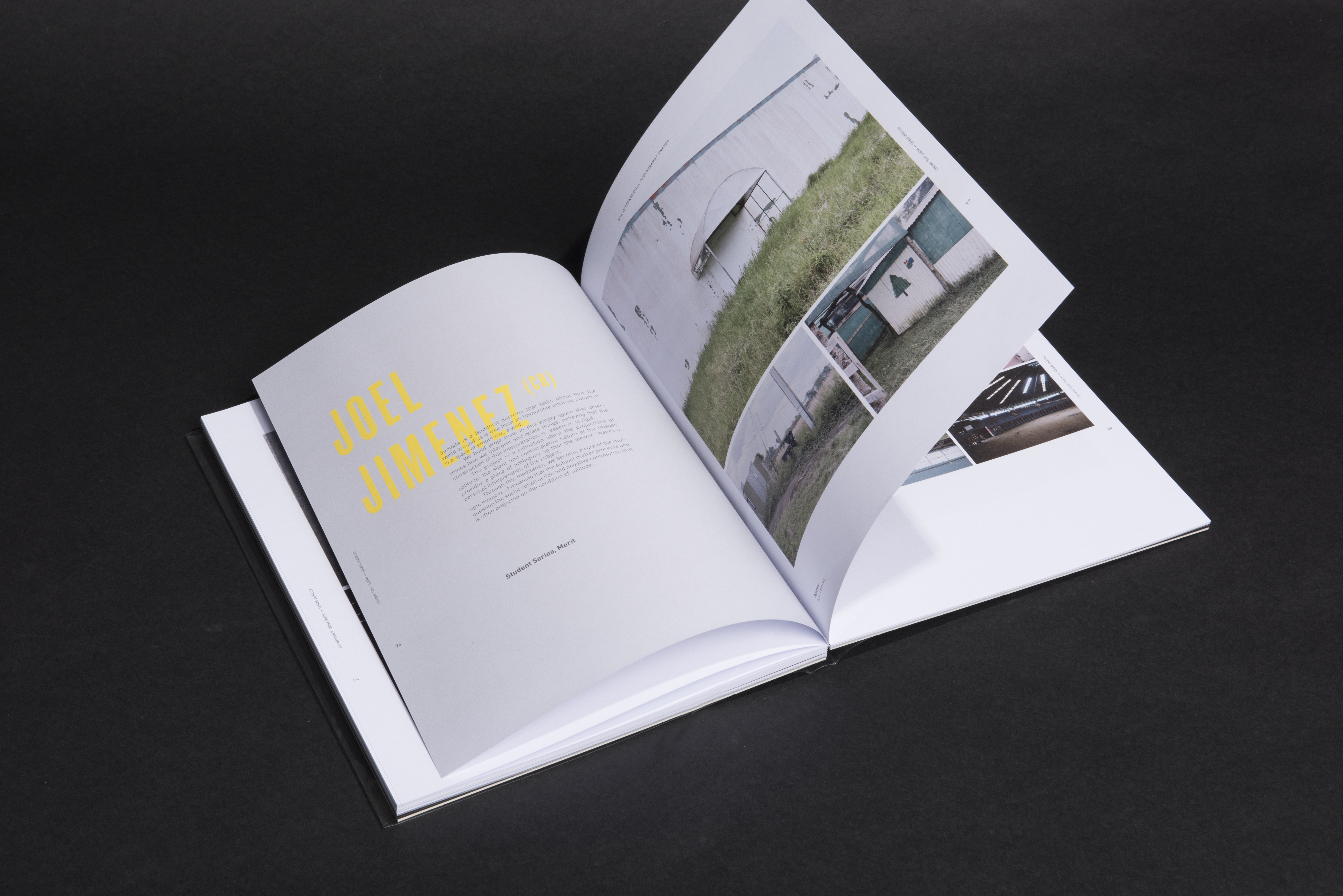
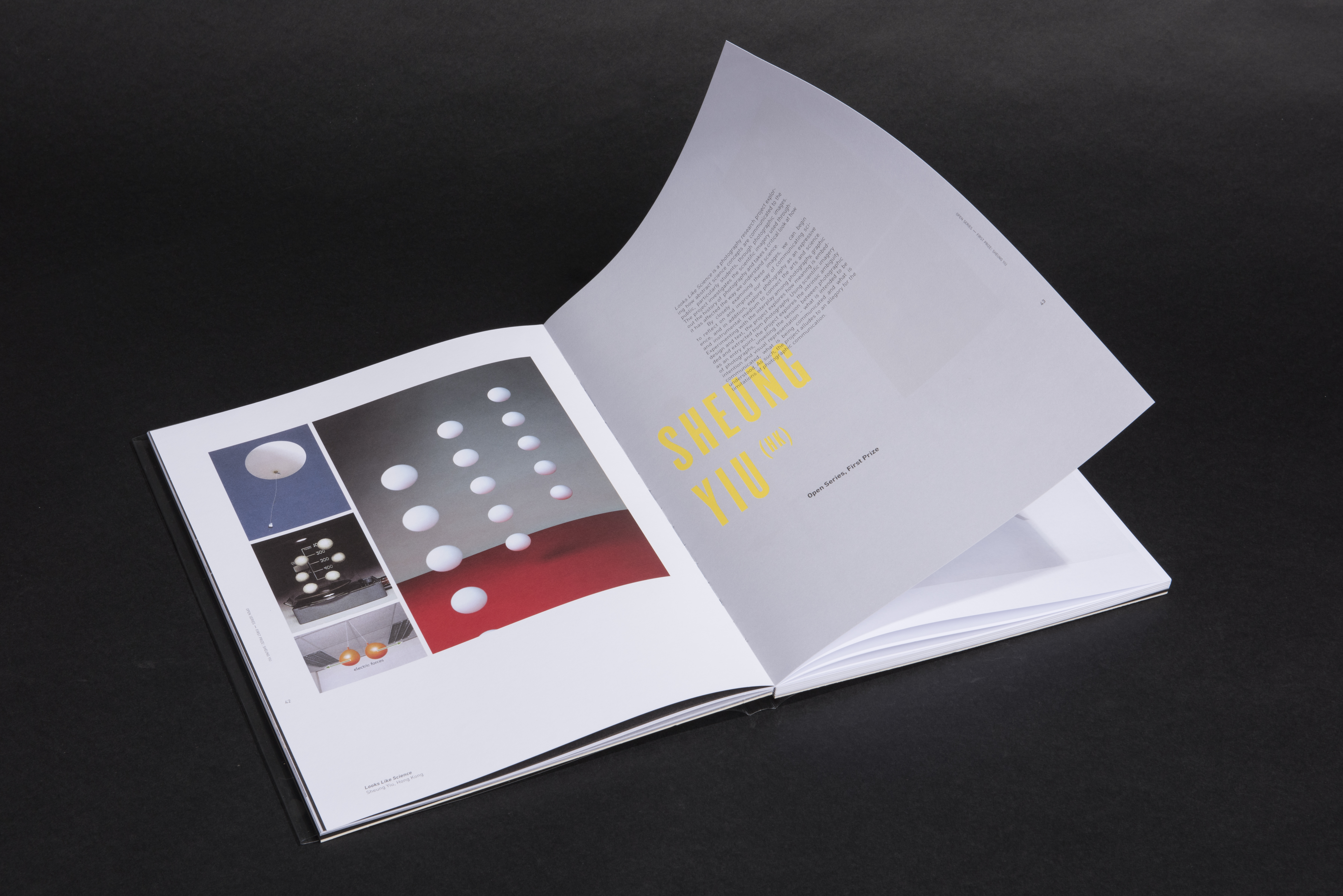
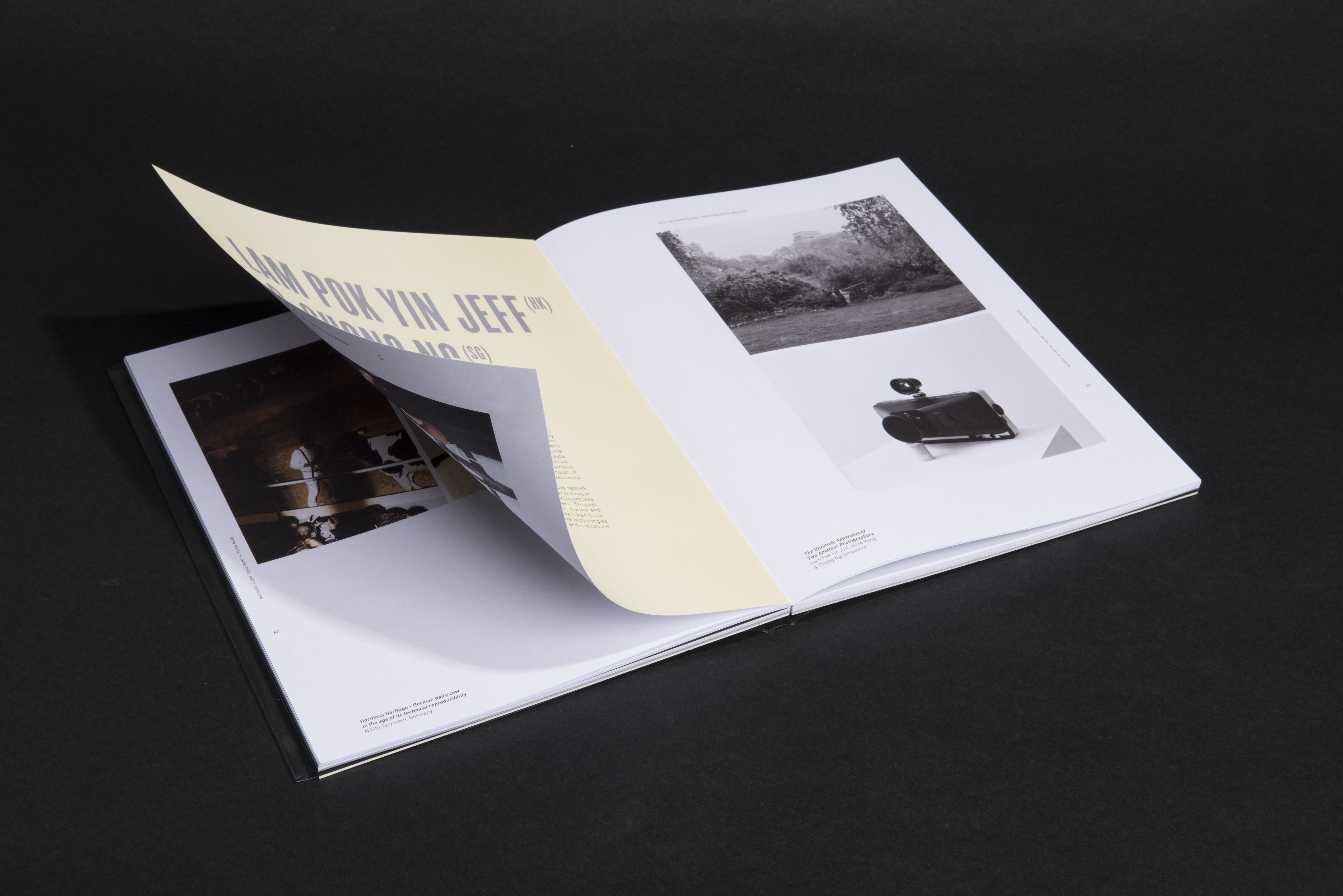
Exceptions of Rule: Counterpoints to Truth

2018

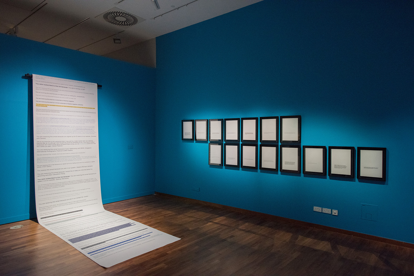
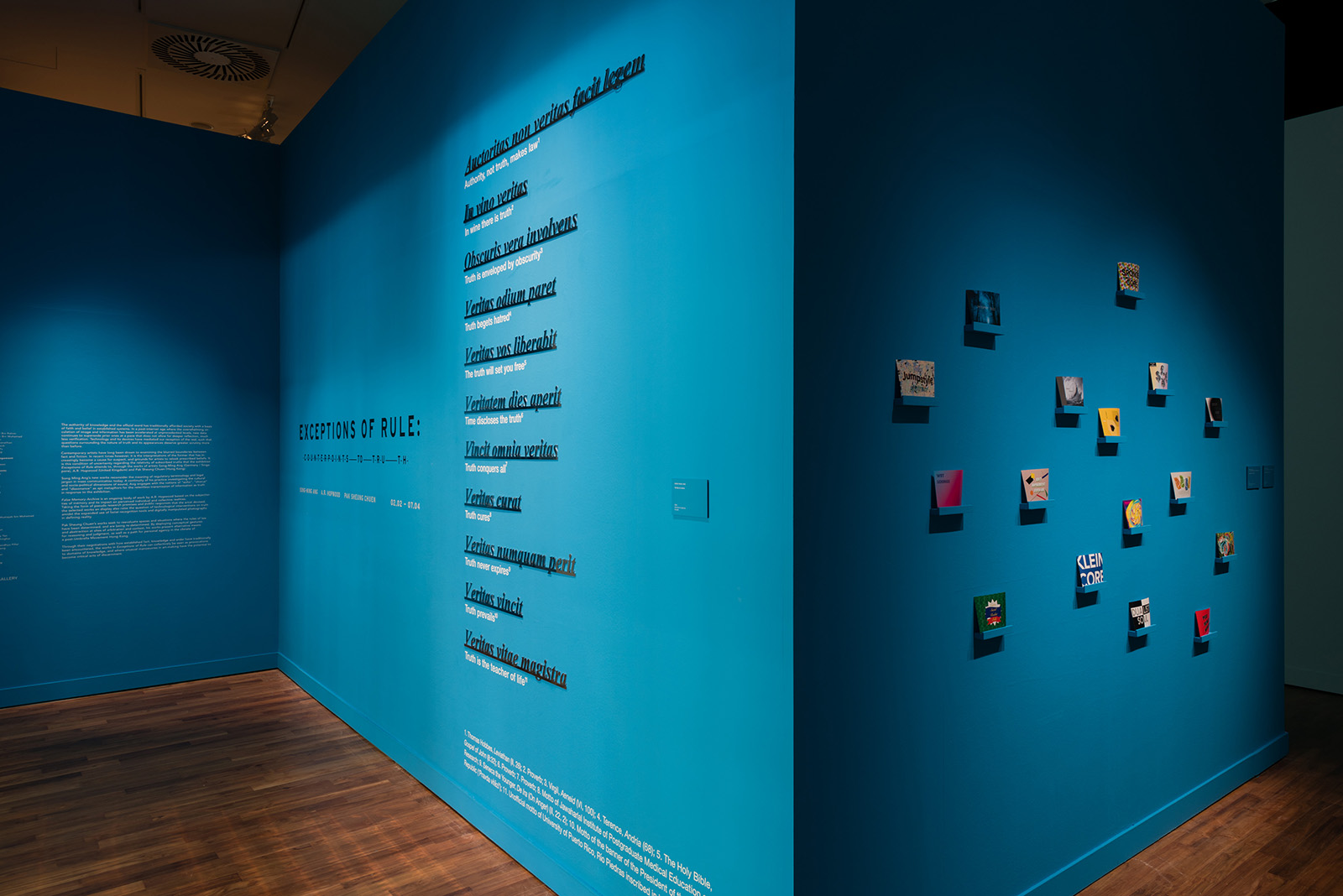
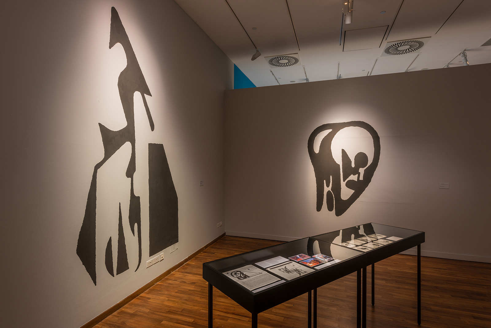
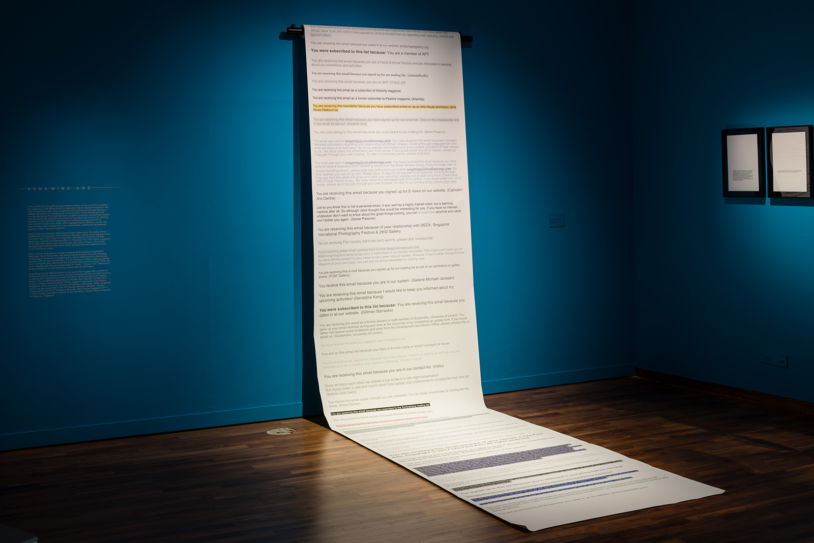
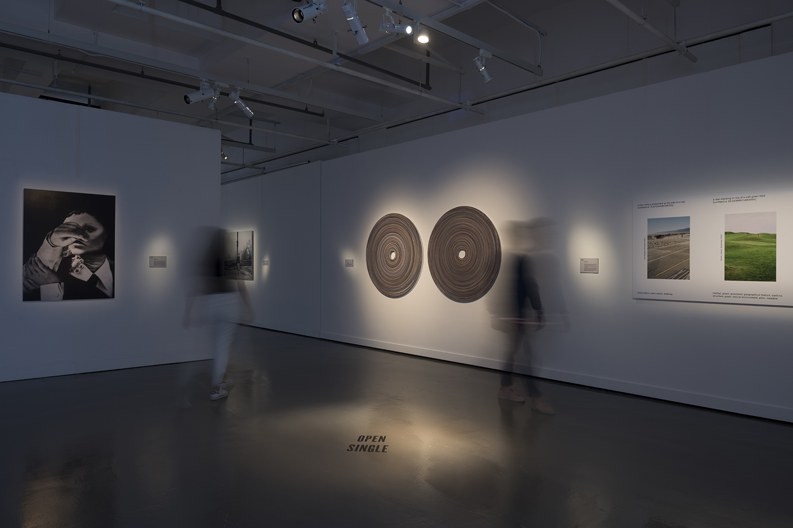
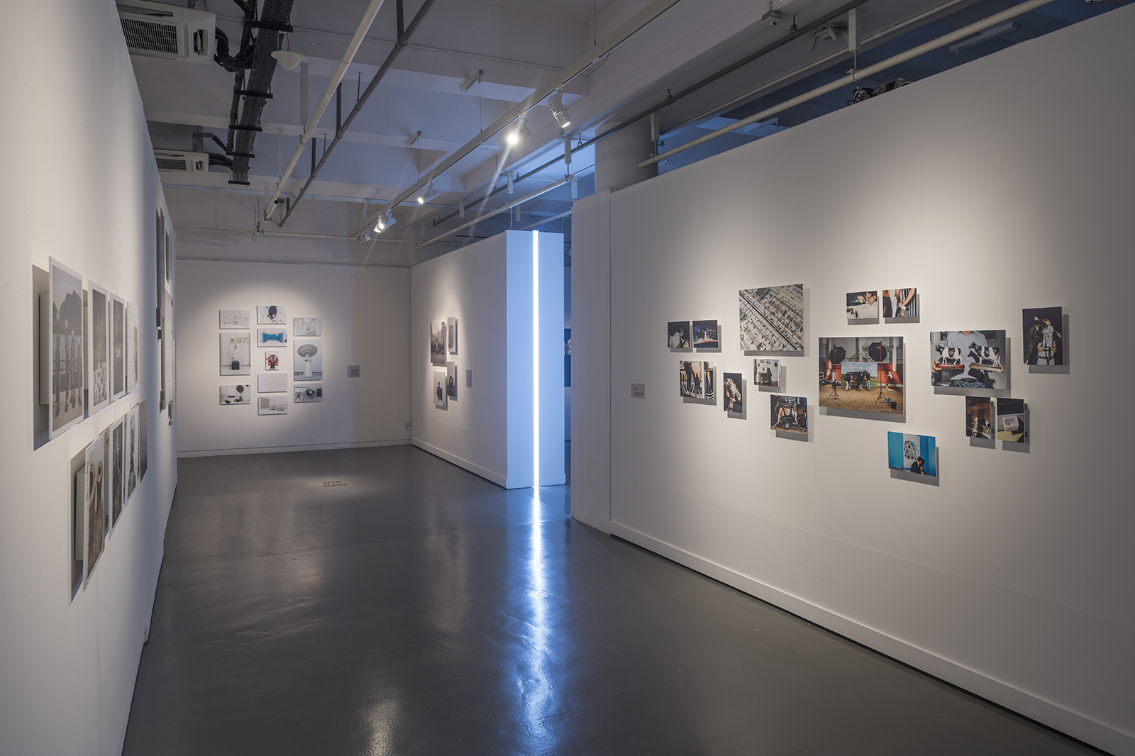
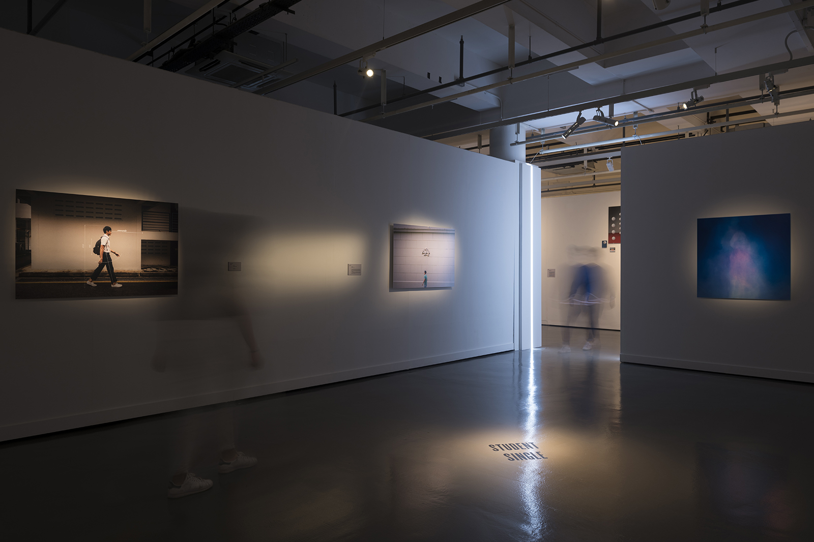
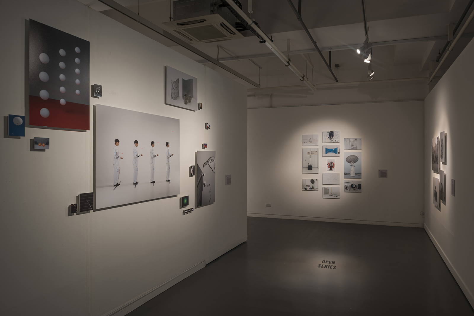
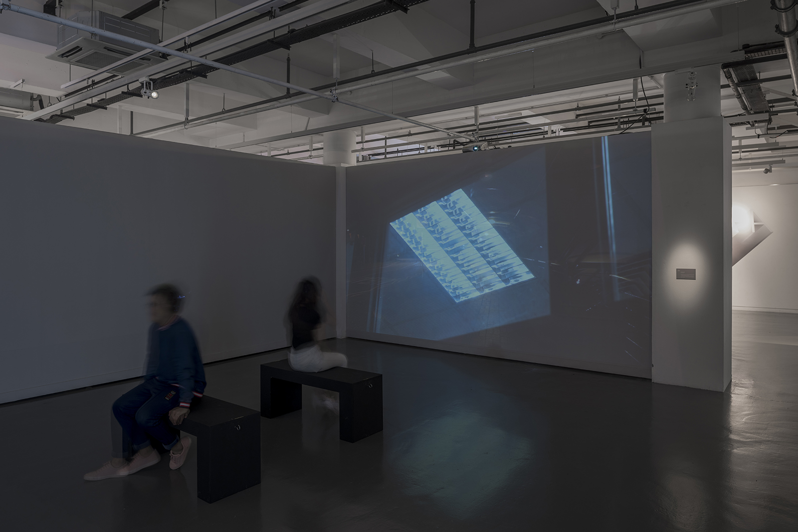
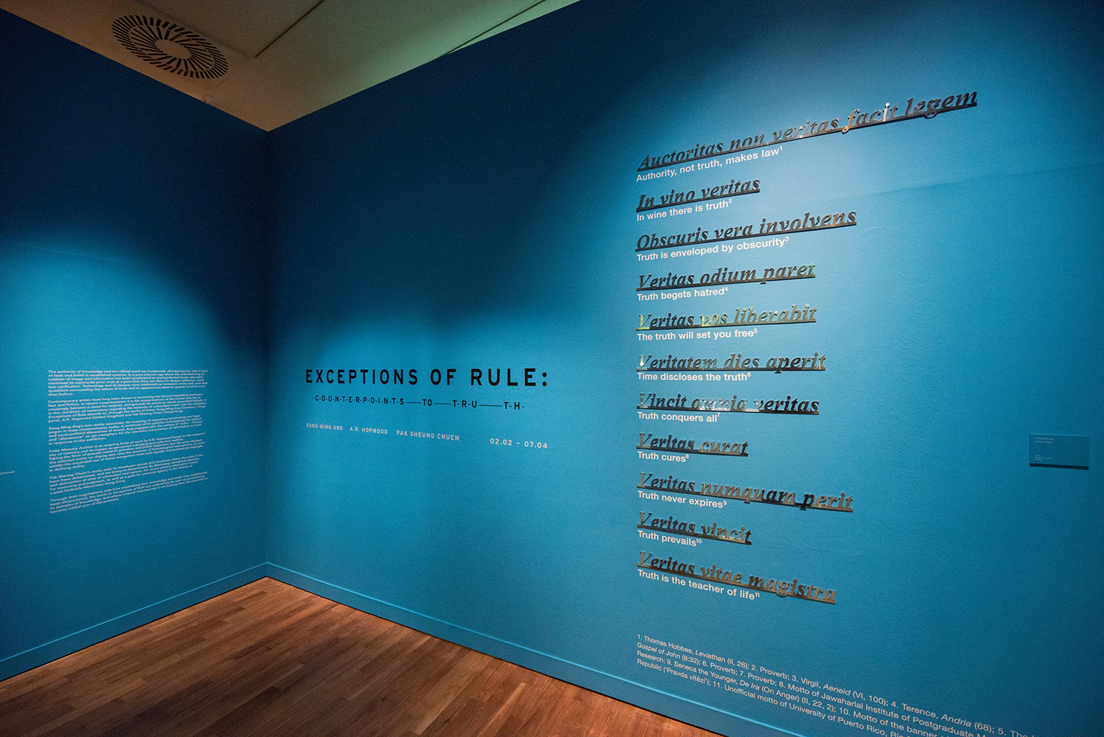
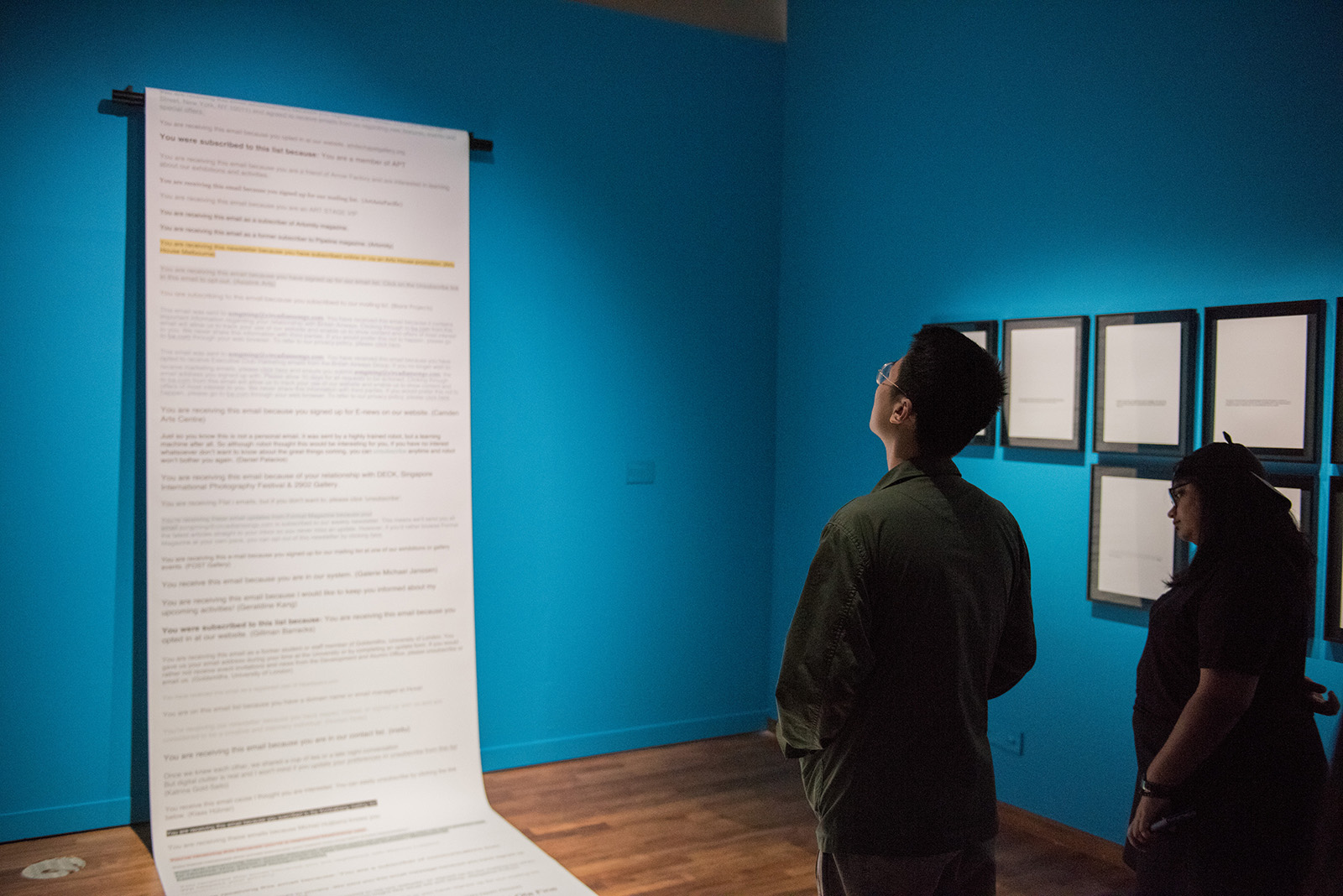
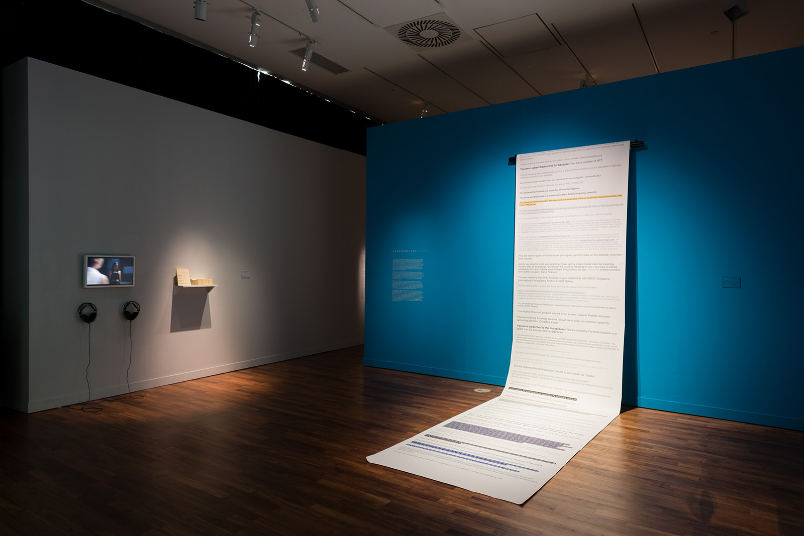
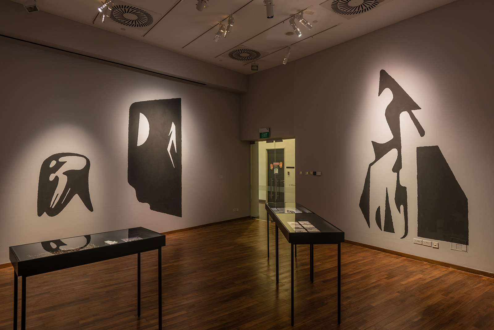
Contemporary artists have long been drawn to examining the blurred boundaries between fact and fiction. In recent times however, it is the interpretations of the former that has increasingly become a cause for suspect, and grounds for artists to relook prescribed beliefs. It is this condition of uncertainty regarding the relativity of subscribed truths that the exhibition Exceptions of Rule: Counterpoints to Truth, attends to, through the works of artists Song-Ming Ang (Germany / Singapore), A.R. Hopwood (United Kingdom) and Pak Sheung Chuen (Hong Kong).

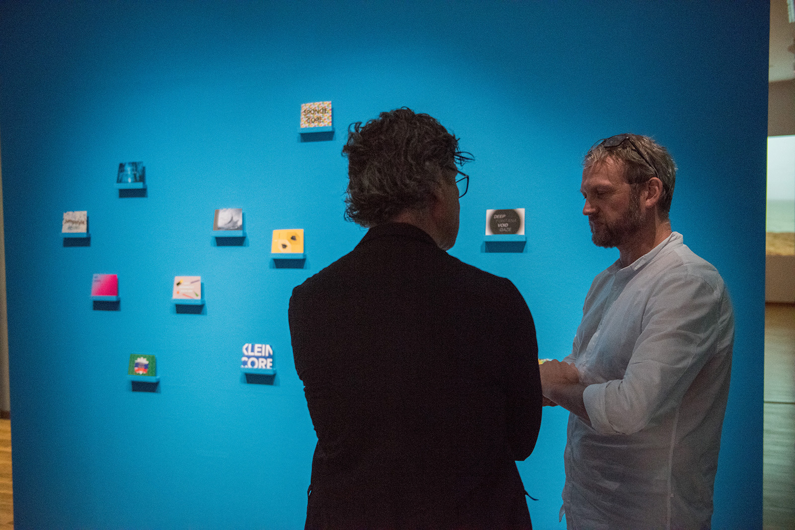
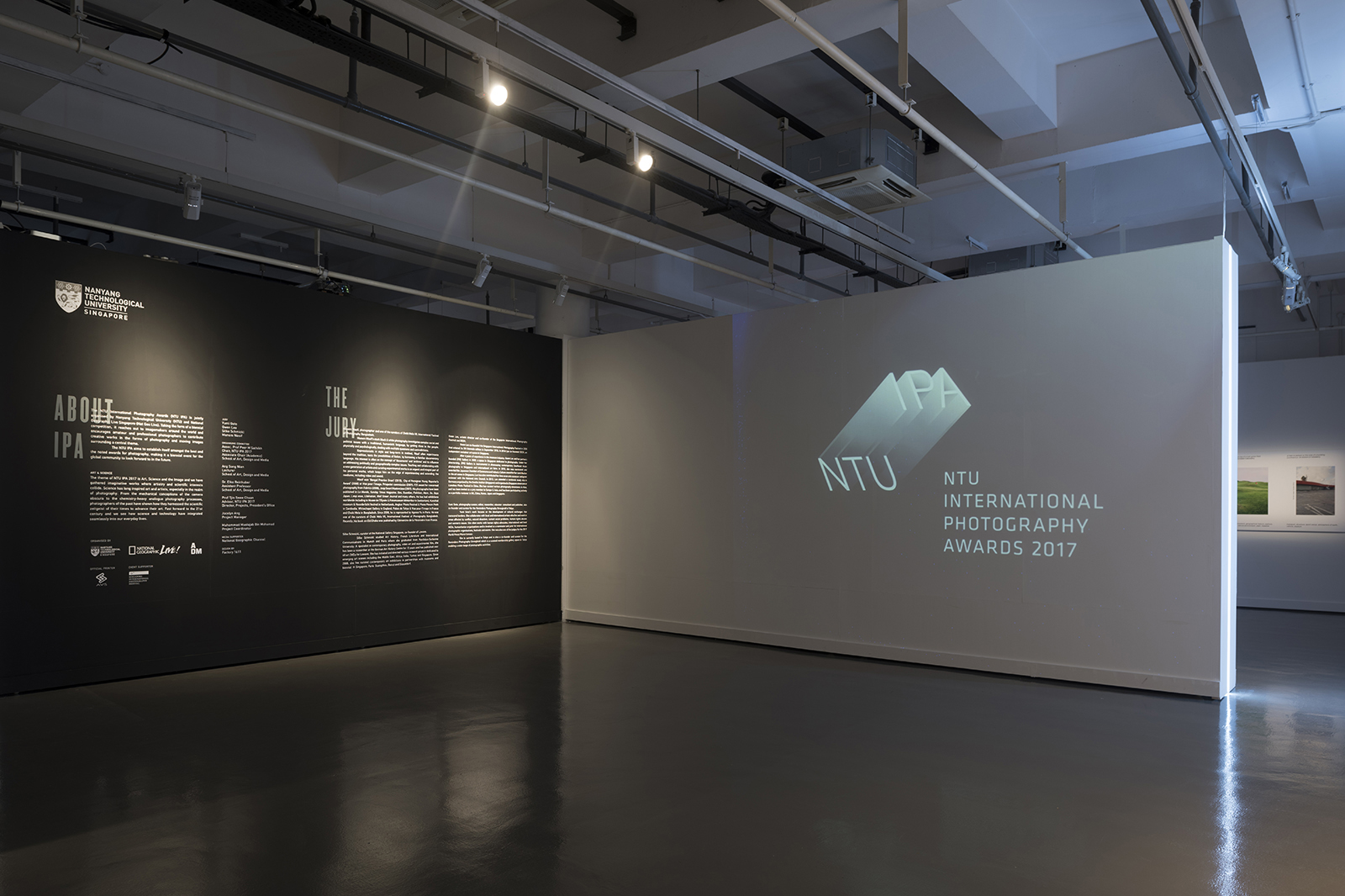
Held at ADM Gallery of School of Art, Design and Media, the works can collectively be seen as provocations to domains of knowledge, and where unusual manoeuvres in art-making have the potential to become critical acts of discernment. The exhibition branding we designed conveys the ideas of the stretching of truth and challenges the notions of Fiction versus Reality.


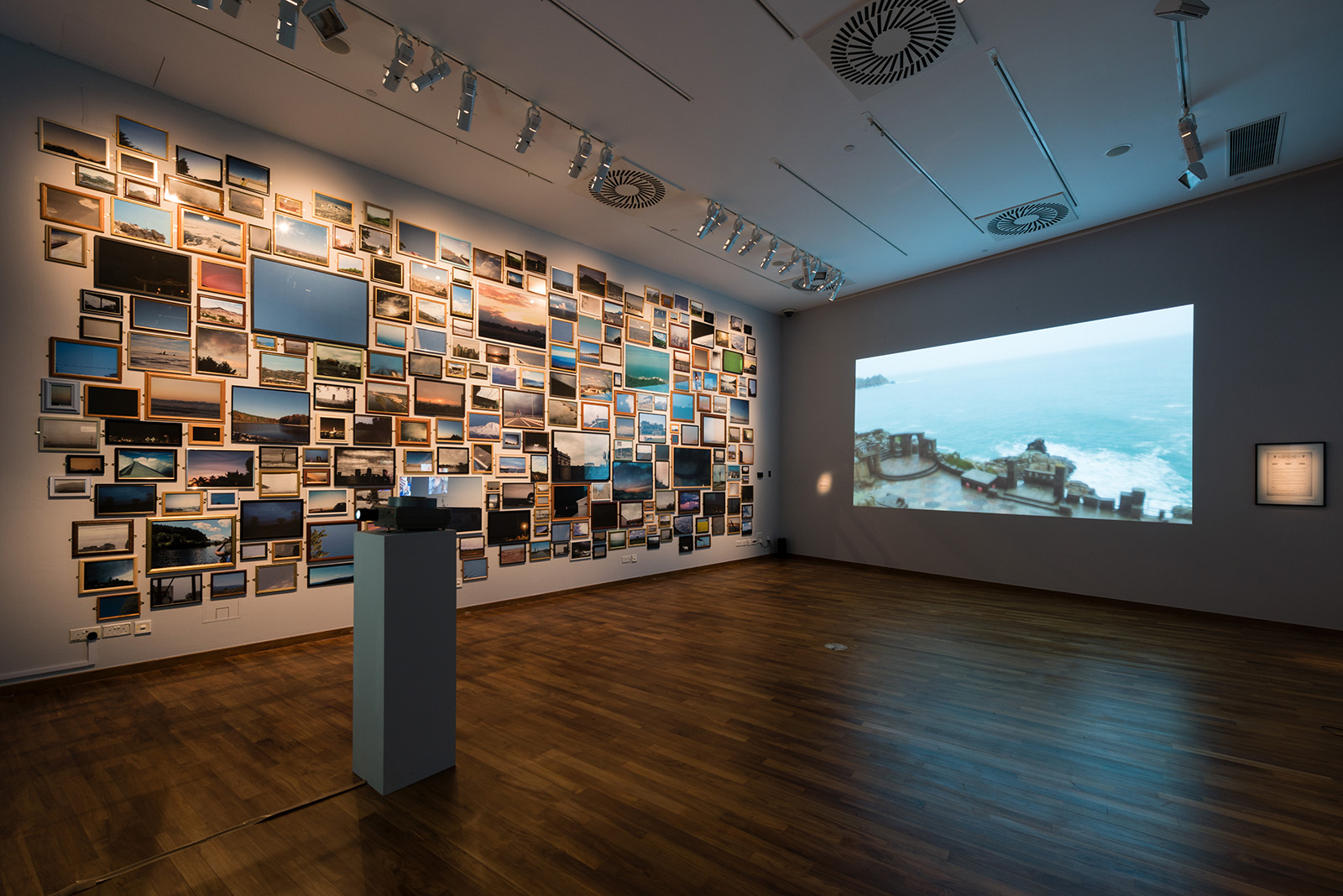
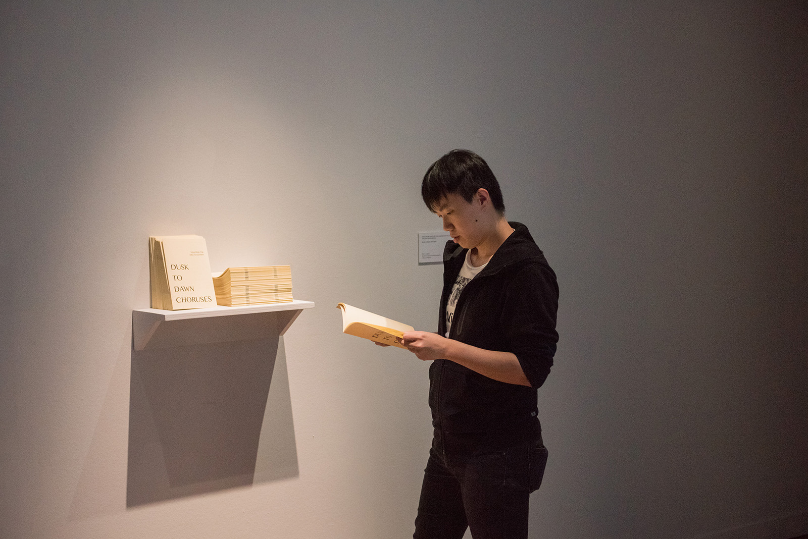
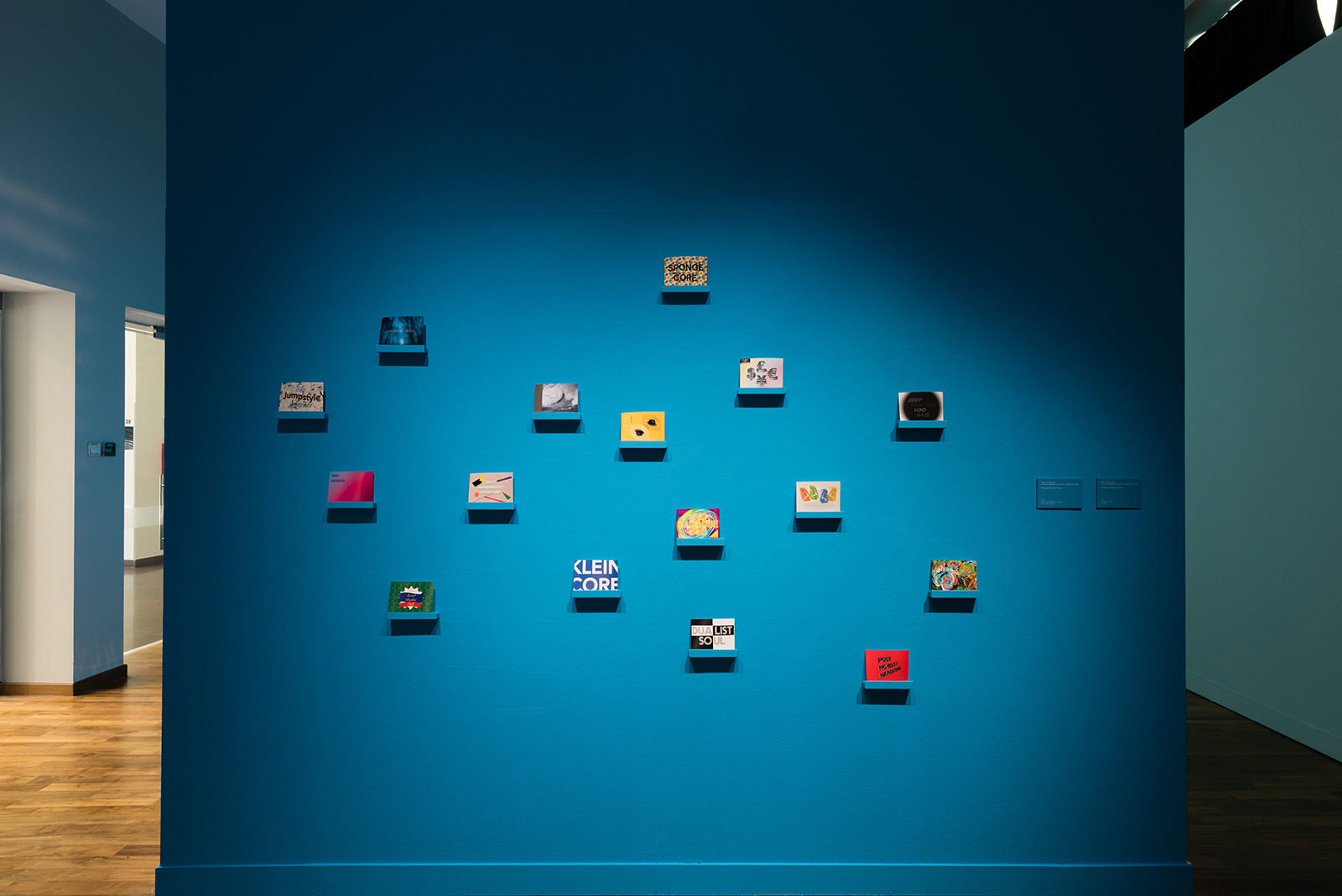
A unique artist post card book we designed for Song-Ming Ang allows viewers to collect the postcard artworks displayed in this exhibition.

NTU International Photography Awards Trophy

2017

The NTU IPA trophy was created for the inaugural competition honouring outstanding photographic and moving images responding to the theme: Art, Science and the Image. We designed a series of 'physics defining', 45 degree fully mirrored trophies; a beautiful yet contemporary form which drew inspiration from the competition brandmark.


NTU International Photography Awards

2017

The NTU International Photography Awards (NTU IPA) is a biennale competition jointly organised by Nanyang Technological University (NTU) and National Geographic Live Singapore (Nat Geo Live).

The theme of NTU IPA 2017 is Art, Science and the Image. Science has long inspired art and artists, especially in the realm of photography. From the mechanical conceptions of the camera obscura to the chemistry- heavy analogue photography processes, photographers of the past have shown how they harnessed the scientific zeitgeist of their times to advance their art. Fast forward to the 21st century and we see how science and technology have integrated seamlessly into our everyday lives.

The brand mark of the award is heavily influenced by the importance of 'light'; how its integral to photography as a medium. Light reflects what the photographer sees. Through science (the photography medium), what the photographer sees is translated into art, where vision becomes 'tangible'

Visit the NTU IPA website here


Light is heavily utilised in the design of the exhibition; light barriers and spots which denotes and divides spaces, helping the viewers navigate the exhibition space seamlessly.

We also designed an exhibition catalogue which details the winners of the competition. The title on the cover was created fully using the spot UV printing technique which made it visible only at an angle where light hits. The main brand mark is then UV printed onto a transparent plastic sleeve which protects the book.

The awards website is designed via a split screen scrolling system that amplifies the concept of light and dark. Participants can submit their works through the left side of the site which featured a countdown timer till the closing date of submission, thereafter it is locked. The right side features the award information and winners.

In Praise Of Shadows

2017

Occupying a unique dimension between darkness and light, shadows accompany solid forms, asserting the presence of the self and tangible objects. Like a companion to all things physical, they suggest a parallel existence that mimics this reality, yet remains a realm that is enigmatic and transient.

The exhibition title is drawn from the 1933 essay of the Japanese novelist Junichiro Tanizaki by the same name that explores the aesthetics of shadows, celebrating the ambiguity and subtlety of colour, shade, texture and tone. In Praise of Shadows, the exhibition, features five artists Lavender Chang, John Clang, James Jack, Ishida Takashi and Warren Khong, whose works take these themes as an entry point to expand ongoing concerns in their respective practices.

The brandmark we designed for this exhibition plays on the illusion between the physical and shadow states; a reflection of the works' attempts to find meaning in between these realms. The idea follows through the rest of the environmental and collateral design, with the visual language framing the content it holds.

DNA Paris Design Awards 2020 — Winners in Graphic Design/Branding category


Exhibition Invite

An exquisite printed invite mimics the act of pulling a plain canvas out from the shadows casted onto the actual walls of the gallery space, drawing one's attention to the intricate role shadows play within the narrative of this exhibition. The package consists of five postcards, each one representing one of the artist exhibiting in this show.

The Art Of Conflict

2017

​Investigating the social, geographical and political dimensions of conflict, The Art Of Conflict held at ADM Gallery features contemporary artists whose works address and reflect on the tensions that emerge from societal ruptures, ranging from urban disruptions to violence and war.

Showcasing artistic responses to some of the most contentious crises in the past decade by artists from China, India, Indonesia, Iran, Korea, Japan and Pakistan, The Art of Conflict highlights how video has increasingly become a critical medium in portraying the immediacies and complexities of confrontational issues, both past and present.

The branding we've designed for this exhibition draws inspiration from the notion of escalating tension; the tipping point before conflict erupts. We translated this idea through a subtle use of abrupt gradient hues transitions, applied across spatial walls, text labels and exhibition print collaterals. The strikethrough across the exhibition brand mark highlights how conflicts affect society and humanity, as well as their consequences, as portrayed by the art in this exhibition.


Exhibition catalogue

Eden In Iraq

2017

Eden In Iraq is an interdisciplinary, environmental art and design exhibition tracing the evolution of the wastewater remediation project in the marshes of southern Iraq near the historic site of the Garden of Eden. The researchers, artists and designers involved in this project have used environmental art, design, and wastewater to create a restorative wastewater garden for cultural memory, education, and shared social space. Drawing on Islamic and Mesopotamian traditions originating in this historically and symbolically charged region, the Eden in Iraq Waste Water Garden is designed to be a syncretic container for ecological and cultural restoration.

We were tasked to create the branding and design of this exhibition, held at National Design Centre Singapore which showcases design/engineering drawings, models, photo & video documentary which helps visitors understand the tremendous effort gone into this process, as well as the rich history of the Marshes and its People.

Read up more about this project here: Eden In Iraq


The structure of the exhibition is centred around three sections, marked by three sets of totems that were inspired by a grid of islamic patterns.


Print collaterals provides viewers a peak into the beautiful marshes when unopened.

Life of Objects

2017

With the advent of the engagement of ready-made objects and images as a legitimate mode of art making, artists have explored a wide a range of issues, using pre-established form and content in critical and innovative ways. The exhibition, Life Of Objects, presents propositions that reconsider the role of the object in contemporary art-making. These include the re-reading of formality and composition in sculpture, the activation of found material and contemporary assemblage, as well as the negotiation with digital technologies that destabilise the notion of medium specificities, as well as materiality in the work of art. Chun Kai Qun (Singapore) presents a philosophy of sculpture that uses humour and failure to play off the futility of ambition against the ideal of excellence in art. Torlarp Larpjaroensook’s (Thailand) work engages with repurposed objects as part of a larger narrative that combines personal memory and whimsical imagination. Martin Constable (United Kingdom) deploys images as objects, relying on established film imagery to reconstruct ways in which images are being made and consumed today. The videos of Hiraki Sawa (Japan) interweave object and space to create intimate psychological dimensions that shift with senses of motion and dislocation. By blurring material properties and function, the artists in the exhibition accentuate, and undermine perception and reality, through artistic devices that open up new contexts for regarding the relationship between art and the object today.

Inspired by ideas of physicality of forms and the re-reading of formality and composition in art making, we designed the exhibition using an exciting color palette and several large scale motifs which represents the objects of art found within the show.


Dragon Trails

2017

Dragon Trails Bespoke Bhutan Tours creates authentic, personalised itineraries for clients who desire a bespoke travel experience through Bhutan. The brand mark presents the imagery of a dragon rising through the mountains embedded within a single brush stroke. The colour palette embraces a rich hue of purple combined with gold, injecting fresh energy against the luxury associated with this destination. The overall effect is elegant, classic, yet hinting at a sense of adventure, hinting at what their clients would experience first hand as well as the fantasy associated with this destination.


Website

We wanted the user to experience the feeling of drifting through clouds as they scrolled through the website, much like how would would feel as they ascend through the mountainous terrains of the region.
Visit the website here: Dragon Trails


Miracle Kutchie Experience 3

2017

We were approached by TODAY IS THE DAY, a visionary non-profit making organization based in Japan, New York, Singapore and Zurich, for the third year running to design and brand the “MIRACLE KUTCHIE EXPERIENCE 3”, an art retreat exchange program in Singapore that uses art therapy as a medium to heal children who have suffered from complex trauma from Fukushima. The theme this year centred around ideas of love and hope, and we presented it in swashes of bright luminescent colors, with the logotype sitting boldly and proudly across a heart emblem.


Write a Christmas Card 2016

2016

The second edition of the our #WriteaChristmasCard features everyone's favourite creature: Cats! Same rules, if you’d like a beautiful card to send to someone you care for, simply enter your mailing address via our website and we’d mail out a blank Christmas card to you for free!

This year's card also contains a cool pop-up dome which opens up from within, surrounded by cool blind emboss features.

Visit the 2016 edition here!