Write a Christmas Card 2015

2015

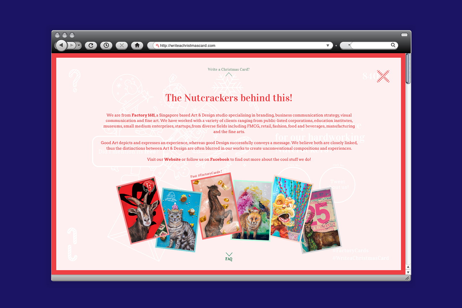
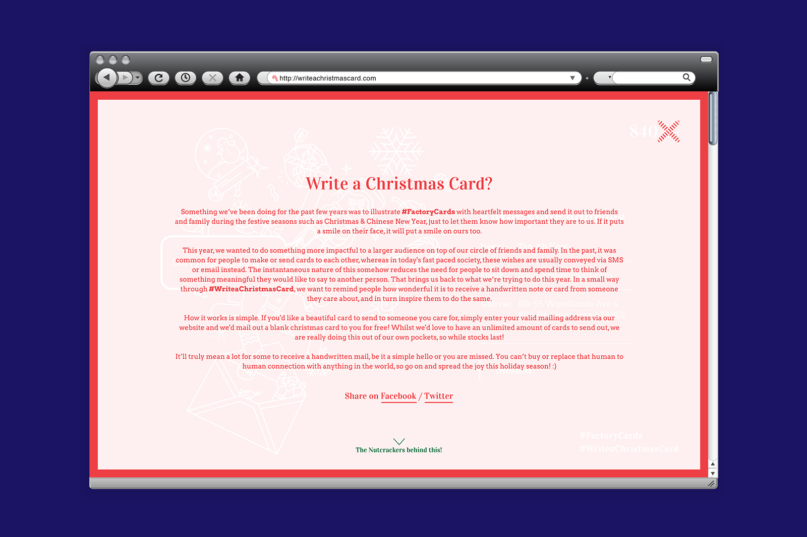
Something we’ve been doing for the past few years was to illustrate #FactoryCards with heartfelt messages and send it out to friends and family during the festive seasons such as Christmas & Chinese New Year, just to let them know how important they are to us. If it puts a smile on their face, it will put a smile on ours too.

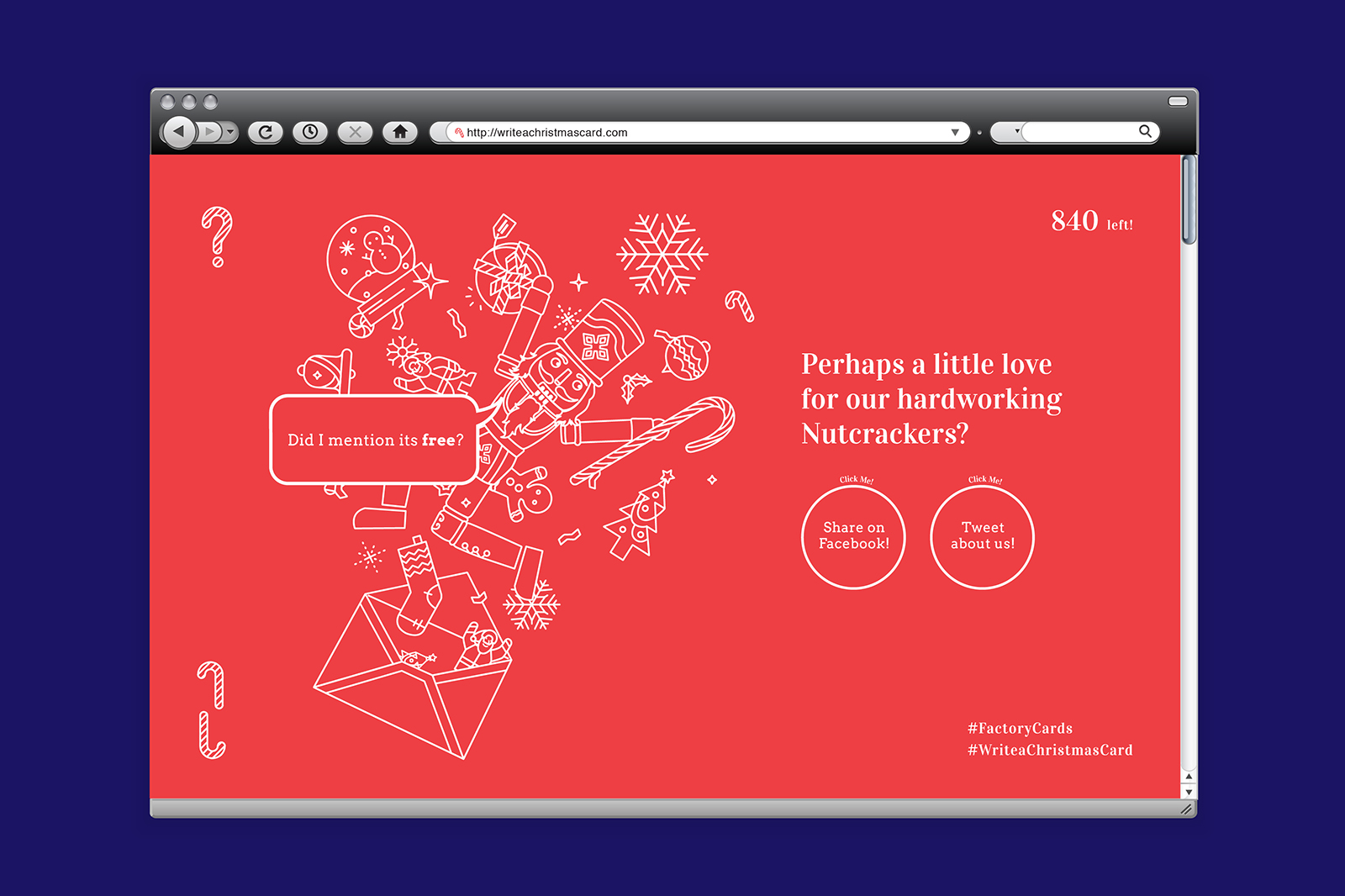
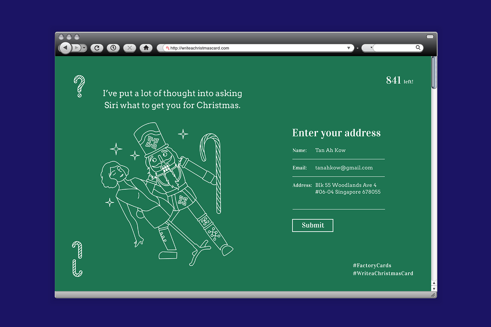
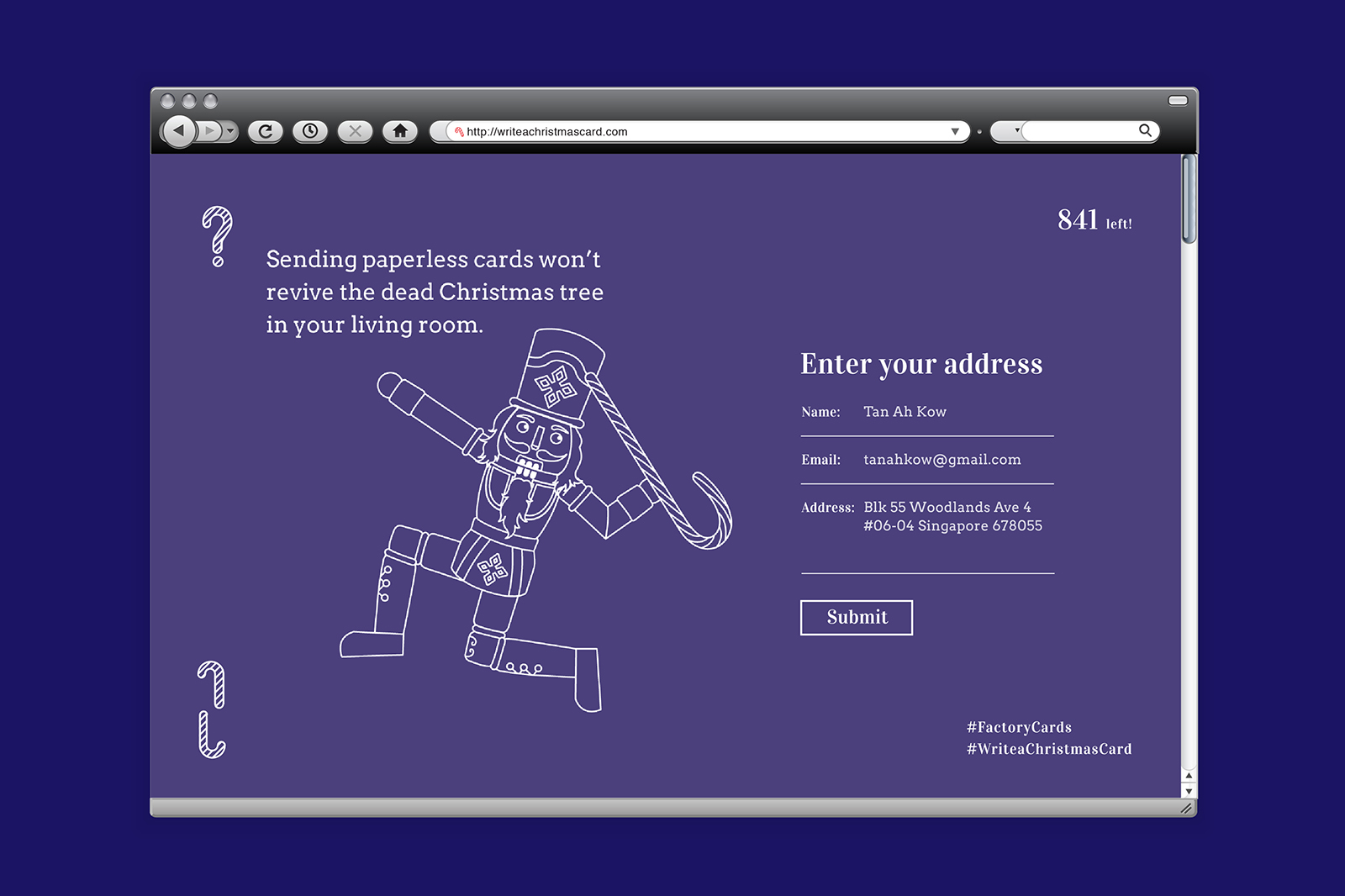
This year, we wanted to do something more impactful to a larger audience on top of our circle of friends and family. In the past, it was common for people to make or send cards to each other, whereas in today’s fast paced society, these wishes are usually conveyed via SMS or email instead. The instantaneous nature of this somehow reduces the need for people to sit down and spend time to think of something meaningful they would like to say to another person. That brings us back to what we’re trying to do this year. In a small way through #WriteaChristmasCard, we want to remind people how wonderful it is to receive a handwritten note or card from someone they care about, and in turn inspire them to do the same.

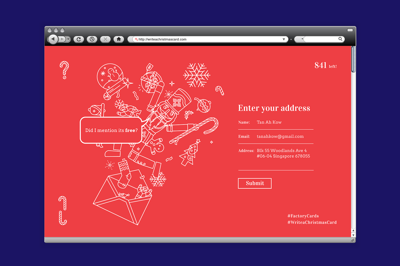
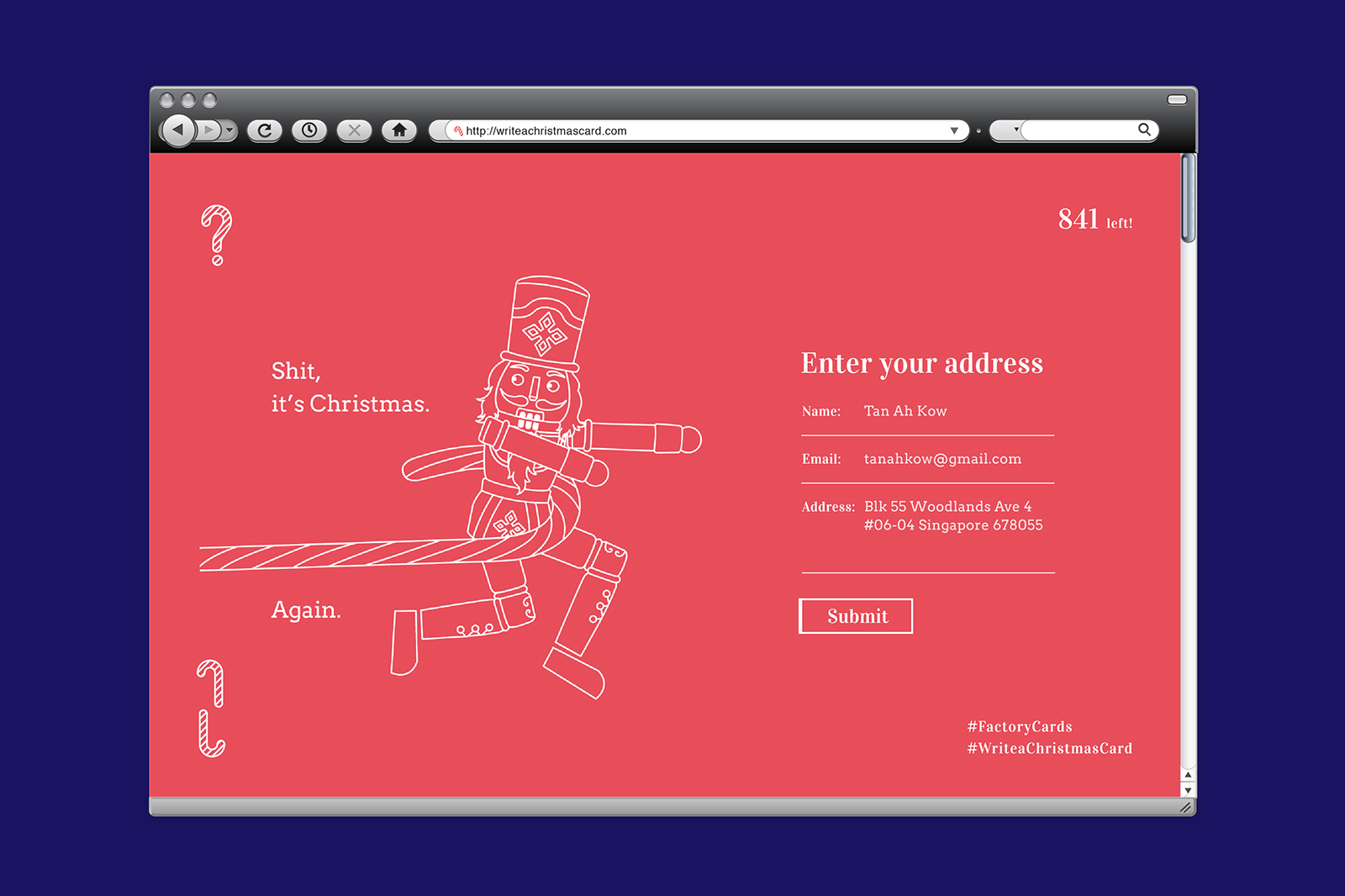
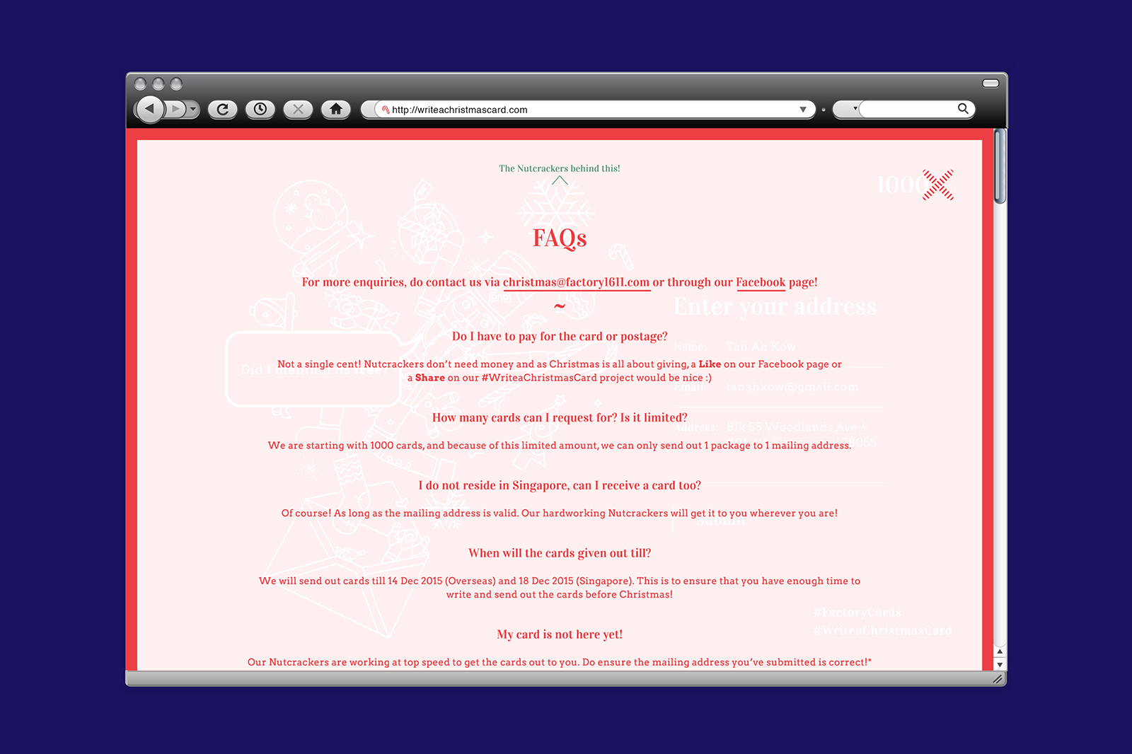
How it works is simple. If you’d like a beautiful card to send to someone you care for, simply enter your valid mailing address via our website and we’d mail out a blank christmas card to you for free! Whilst we’d love to have an unlimited amount of cards to send out, we are really doing this out of our own pockets, so while stocks last!

It’ll truly mean a lot for some to receive a handwritten mail, be it a simple hello or you are missed. You can’t buy or replace that human to human connection with anything in the world, so go on and spread the joy this holiday season!

Visit the 2015 edition here! 


3D Wonders Museum

2015

3D Wonders Museum is a brand new trick eye museum located in Sabah, Malaysia. It is housed within the same compound as the architectural marvel known as Rumah Terbalik, one of only five upside-down houses in the world and the first of its kind in Malaysia.
 
We were tasked to design the entire museum from ground up, from the branding, spatial and experience to content design, including hand crafting all of the thirty plus trick eye pieces around the museum.

Official 3D Wonders Museum website


Built and curated around the topic of conservation, the 3D Wonders Museum is not only the largest 3D art exhibition in East Malaysia, but also one of the only ones in the world that is dedicated to educating the public about the importance of protecting biodiversity, ecosystems, and natural resources against careless human activities. A segment of the exhibition also allows the visitor to experience Sabah’s beloved customs, traditions, and landscapes; rubbing shoulders with indigenous tribal headhunters, scaling Mount Kinabalu, and observing myriad wildlife in their natural habitats, allowing a unique glimpse into a side of Sabah you’ve never seen.


Fellini: Circus of Light

2015

​The exhibition Fellini: Circus of Light held at ADM Gallery in the School of Art, Design and Media is an introduction to works of the late film director Federico Fellini (1930 – 1993), known as one of the most influential filmmakers of 20th century European cinema and celebrated for his signature flair that combines fantasy and flamboyance within the social realities of post World War II Italy. Featuring more than 50 photographs, movie posters and original drawings from the collection of the Fellini Foundation for the Cinema that documents Fellini’s vast oeuvre, the exhibition draws from Fellini’s classics such as La Strada (1954), La Dolce Vita (1960), (1963), Juliet of the Spirits (1965), Fellini Satyricon (1969), The Clowns (1971), Amarcord (1973), Fellini’s Casanova (1976), Intervista (1987) amongst others.
 
The exhibition unveils critical aspects of the Italian maestro’s universe as well as his approach to humanism is based on his personal experience, blended with fictional narratives. Inspired by Fellini famous statement, “the clowns are the ambassadors of my vocation…“, we crafted the exhibition identity using a whimsical circus styled typography and graphical system.
 
View official website here


Invite

An interactive invite which uses a tunnel technique to lead the viewers into the circus atmosphere which imbues Fellini’s multi-layered works using many classic motifs from his films. It also serves as a desktop collectable for admirers of Fellini’s works.


Publication

This book was published in conjunction with the exhibition, an intimate publication which features Fellini’s works on exhibit as well as essays written about him and the show. Taking inspiration from the fact that Fellini is known to be an avid cartoonist, extra attention was made to design the publication like a notebook, inspired by one of the many belonging to Fellini himself. It also comes with a die-cut bookmark featuring Fellini’s wife who played Gelsomina from the film La Strada, 1954.


Environmental Graphics

Event photos: Credit of ADM Gallery

StartingUP2015

2015

Ideasinc is a start-up accelerator programme based in Nanyang Technological University which aims be a major partner in the Singapore’s effort to promote and develop an entrepreneurial environment to bring about significant economic and social development through home-grown enterprises. We were invited to create the brand identity for the StartingUP2015 conference organised by ideasinc, where locally based entrepreneurs and like-minded individuals are invited to share their start-ups’ founding stories, obstacles that they had encountered, and what they do to maintain their competitiveness.
 
The conference identity was based on the idea of a maze; navigating obstacles, overcoming challenges, the very spirit of entrepreneurship itself. We’ve created a custom maze typeface as a key graphic that exemplifies this spirit, and it is applied across all print, environmental & digital mediums.
 
Event photos: Courtesy of ideasinc


The Tulip Story

2015

The Tulip Story is a commemorative book that celebrates the successful art and health initiative led by Assistant Professor Michael Tan in partnership with Parkinson Society Singapore. It showcases a collection of creative paperclay artworks created by people with Parkinson and their caregivers, offering viewers an understanding of how participation in art activities enhances the lives of the patients and their caregivers.
 
Inspired by the journey of these participants, a family of Tulips (the official symbol within the Parkinson’s community) is being etched onto the cover using pearl and bronze foil stamping to present the strength and spirit of the community, as well as the personal stories shared within. The warm peach cover, intimate typesetting formats and paper choice creates a quiet, yet strong identity for this very special publication. Encased within an inlet in the back cover is a set of postcards featuring Tulip clay artworks by the participants.
 
Exhibited in SingaPlural 2016 – Recognition Showcase


Miracle Kutchie Experience

2015

TODAY IS THE DAY is a visionary non-profit making organization based in Japan, New York, Singapore and Zurich, whose goal is to bring positive change to the world through art based activities and lectures. In July 2015, it organized “MIRACLE KUTCHIE EXPERIENCE” – An art retreat exchange program in Singapore that uses art therapy as a medium to heal children who have suffered from complex trauma from Fukushima.
 
We designed an interesting duo-tone origami-fold brochure and invite for the event, which opens up to articulate the purpose of the programme as well as the projected outcomes of this event.


Make Scents Of The World Around You

2015

In conjunction with the ManyWaysOfSeeing (MWOS) series organised by Design council Singapore, we worked closely with fragrance experts NoseWhoKnows to handle the branding for Make Scents of the World Around You, a series of workshops, seminars for pre-schoolers and pre-school educators, and an exhibition at the end which aims to provide an immersive experience for participants, complete with interactive elements throughout designed to engage one’s senses.
 
The focus of the experience is to allow viewers, through the artworks and scents created by the participants of the workshops, to better understand how olfaction interacts with our other senses and our memories and how it can be utilised as a medium of expression and communication instead of relying on better-known sensory-related tools such as pictures, sounds and words. The exhibition will serve to illustrate, by example, how olfaction can be integrated over a broad range of activities.


At the heart of the exhibition are twenty pedestals we designed to showcase scents which are inspired by the memories of the pre-school educators whom participated in the workshops. Smell is a powerful memory trigger, with the actual ability to smell highly linked to memory. In order to identity a scent, one must remember when he or she has smelled it before and then connect it to the visual information that occurred at the same time. With this in mind, we created these interactive kiosks which allowed viewers to immerse in the interviews with the educators as they recalled the memory which inspired the scent they created, while the viewer takes in the scent at the same time, creating a multi sensory experience.


Pedestal Top Design


Video Highlights

In collaboration with PraeImpact Studios


Workshop & Exhibition

The Singapore Story

2015

Seeing Singapore’s past through art

The Singapore Story is exactly that: about Singapore’s past through art depicting the lives of its people and conditions from the time of the island’s founding by Stamford Raffles in 1819 to its present state as a global city. Visitors will be brought back in time through these paintings and video presentations of lost images, the various stages of life in Singapore – the slumps, the simple life, hawkers peddling food on the streets, going to the markets in Chinatown, bump boats lining the Singapore River and the filth and unpaved roads all over the island. Sanitation was lacklustre and as such, diseases such as malaria, measles and other infectious diseases were very prevalent. Health care was very basic. Infant mortality rates were high and life expectancy rates were capped in the 60s.
 
These visual memories and videos of decades long ago will open a window for the younger generation to reflect on where we’ve come from and inspiration for what lies ahead in the future.


With over 200 artworks displayed, the environmental graphics was focused on conveying a coherent narrative throughout the exhibition. We adopted a bold venture to use two contrasting typefaces for the exhibition title in the words ‘The Story‘ and ‘Singapore‘. This was inspired by how every single artwork was a recollection, a scene, a remembrance, or an image depicting a particular period of Singapore’s history. The typeface and colour choices was extended throughout the various section titles and descriptive texts to ensure a comfortable consistency and balance in the message.


ADM Show 2015

2015

What do we see when a ball is travelling through the air or rolling across a surface? Some may marvel at the effortless grace with which a simple object moves through space and time, but for most of us, a ball in motion is an ordinary occurrence bound by the laws of physics.
 
But it is more than that. The ball achieves momentum, gains speed, passes by and through the pressures that could slow it down or bring it to a halt. It becomes greater than a simple shape – it’s a circle, a wheel, a cell, an atom, an organism. It takes flight, it clashes and connects with others, and through that friction gains strength, intensity and direction. It is projected into the world; its reach and potential amplified.
 
This arc parallels the journey that students undertake at the School of Art, Design and Media (ADM). The pathway of the ball is a symbol of their growth and the amplification of their potential, which is showcased during the annual ADM show.

admgradshow.com

 
AWARD(S)

DFA Design For Asia Awards 2016 (DFA 亚洲最具影响力设计奖) – Bronze


This year, the show’s identity uses a bold, deconstructed hybrid logotype, complemented with the image of a ball that projects the title of the exhibition. While the ball symbolises the possibilities of student potential, the letters in the typographic stack evoke dynamism and vibrancy. Between the division of lines and planes, the message behind the logo is simple: to project creative talent into the world – as our graduates will when they complete the final stage of their journey through ADM.


A customised typeface was designed to convey the spirit of ‘Amplification’ the key theme in this year’s show identity and it is used throughout all print, digital & environmental materials to strengthen the visitors’ experience.


Full Set of Collaterals


The invitation this year was based off the idea of a Thaumatrope, an interesting way for us to portray the idea of Amplification for the show identity to be represented within a 2D printed material.


Exhibition Catalogue


An app designed for the show on both iOS & Android platforms that contains nifty features such as being able to browse through all the graduating students’ portfolios on the fly, contacting the students directly through the app (either though e-mail, calls or messaging) and also finding out about the latest events.
 
Download links: iOS / ANDROID


Wayfinding

Post

2015

Urbanisation has reached new speeds. The physical and virtual world has met for a match at the tennis court. The call for nationalistic stance on matters is pushing international relation efforts – how does one negotiate their stand on reality then and what does it mean to call it home (again)? Modernity in modernity- we are face with nostalgia, paranoia and chaos of the past, such damaged romanticism finds itself ever-promising a new dawn… Are we ingesting ourselves to what wasn’t left behind or is this merely a trip back to Eden?
 
We were commissioned by Jane Koh, an independent curator to design a set of branding collaterals for the exhibition titled Post, as well as an artist publication which documented two of her photographic series.