Tomorrow Is An Island, as inland, a sin land

2020

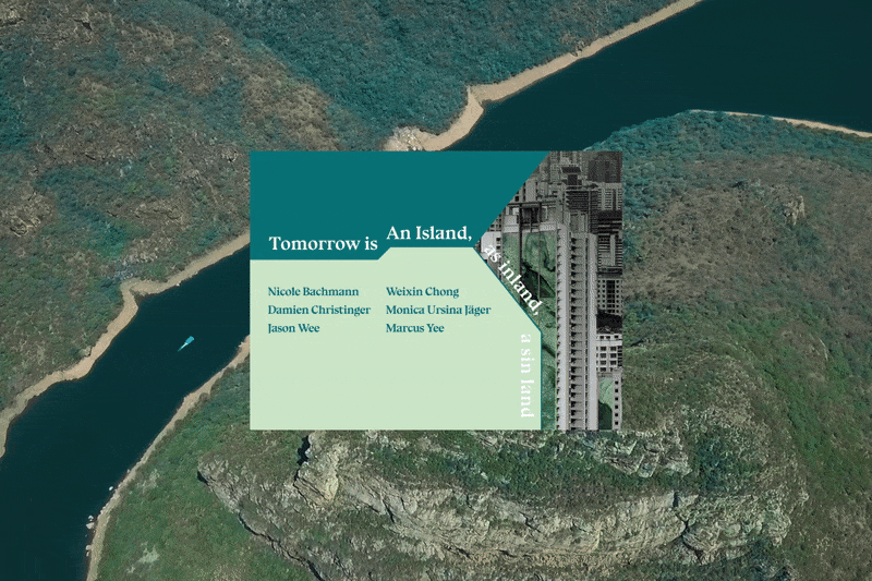
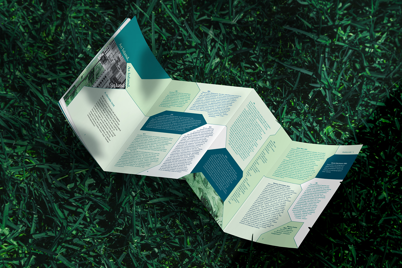
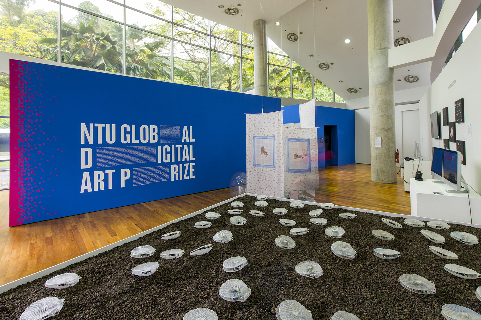
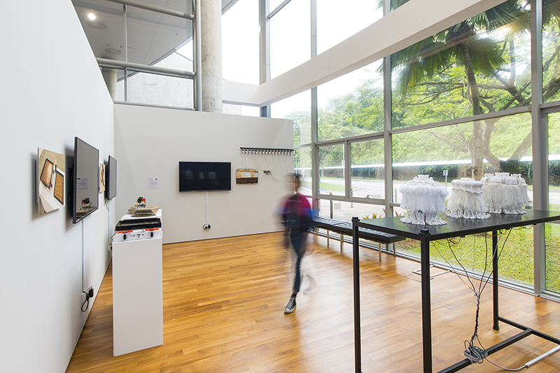
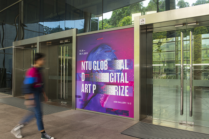
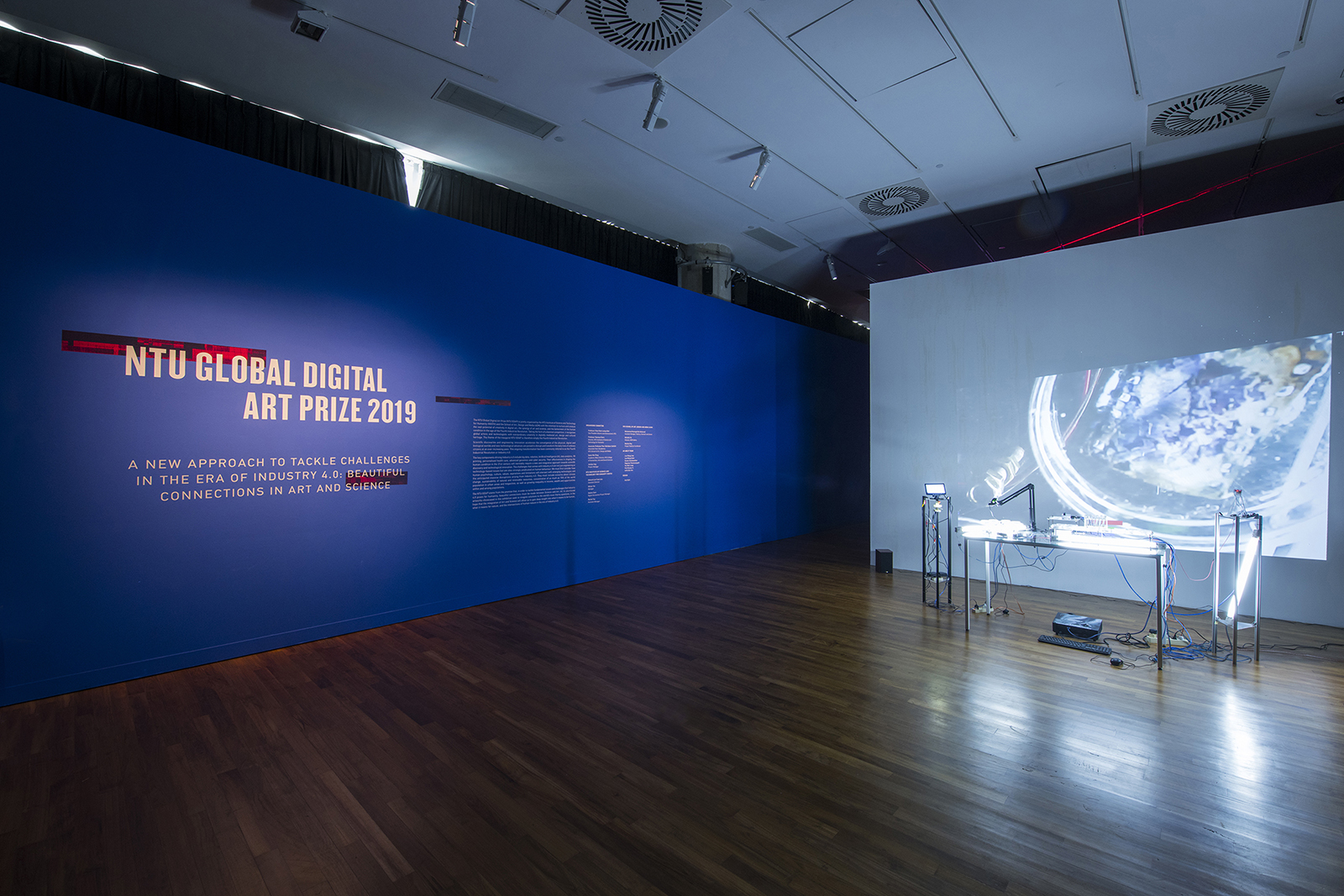
Tomorrow Is An Island, as inland, a sin land is an artist-led exhibition featuring artists Nicole Bachmann (Switzerland), Weixin Quek Chong (Singapore), Monica Ursina Jäger (Switzerland), Jason Wee (Singapore) and writers Damian Christinger (Switzerland) and Marcus Yee (Singapore). Held at the Nanyang Technological University ADM Gallery, it speculates on the future of islands, deep time, the fate of “crisis” as a frame of our predictions and conceptions of future time, and the exchanges between bodies and cities.

We designed the exhibition branding based on how the title itself deploys a sequence of anagrams that re-scrambles with each new phrase, suggesting the ways in which the next moment could retain recognisable components of the present but to disruptive effect. The visual element is also translated to the exhibition design whereby the letter which inspired this conversation from which the exhibition project came about, stretches across the entire length of the space; reaching each and every corner like roots and water bodies embodying an archipelago.


Intestinology 04: The Cold Purity of Mathematic Love/Trust Equations

2019

Joo Choon Lin’s Intestinology series of works is the artist’s attempt to articulate processes and principles that inform her approach towards materials, and how they are transformed through her art-making. Just as how the body’s digestive system converts that which is consumed into nutrients required to support the body, Joo seeks to distill the base elements of the materials that she works with and present them in renewed contexts.

Curated by Michelle Ho and held at the Nanyang Technological University ADM Gallery, Intestinology 04: The Cold Purity of Mathematic Love/Trust Equations explores the forms that the element carbon can take, with graphite and casein-milk sculptures that interact with geometric drawings representing the unfolding of a diamond’s many facets. We designed the branding and exhibition with the intention to incorporate the idea of equations through the forms of ellipsoid and intestines. The title wall itself was designed like a chalkboard where visitors can partake in adding on to the elements, which the artist has created.


Sultans

2019

Sultans is the casual sub-brand of Sultans of Shave. Developing the brand’s name and visual language was a fun one as we injected humour and light-heartedness into it. By reducing the name to Sultans, it brings out the brand promise of fuss free, barbershop quality haircuts at wallet-friendly prices, yet the same top-notch service synonymous to the Sultans of Shave brand.

As such, the brand mark was designed to be energetic and vibrant, complementing a set of key graphics that spoke about the creative touch-points of barbering and the modernity aspects in classic trend


58th Venice Art Biennale 2019, Singapore Pavilion collaterals

2019

In conjunction with the Singapore Pavilion at the 58th Venice Art Biennale 2019, we've designed a series of collaterals to accompany the artworks on display.

One of the key items was a box set, two volume monograph for artist Song-Ming Ang. Free from traditional rigour and rules, the box set opens up to a brightly coloured centrefold featuring a still from his artwork Recorder Rewrite (2019), a key work exhibited during the show. The two individual paperback covers employs two series based works from his career.

Volume One, featuring Recorder Sculptures (2019), is a compilation of essays and write-ups about his works showcased in the pavilion. Volume Two, featuring Different every time (2017), is a collection of 37 notes written by fellow artists, curators, writers etc in response to 37 of his artworks spanning his career.

Featured in: Book Biennale


We also designed four sets of brochures that doubles up as collectable postcards through a centre perforation. Each set features a prominent work exhibited at the pavilion.

Reversible tote bags featuring the major colorways employed in this exhibition.


Scream Asia

2019

Scream Asia is a Singapore horror film festival started to slake Asia’s immense thirst for horror films. Organised by mm2 Entertainment and Cathay Cineplexes, the festival ran from 19-28 October 2018, screening a total of 11 feature films and 1 short film from Singapore, Indonesia, South Korea, Japan, Australia, Denmark, France, Germany, Sweden, Brazil, UK and USA.

Besides film screenings, there were also masterclasses taught by acclaimed horror filmmakers Joko Anwar (Satan’s Slaves) and South Korean director Yeon Sang-ho (Train to Busan)

We were engaged to craft the promotional campaign and create the fun and nostalgic branding for this inaugural festival. Along side these, we also created the key visuals as well as the online ticketing platform, all print collaterals and advertisements.

Visit website here.


Sultans of Shave

2019

The barber is a profession that dates back to every era known to man, from being a prized member of staff that served the Egyptian pharaohs, Sultans of the Ottoman Empire and more recently, the British royal family.

Home of the contemporary gentleman, Sultans of Shave is a contemporary barbershop delivering the finest barbering experience inspired by quintessential men’s parlours in London. It specialises in classic gentleman’s haircuts and shaves with a traditional straight razor. In the words of the founder, "In a world full of trends, Sultans of Shave remains a timeless classic."

We were tasked to create an iconic brandmark in response to the brand’s mission: a passion for the finer things in life, like the art of men’s grooming. The royal gold conveys a sense of grandeur and luxury, whereas the sultan's blue brings about a sense of approachability; a space for gentlemen to pamper themselves and network in a relaxed setting.

DNA Paris Design Awards 2020 — Honourable mention for Graphic Design/Branding category
IDA Design Awards 2019 – Honourable Mention


To visually express the brand's promise of quality, we’ve crafted a Sultan's signature to be complemented with the brand materials; a stamp of true excellence.


Year of the Pig

2019

This year's studio Chinese New Year card features a gold foiled pig against a sea of cascading dollar signs against a backdrop of a luxurious red paper stock. The words '金猪送福' – 'The golden pig sends fortune' is written on top of the card; a blessing we hope for the recipients of the card.


Write A Christmas Card 2018

2018

TIRED OF FEELING LIKE A FOOL WHEN YOUR CHRISTMAS CARDS DON’T LOOK COOL? Our CHRISTMAS CARD PACKAGE is the answer!

For the forth edition of the our #WriteaChristmasCard project, we went full corgi and Christmas wonderland. Shine brightly this Christmas with a little help from Santa's favourite dog! Who needs Rudolph when you have the Christmas Corgi Cards!

Check out the 2018 edition here!

Revisit the past campaigns here: 2017 / 2016 / 2015

A series of Kitsch videos to promote this year's campaign.


HO–HO–HOLY SH*T! It's a Corgi! You heard that right. No more boring old Santa — spice your Christmas up with these adorable corgis!


Tired of feeling like a fool when your Christmas cards don't look cool? Well, you've come to the right place!


Hey, there fella! Do you want your Christmas this year to be cool or do you want it to be A LOT COOLER? Blow all your friends' socks off by sending them our Christmas cards!


Having trouble finding the perfect Christmas card? Say no more! Well here comes the solution!


Tired of the same fat jolly old man? Out with the boring old Santa and welcome our adorable Christmas corgi!