ADM Show 2018

2018

A wave disturbs the status quo; it disrupts the surface – less like a ripple and more like a torrent. The anticipation of the next wave charging in, ready to break boundaries and venture into new grounds. That rush of adrenaline and excitement, knowing that there’s always something new brewing at the horizon, ready to hit the next coastline.

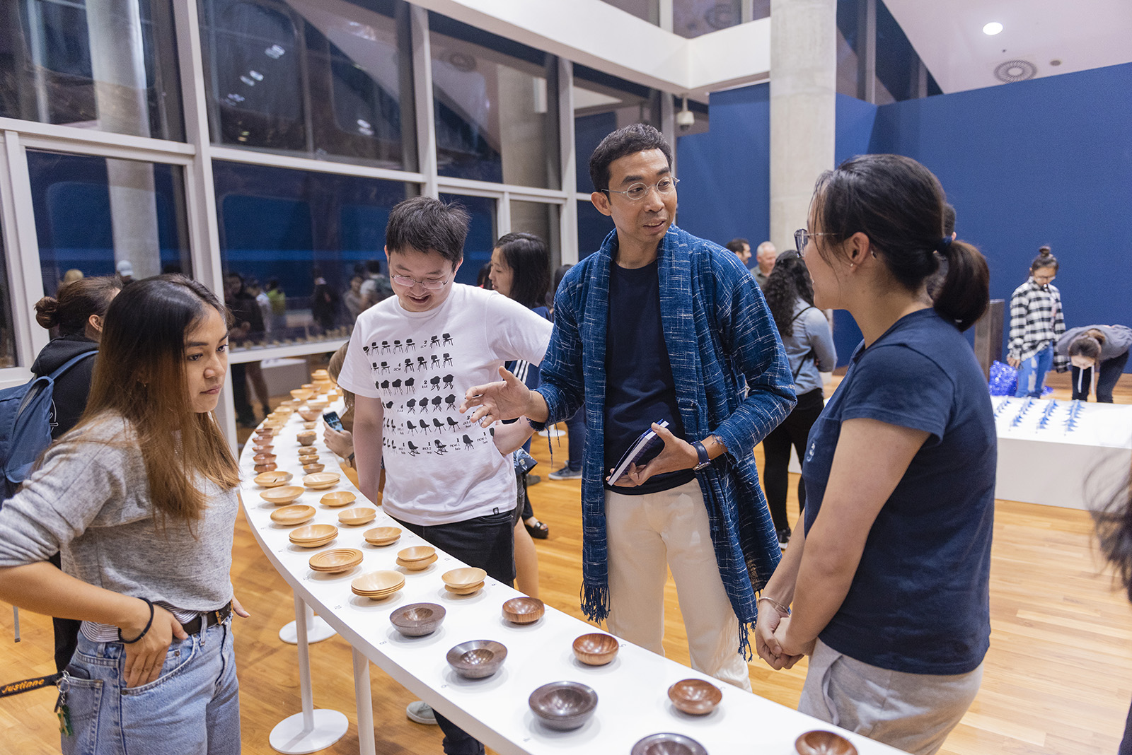
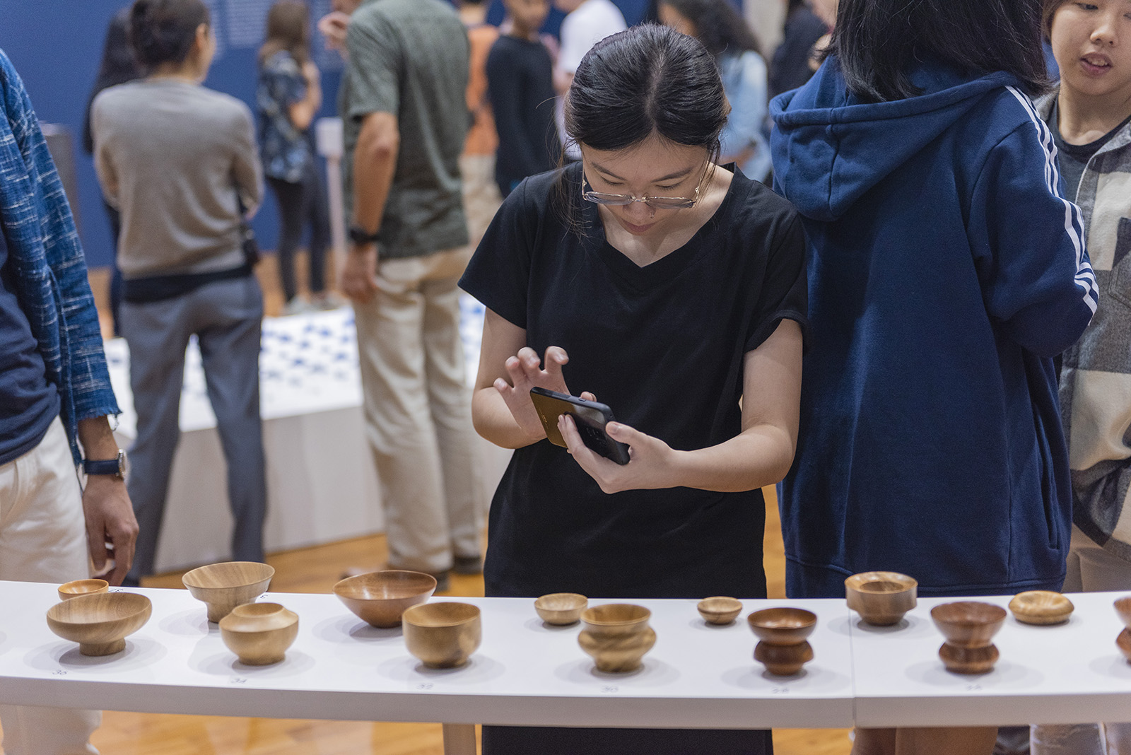
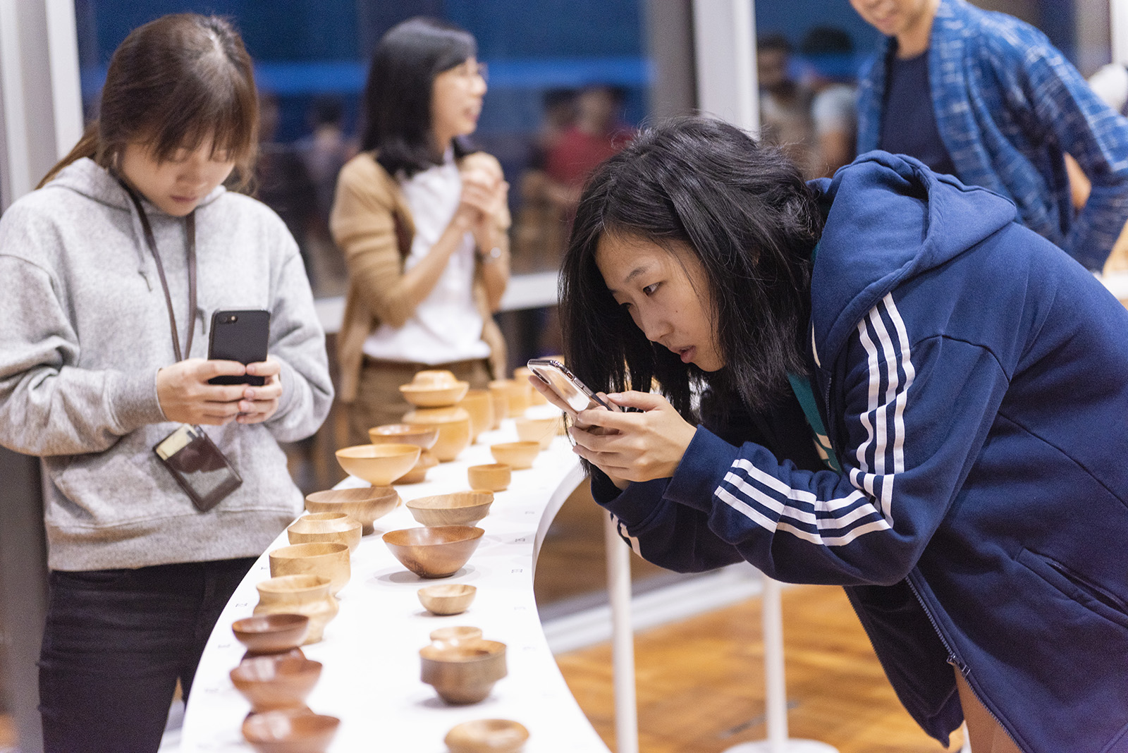
Bold. Audacious. Inspired. The 10th graduating batch from Nanyang Technological University’s School of Art, Design and Media presents the next generation of creatives: 164 movers and shakers you cannot ignore. These are the intrepid creators that stand at the ready; ready to take chances, and ready to heed their calling.

This is not just any graduation show. It is four years worth of cumulative work, blood, sweat and tears that come together over the span of a week; a celebration of each students’ creative journeys and the exciting waters that lay ahead for them to explore.

This is ADM Show 2018. This is The Next Wave.

admgradshow.com

DNA Paris Design Awards 2020 — Winners in Graphic Design/Branding category


We started the branding campaign by asking the question: what truly excites people?

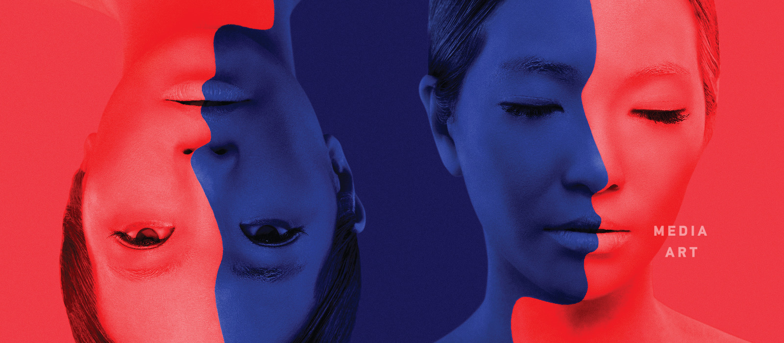
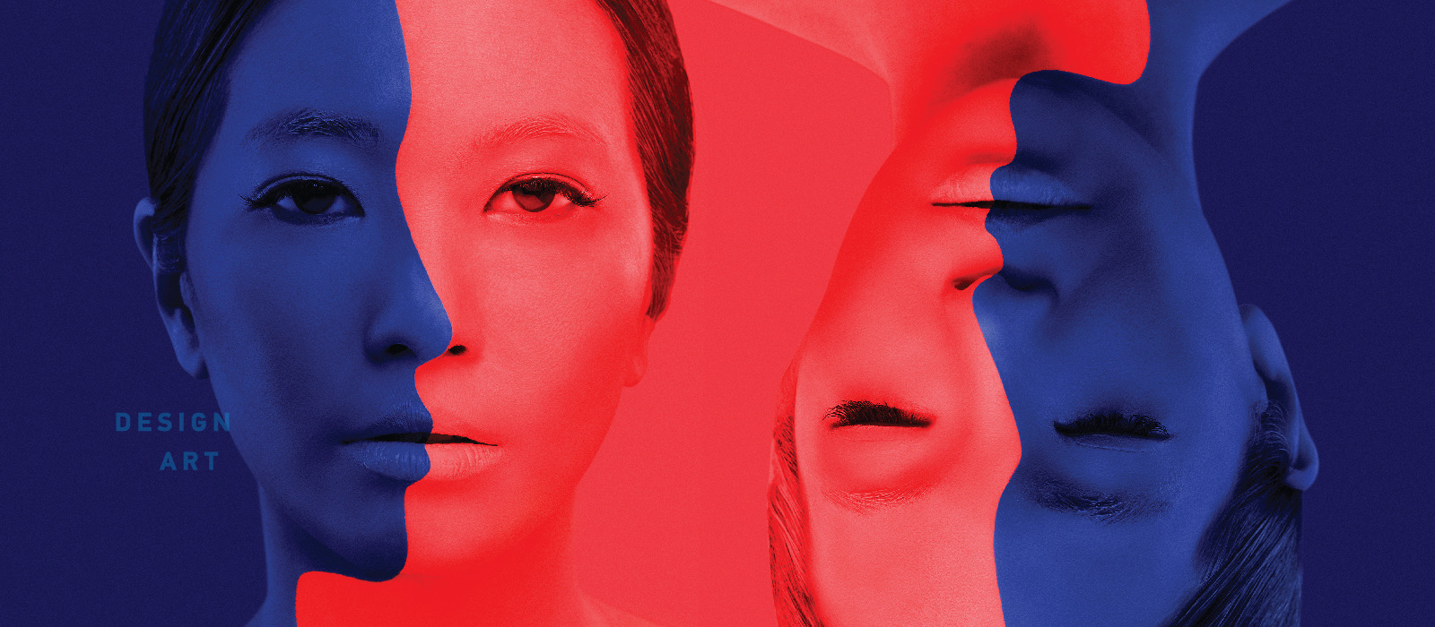
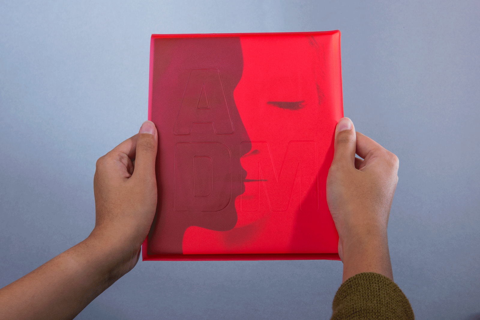
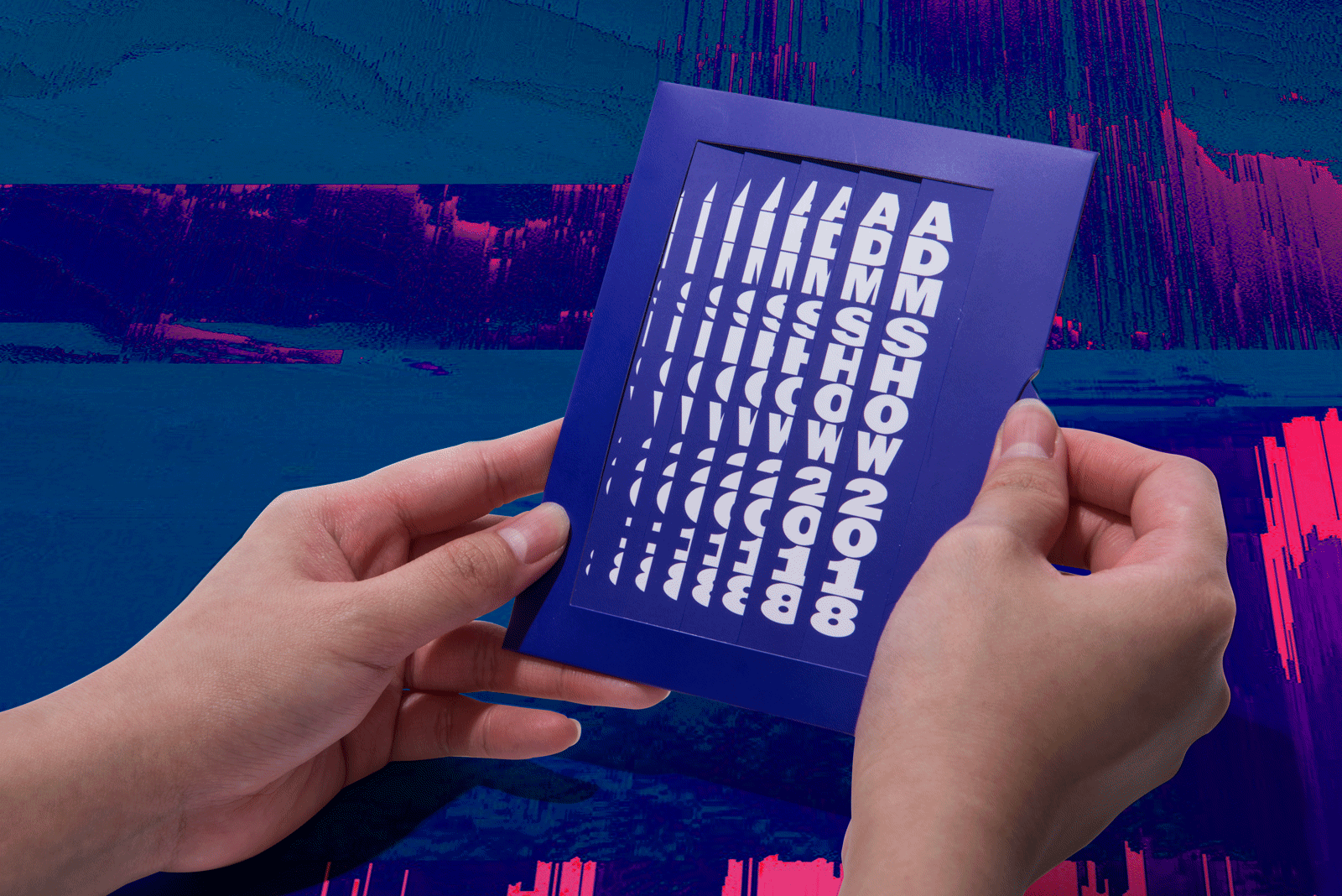
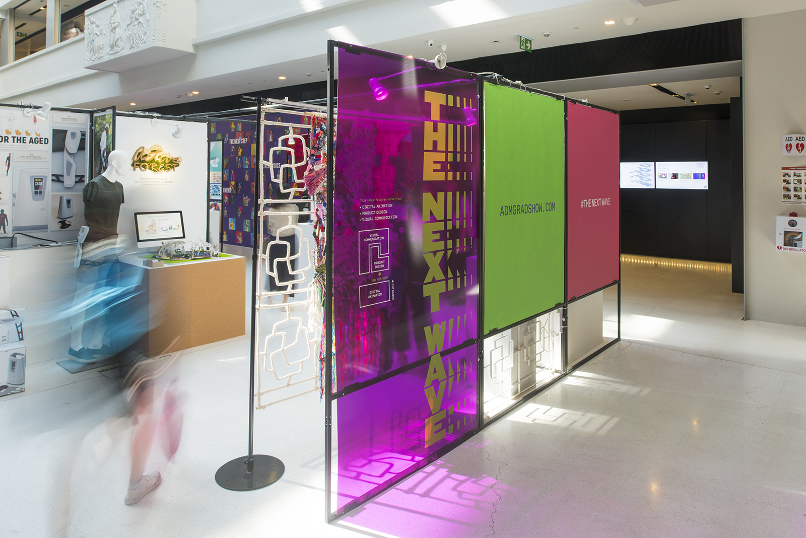
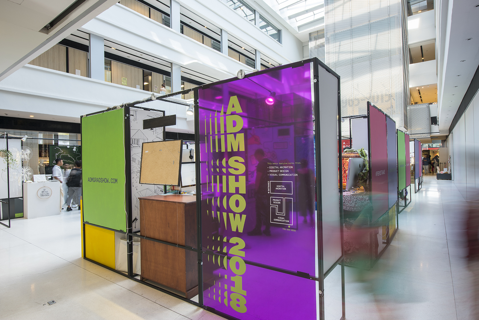
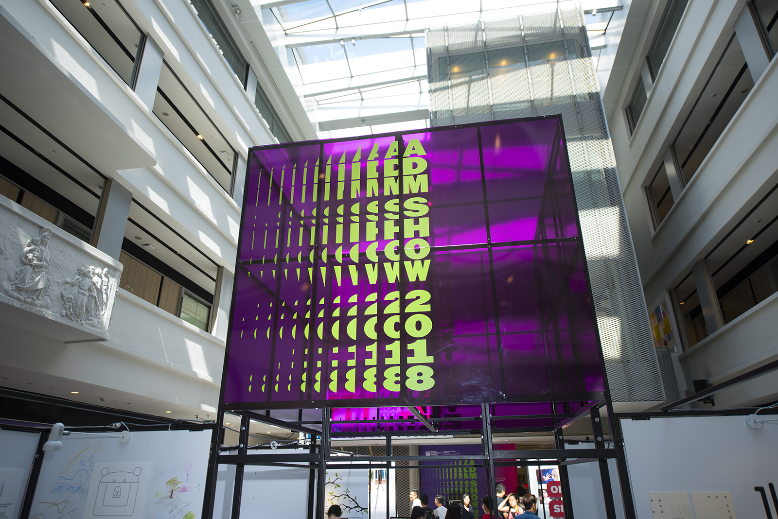
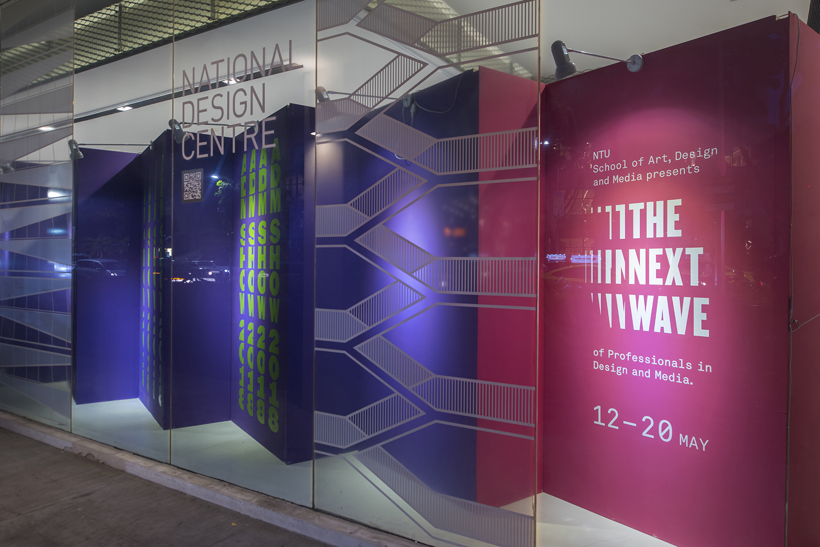
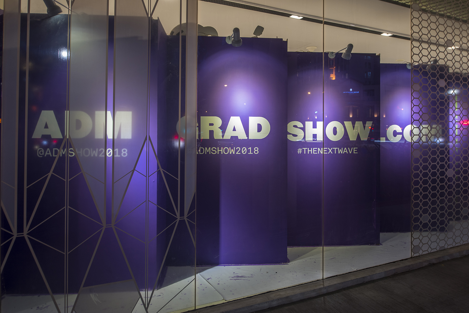
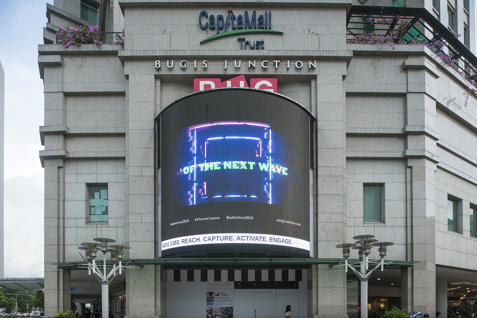
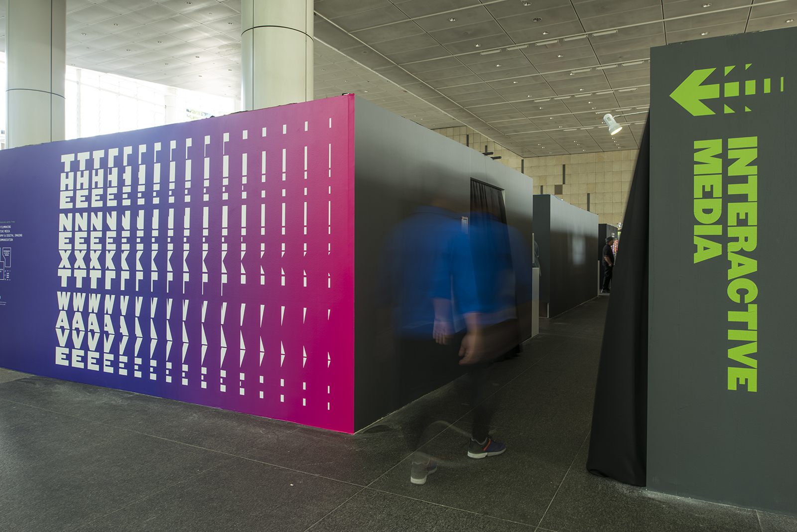
Is it the next big idea? The next film? The next game changing innovation? It is always the idea of something new at the horizons that stirs up excitement. This year, the show’s identity reflects the motion of a wave rushing forward; the new creative energy within this graduating batch as they challenge themselves as the next wave of movers and shakers in the creative industry. Combined with bold, towering typography, it lends personality and helps to reinforce the boldness of the message.


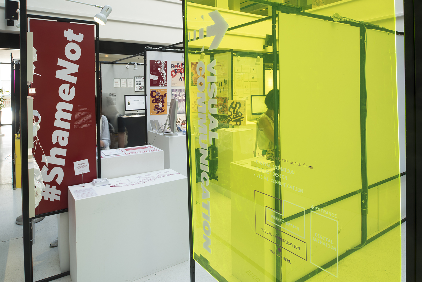
A rich body of neon colours were utilised across all applications, demonstrating the elements of wonder in the creative process and highlights the energy that comes with new ideas.


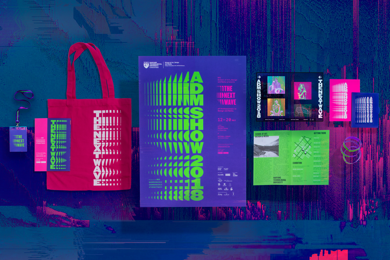
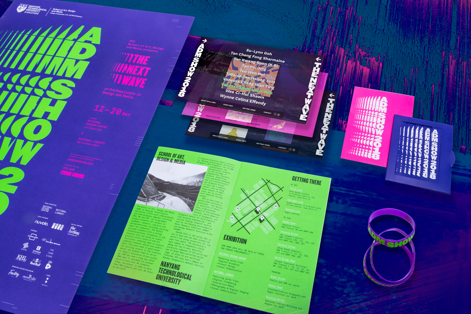
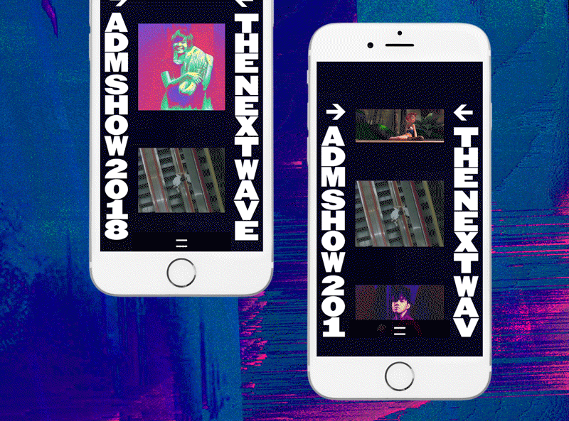
The multi-layered format of the website showcases the multi-dimensionality of this ‘Next Wave’ of graduates.

 
Being part of the 'Next Wave', we wanted the graduating batch to fully express their hopes and dreams upon graduation through this photoshoot. The messaging reinforces the campaign, and these populate our social media platforms across the entire duration.
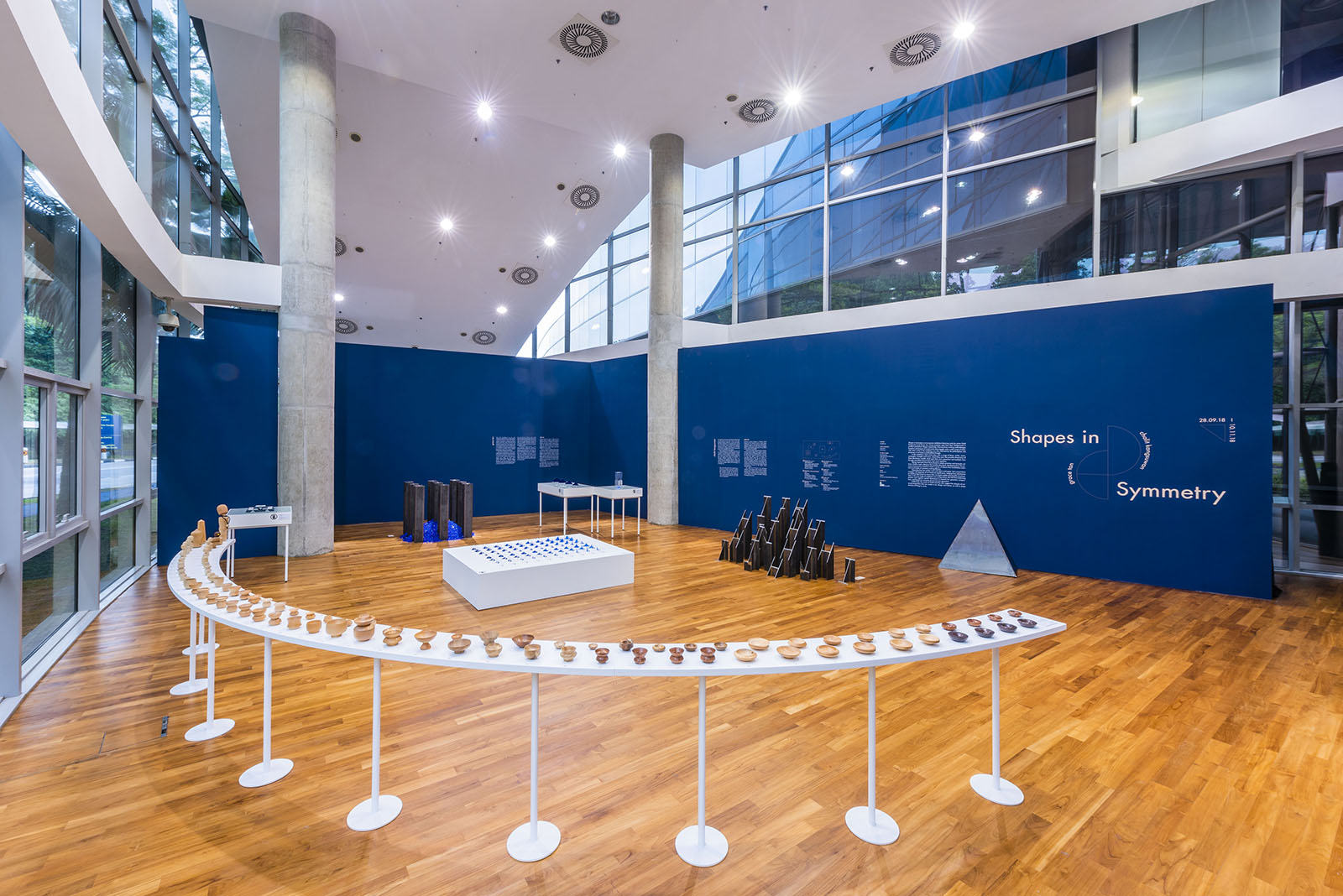
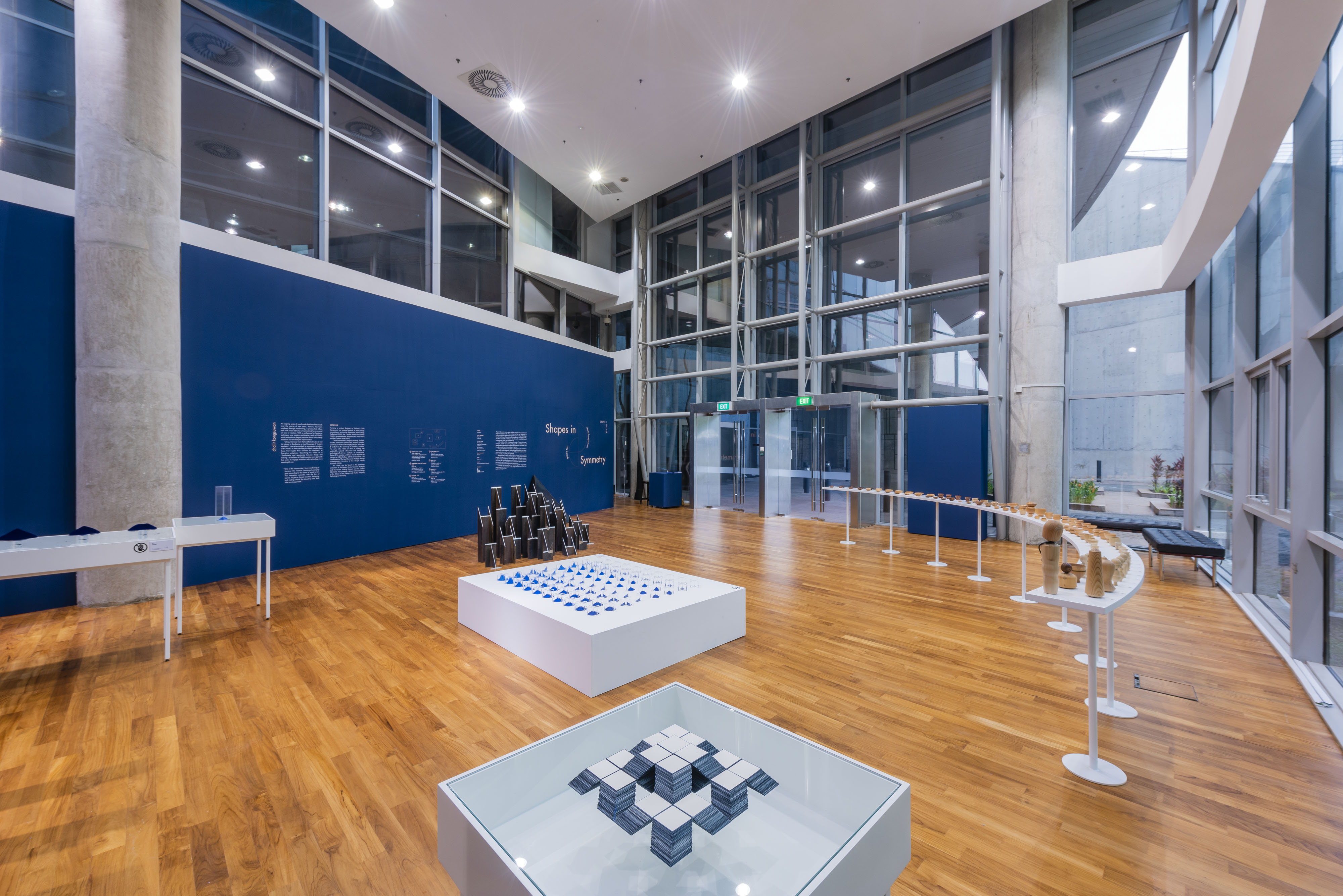
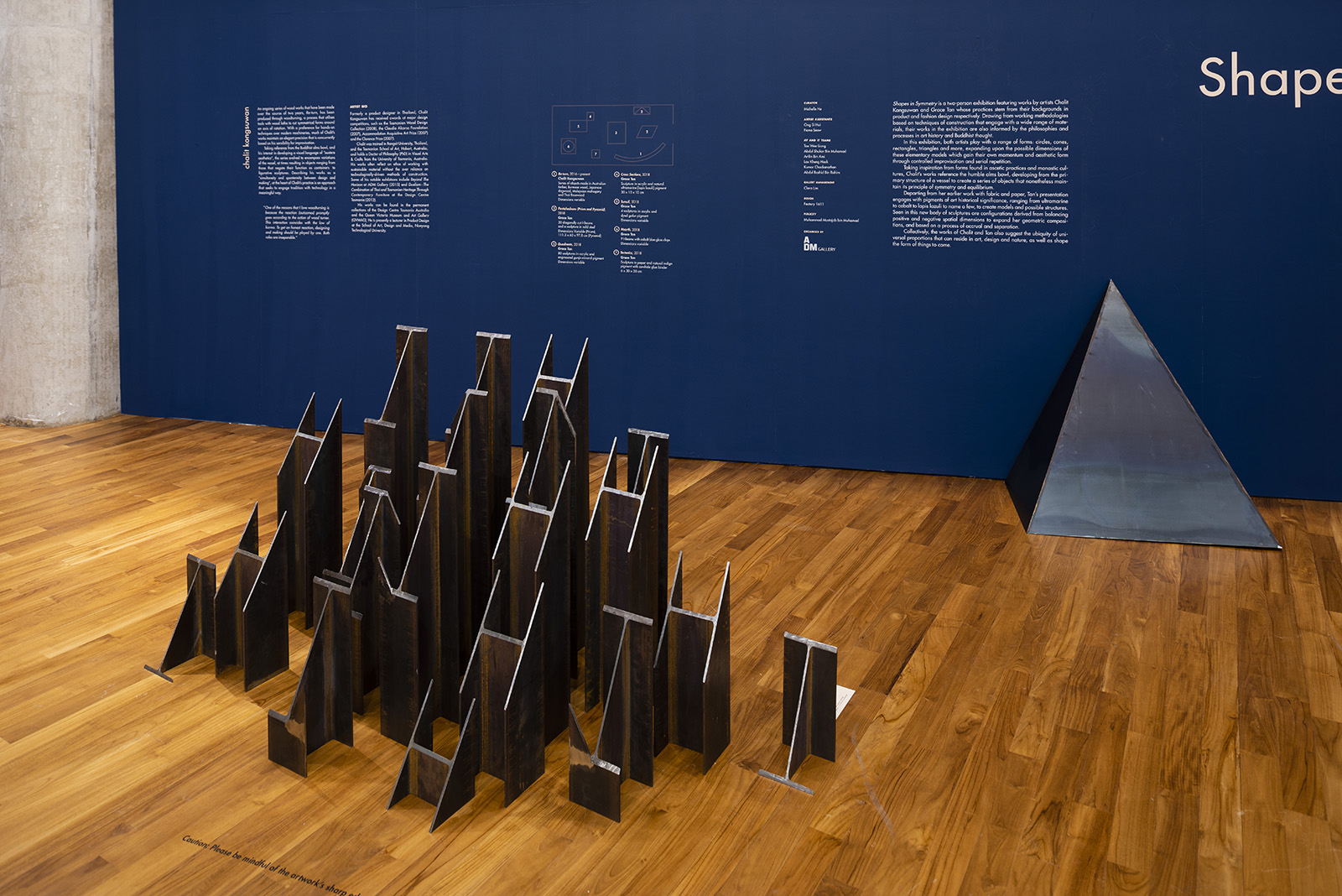
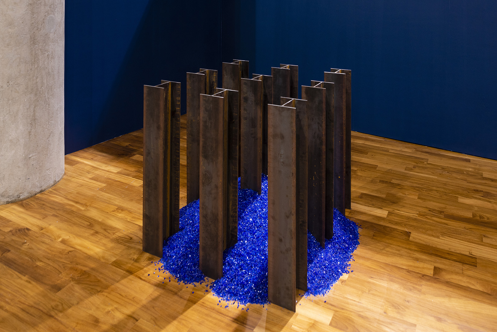
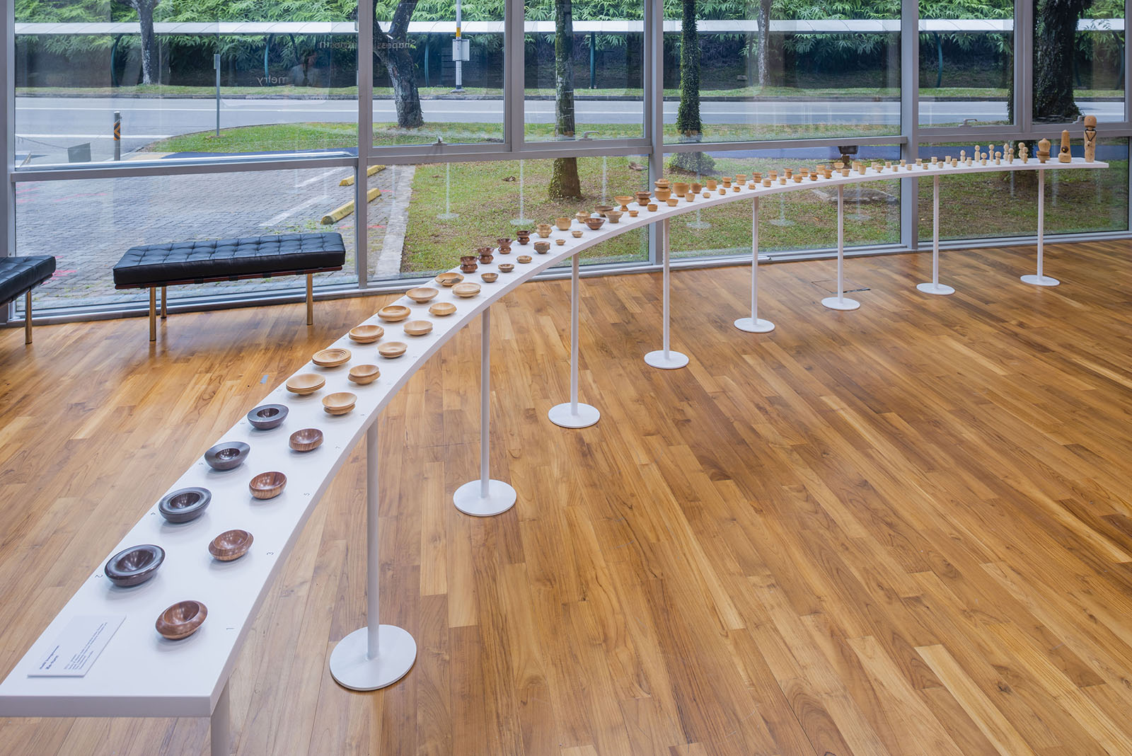
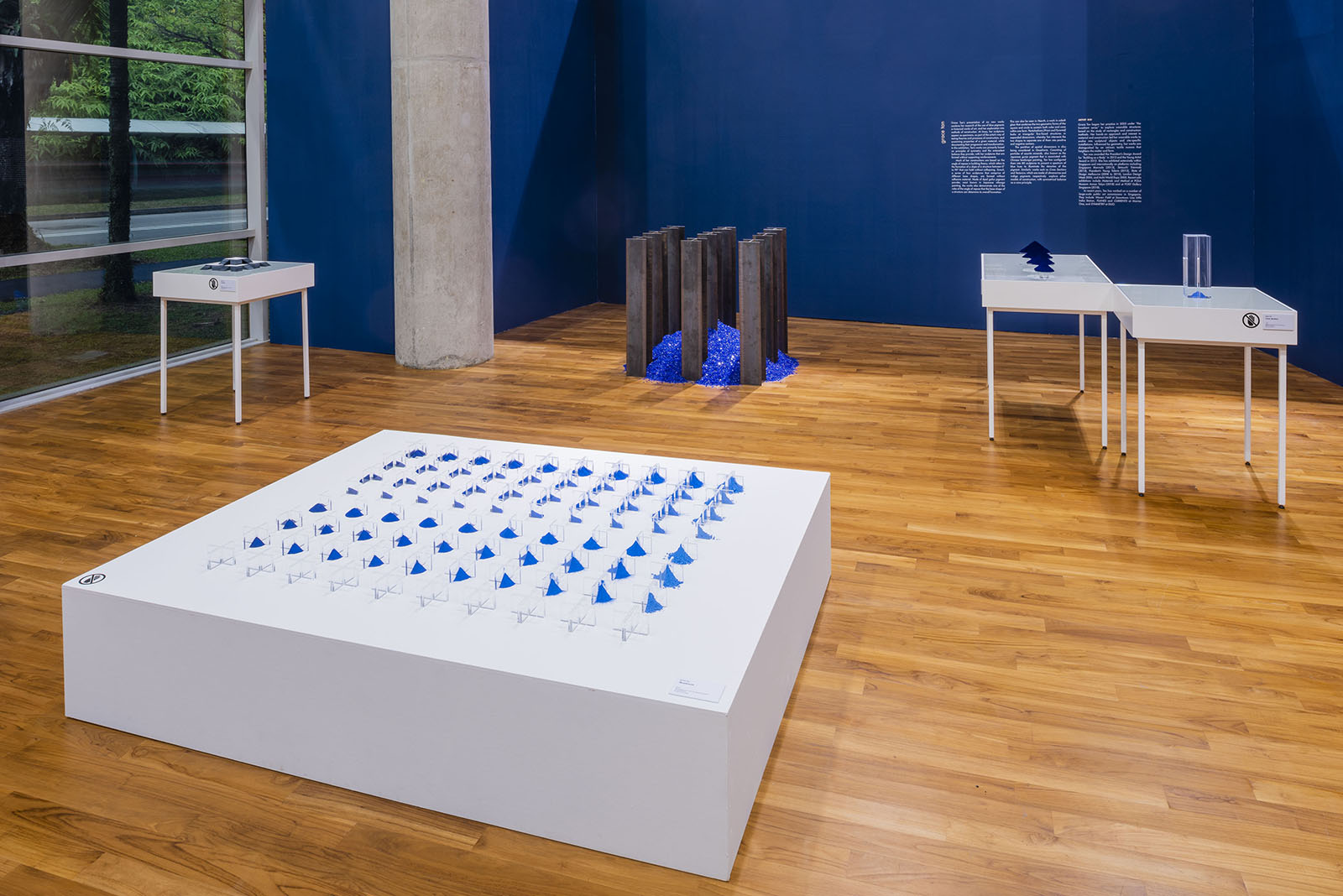
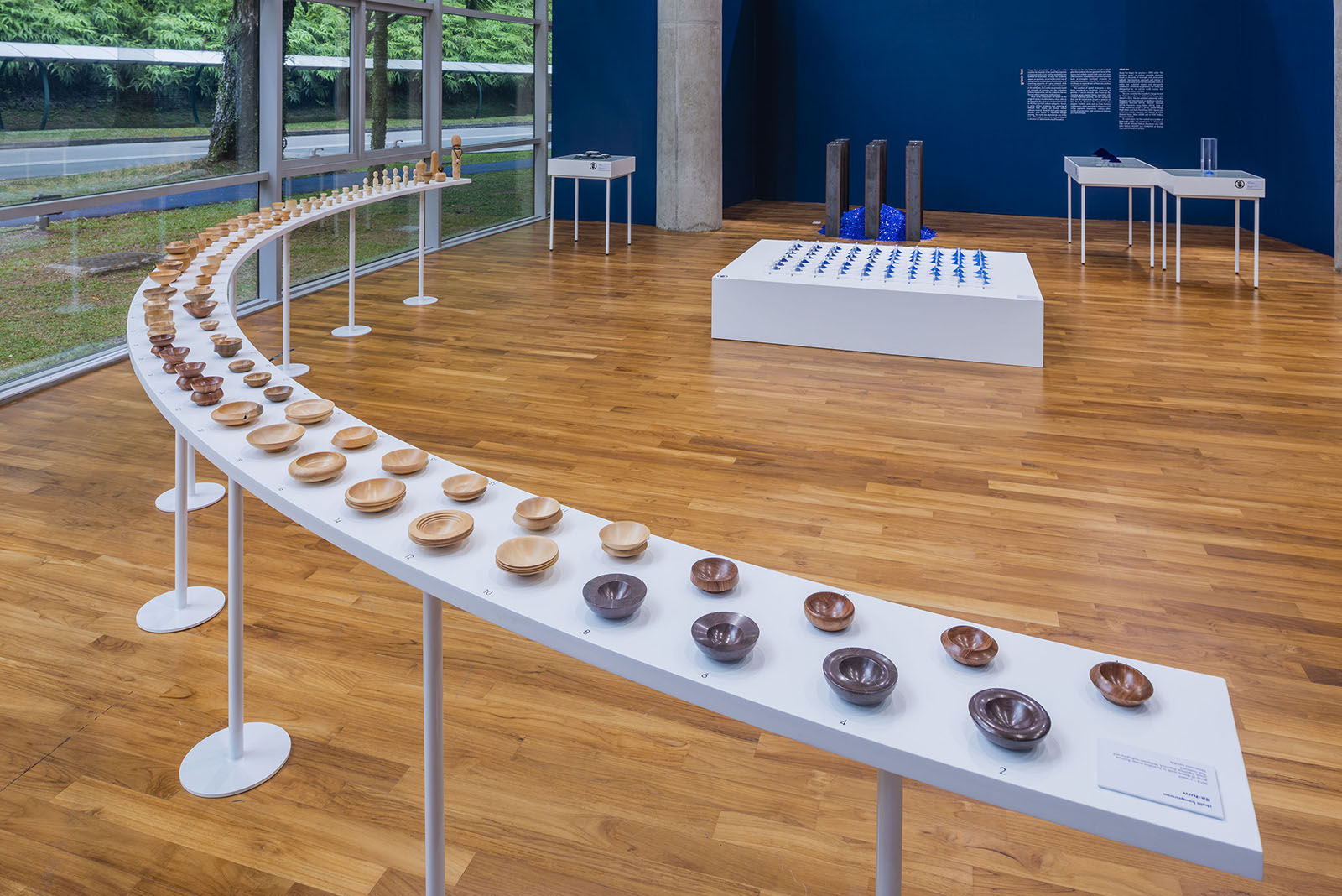
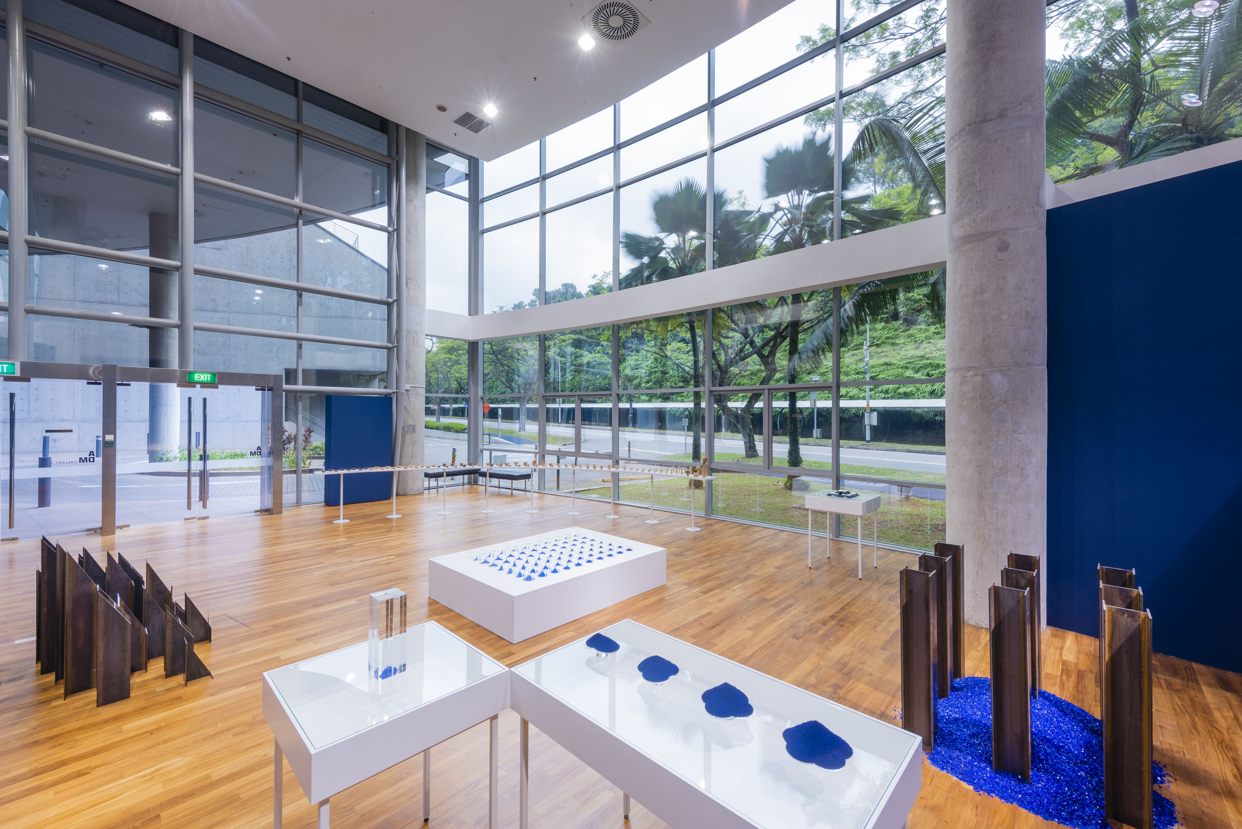
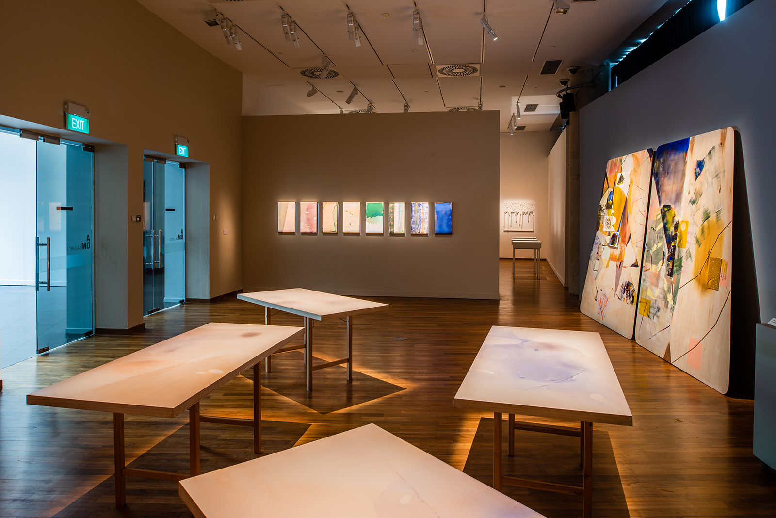
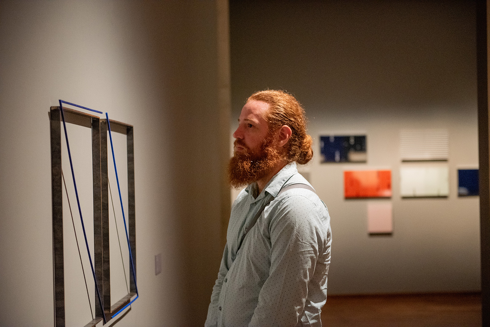
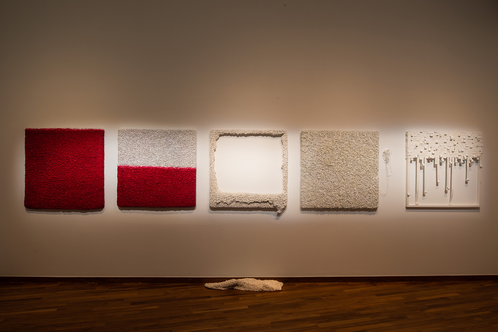
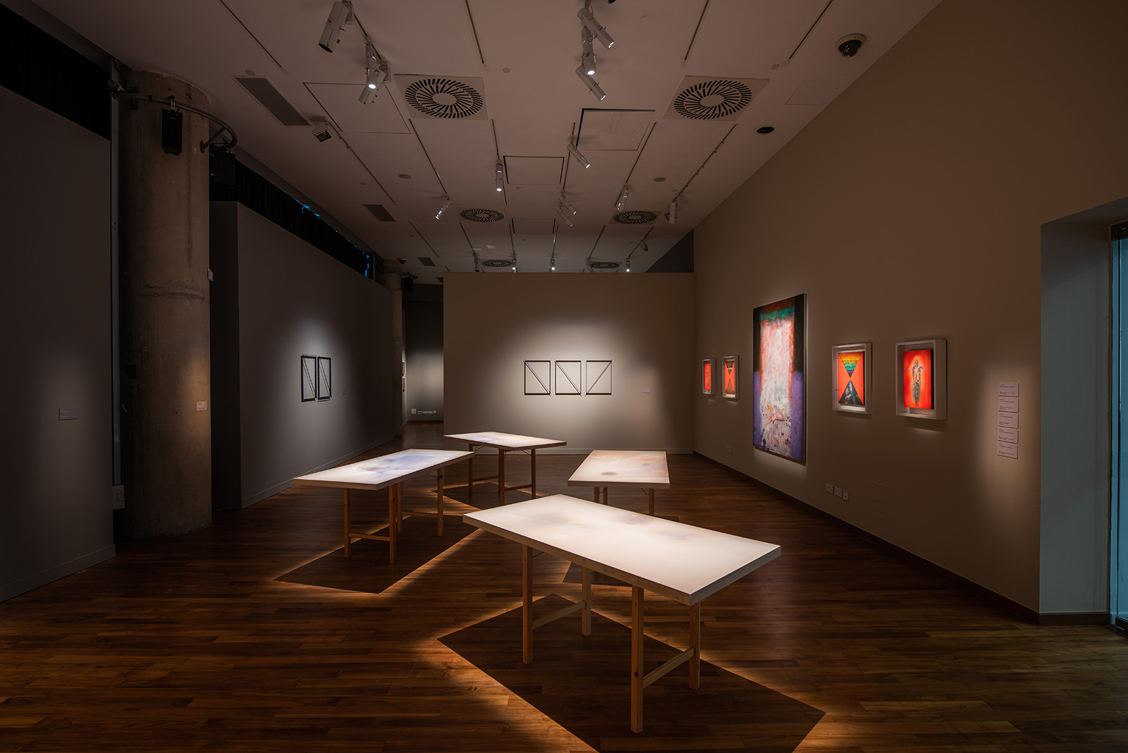
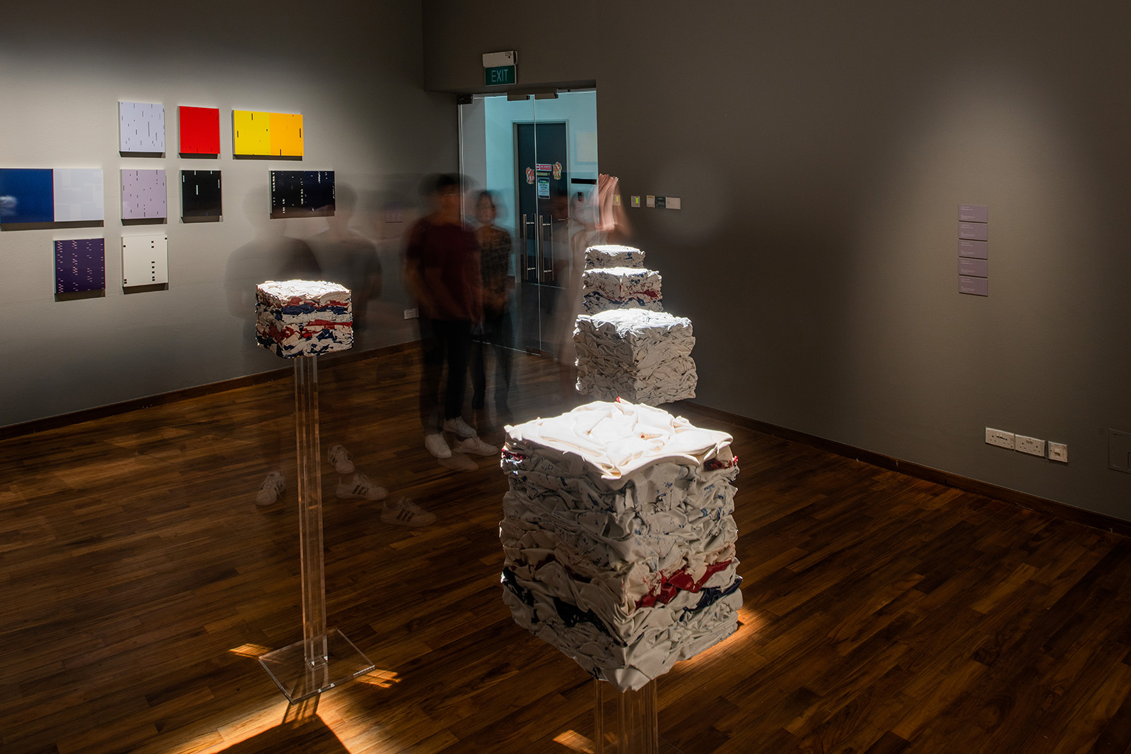
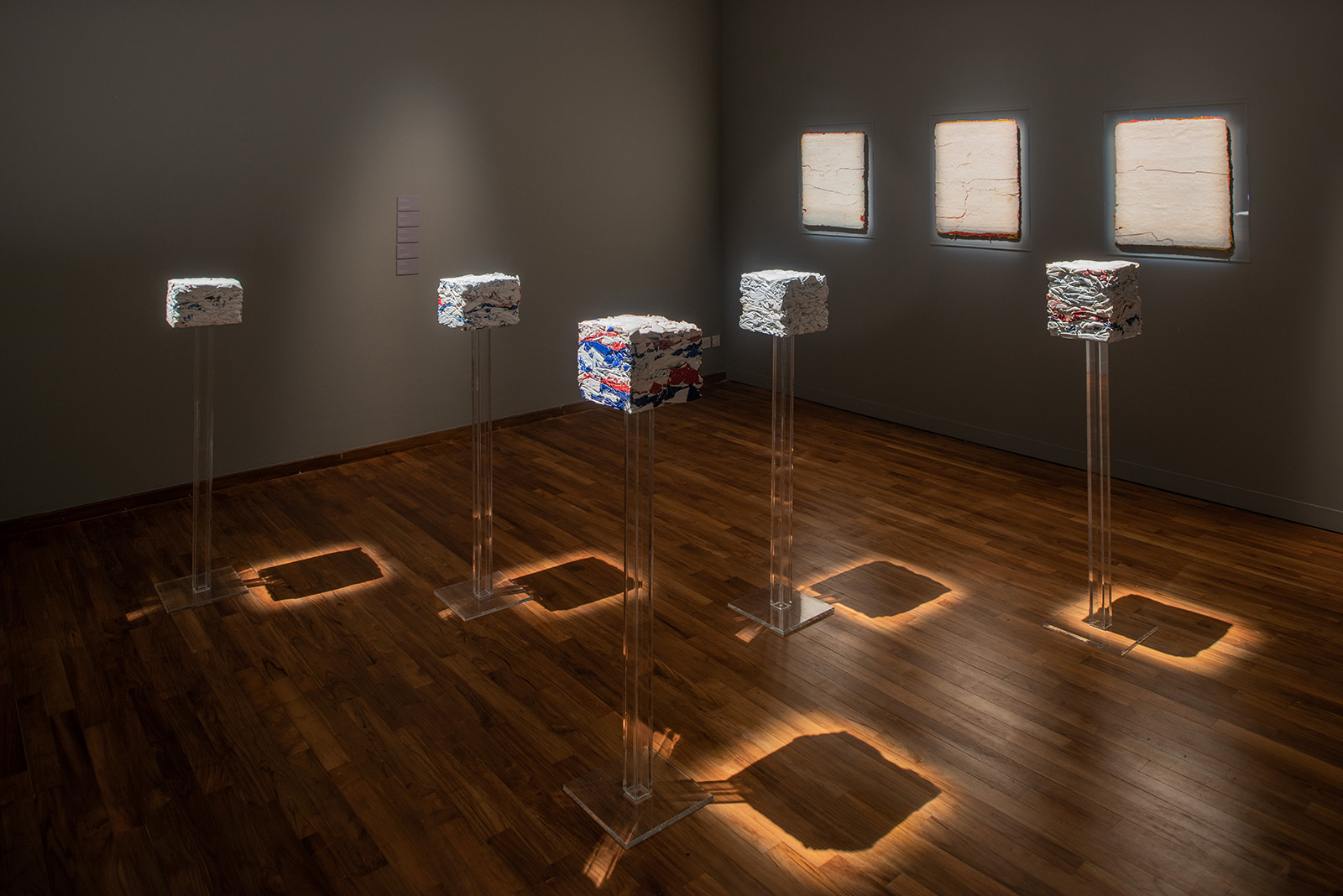
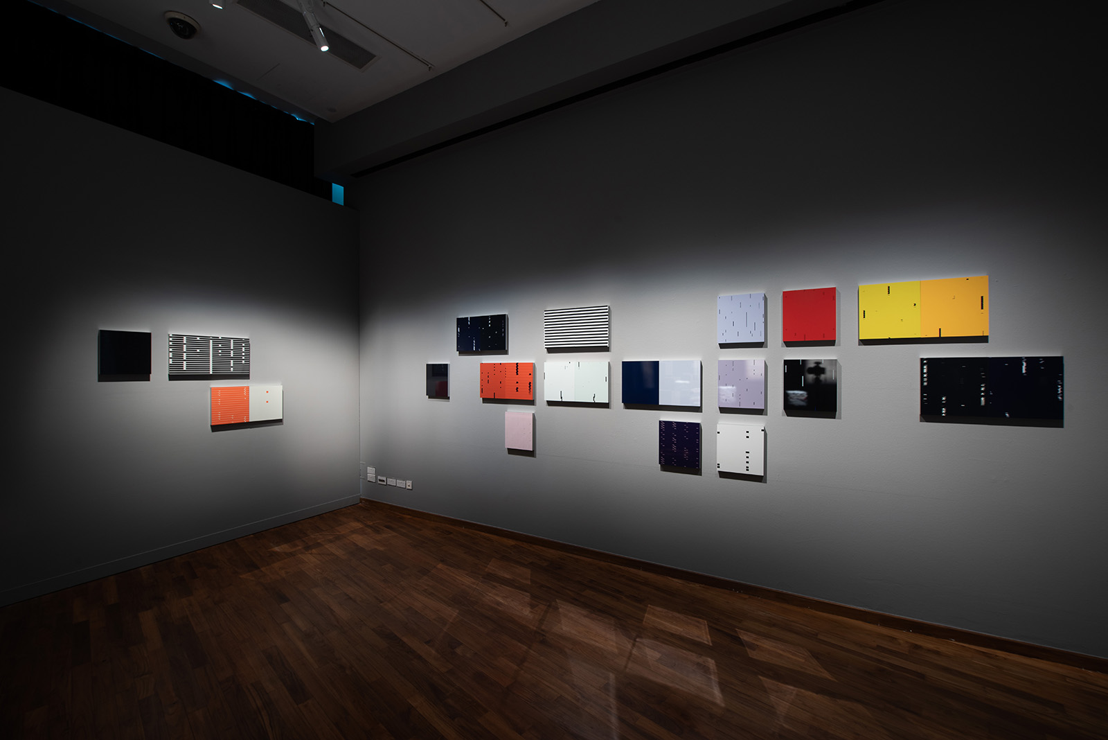
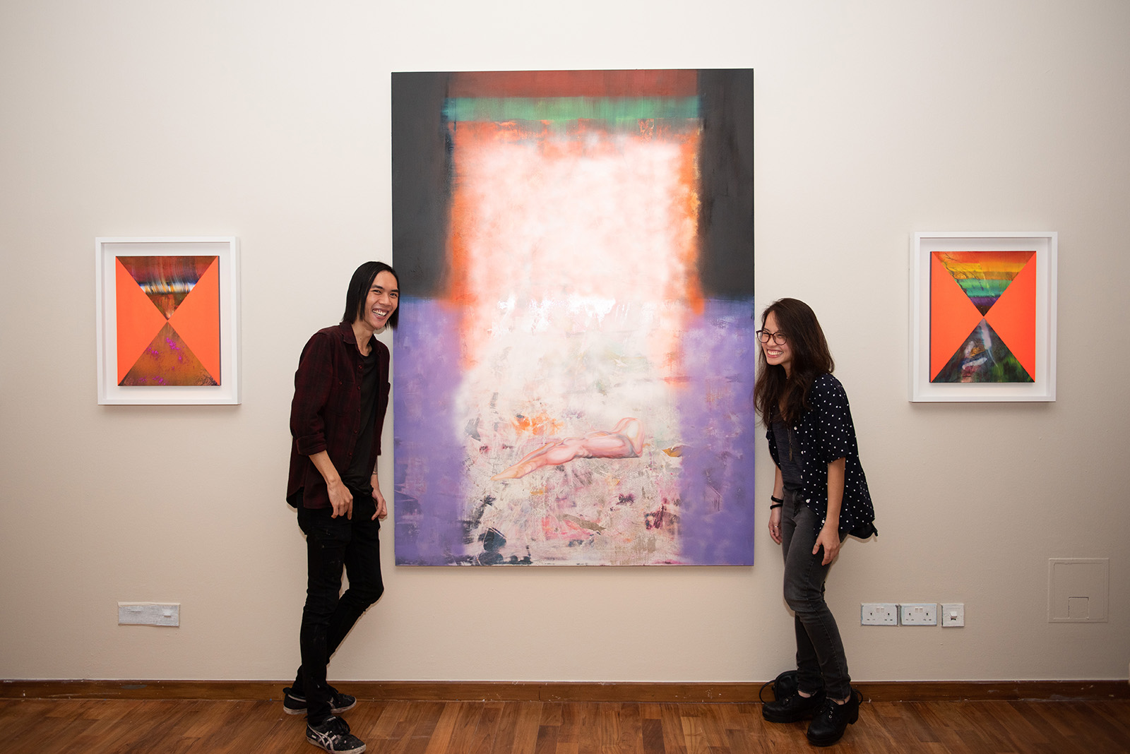
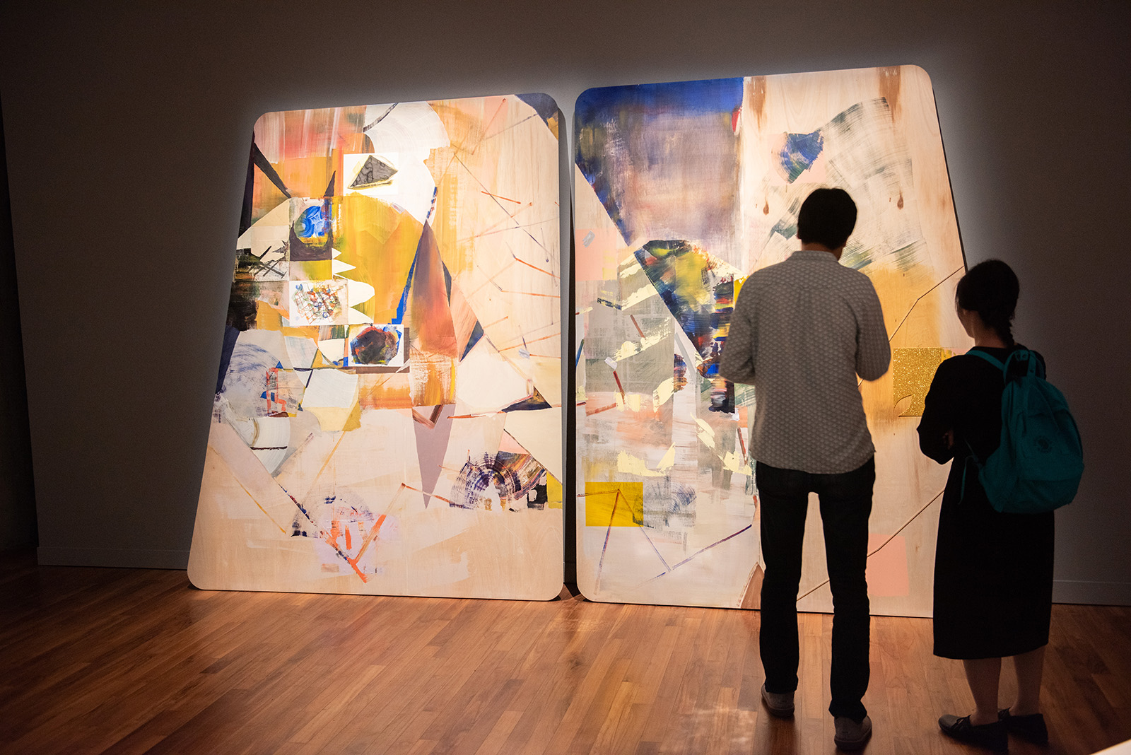
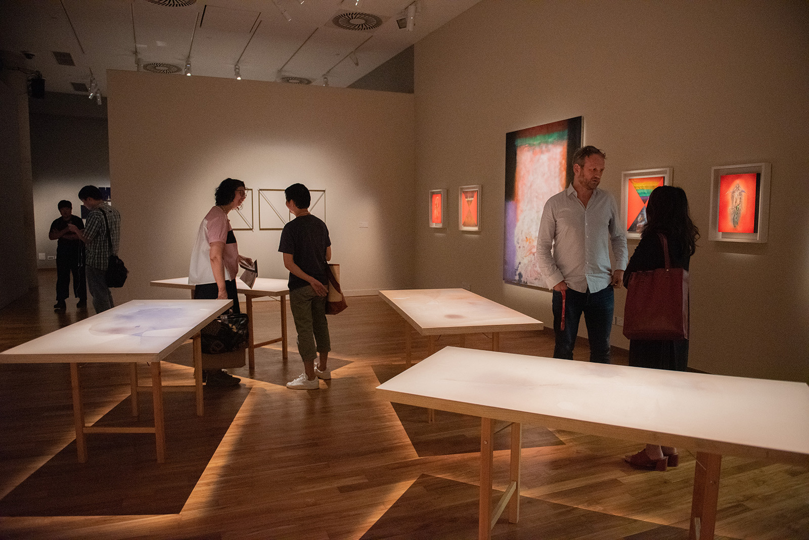
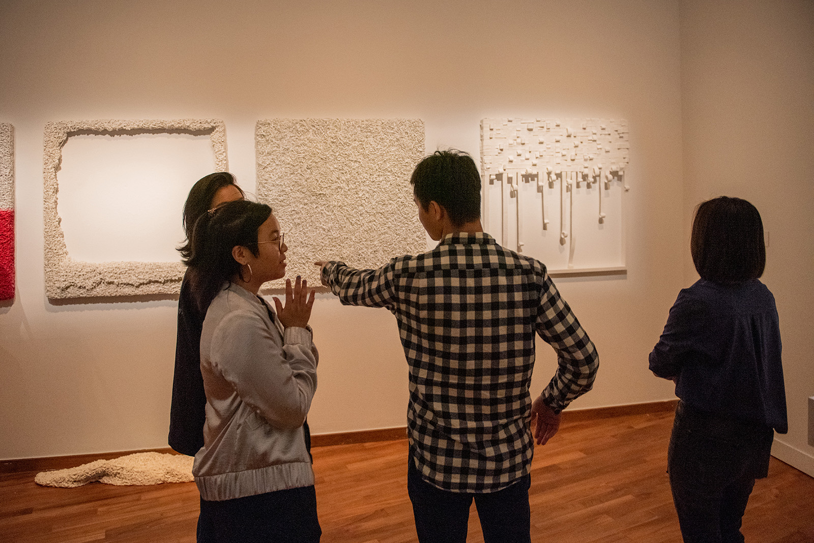
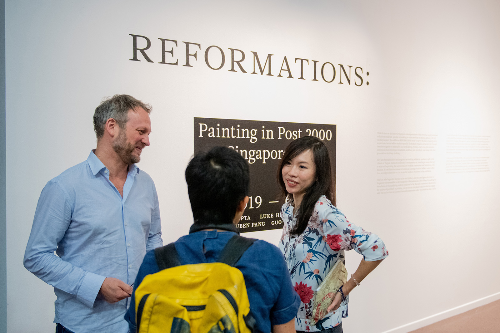
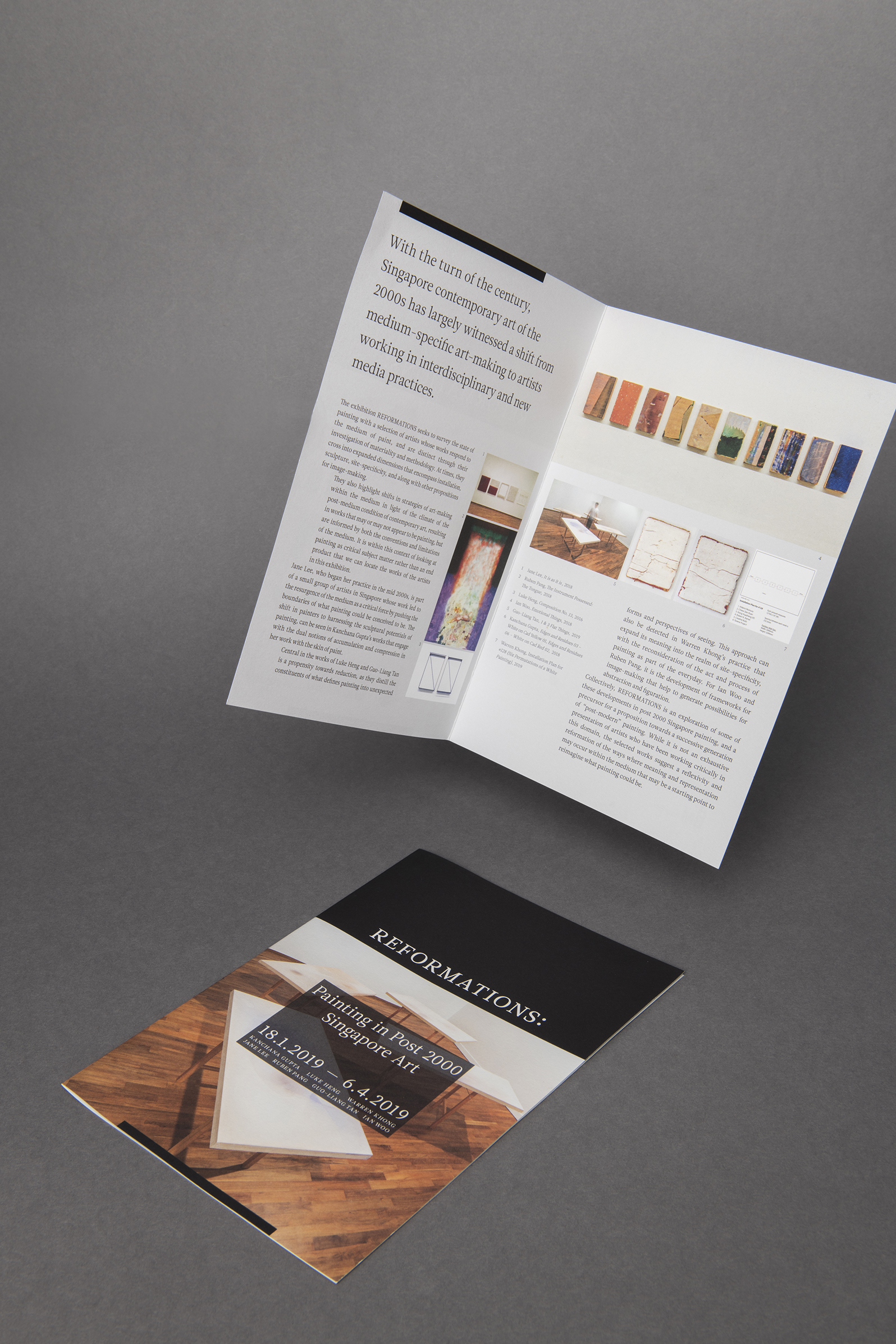
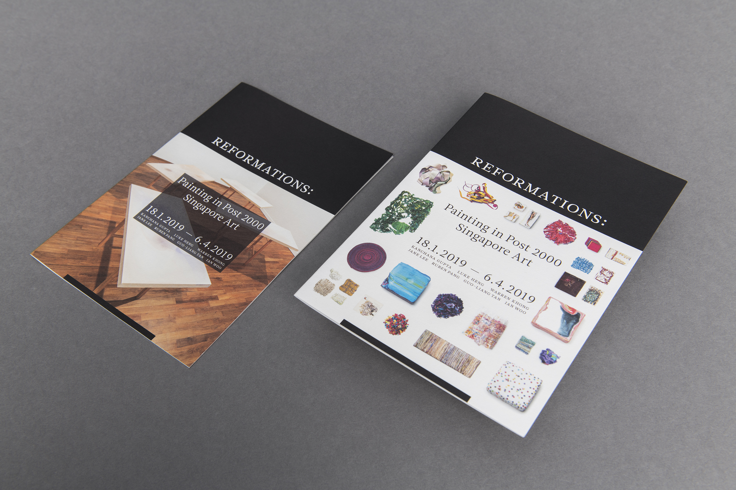
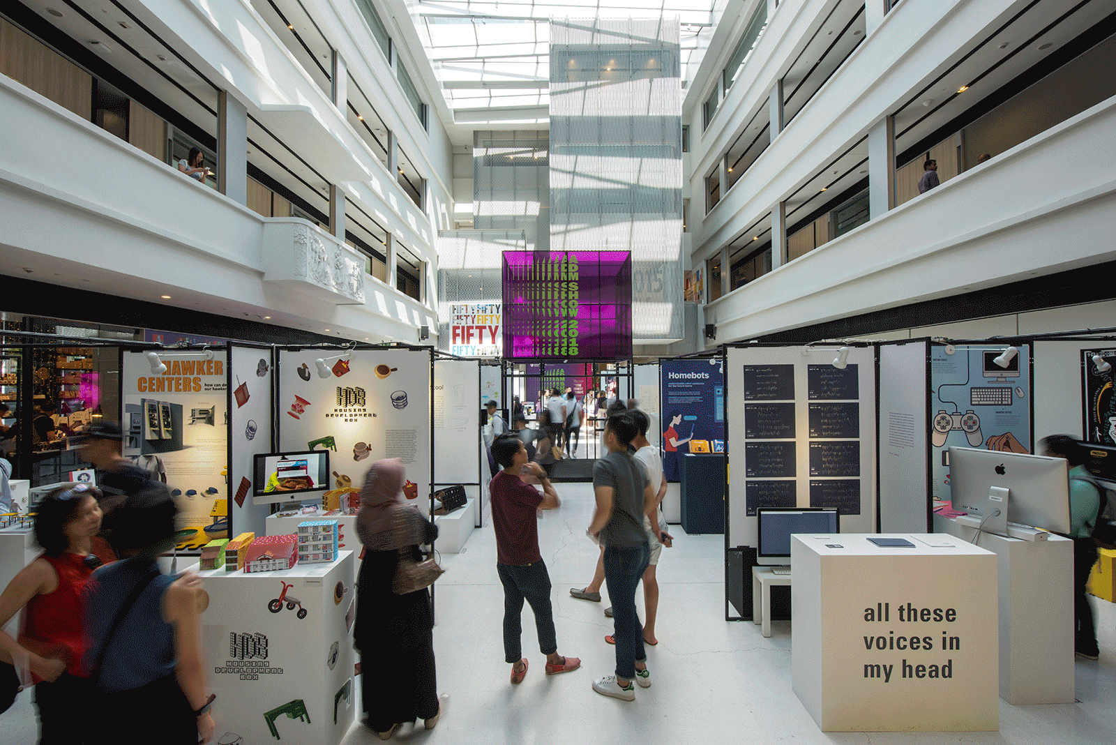
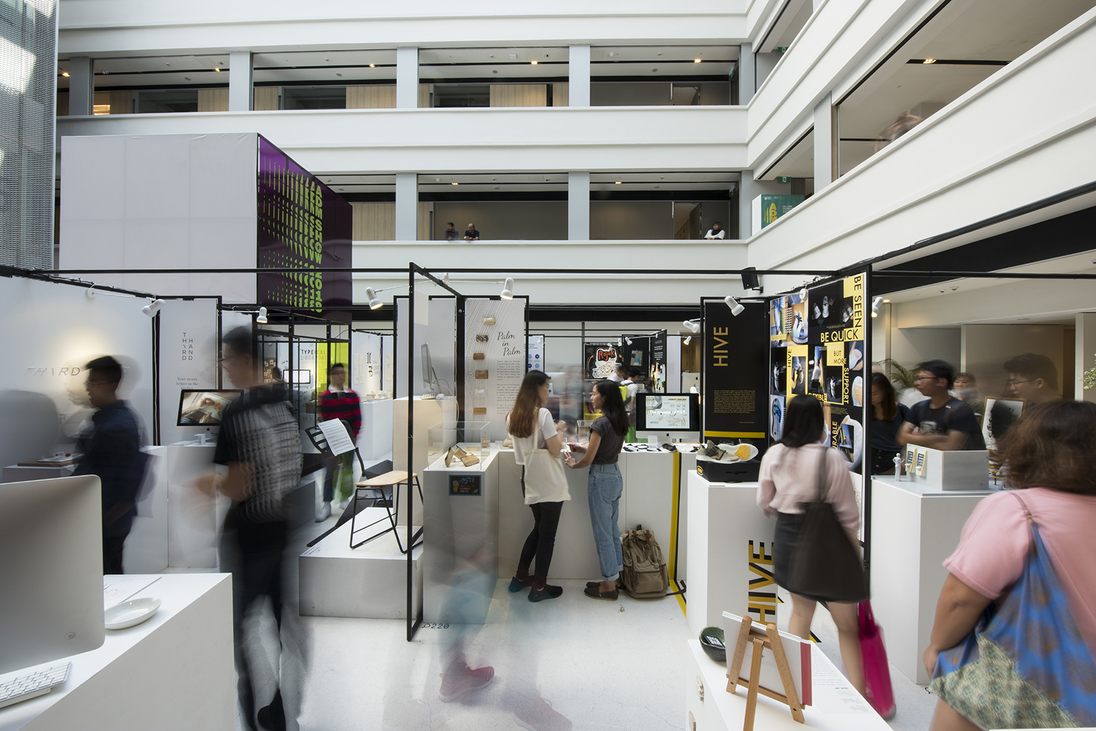
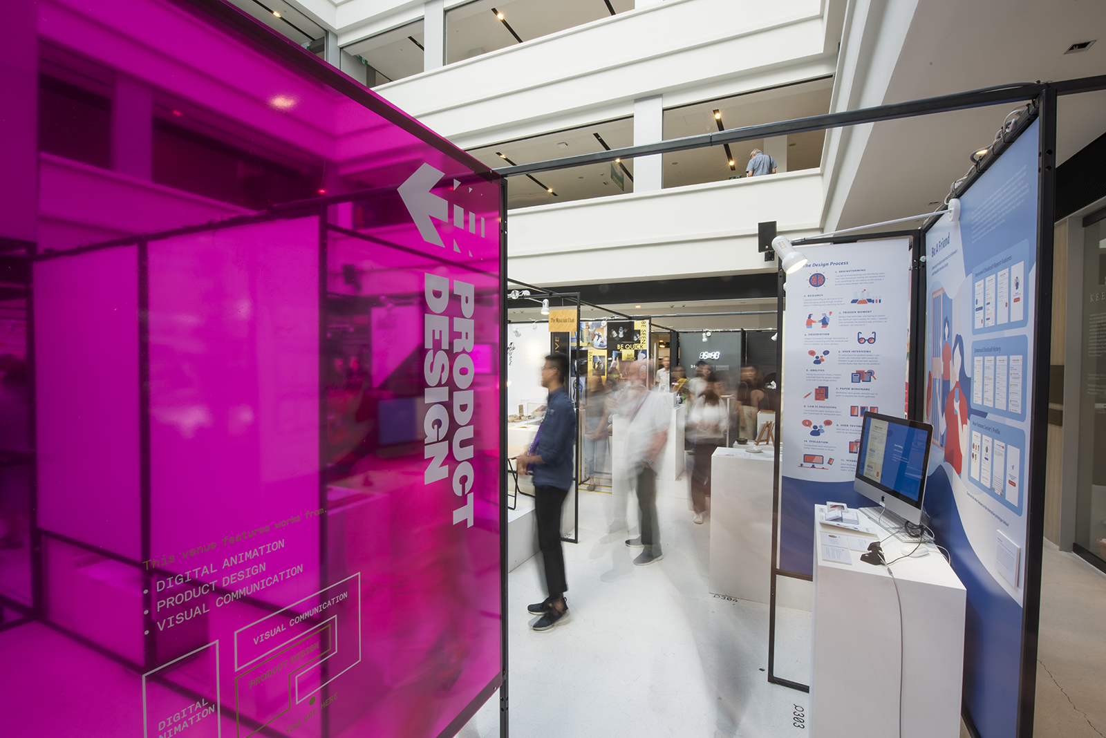
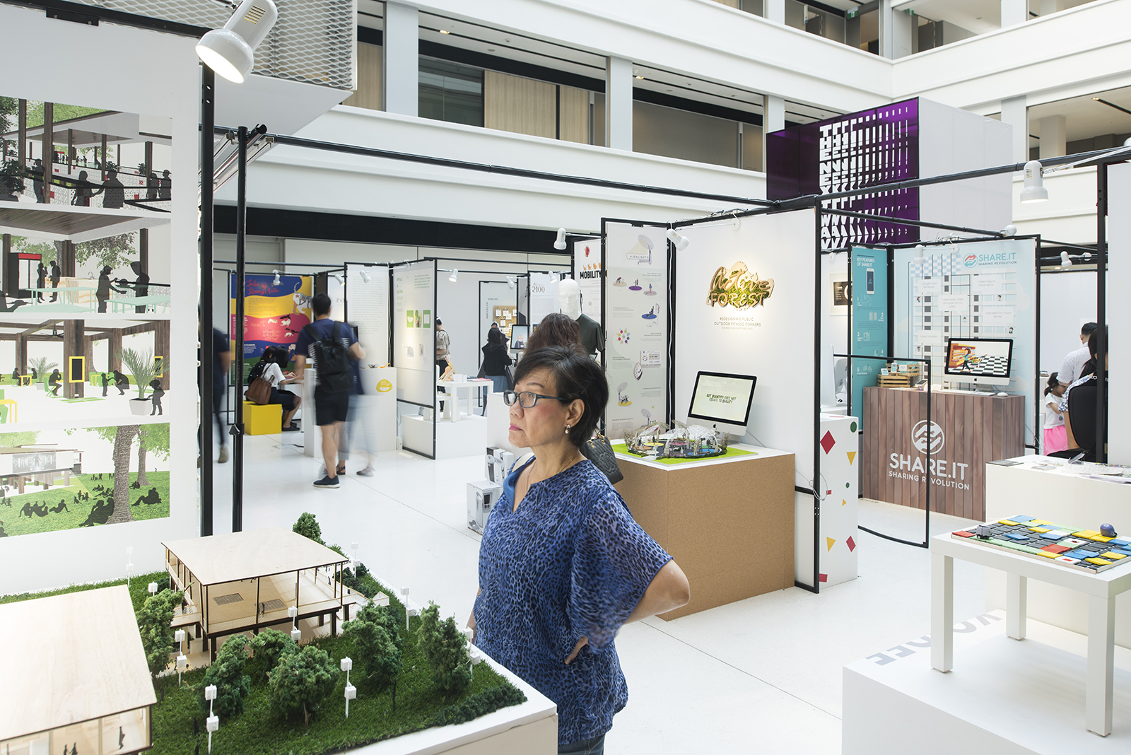
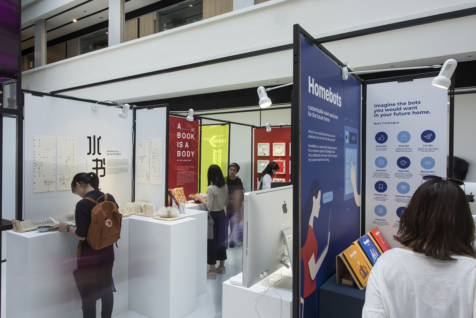
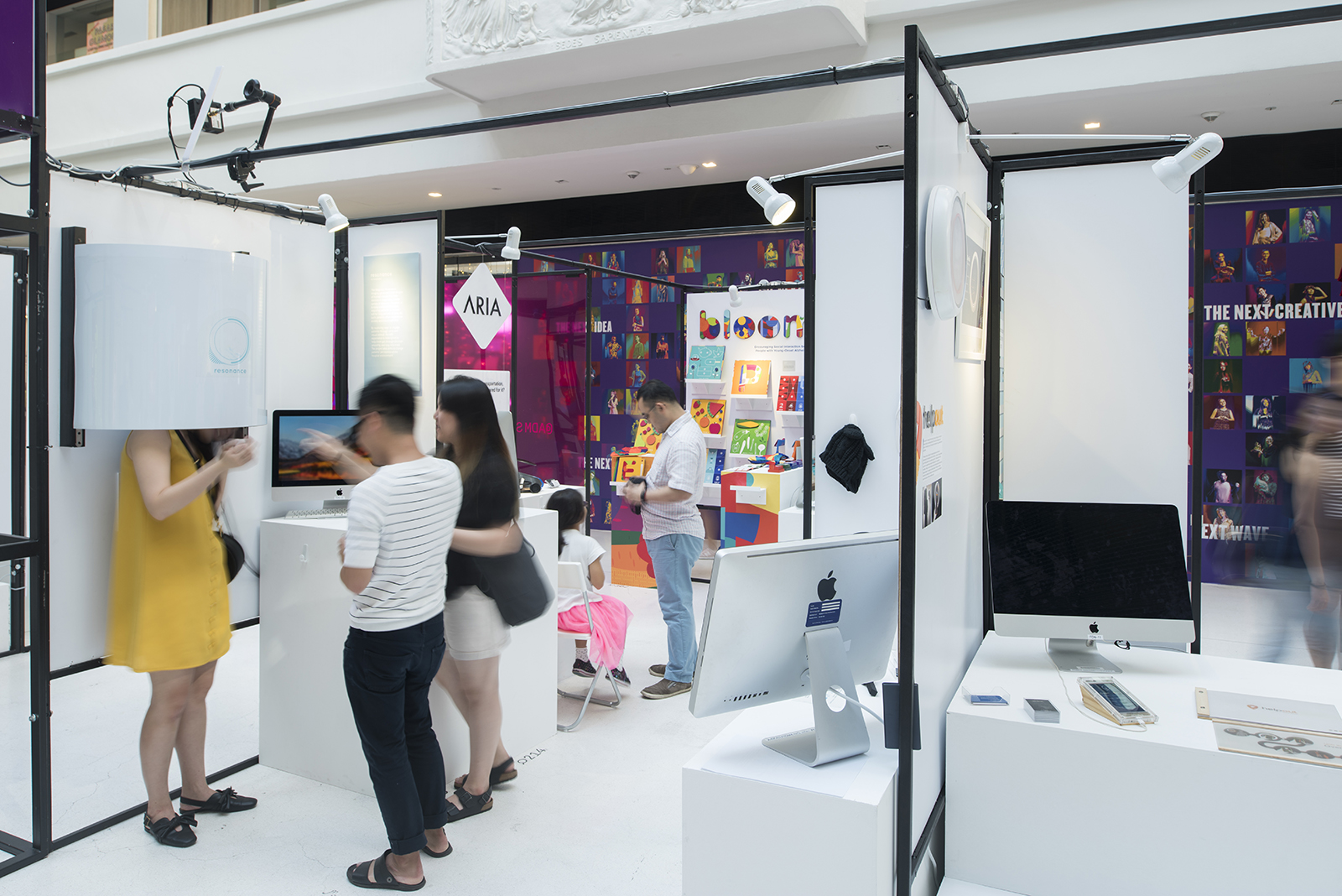
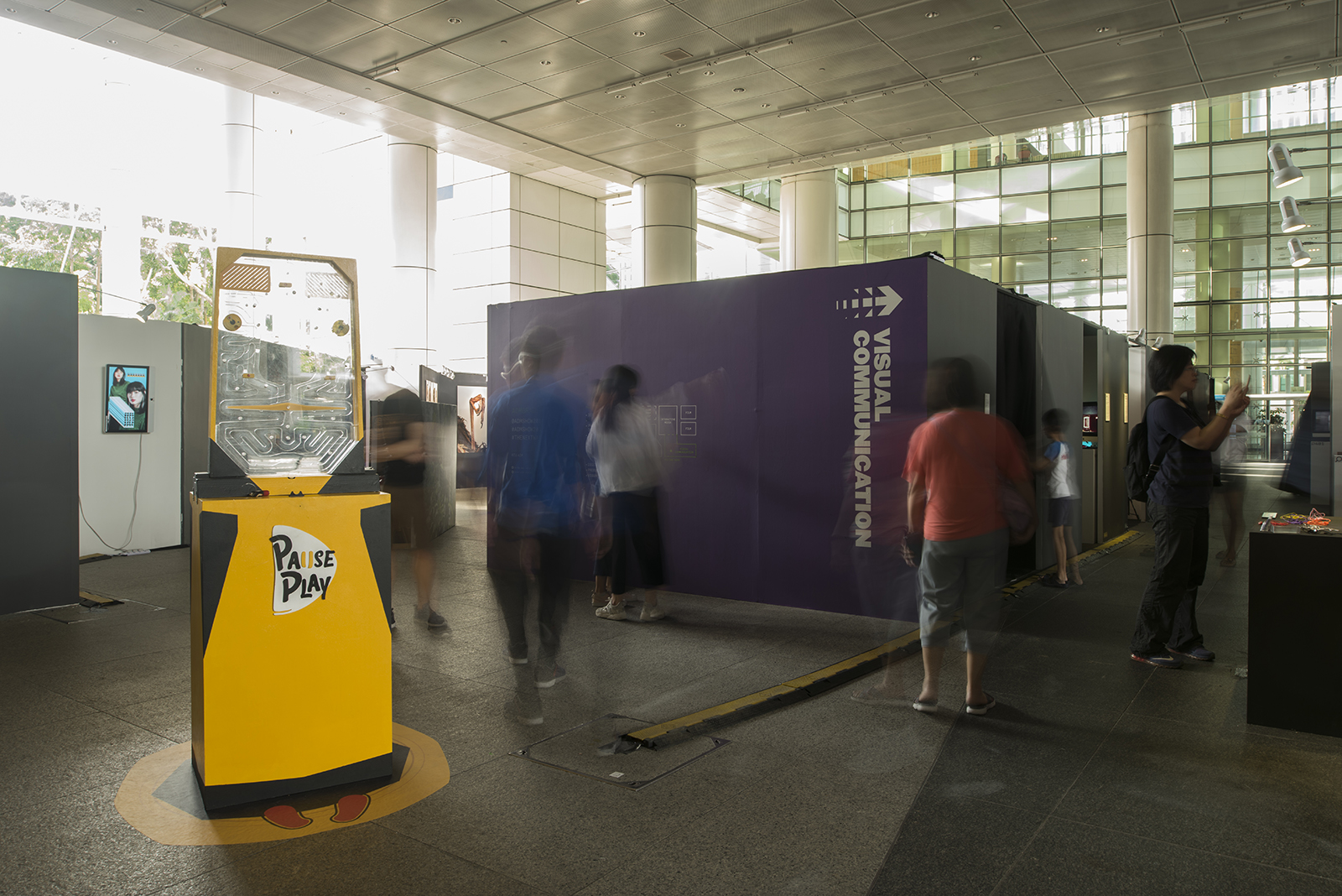
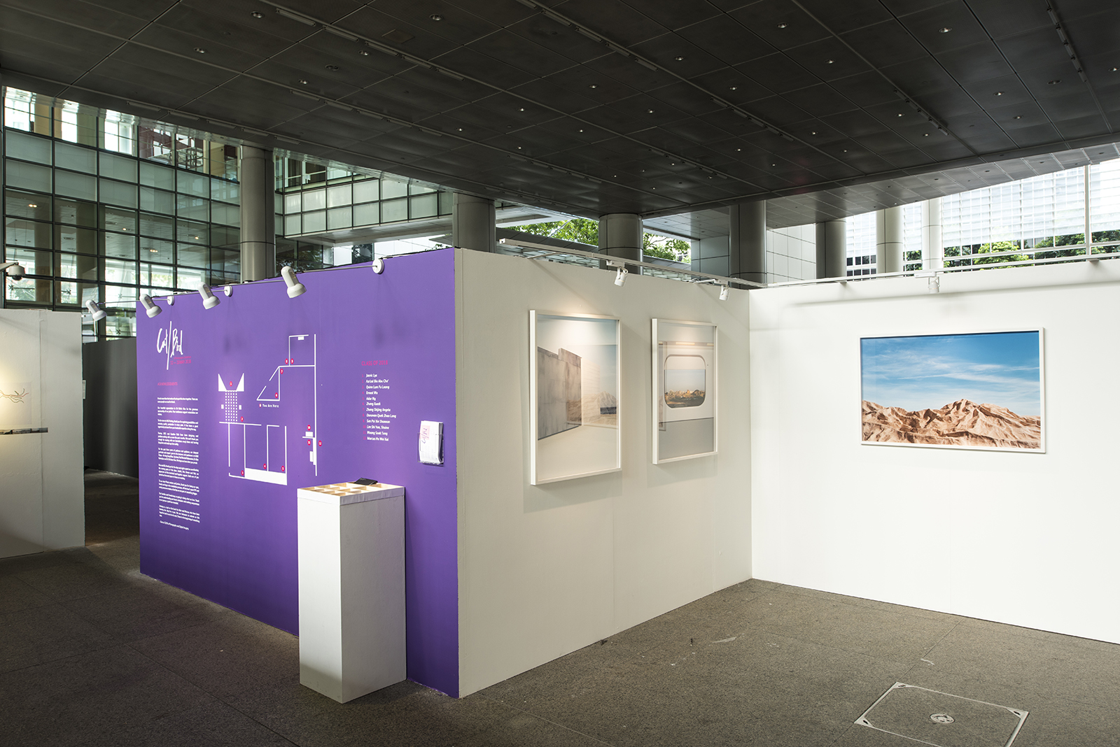
 

Exhibition Design

The exhibition itself is presented over two venues:
— National Design Centre & National Library.

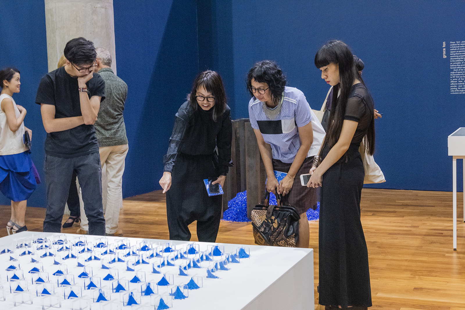
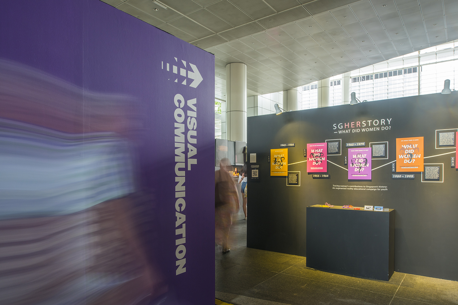
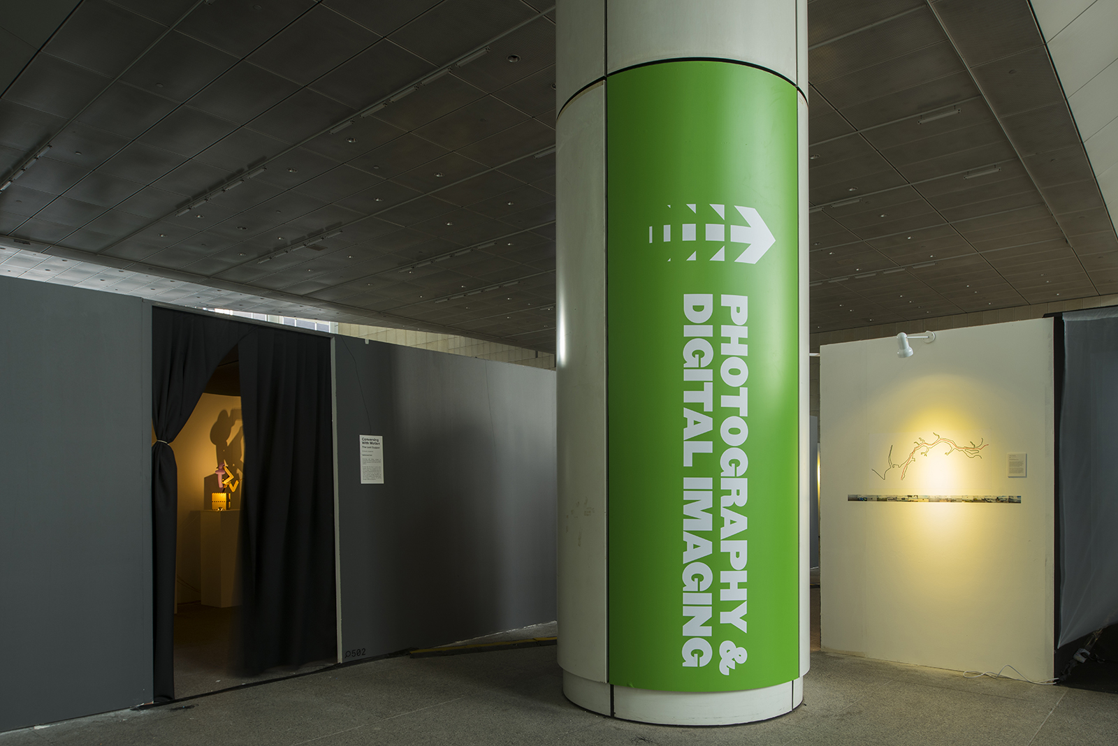
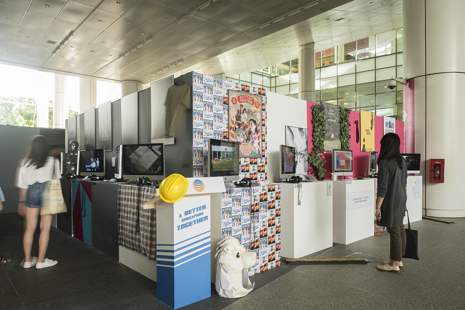
We adopted a tiered and layered approach to constructing the exhibition booths which creates texture and excitement in the exhibition viewing experience.

The ‘Next Wave’ idea is also presented spatially through layered dynamic movements in the key visuals and typography which are applied onto wayfinding graphics such as gigantic totems, walls and pillars wraps, helping visitors navigate through the show.


Exhibition Design (National Library)

 
In collaboration with:

Video — Semicolon

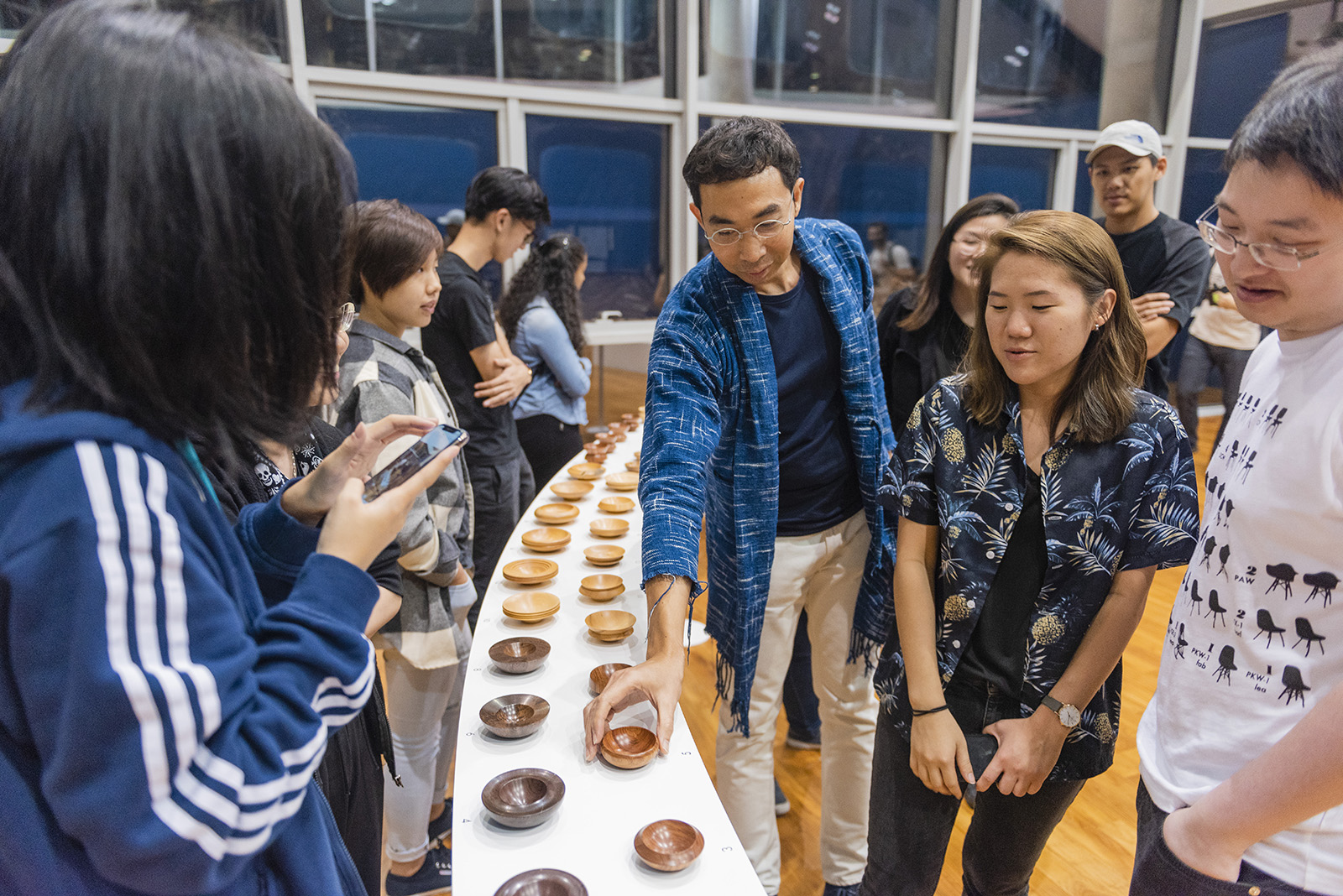
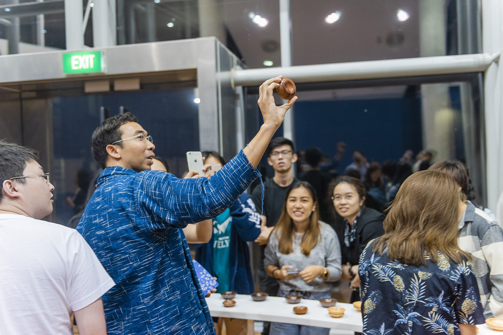
Photoshoot — Photography and Interactive Media majors from the class of 2018

Build — Creative Bulb

A Land Imagined

2019

A Land Imagined 《幻土》, winner of the Golden Leopard at the 71st Locarno Film Festival is the second feature film by director Yeo Siew Hua. Set in industrial Singapore, police investigator Lok must is looking for missing migrant worker Wang. Wang suffers a worksite accident and is afraid of repatriation. Unable to sleep, he frequents a dreamy cybercafé in the dead of the night. Hoping to look for some form of human connection in this foreign land, Wang forms a virtual friendship with a mysterious gamer that takes a sinister turn. When Wang suddenly disappears, Lok digs deep into the trail leading to a land reclamation site and uncovers the truth beneath all that sand. In a diverse land where identity is inherently foggy, Yeo suggests that becoming another person is as easy as dreaming it.

The typeface on the titleblock references shimmering  waves and evokes the feeling of shifting landscapes.

Identity formation in Singapore is fluid and schizophrenic, like our ceaselessly shifting shorelines reclaimed from sand we appropriate from so many places. The colors and treatment of the poster reflects the connection and tension between all these people in the same imagined land responding to the imagined world.


SINGAPORE GALA PREMIERE


We also designed the red carpet gala premiere held at Cathay Singapore. It features a series of large backdrops with the photos of the main leads of the film and also the festival circuit the film has been on, showcasing the international film awards it has garnered in the process.


In Random Order

2019

In Random Order is an exhibition organised by FOST Gallery featuring artists Kray Chen, Heman Chong, Grace Tan, Syagini Ratna Wulan. Each body of work functions within a structure, physical or conceptual, which is determined by a set of rules and a unified composite of interrelated and independent modular parts. Each individual artist has found ways to re-delineate the spatial and temporal boundaries, circumventing or subverting the set order. The animated exhibition identity we designed for this show presents an evident order when viewed through an obvious pattern or sequence. The monochrome scheme of it further reinforces the duality between the arbitrary and structure.


Shapes in Symmetry

2019

Shapes in Symmetry is a two-person exhibition curated by Michelle Ho at the ADM Gallery, Nanyang Technological University, featuring works by Chalit Kongsuwan and Grace Tan whose practices stem from their backgrounds in product and fashion design respectively. Drawing from working methodologies based on techniques of construction that engage with a wide range of materials, their works in the exhibition are also informed by the philosophies and processes in art history and Buddhist thought.

In this exhibition, both artists play with a range of forms: circles, cones, rectangles, triangles and more, expanding upon the possible dimensions of these elementary models which gain their own momentum and aesthetic form through controlled improvisation and serial repetition.

The exhibition brand mark and design was designed to draw similarities between both artist works; the harmony of shapes and forms through the principles of symmetry and equilibrium.


We also designed a limited edition artist postcard book for Grace Tan which showcases her thought process, and to get users to understand how many different patterns can be made from simple shapes.


REFORMATIONS: Painting in Post 2000 Singapore Art

2019

With the turn of the century, Singapore contemporary art of the 2000s has largely witnessed a shift from medium-specific art-making to artists working in interdisciplinary and new media practices. The exhibition Reformations: Painting in post 2000 Singapore Art held at ADM Gallery in Nanyang Technological University is a survey of artists whose works respond to the medium of paint, and are distinct through their investigation of materiality and methodology in painting. At times, they cross into expanded dimensions that encompass installation, sculpture, site-specificity, along with other propositions for image-making. Featuring artists Kanchana Gupta, Luke Heng, Warren Khong, Jane Lee, Ruben Pang, Guo-Liang Tan and Ian Woo, the exhibition is an attempt, and precursor for a proposition towards a successive generation of “post-modern” painting.

The exhibition identity features a bold black box; the abstraction and figuration of the very idea of what a canvas represents. This concept responds to the featured works in this show which suggest a reflexivity and reformation of the ways where meaning and representation may occur within the medium that may yet be a starting point to imagine the forms of progression in Singapore painting.


Sound & Vision

2019

Sound & Vision, a group exhibition presented by FOST Gallery features works from Zul Mahmod, Ng Joon Kiat, Wyn Lyn Tan and Ian Woo.

Curated by Michelle Ho, the exhibition presents artists working in conditions of abstraction, highlighting the means of composition in their art making that engage with notions of repetition and rhythm, tonality and intensity, and unity and dissonance, and how these are being interpreted in artistic practices across mediums.

Music and painting are interconnected in some ways, a premise that has been a recurrent proposition in the history of painting. The exhibition identity we designed draws inspiration from sound waves, presenting affinities and corresponding relationship between the depictions of image and sound.


Studio Flex

2018

Studio Flex is one of Asia's leading designer furniture store and manufacturer. The concept of the identity is a nod to the studio's promise, to 'Make Function Beautiful'; achieving the perfect notes between form and function whilst deriving holistic solutions for their clients. The result is a bold and confident monotone brand-mark, mirroring and emphasising the effortless clarity of this balance.


Miracle Kutchie Experience 4

2019

We were approached by TODAY IS THE DAY, a visionary non-profit making organization based in Japan, New York, Singapore and Zurich, for the fourth year running to design and brand the “MIRACLE KUTCHIE EXPERIENCE 4”, an art retreat exchange program in Singapore that uses art therapy as a medium to heal children who have suffered from complex trauma from Fukushima. The theme this year centred on ideas of love, fun and hope. Inspired by childhood memories of the fun of playing with stickers, we designed the identity based on it, with bright coloured emoji stickers plastered across it.

Exhibited at the International Taiwan Poster 2018 organised by TPDA (Taiwan Poster Design Association)


ADM Prospectus 18/19

2018

As the NTU School of Art Design & Media welcomes its new intake of students under its brand new undergraduates programmes of Design Art and Media Art, we designed this year's prospectus as a reversible book; Design Art to be read from the front and Media Art to be read from the back. The center dividing section houses the admission criteria and information.

The cover design features a portrait which is transformed through an illusion. The negative space carved by a difference in color reveals the imagery of a second face, with each colour representing Design Art and Media Art respectively. The book is then encased in a red plastic sleeve that hides the title of the book, only to reveal when the book is drawn out.

Cover Photography: Jasper Yu
Talent: Ang Geck Geck Priscilla


Hovie

2018

Hovie is a Shenzhen based international media group with vested interests in film production, event strategy, media promotions and film related investments. We was tasked to rebrand the company, giving it a new image of confidence and flair that would resonate with its clientele comprising media personalities, multi-national firms, and government bodies.

The logo features a central symbol resembling a ray of spotlight. Used as a encasing device, it houses their key word mark in both Mandarin & English. The straightforward beacon-like logo speaks boldly of their company's vision; to be in the lead and focal point of the region's burgeoning media industry.


Animation done in collaboration with Semicolon