Hello Group

2017

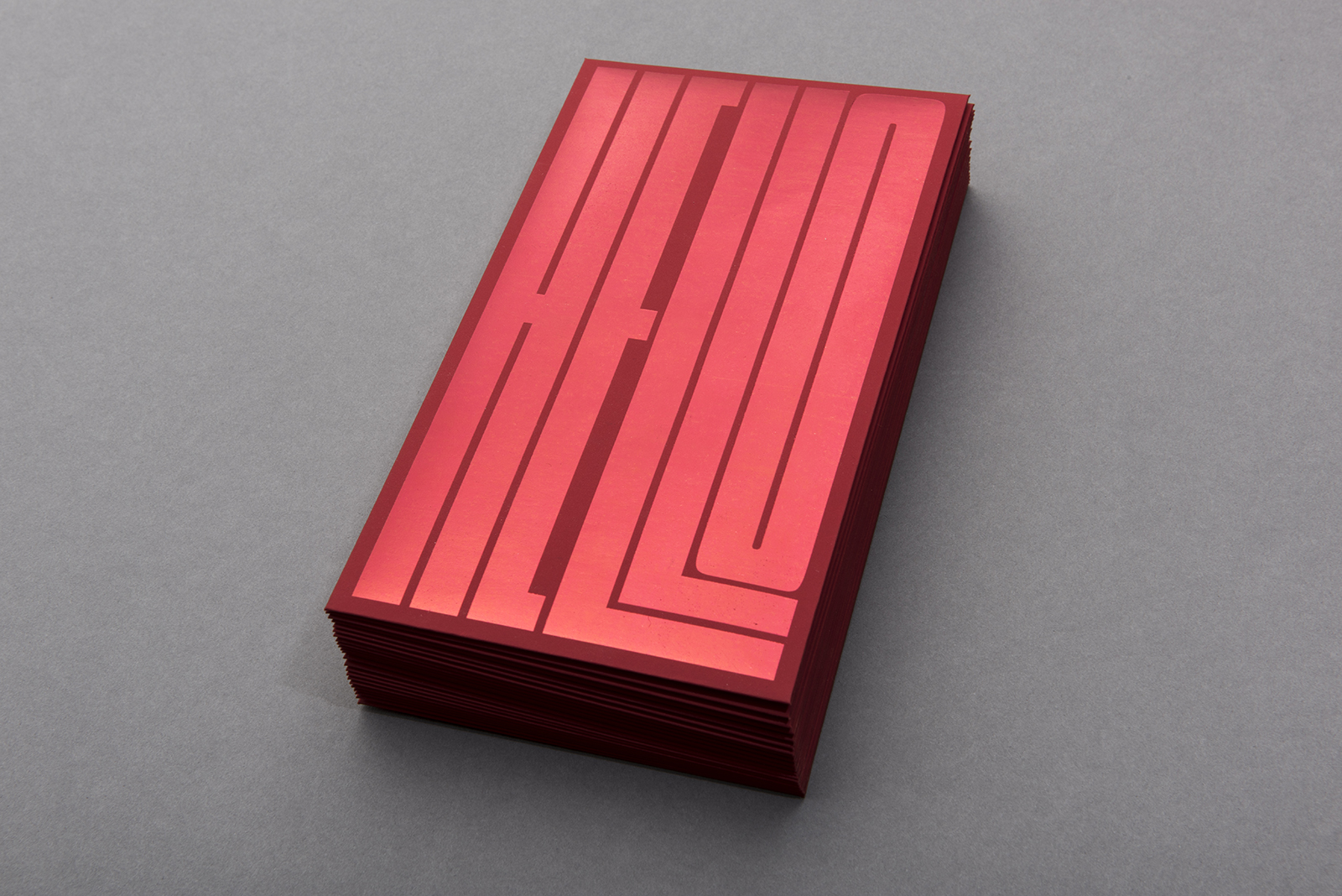
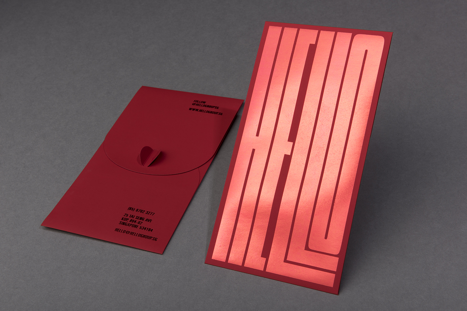
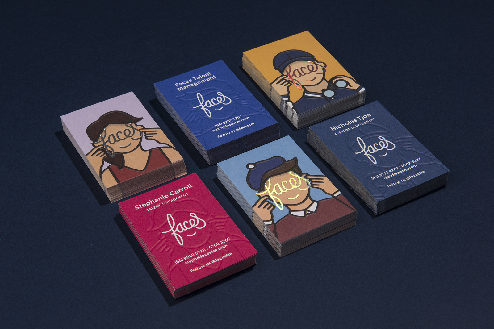
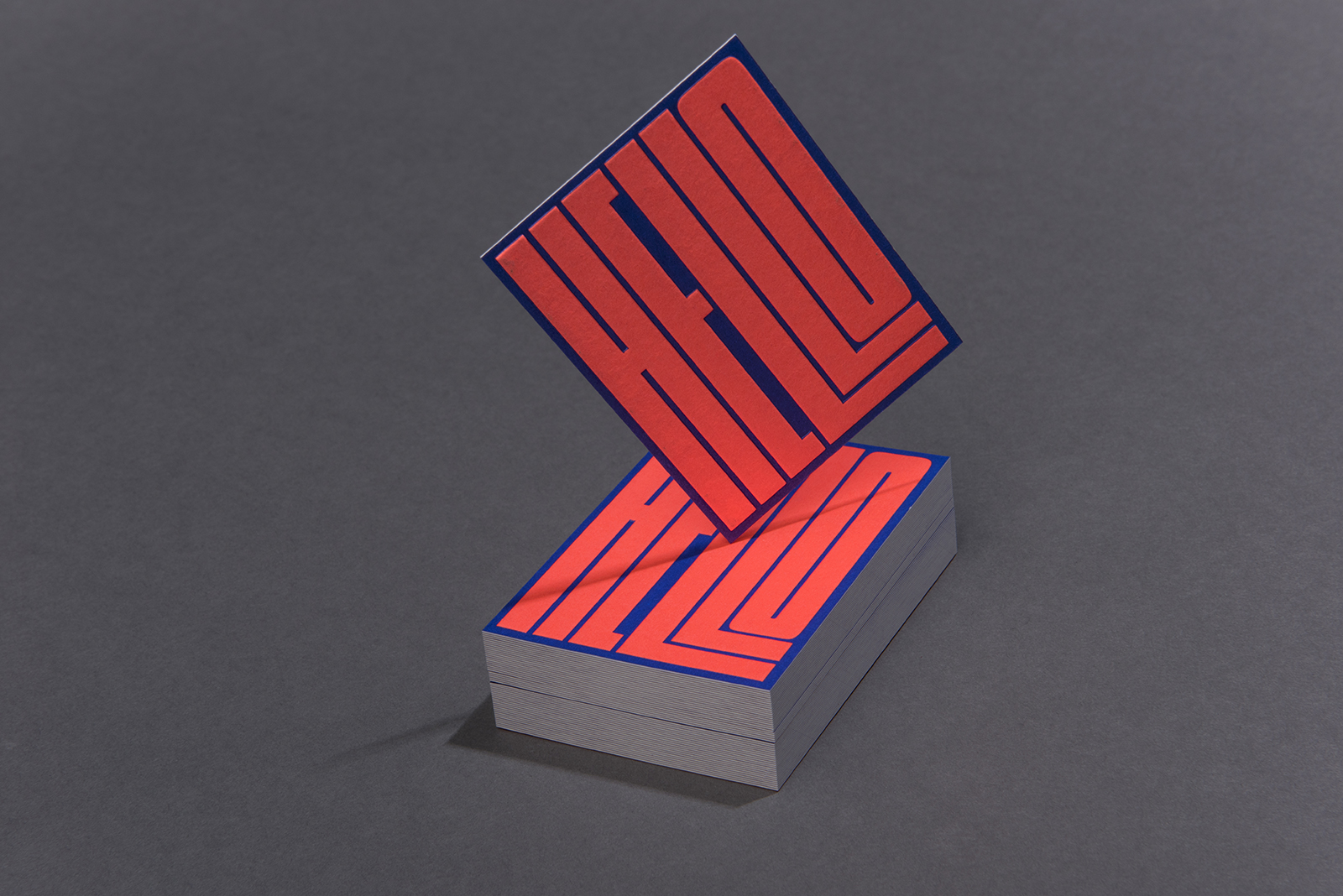
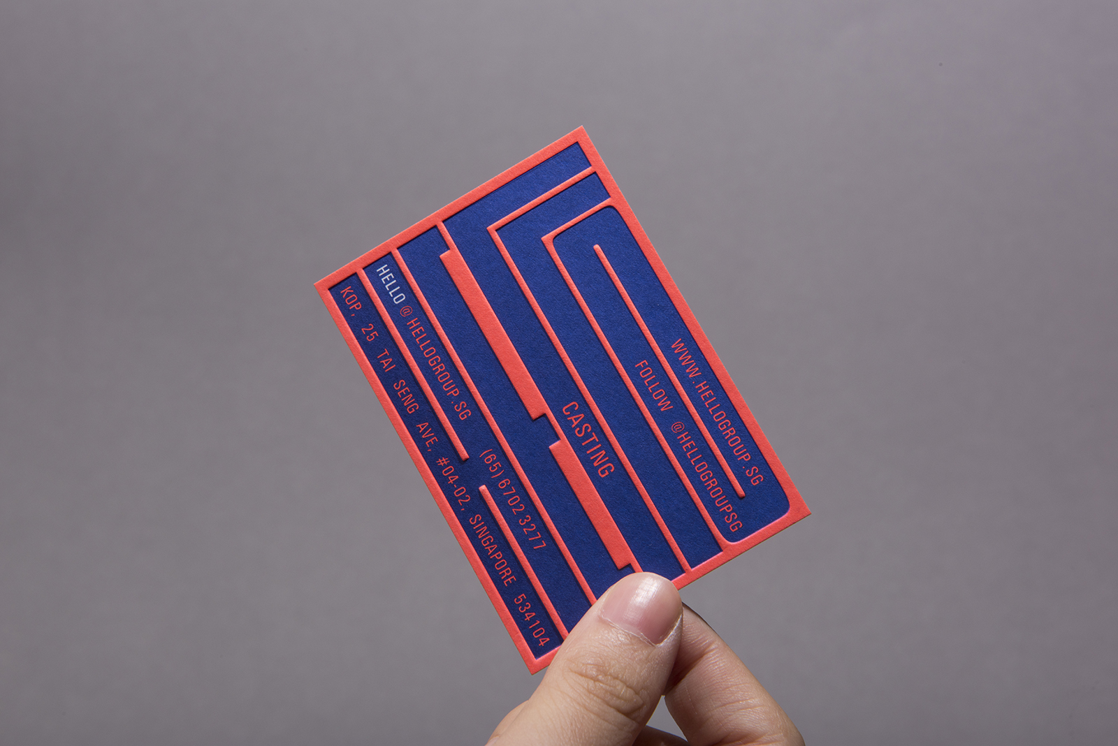
Hello Group is a top casting and talent management agency in Singapore. One of the first words their casting managers often say when they approach people during the casting process is ‘Hello!‘. As such, we designed a word mark for their logo which appears intentionally large and loud, suggesting the individuality and passion that goes into casting process.

Visit their website here.


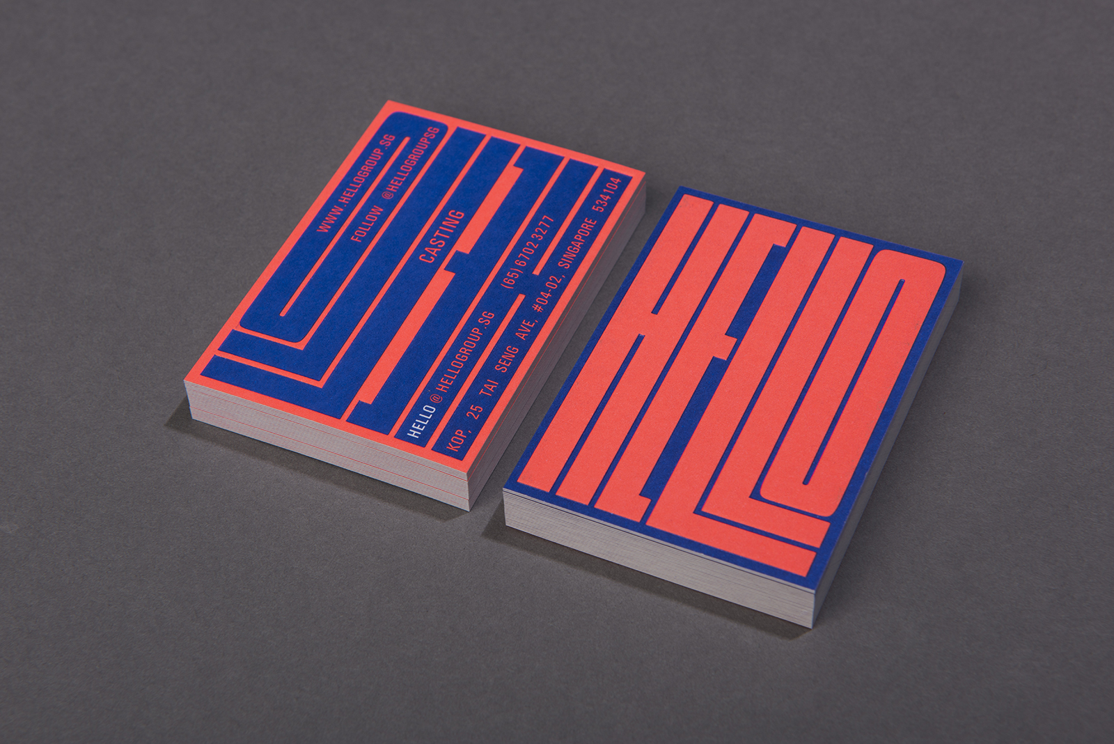
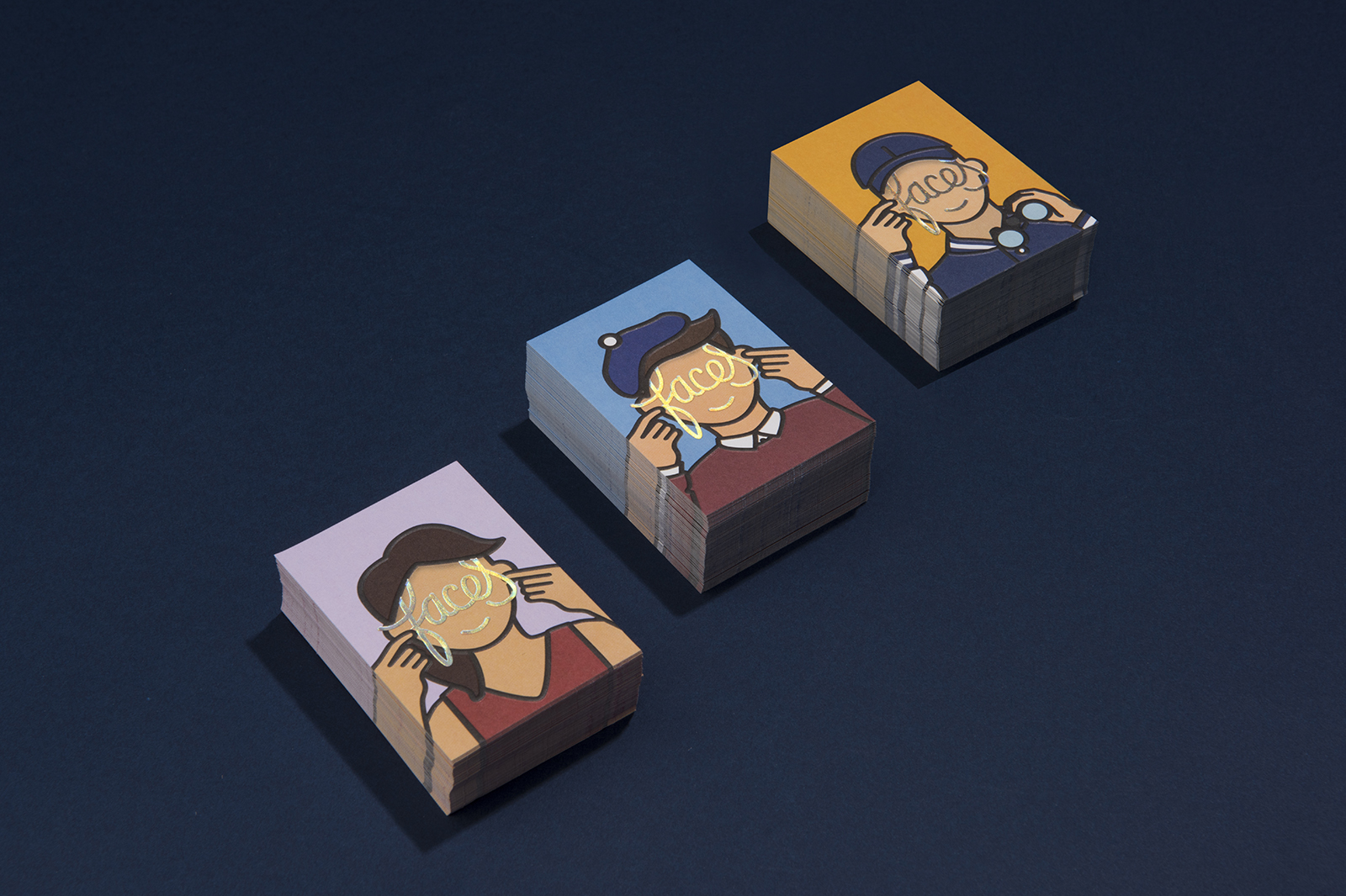
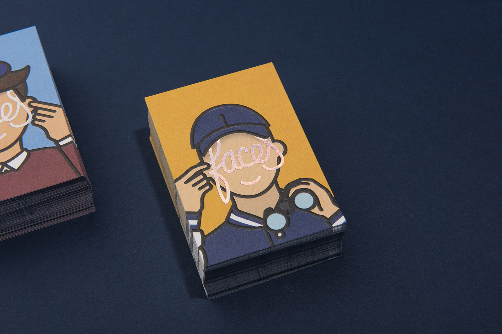
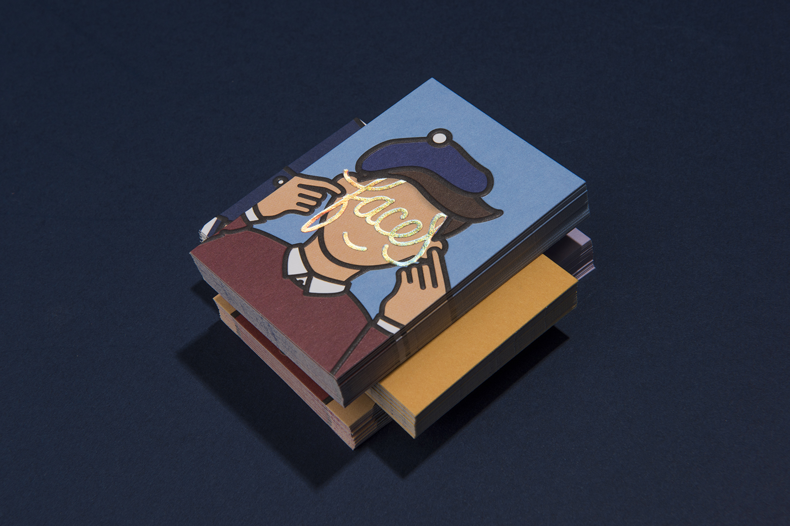
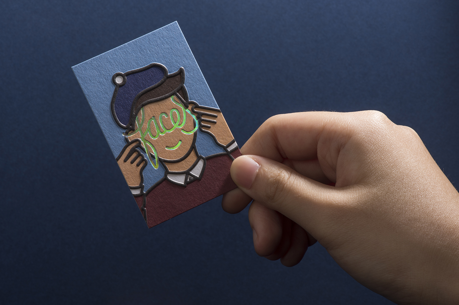
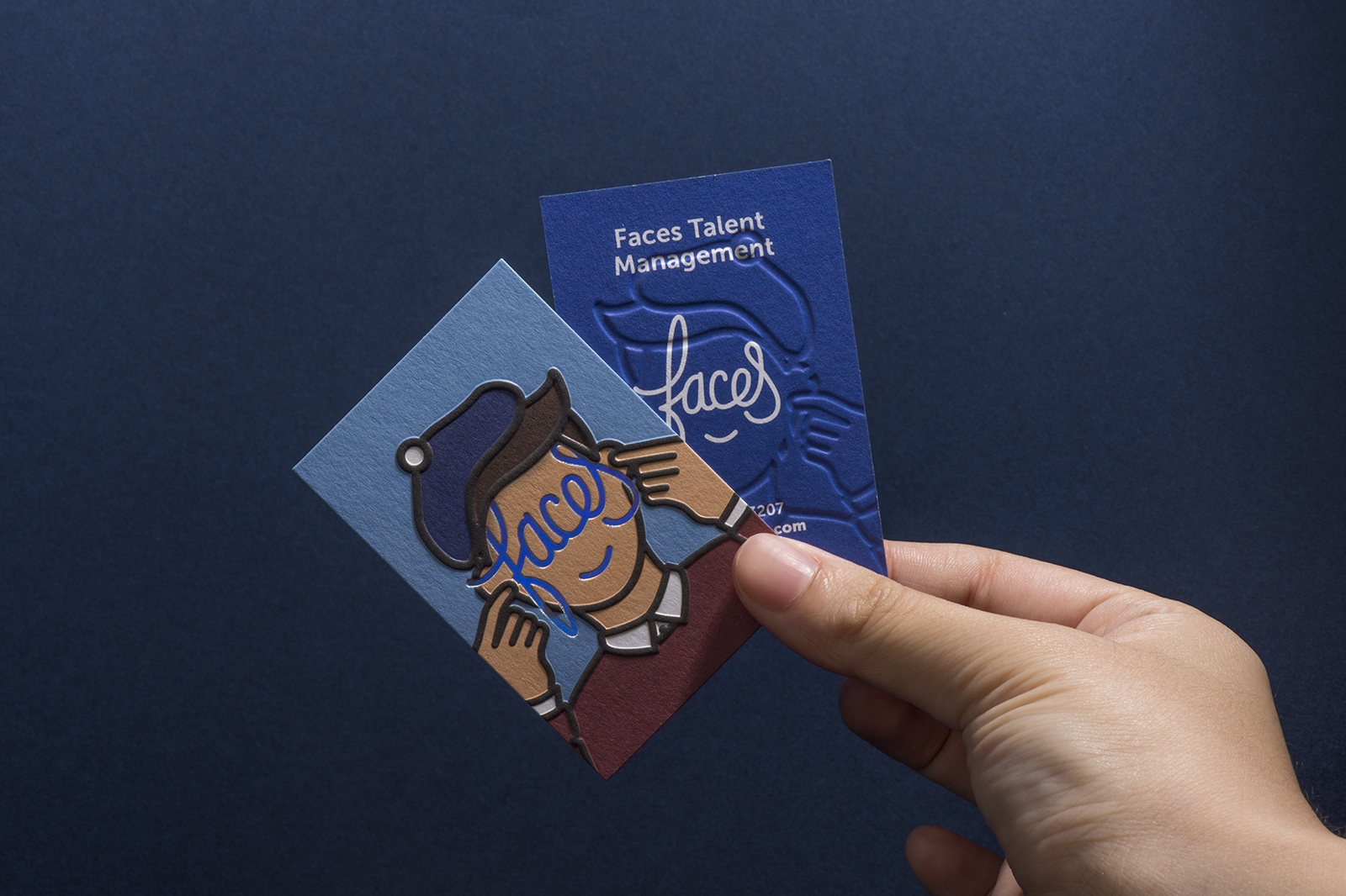
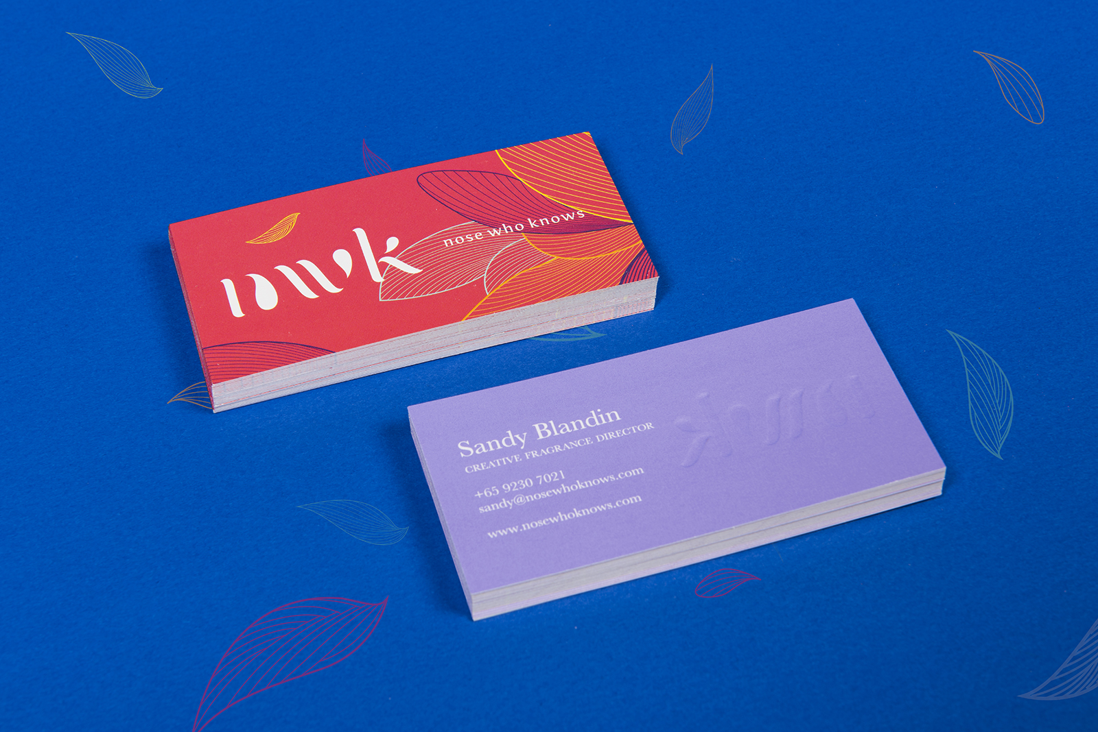
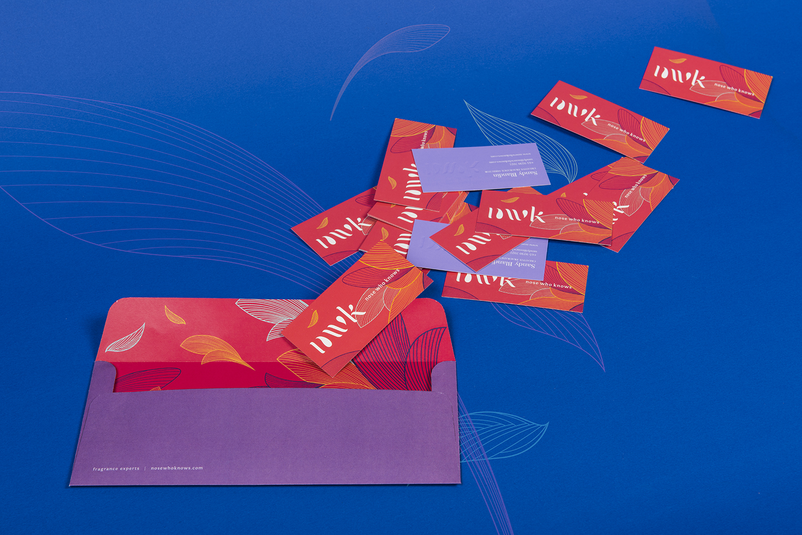
The name cards we designed for the casting managers, often the first point of contact between the casting managers and the talents, is painted in bright neon orange and blue, playing up the fun and affable nature of this profession.


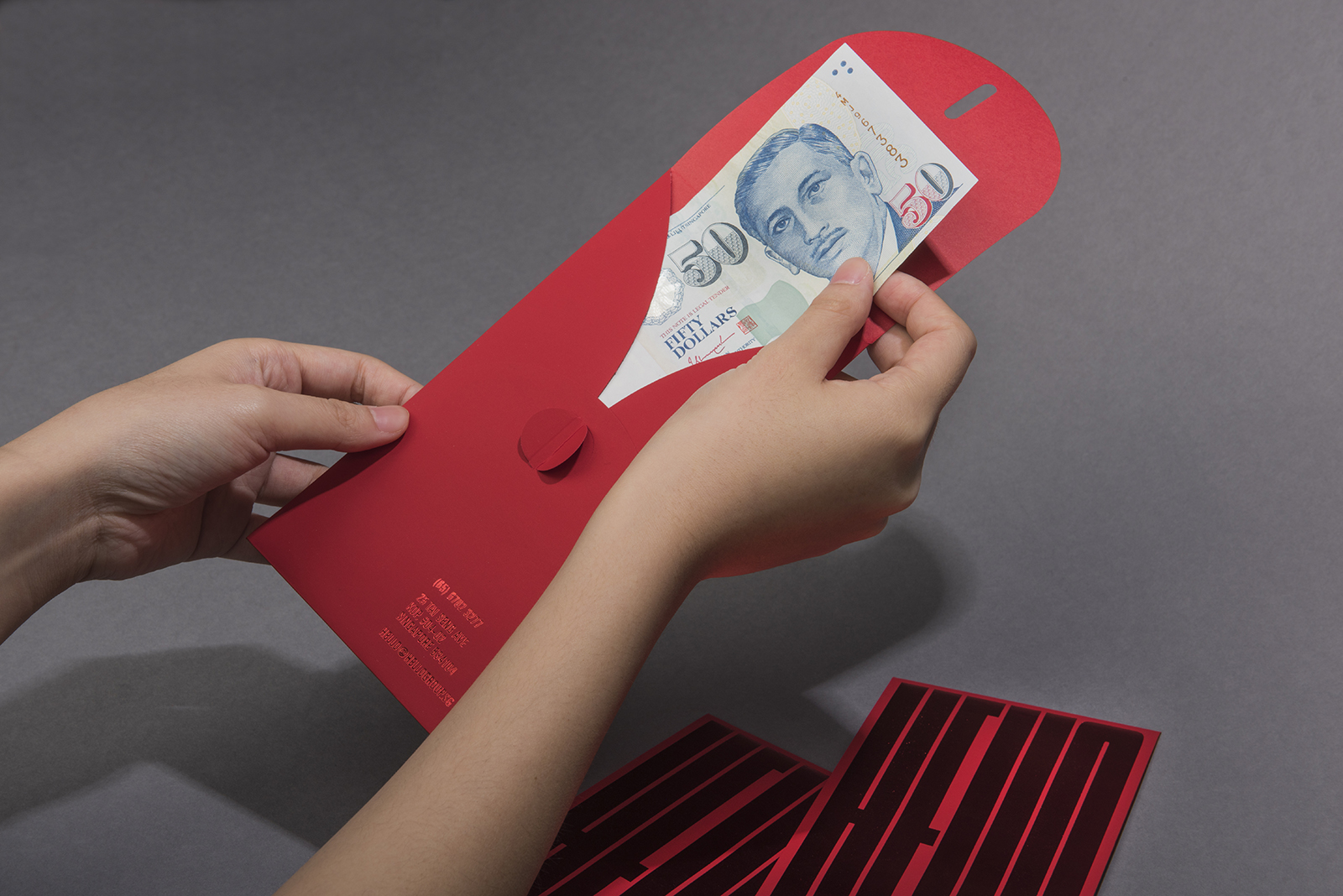
We also designed red packets for them, which serves a practical function for them in the cultural context of Singapore, as it is customary to pay their talents through red packet at the end of a shoot.


Faces Talent Management

2017

Unconventional, creative and energetic – these are three words that sum up Faces Talent Management. We wanted to create a brand mark for the talent agency that focuses on bringing a human touch back to a perceivably aloof industry. Inspired by the concept of 'Face Value', we made use of the silhouette of a face to craft a custom typography that immediately reads as a face A series of face icons were also created as a secondary graphical element to represent the different categories of talents the agency represents, kids, adults, seniors, etc.


Website

The website is built upon bright and vibrant coloured illustrations, capturing the dynamic energy present in the agency which helps differentiate itself from its competitors.


A Figment of Film

2016

While the disciplines of cinema and the visual arts have produced their respective innovations in image-making and modes of representation, they share intricate relationships of exchange, as contemporary artists and film-makers alike, deal with the complexities of image and narrative making. A Figment of Film presents five artists whose works deal with the very subject matter of film.  Each presentation engages with a broad dimension of cinema, ranging from the investigation of the still and moving image, to the reframing of filmic imagery.


In the exhibition, artists deal with the translation of cinematic images into painting, and vice versa, presenting new ways of looking at composition, perspective, spatial dynamics as well as time. Other works explore film history and the blurred boundaries between historical fact and Hollywood mythmaking. Through these works, the show raises questions that allow us to consider these languages of art-making, as well as new contexts of creation, innovation and reception in artistic production.


Sea State

2016

SEA STATE is an exhibition by artist Charles Lim Yi Yong, commissioned for the Singapore Pavilion for the 56th Venice Biennale and presented at the NTU Centre for Contemporary Art Singapore. For over a decade, Lim’s ongoing project SEA STATE examines the biophysical, political and psychic contours of Singapore through the visible and invisible lenses of the sea. SEA STATE is an in-depth inquiry that scrutinises both man-made systems, opening new perspectives on our everyday surroundings, from unseen landscapes and disappearing islands to the imaginary boundaries of a future landmass.

We took inspiration from this to design the exhibition branding, which is applied across all environmental graphics and print collaterals.


Reframing Modernism

2016

Reframing Modernism is National Gallery Singapore’s first international collaboration with Centre Pompidou, Paris. This exhibition reframes the existing paradigm of how modernist painting is understood. Drawing on over 200 iconic works by modern artists from Southeast Asia and Europe, it invites us to reconsider how artists working in different global contexts approached modern art and modernism in the 20th century.

As many of the artworks feature common approaches to modernism, common ways of working and common conceptual orientations, we made use of the symbol a cluster of frames to represent the emphasis on shared qualities, mimicking how visitors will move between bodies of work across nebula like structures, thus be encouraged to make their own connections between different bodies of work. The serif logotype is deconstructed amongst the frames which bring forth a sense of broad minded dialogue and interpretation between the viewers and the artworks.

In collaboration with Superfat Designs


Spatial & Wayfinding Design

Spatially, the exhibition is designed in such a way that the eye is drawn along large horizontal walls and within nebula clusters, which creates a natural rhythm and allows viewers to be able to physically draw a direct correlation of artists from South East Asia with their European counter parts with the help of textual explanations on the walls. Portions of the artworks throughout the exhibition can be seen through gaps between walls which strengthens the notion of the interrelated case studies. The artworks are always laid out adjacent to each other to allow for with more work to be captured in the viewers peripheral vision. This leads the viewers to the next artwork and how they should be viewed.


As the exhibition spans across three galleries, we also created a series of way finding devices that all ties in neatly with the branding elements we’ve created such as the frames and deconstructed text to conjure a consistent look and feel throughout, allowing for the viewers to be directed seamlessly throughout the galleries and the various activity stations.


Experience Station


Education Station


Exhibition Collaterals

Nose Who Knows

2016

Nose Who Knows is a fragrance studio dedicated to olfaction with over 15 years experience in fragrance creation and education. Exclusive partner of Cinquieme Sens, a famous Fragrance Institution from Paris, they aim to refine one’s understanding of the world around them through the sense of smell. The brand identity we designed seeks to convey this very sense of expertise, as well as the prestige associated with the fragrance industry.

We made use of the ‘goutte’ of perfume to craft a custom typography for the brand mark to capture the sense of elegance and essence of olfaction. The line work motif of flower petals floating in the air was crafted as a secondary graphical element to convey the movement and energy of the dispersion of scents; combined with vibrant colours to depict how scents conjure one’s imagination and memories.

Visit the Nose Who Knows website


CCA Quarterly

2016

Located in Gillman Barracks, the NTU Centre for Contemporary Art Singapore (NTU CCA Singapore) is a national research centre of Nanyang Technological University and is supported by a grant from the Economic Development Board, Singapore. The Centre is unique in its threefold constellation of exhibitions, residencies, research and academic education. The NTU CCA Singapore positions itself as a space for critical discourse and encourages new ways of thinking about Spaces of the Curatorial in Southeast Asia and beyond. As a research centre, it aims to provide visiting researchers and curators a comprehensive study on the contemporary art ecosystem in Singapore and the region. The Centre’s dynamic public programmes serve to engage with various audiences through lectures, workshops, open studios, film screenings and Exhibition (de)Tours.

We were tasked to design the quarterly(s) for 2016, a set of brochures launched every three months to highlight the ongoing events and activities going on in the centre. Set in an accordion fold, its grid system allows the viewer to easily locate activities and programmes they are interested in based on dates and venues. We also specially designed a taller than usual insert for the public programmes to draw people’s attention to it.


A Fact Has No Appearance

2016

A Fact Has No Appearance held at National Gallery Singapore investigates the impact of new ideas on Southeast Asian art in the 1970s by focusing on three key artists: Johnny Manahan (The Philippines), Redza Piyadasa (Malaysia), and Tan Teng-Kee (Malaysia/Singapore), providing an insight into their approaches during a dynamic moment in the region’s history where they broke new ground, challenging the boundaries of painting, sculpture, photography, video, and performance.

In collaboration with Superfat Designs.


As the name suggests, the title can be interpreted as both a statement or a question, drawing parallels with the notion of challenge depicted by the artworks during its time. The modern san serif logotype is arranged in a free form manner to illustrate the interwoven experience of the show, whereas the words ‘Fact’ & ‘Appearance’ were deliberately deconstructed to to reflect how art making at that time provided a contrarian view to the norms.


The entrance area serves an important function to set this tone for the exhibition. The walkway is flanked by Piyadasa’s provoking sculpture A Configuration Can Never Have a Literal Existence on one side and the exhibition title wall on the other. Directly facing the entrance is a video projection of Tan Teng Kee’s The Picnic, an eye catching introduction into the exhibition space. The spatial design is created in such a way that the eye is drawn along the diagonal voluminous walls which creates a natural rhythm; portions of the artworks from the different artists can be seen throughout the exhibition which strengthens the notion of interwoven case studies. In conjunction with the launch, a special publication was also designed featuring essays, conversations, and archival images related to this series.


Earthwork 1979

2016

Earth Work 1979 is a re-staging of Tang Da Wu’s seminal show Earth Work, presented in 1980 at the National Museum Art Gallery (NMAG). It revisits a key moment in local exhibition history, and explores the turn towards conceptual art in Singapore.

The earliest recorded example of land art in Singapore, this series was created in 1979 when Tang discovered a field north of Ang Mo Kio that had just been cleared for redevelopment. He spent months observing the textures and colours of the earth, the impact of the sun and rain, and the marks that were left behind. These natural elements became key factors in creating artworks that reflected the impact of Singapore’s rapid development on the environment.

Held in the concourse gallery of National Gallery Singapore, Earth Work 1979 is the first time that these important works have been on public display since 1980. It also includes archival photos that have never been shown before.

In collaboration with Superfat Designs.


We were tasked to handle the branding, spatial design, as well as the build of the exhibition. As the name suggests, earth works are works created through the moving or processing parts of the earth’s surface involving quantities of soil or unformed rock. The earth is almost scared, a heavy infinite mass. In the design of the space, we wanted to respect the absolute nature of earth by creating structure yet gentleness at the same time. The zoning design uses the long hanging curtains artworks to create tension and frames the other works within the space. The natural colour palette reflects the organic nature of the artworks, yet at the same time not overpowering them. In conjunction with the launch, a special publication was also designed featuring essays, conversations, and archival images related to this series.


ADM Prospectus 16/17

2016

The annual prospectus publication is part of NTU School of Art Design & Media’s yearly outreach efforts, which serves as a promotional material which allows prospective students to understand and find out more about the undergraduate programmes the university has to offer.

This year, the publication is presented in an interesting three-tier book format: Part I explaining the admission criteria and general information about the school, Part II detailing the Bachelors of Fine Arts programme offered at the institution, and Part III, a new segment which features notable alumni from the school speaking about their journeys and careers. The front cover is embossed in a striking fashion of waves and each booklet is tiered in color to differentiate between the chapters. The publication is also side sewn using threads of different colors, an homage to the university colors but more importantly highlighting the free spirited creativity unbound at this institute.